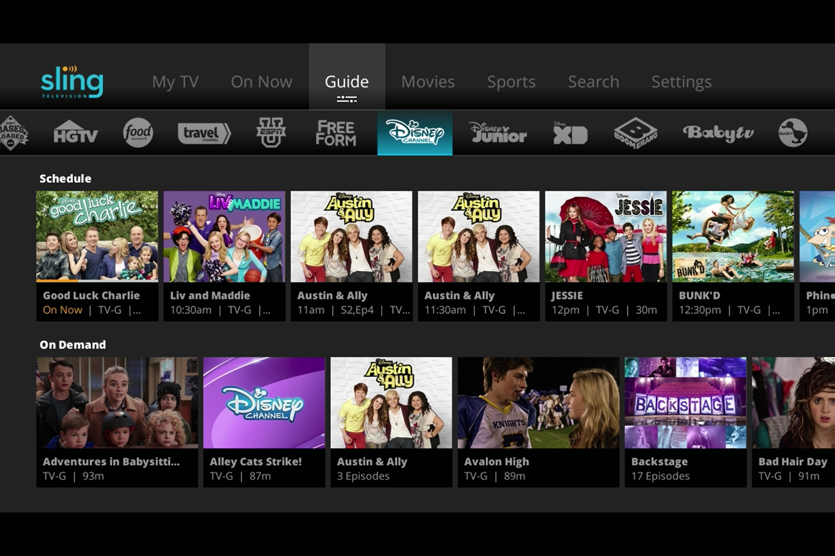
That updated UI is now making its way to Roku users, Sling TV announced in a blog post on Tuesday. Both standalone players like the Roku 4 and Roku Streaming Stick, as well as Roku-enabled TV models, are getting the new UI, which Sling TV says offers a more personalized experience.
The updated interface will be immediately noticeable upon opening the app, as the new My TV home screen is front and center. A new “My Channels” section allows viewers to quickly access the favorites, while a “Continue Watching” section below allows you to quickly get back to the last TV show or movie you were watching.
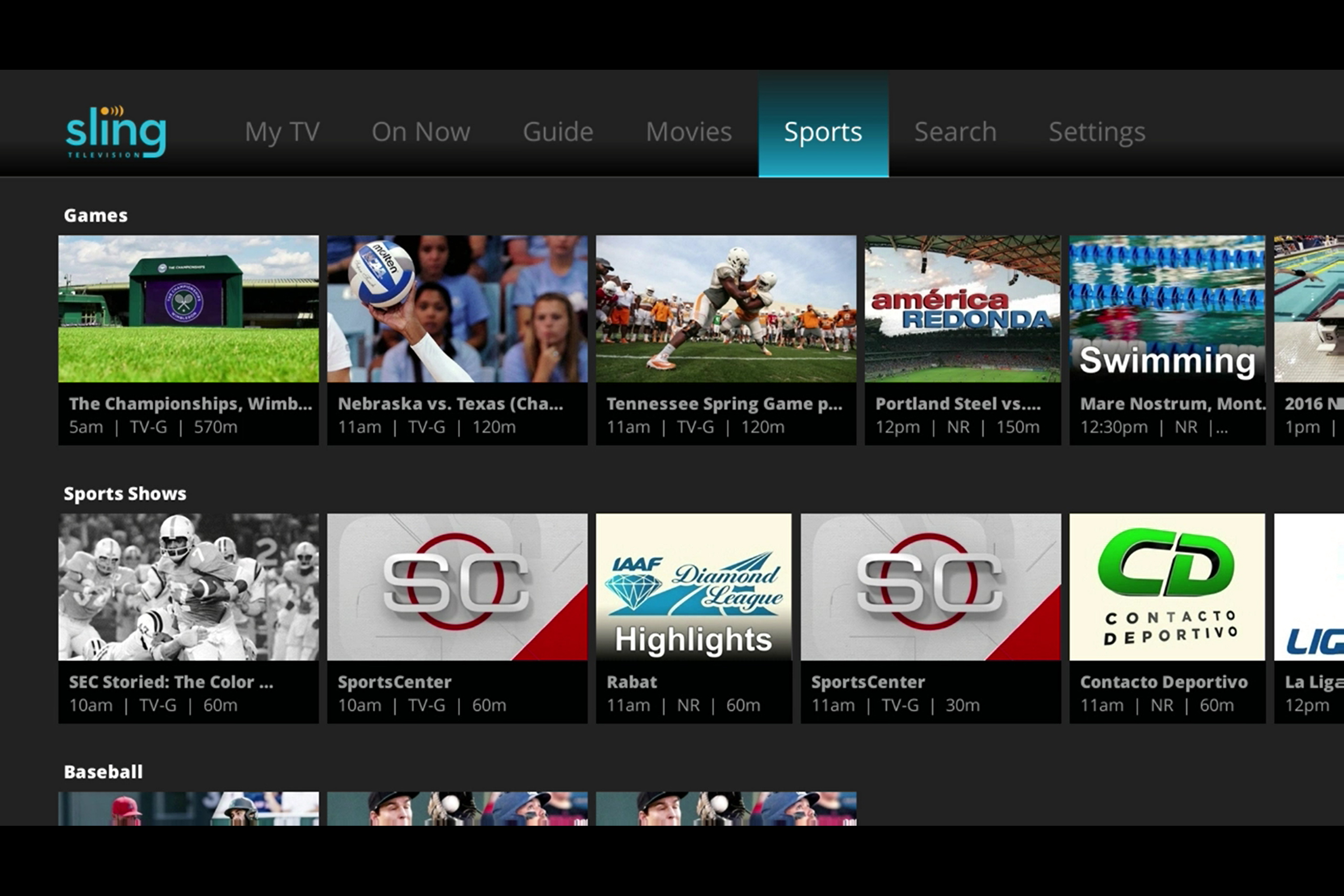
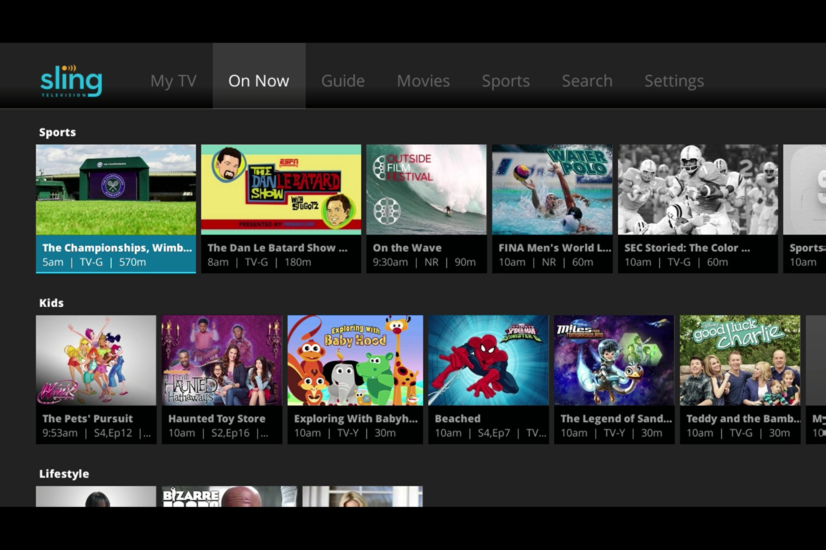
While the standard guide view hasn’t gone anywhere, there is also a new “On Now” view that presents users with a different take on what is currently airing. Organized by categories like sports, lifestyle, and action, this view should be a hit with viewers who feel like watching something but aren’t sure exactly what. This will also be joined by a “Sports” view, which Sling TV says is coming soon and will allow viewers to browse by sport, schedule, or what is currently airing.
The updated UI is rolling out starting now, so if you’re a Sling TV user with a Roku, expect to see the change soon if you’re not seeing it already. The blog post also mentions that this new view will be rolling out to other supported devices throughout the year, so if you’re watching on a Fire TV or other device, you’ll eventually get the new interface.


