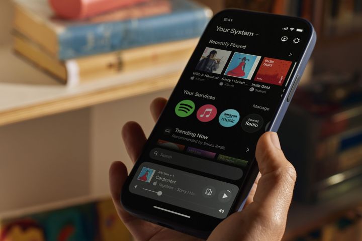
Sonos will update its S2 mobile app with its most extensive redesign to date on May 7. It will also replace its native apps for Windows and macOS with a new web app that lets Sonos users access their systems from anywhere using any modern browser. Sonos says these moves are aimed at helping customers manage their music and their Sonos system more easily, and with fewer taps.
However, Sonos’ team also spent considerable time in thier media briefing talking about the app’s modernized underpinnings and how they will let Sonos continue to innovate in the future. You don’t need a crystal ball to know they mean products like the as-yet-unreleased Sonos headphones.
The redesign also introduces more customization, letting each member of your household decide which songs, playlists, or podcasts should be front and center when they open their Sonos app. Overall, it looks like a better experience, but as with any user interface change, it will come with a learning curve. And not everyone will be happy with Sonos’ “new” search, which is now the only option for finding content, as its “classic” search has been retired.
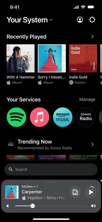
The biggest change to the Sonos app is the elimination of tabs. Instead of flipping between five sections (My Sonos, Browse, System, Search, and Settings), most features are now directly accessible from a revamped and customizable home screen.
That home screen is a mix of always-present elements at the top and bottom, and a customizable set of content carousels in the middle. At the top, next to the name of your Sonos system (which you can rename any time), is an account/profile button (which used to be accessed from the Settings tab) and a gear icon that takes you to the new settings menus.
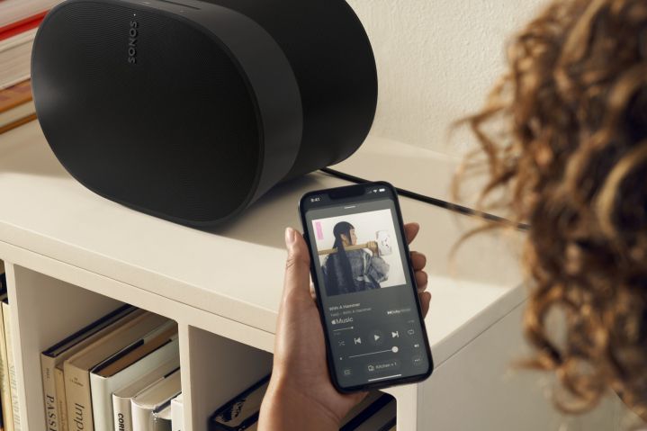
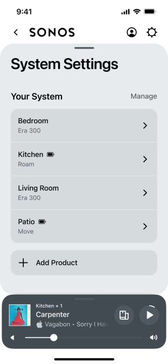
At the bottom is the mini-player that will be familiar to Sonos users, however, it now has two expanded modes. You can tap it to get the redesigned full-screen now-playing window or swipe up to reveal all of your Sonos components, which used to live in the System tab.
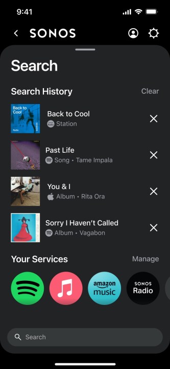
Instead of getting its own tab, search is now only accessible from the home screen. When not in use, it hovers above the mini-player. You tap it to start a new search, which launches the on-screen keyboard and displays your search history.
This change may be the one that takes the most getting used to, since you can no longer jump straight to the search screen from any other area of the app, including the full-screen now-playing window.
At the heart of the redesign is the customizable middle section of the home screen. It merges the older My Sonos and Browse tabs into a single experience. As with My Sonos, you can access all of your favorited content including albums, playlists, artists, etc. These are presented in a scrolling list that also includes your recently played items and a Your Services section with icons for your streaming services.
The list can be reordered (and the items removed if you don’t want them), and you can identify one streaming service as your primary — it will always be first inside the Your Services section.
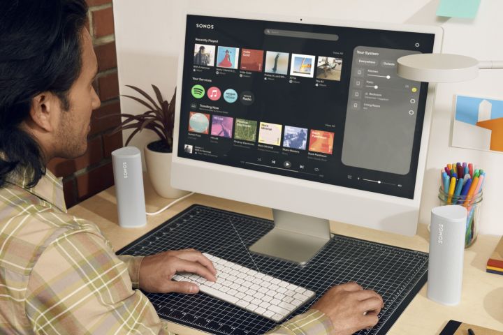
The new web app (accessible at www.sonos.com/web-app when it goes live on May 7) contains most, but not all of these features. Notably absent is the ability to add or edit the home page’s content carousels. However, the ability to access the web app from literally any device that has a browser and access to the internet is a big deal, especially for those with second properties like cottages.
Now, instead of wondering if you left the patio speakers playing full blast to the neighbors, you’ll know and be able to do something about it.
Let’s just hope this new from-anywhere control doesn’t open up any new security risks.
Unfortunately, Sonos didn’t provide me with beta access to the new app, so I’ll be getting my first opportunity to try it on the same day as you. As I indicated above, I’m not a fan of the new search, but I’m excited about the changes and I’m looking forward to trying that new web app.
