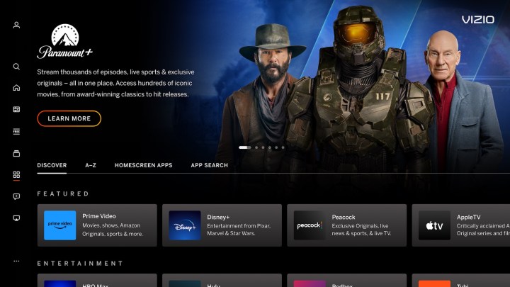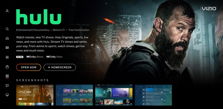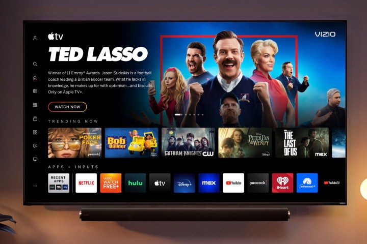
It’s been a while since Vizio gave its SmartCast interface a fresh coat of paint and it was beginning to show its age when compared to Google TV, Apple TV, and Amazon’s Fire TV. Today, that changes, with a new interface that ditches the “SmartCast” name, in favor of the simpler “Vizio Home Screen” — it’s a full refresh of many of the key interfaces that Vizio owners use to navigate and find their shows, movies, and apps.
The first thing you notice is the way the cover art for shows and movies now blends into the background of each screen instead of being presented as a rectangular billboard. It’s a much more engaging format and mirrors what we’ve started to see from the other leading smart TV platforms.
- 1. The Vizio app catalog
- 2. The Hulu app details page
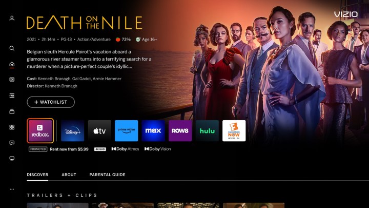
- 3. Details for a movie
But beyond the modernized aesthetics, Vizio points out that there are some concrete improvements to the usability of the screens too.
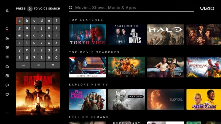
The menus, settings, and navigation features have all been revamped to make browsing easier, including a newly redesigned on-screen virtual keyboard and genre pages, which the company says will improve the ease and speed of searching for content.
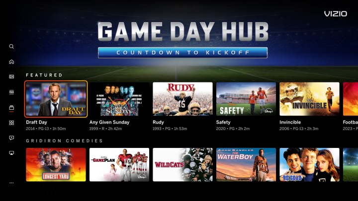
- 1. The Game Day Hub
- 2. The home screen search page
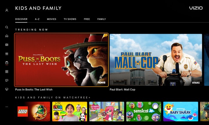
- 3. The kids and family category page
Finding your next binge-worthy show could be easier, faster, and more targeted to your tastes: the home screen now has built-in recommendations and information like Common Sense Media parental guidance and Rotten Tomatoes scores.
You’ll also have more control over the apps — customizing the app row can now be done in a single click, and each app will deliver its own content recommendations. The My Watchlist screen lets you pull together movies and shows from different apps in one place.
You’ll also notice that it takes fewer clicks to get the information you want. Instead of making you click through to a show or movie’s info page, much of that content is now shown next to the cover art at the top of the screen when you hover over a show’s thumbnail.
The info pages themselves are also more useful, with Discover, About, and Parental Guide sections that provide extra info related to the content you’re about to watch. You’ll also see helpful metadata for each title like its resolution and whether or not it’s available in formats like Dolby Vision or Dolby Atmos.
Again, these features aren’t new to the world of smart TV interfaces — in many ways, Vizio has simply copied the formats now used by its competitors — but it will still be a breath of fresh air for Vizio TV owners who have been itching for a better way to watch streaming content.
Though Vizio hasn’t said when Vizio owners can expect to see the new Home Page, or which Vizio models will be getting the revamped experience, Kaitlyn Collins, VP of Product Marketing at Vizio said that, “our goal is to make it easy for our consumers to experience our latest innovations as soon as it is available, even on older Vizio Smart TV.”
