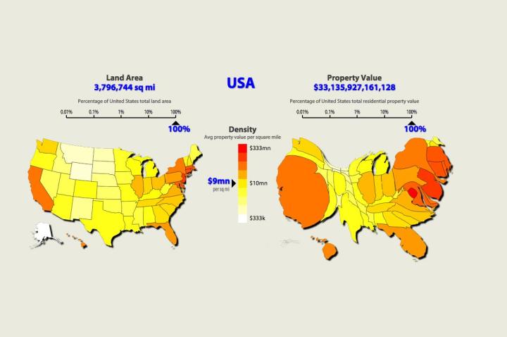
To get a sense of what all that concentrated property value looks like, Max Galka created an animated map at Metrocosm. To make the cartogram, Galka used The Economist’s data. The cartogram morphs from the usual representation of the U.S. to a mess of red, yellow, and orange blobs of various sizes. The big red ones, mainly in New York and California, represent counties where the housing value is over $40 billion. The little yellow and yellow-orange ones in the middle are counties with property values under $5 billion and $15 billion.

When the map goes back to its original view, you can see the vast majority of the counties are the two yellow shades, while only a few in the states mentioned above are red. A few other areas in states such as Washington (around Seattle), Michigan (in the Detroit suburbs), and Illinois (the Chicago area) also have pockets of red and orangish red surrounded by yellow.
That the high property values are concentrated in these handful of states isn’t surprising, but seeing it illustrated in a way that goes from a swatch of yellow to a bulbous protrusion of red really drives the point home … and just how much that home is worth really depends on where you live.


