See what furniture looks like in your home with the Wayfair app

wayfair view in room 13350413 1172786409410193 4934301771077287710 o
Image used with permission by copyright holder
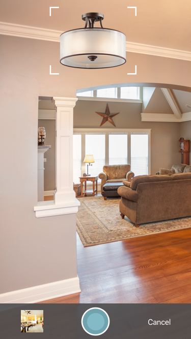
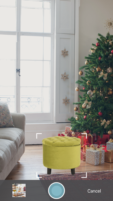
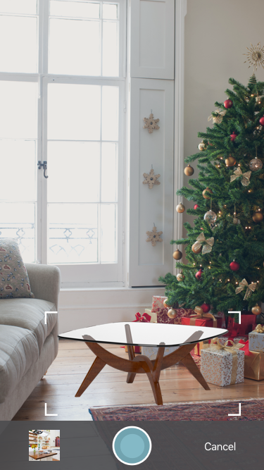
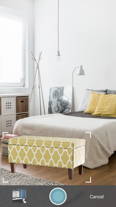
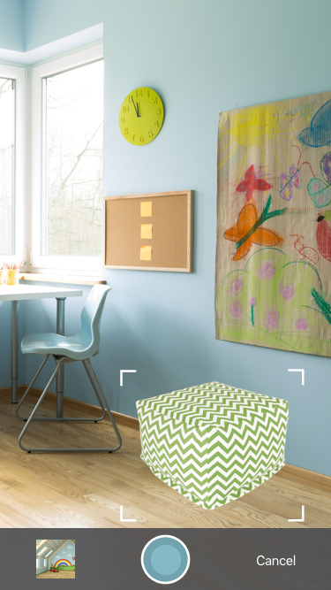
You wouldn’t buy that pair of pants before making a trip to the fitting room, or a car before taking it for a test drive, so why buy furniture without seeing it in your home? Now, you don’t have to. It’s all thanks to the new “View in Room” feature from the Wayfair mobile app, which promises to let “shoppers see furniture and décor in their homes before they buy.” Rather than using your mind’s eye, you can use your actual eyes and place 2D product images in any room of your house through your smartphone’s camera.

“As we pioneer new emerging technologies such as virtual and augmented reality, we are simultaneously focused on bringing new solutions to market that will immediately benefit all of our customers,” said Steve Conine, the co-founder and co-chairman of Wayfair. “The new View in Room feature solves a common customer pain point by making it possible for shoppers to preview furniture and décor in their home before placing an order.”

Recommended Videos

While many augmented and virtual reality experiences require a headset or some other hardware, Wayfair’s app allows shoppers to take advantage of this technology with nothing more than their mobile device. Just click the View in Room button underneath a product image in the existing app and the product will appear on your screen in camera mode, so you can take a picture of a room with your potential purchase superimposed.

“From lighting and throw pillows to sofas and chairs — and even holiday décor — the View in Room feature makes shopping for the home fun, interactive and social,” continued Conine. “Our newest visualization feature is broadly available to our rapidly growing customer base and offers shoppers the added confidence that they’re making the right furniture and décor selections for their homes.”

You can check out the mobile app here.
Lulu Chang
Former Digital Trends Contributor
Fascinated by the effects of technology on human interaction, Lulu believes that if her parents can use your new app…
The Google Home app is getting a long-overdue feature
The Google Home logo on a Pixel phone.

According to the sleuths over at Android Authority, the Google Home app is about to get a much-needed feature that I'm honestly shocked hasn't been added yet: a search bar.

If you've never used the Google Home app before, it's sort of the command center for all things smart home in the Google smart home ecosystem. If you only have a few smart home devices, it's easy enough to navigate — but if you have an extensive smart home setup, you could have upwards of 50 devices listed in the app. If you don't take time to organize and label them, it gets unwieldy fast.

Read more
Does your Duolingo app icon look sick? You’re not alone
The Duolingo app icon, showing a sick-looking version of the Duolingo owl.

It's an absolute tragedy: The normally chipper Duolingo owl has fallen ill.

Just kidding. The app icon might have changed, but it doesn't mean any significant changes are coming to the app. It did stir up quite a bit of conversation on both X (formerly Twitter) and Reddit, though, as users around the world noticed that the Duo owl looked like he needed a heavy dose of DayQuil.

Read more
The Google Tasks app just got a big redesign. Here’s what it looks like
Google Tasks August 2024 update shown on Android device.

The Google Tasks app has undergone a significant update, featuring a redesigned look. This update is being rolled out to users and will soon be available on your Android phone.

First revealed in June, the update provides a more polished user experience by replacing the current list format for each task with cards. The bottom bar has been removed; there's a floating action button instead. Furthermore, the three-dot overflow menu is now accessible from each card. The menu sits beside the app's sorting options.

Read more