“Nissan has done itself a favor with the newly updated NissanConnect infotainment suite, by offering buyers a host of high-tech features in a compelling package.”
- Excellent features
- Good boot and response time
- Usable interface
- Slightly below average touchscreens
Updated on 7-8-2015: This rating was lowered to reflect increased competition in the space from Apple and Google. For more on how we rate products, see our scoring breakdown.
Nissan’s updated infotainment suite, NissanConnect, is a big improvement on the outgoing and outdated system. And its futuristic design nicely complements the company’s cutting-edge exterior design language.
NissanConnect may not be perfect, but it is nearly perfect for what Nissan needs it to do. It is also yet another example of the trend of mass-market automakers outdoing their luxury counterparts with in-car tech.
In fact, customers need to look no further than Nissan’s luxury sub-brand Infiniti to see just how little connection there can be between luxury and tech competence.
Ease of use
NissanConnect is a fairly well laid-out system. Like a lot of newer infotainment suites, its design is reminiscent of a smart phone or tablet.
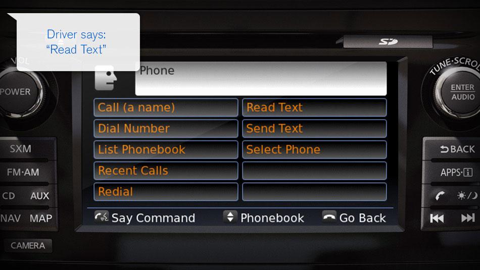
Users interact with NissanConnect through a large touchscreen surrounded by six physical buttons. The touchscreen itself displays the system’s apps in a format familiar to any iPhone user. Those physical buttons can be used to access key features, such as navigation, audio, and phone.

As is the case with similar setups, navigating between main features is easy and intuitive. Likewise, important tasks, such as pairing devices, is relatively simple.
Things get a little more confusing when trying to work with smaller details, but this is case with all but a few of the best infotainment systems.
My only real complaint with NissanConnect is that the buttons and type are a bit small on some screens. When trying to hit pause on the audio screen I repeatedly hit “home” by accident. It may just have been my stupid, fat fingers but it is not a problem I have had with some other systems.
Features
Nissan did well for itself when equipping NissanConnect with features. Obviously, the standard complement of navigation, phone, and audio features are there. But within those systems there are some hidden jewels.
NissanConnect responds quickly and smoothly to commands.
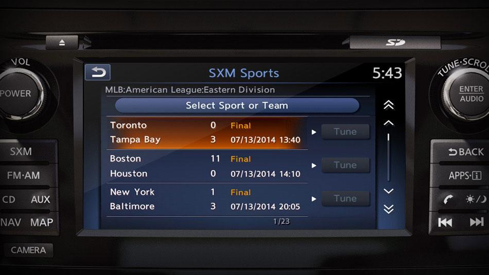
For instance, the navigation system and a Sirius Satellite Radio app join forces to push severe weather alerts. While driving a 2015 Murano, for example, I received alerts about bad weather near my location. Granted these were a little aggressive, given that the actual wind was some 40 miles away, yet the feature was still welcome. Broadly, though, features like this exemplify how well NissanConnect’s capabilities are integrated.
I also appreciated Nissan’s navigation system. Like most modern systems, it allows operators to search through points of interest. Unlike most of such systems, Nissan’s is very well executed. The smart search feature in particular deserves praise.
Hardware
NissanConnect is a fast, smooth-running system. In prior years this would have made it stand, but infotainment has come a long way in the last generation. As it is, NissanConnect is still above average.
The two areas of strength for NissanConnect are its boot time, which is extremely short, and its response time. For touchscreens, a quick response is essential, as the operator is otherwise unable to tell whether they actually hit the button. Thankfully, NissanConnect responds quickly and smoothly to commands.
Sadly, the touchscreens themselves are only average. The display has good but not stunning resolution and offer only average color quality. The only slight disappointment is the quality of the touch response, which at times felt imprecise.
Still, NissanConnect’s hardware is far from disappointing for a mass-market automaker and stands well ahead of the systems used by Toyota and Volkswagen.
Graphics
NissanConnect hews to the futuristic and slightly cartoonish style of other Japanese automakers. As stylistic choices go, this may be a bit off-putting to more conservative buyers.That said, Nissan has at least executed it well.
A good interface, excellent features, and above average hardware.
In part, this is down to the fact that the system’s design elements pair well with the aggressively modern interior and exterior designs that Nissan favors in recent years. Nissan also nicely balanced legibility with style, when designing its icons and scripts.
Along with Mazda Connect — Mazda’s equally blandly-named infotainment suite — NissanConnect shows how this design style can be well implemented alongside a broader design philosophy. In short, I like it. Even for those who don’t, the style and design is at least functional.
Conclusion
NissanConnect is a solid addition to the new more upscale models offered by the company. It offers a good interface, excellent features, and above average hardware. It may not quite be an industry leader, but no Nissan owner should have cause for complaint.
Perhaps the biggest complement I can pay NissanConnect is that it actually seems well integrated with the car in which it has been installed. Too many infotainment systems seem badly out of touch with the design language of the cars in which they are installed. Not so Nissan Connect, it fits well with the cars in both its aesthetic design and indeed its high-tech capability.
Highs
- Excellent features
- Good boot and response time
- Usable interface
Lows
- Slightly below average touchscreens


