Amazon announced its new Kindle Paperwhite lineup recently following months of rumors. At first, I was ecstatic to see new Paperwhite models. As an avid follower of all e-book readers, I own most of the Kindle lineup, a handful of Kobo and Nook devices, and even an Onyx Boox Nova 3, so I didn’t think twice about intending to buy the new Paperwhite.
After all, it’s been three years since a Paperwhite model hit the market (the Oasis was released in 2019). It’s long overdue for features like the warmer screen temperature, USB-C charging, wireless charging, a bigger screen, and longer-lasting battery life. Amazon’s Kindle devices may hold the largest e-reader share in the U.S. and U.K. markets but competitors like the Barnes & Noble Glowlight 3 and the Kobo Forma both boast a warmer reading light, bigger size options, and were the first to roll out with features like waterproofing so it’s nice to see Amazon catch up.
But what I wasn’t expecting in light of all these improvements was a thinner bezel. And, quite frankly, I find it disappointing.

Kindle History 101
To get into the physical aspect of this poor decision, take a look at the anatomy of the Kindle Paperwhite. The 2018 model boasted a 6-inch display with 300 pixels per inch (ppi), and a thinner bezel even then. I had issues with this back then, noting it as one of the Paperwhite’s major flaws. As a reader, how am I supposed to grip it without running the risk of accidentally tapping the screen and jumping forward an unknown number of pages?
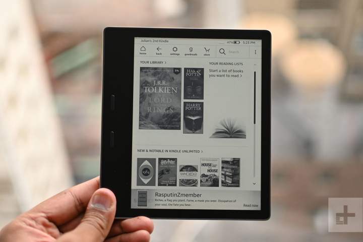
The new model of Amazon Paperwhite comes with a 6.8-inch, 300 ppi screen. The extra 0.8-inches of display size is a huge plus to readers. In fact, the increased screen size makes the new Paperwhite more of a successor to the Kindle Oasis, which has a 7-inch, 300 ppi display. However, unlike the Oasis, the bezel simply doesn’t make sense. One of the huge perks to the Oasis was that Amazon designed it with an easy-grip, ambidextrous bezel with physical page turn buttons. It’s comfortable and easy to use, as we noted in our review.

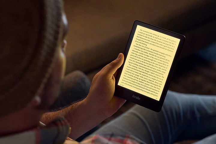
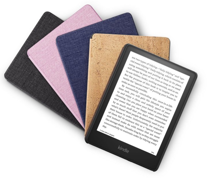
That’s not the case with the new Kindle Paperwhite and the Kindle Paperwhite Signature Edition. Their design follows previous Paperwhite models with a plain, smooth backing and increasingly narrow bezels. Without the easy grip and physical buttons that distinguish the Oasis, the new Paperwhite series will be less comfortable to hold despite having the latest specs like a USB-C and wireless charging.
Sacrificing comfort for looks
In opting for a thinner bezel, Amazon sacrificed a practical design for a fancy one. The bezel is flush with the rest of the screen, and, I have to give them credit, it looks the part of a beautiful e-book reader. However, beauty and practicality don’t have to experience this kind of disconnect.
In fact, that’s partially why I fell in love with the Nook GlowLight 3 earlier this year. It had a much thicker bezel and physical buttons on not just one, but both sides, I had an easier time gripping the case and more control over what happened to the pages. Granted, the Glowlight 3 didn’t possess the modern aesthetic of the new Paperwhites, but when we’re comparing black slabs, there’s only so much you can do.

I know from past experience that a thin bezel — especially one that sits flush against the screen — just doesn’t feel organic in my hands. Most people prefer sleeker devices, but while that’s true for me when it comes to phones, tablets, and laptops, it just doesn’t make sense for an e-book reader where everything rests on the comfort and how easy the pages are to turn.
Unfortunately for me and others like me, we may be on the losing end of this battle. The trend in the e-book reader market is clearly toward the smaller is better when it comes to bezels, without regard for how it actually affects the ergonomics of the reading experience.
Fair enough, but that’s why I’m going to be giving this new Paperwhite a pass.


