The newest version of Google’s flagship operating system, Android 12, is officially live for all supported Pixel phones, starting with the Google Pixel 3, and it ships out of the box for the Pixel 6 and Pixel 6 Pro.
Here’s everything you need to know about Android 12.
What is the Android 12 release date?
Google released Android 12 to the Android Open Source Project (AOSP) on October 4, with a consumer release coming shortly afterward for all eligible Pixel devices, including the Pixel 3, 3a, 4, 4a, 5, and 5a, on October 19. It’s also worth noting that the Pixel 3 and Pixel 3a are not expected to get Android 12L (more on that below), while the Pixel 4 and newer will.
It remains to be seen when the update will arrive on other phones. Oppo has announced ColorOS 12, its Android 12-based operating system, and beta testing for that began on October 11. As for Samsung users, One UI 4 is already in the beta-testing phase. Neither have final release dates, but anytime between December and January seems plausible based on prior timelines. A handful of other manufacturers, from Vivo to Asus to Xiaomi, have started testing Android 12 releases as well. You can read our overview of the Android 12 release schedule to see when your phone can be expected to get it.
What are the new features in Android 12?
What Android 12 is will depend on what phone you have. Google is touting its Material You overhaul for its Pixel line of phones, while Samsung and Oppo adopt lighter touches of the same basic idea on their operating systems. What remains consistent is that there are privacy improvements here and there, with new toggles to keep your microphone and camera off when necessary, a privacy dashboard to see what apps request which permissions, and a lot of under the hood changes to make your phone better overall.
Here’s a rundown of the new features on offer by Android 12:
Design refresh
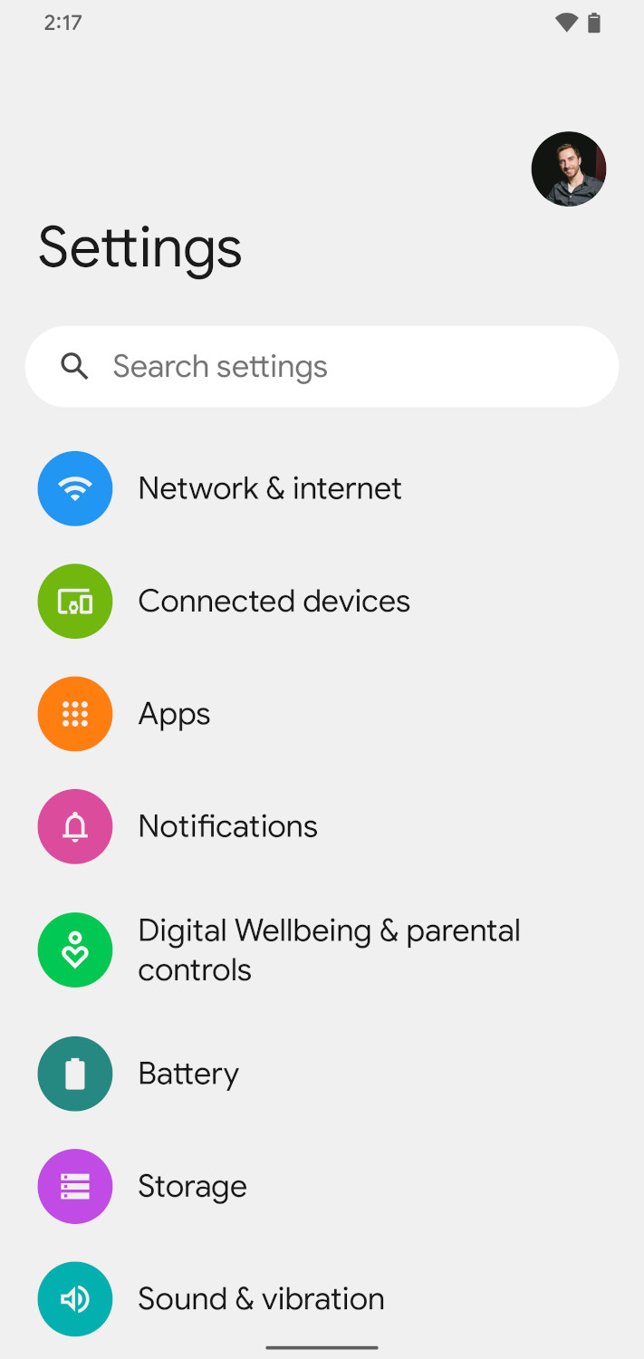
Easily the biggest change to Android 12 comes in the form of a design refresh. Buttons are bigger and bolder, everything has large and rounded corners, and Google isn’t as concerned about taking up more space on the display. Android 12, it seems, is more about using space smartly than trying to pack more stuff into it.
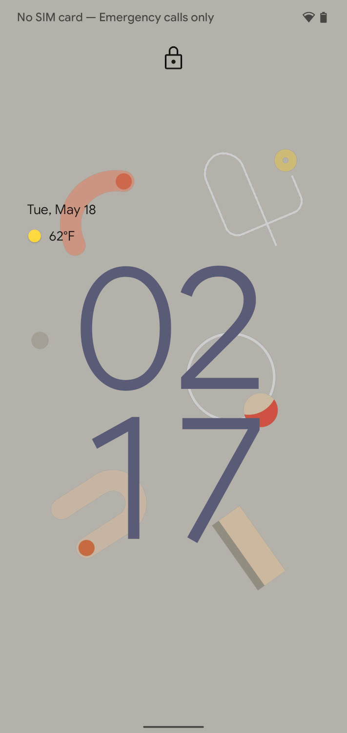
These bigger icons seem to apply to pretty much every aspect of Android 12. Everything more or less works the same, but Settings menu options, Quick Settings panel, sliders, and so on are all much larger, bolder, and more colorful. Even the lock screen has gotten the treatment — when there aren’t any notifications, the clock takes up a majority of the display, and even with notifications, it’s large enough to easily see at a glance.
There are smaller tweaks to animations and motion in Android 12. For example, when you hit the power button, there’s an animation that illuminates the display from the button itself. When you plug your charger in, another animation plays. It’s a very animated, very visually pleasant take on a mobile operating system.
Material You

Alongside the design refresh are new theming options that Google calls “Material You,” which essentially take color scheme cues from your wallpaper. These include primary colors and what Google calls “complementary” colors. The theming is actually systemwide, and even third-party developers can hook their apps into it to make for a more unified look. For example, if you use green wallpaper, expect your phone to be shaded by tints of green. If you have green or yellow wallpaper, you’ll be able to pick which one the theming system chooses to accent your phone with. Google has taken out other customization options from Pixel’s version of Android as a result. Previously, users had the option to change font or icon shapes, but that’s no longer the case as a result of the new theming system.
Material You also works in apps, with Google updating apps like the Clock, Camera, and Calculator with a Material You aesthetic ahead of the Android 12 release.
Material You may well be the biggest part of Android 12, but you won’t see it outside of Google Pixels for the most part. Samsung and Oppo have their own takes on the wallpaper-based color theming, but it doesn’t extend beyond bits of the system interface and their own included apps — which means Google’s apps also keep their “Material Blue” color. Google has been upfront and said that the aesthetic will be limited to Pixels at the start, with some inferring from code changes that Material You will make its way into Android with Android 12L (more on that below).
Revamped notification shade

As part of the all-new design refresh, Google has moved some aspects of Android around — and as is tradition on Android, the notification shade gets one of the biggest revamps. Quick Settings, for example, are getting easier to access — you’ll be able to toggle four of your most-used Quick Settings on the first swipe of the notification shade, in the form of relatively large rectangular buttons. Then, you just swipe again to access all of your Quick Settings.
Android’s Power Menu will also be rolled into this new Quick Settings area. That means that you’ll be able to access your smart home controls and Google Pay wallet from the Quick Settings menu while holding the power button will instead trigger Google Assistant. With Android 12’s Release Candidate, Google also added shortcuts to both the home controls and Google Pay wallet to either side of the lock screen. You’ll now be able to access either of the two without needing to swipe down on the notification center.
Another small change Google is making is with a new Internet Panel for managing your connectivity. Google says it’s also meant to help users troubleshoot issues more easily and switch between providers faster, whether on Wi-Fi or mobile data.
On a related note, you’re able to access Device Controls and the Quick Access Wallet more easily with new lock screen shortcuts.
New privacy controls

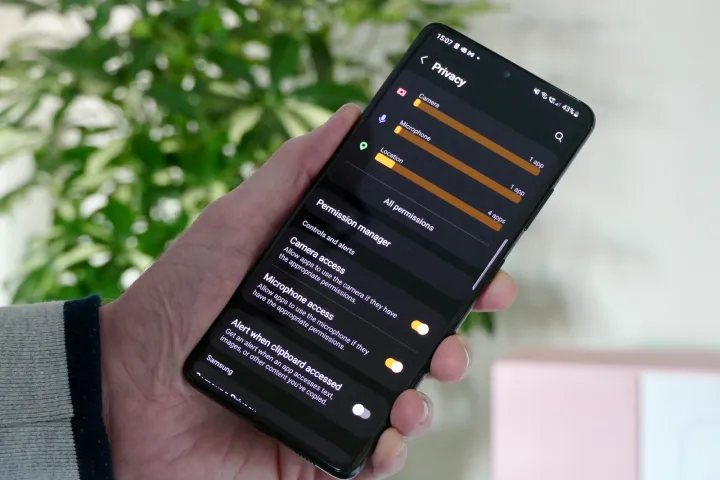
The general public is getting a little more hip to privacy, and Android 12 offers several features for the privacy-conscious. Most notable of these is the new Privacy Dashboard, which shows a range of information about the permissions you have granted to each app, and allows you to revoke specific permissions if you choose. You’ll also get information about permission usage, including a timeline of when apps have accessed your location.
Speaking of location, there are more location permissions in Android 12. You can now grant apps “approximate” location instead of specific location, which will come in handy for things like weather apps.
There are other features around privacy as well. As on iOS, there are now brightly colored indicators for when your microphone, camera, and clipboard are being accessed by apps or websites, preventing clandestine use, for the most part. New toggles in Quick Settings will let you switch off the camera and microphone to preserve privacy. Lockdown mode lets you secure your device in seconds right from the lock screen.
Google is working to make other aspects of your data safer, too. Notably, Android 12 includes the new Android Private Computer Core. It’s a segmented section of Android that handles features like Smart Reply, Live Captions, and other A.I.-related features that focus on sensitive data.
Digital car key

Apple announced Car Key last year as a way for customers to use their phones to unlock their compatible car. Now, Google is following suit with Digital Car Key. Digital Car Key uses ultra-wideband to allow users to unlock their cars with the phone still in the user’s pocket. There’s a backup in case the phone doesn’t support ultra-wideband — the feature can also work through NFC.
Of course, this feature requires carmakers’ cooperation, and that could take some time. So far, only BMW has committed to using Apple’s Car Key, and BMW is also the first to support Digital Car Key. Hopefully, adoption by both Google and Apple will spur wider support from carmakers for the features.
Android TV remote
If you’re plugged into the Android ecosystem, you may use an Android TV device along with your Android phone, and Android 12 finally includes a built-in remote for Android TVs. The feature will work with the Chromecast with Google TV, or TVs that have Android TV built into them, and offers basic software controls, access to Google Assistant, and volume controls.
Previously, to use your phone as a remote for your Android TV, you needed to install an app, and you’ll no longer have to do that.
Better integration with Chrome OS
You can already use Nearby Share to share images between an Android phone and a Chromebook, but Google is working on taking a little friction out of the process. According to Google, Chrome OS’s Phone Hub will expand to include a new feature to show photos on your Android phone without needing to wait until those photos upload to the cloud. This feature is powered by Wi-Fi Direct.
Scrolling screenshots
Google is bringing a feature that’s previously been touted by third-party Android phone manufacturers — scrolling screenshots. With Android 12, Android now natively supports scrolling screenshots, allowing you to show more content in one screenshot. If you want to capture a long tweet thread, for example, you can now do so with the new “capture more” button that shows up when you take a screenshot.
On-device search
Google is also improving its universal search on Android 12. Now, developers will be able to index parts of their apps so that the Pixel launcher’s search bar can pull up app content when users type in terms. For example, searching the term “red” gives us any app starting with “red,” a contact whose name starts with “Red,” as well as the Snapchat filter for “red cap.” It’ll get a lot better in the future as more developers update their apps to work with Android 12, but Google’s intention here is presumably to provide an experience that’s similar to the iPhone’s spotlight search and Chrome OS’s Everything button.
Smoother autorotation
Google is also improving a basic feature — autorotate. With Android 12, the operating system will now try to use your face to keep itself oriented. This use case is aimed at those who are usi9ng their phones in bed or lying down, and Google says that it won’t store any images captured via this method as it’ll be using its “Private Compute Core” system to keep this all private.
It’s available on the Pixel 4 and later.
Faster mobile game downloads
Gaming on an Android device is going to get a lot faster with the company’s new “play as you download” feature. Announced during the Google Games Developers Conference, Android phone gamers will be able to start a game while it’s being downloaded, much like you can do on some consoles.
Android 12L

While Android 12 keeps rolling out to more and more Android phones, Google has also released Android 12L, its follow-up to Pixel phones from the Pixel 3a and newer, with plans for it to hit foldables and tablets later in the year. The company’s primary focus with this version of Android is to revamp the OS for larger-screened interfaces (hence the L designation). A deep dive into Android’s past reveals that Google’s latest effort with this was in Android 3.0 Honeycomb, which is ancient history at this point. Since then, Android has generally resorted to simply being a blown-up version of the phone UI when used on tablets and foldables. It’s not an optimized experience, and it’s since held Android tablets back in terms of usability.
Google has brought changes to Android in this release, including a new dock that resembles the Chrome OS tablet interface, as well as Samsung’s One UI and Apple’s iPadOS. A newly optimized lock screen, notifications center, and settings app hint at other changes being made to acclimate Android to larger screens and foldables. Google has, in recent years, pushed for Android apps to take account of larger devices, but this is the first time the company is revamping its OS with that goal in mind. Android 12L experiences will also make their way to Chromebooks in the form of app optimization.
With foldables like the Galaxy Z Fold 3 and Surface Duo 2 taking different approaches to the foldable software, it’s good that Google steps in to standardize the experience and provide a solid base for Android devices going forward. Android 12L will also make its way down to more Android phones through the year. The changes there are likely going to be all in the back end, but Google will be adding Material You Dynamic Color to AOSP with 12L, allowing other Android phone manufacturers to bring the same color-theming support Google’s Pixels have to their own devices.


