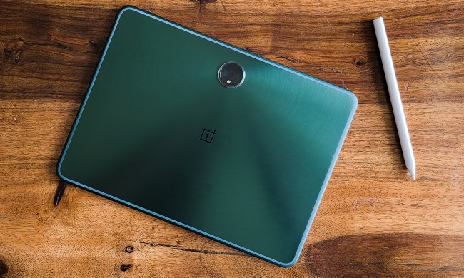
Google is finally getting serious about Android tablets with the public release of Android 12L, but the company is still lagging on the effort it seems. Tailored for tablets and foldables to make the most out of their larger screen real estate, the Android 12L update is currently only available for Google’s Pixel phones. No tablet out there, even Samsung’s beastly Snapdragon 8 Gen 1-powered Galaxy Tab S8, is getting it anytime soon.
As per Google’s blog post, the update will arrive for foldables and tablets from Samsung, Lenovo, and Microsoft “starting later this year.” There isn’t a month specified, and the Android 12L rollout will no be uniform, as each company will take time to customize and implement Android 12L in line with their own in-house skin. Google says it will create more new features and experiences for tablets with Android 13, which will arrive later this year.

As for the tablet-specific features in Android 12L, they are few but meaningful. To start, Google has divided the notifications panel and the tiles area across two columns. Swiping down from the top in the screen’s right half shows a list of notifications, while the same gesture executed on the left half gives access to the quick action tiles.
The two-column formula also makes its way to the Settings section. With Android 12L, tapping on a Settings option opens the next page on the right side, which means users will no longer have to go in and out of pages to see and make the necessary changes.

The image above gives a better idea of how Android 12L’s Settings menu layout looks on a tablet. Google’s blog post doesn’t say if the same approach will make its way to apps like Gmail, but it would definitely look neat. In fact, Google hasn’t detailed any app-specific Android 12L optimizations, even for its in-house apps.
Another key Android 12L upgrade is the arrival of a persistent taskbar. A simple drag-and-drop gesture for a taskbar app icon will open the split-screen view on a tablet. The implementation looks clean, but it isn’t really new, even for the Android ecosystem. Oppo’s foldable Find N already takes a similar route for split-screen multitasking, and also adds some neat gestures such as a two-finger downward swipe across the middle to launch the split-screen mode.


