Over the years, Google has earned itself a bad rep for abandoning the cause of Android tablets. At its most generous, Google’s interest in redeeming Android on tablets can be described as an on-off romance. Apple, on the other hand, poured some serious energy into building up iPadOS as it continued to diversify its iPad portfolio — most recently with the iPad Pro (2022) and iPad 10th Gen.
Then came Android 12L, Google’s first sign that it was taking foldable phones and tablets seriously. With Android 13, the company doubled down on building a standout experience for larger screens that can also scale the UI for different aspect ratios without making apps look like a magnified mess.
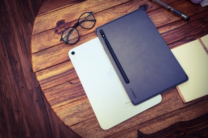
Now, we no longer have a Pixel or Nexus tablet line to see the best of Android on large screens, the way we get to experience Google’s best work on Pixel smartphones. (At least, not until the Pixel Tablet gets here.) However, Samsung took things into its own hands and came up with One UI 5, which really lifts its Galaxy Tab line far above the iPad in multiple meaningful ways.
The ball is back on Google’s side of the court with Android 14, and the company is not holding back this time. In fact, with the release of Android 14’s first Developer Preview, Google has focused mostly on adapting Android 14 for large-screen handheld devices that come in all shapes and sizes.
Android 14 handles the large screen disparity
- 1. Android apps scaling in landscape model
- 2. Android apps scaling in portrait mode
With Android 14, the operating system will be offering more versatility to developers when it comes to capabilities such as window size adjustment, the behavior of sliding panes in an app, how one app can use an active link to launch another app window side-by-side, and how well they play with peripherals — among other capabilities.
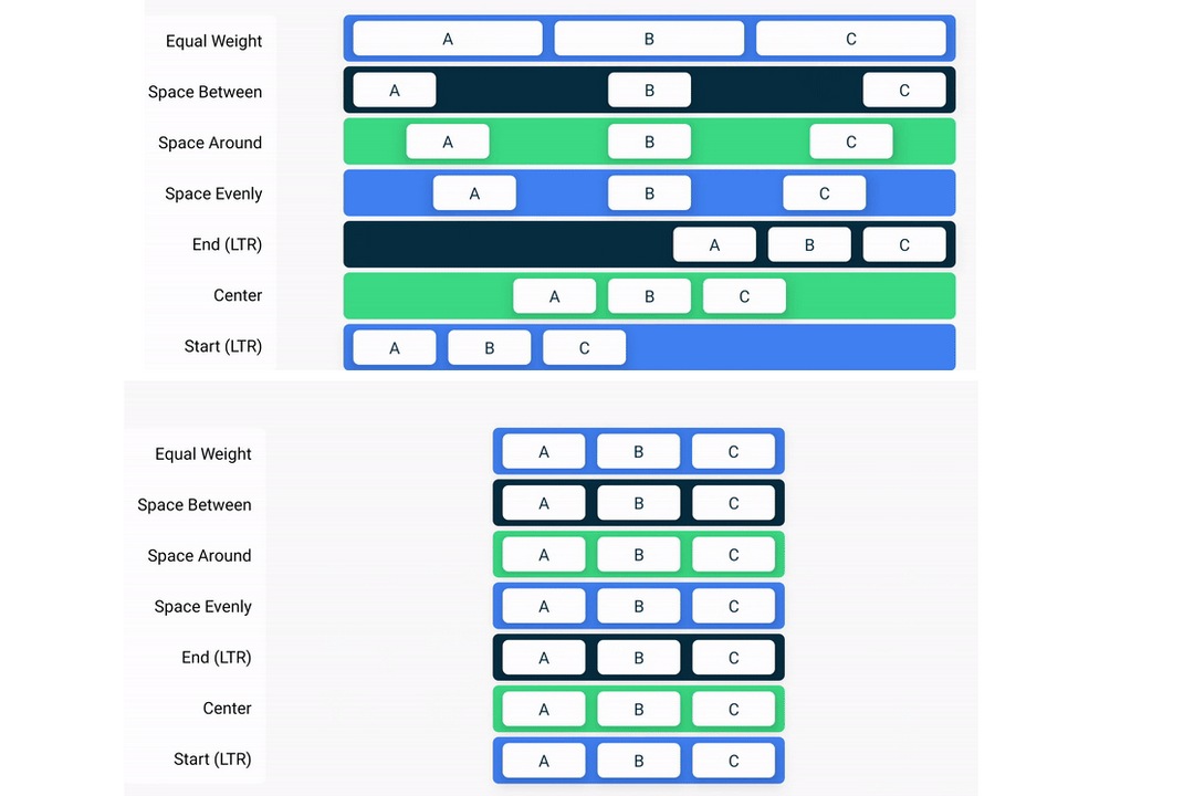
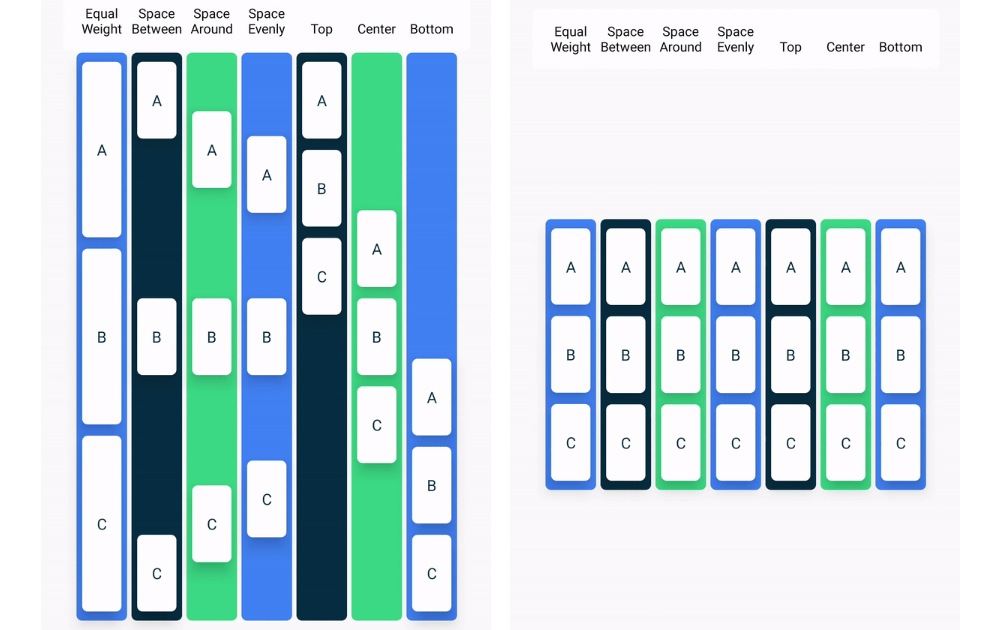
The company has already created development templates on how app UI scaling works on large screens, and it can adjust accordingly when the orientation switches between portrait and landscape usage. Take, for example, the different templates for UI element spacing (see the picture above) that are available for developers to get an idea of how to tweak background color shading and adjust the placement of functional UI elements in their apps.
This is important and leads to a better-looking Android interface on larger screens. So far, a majority of Android apps simply look like a stretched mess on foldable screens and tablets, with each brand doing its own take, and each developer taking their own route.
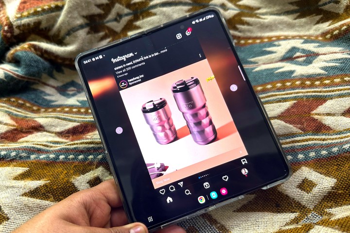
Take Instagram, which opens in a phone-like portrait form on the Galaxy Z Fold 4’s inner display. You can either keep the UI centered, or bring it closer to the left or right edge for easier one-handed usage, while the rest of the screen area is blurred. Twitter, on the other hand, takes the whole screen but doesn’t really act well when it comes to playing vertical videos.
It makes the best of the screen real estate, but also offers UI and aesthetic compromises along the way. Google’s own first-party apps do a lot better, but that’s not surprising at all. That disparity will likely be addressed in the coming months, or at least within the next year, as more developers optimize their apps for Android 14.
A tier system of app goodness

With Android 14 system images now available to flash on compatible phones and via the Android Studio route on larger screens, Google has simultaneously updated what it calls app quality guidance for large screens. Google separates apps across three tiers, based on how well they scale for large screens and the functionalities they offer.
Tier 3 is the bare minimum for apps. Such applications may not always offer the most visually pleasing experience, but they will at least take up the entire screen (or at least take up the full window in split-screen mode). Moreover, they should avoid those ugly sidebars (aka letterboxing) at all costs and must also offer basic support for peripherals like a keyboard, stylus, mouse, and trackpad.
The best fall in Tier 1 of large screen compatible applications. These large screen-loving apps not only fulfill all the aforementioned criteria but also support goodies like picture-in-picture mode and allow the seamless opening of another app in a split-screen separate window using a deep link.

Notably, a Tier 1 app should also let users run multiple instances of the same application, separated across different windows. The ideal use-case scenarios are apps like web browsers, document editors, file managers, and shopping apps.
Next, this class of apps should also adapt accordingly to the screen posture. For example, when the device is being used in tent mode, in a book-like format, or separated across two screens, the UI should adjust accordingly. Samsung already offers this versatility on its foldable phones.
Boosting the computing chops
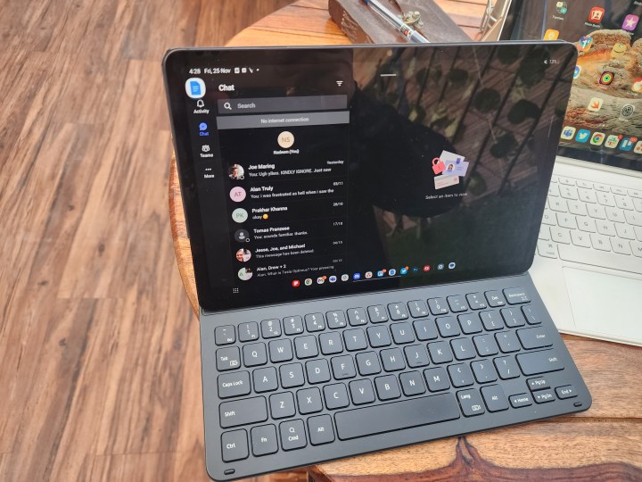
Google is also dreaming of apps that can emulate a true computing experience on foldable Android phones and tablets. As such, the company seeks apps to support keyboard shortcuts that are in line with what you get on Windows or macOS.
In addition to it, Google also advises developers to go the extra mile by combining click or tap gestures with important keyboard modifiers like the Control and Shift keys. Apple already does it to a small extent with the Magic Keyboard on iPads, but Google’s attempt sounds like a well-incentivized attempt that will ultimately elevate the computing experience for Android loyalists in a major fashion.
This is a sample of ideal dynamic app scaling for messaging and communication apps for Android.
(Credit: Google) pic.twitter.com/rcqIgqCcd8— Nadeemonics (@nsnadeemsarwar) February 8, 2023
Diving deeper into the UI intuitiveness side, Google wants all Tier 1 apps to show a scroll bar while using peripherals like a trackpad or mouse. Moreover, UI elements should be able to show fly-out menus or tool suggestions with a cursor hover gesture, just like web browsing on a PC.
Google is also prioritizing “desktop-style menus and context menus” wherever deemed fit. Talking about gestures, Google wants Android apps to emulate the desktop gesture that allows a triple-click to select the entire line or paragraph of text.
When using a stylus, every Tier 1 app targeting Android 14 should allow drag and drop for moving around content, both within the app and across separate windows for the same or different app. Google is also specifying the guidelines to help creative folks, asking developers to bake support for stylus tilt and pressure sensitivity, just the way iPadOS allows it between an iPad and the Apple Pencil.
This is a sample of ideal dynamic app scaling for messaging and communication apps for Android.
(Credit: Google) pic.twitter.com/rcqIgqCcd8— Nadeemonics (@nsnadeemsarwar) February 8, 2023
In fact, it is also desirable that apps should allow custom cursors for different kinds of apps, like crosshair in a shooting game, a brush in design apps, and magnifiers in reading apps. It makes sense that Google has a fitting classifier for each kind of app. Large screen ready for Tier 1 apps, large screen optimized for Tier 2 apps, and large screen differentiated for Tier 3 apps.
Google isn’t messing around with Android 14
As Android 14 arrives in the hands of developers, Google has made it clear that the company is here to play the long game with tablets and foldables. The Pixel Tablet will be a great showcase, but the focus on non-standard Android form factors is also a teaser of what great things are set to come with the rumored foldable Pixel.
I am excited to test out Android 14 when it reaches the open beta phase, but I’m more enthusiastic to see what great work Samsung and Oppo do with their layer of customization atop Android 14’s foundations. It would be interesting to see how Apple counters the renewed assault from Google on making the best mobile OS for large screens!
