
Our phones, as you know, can sometimes become depthless abysses. Almost everyone has experienced the inconquerable pull of spending hours switching from one social media or entertainment app futilely. And this routine even has a name — “doomscrolling.”
Thankfully, overlords that control the smartphone world, namely Google and Apple, have been conscious of this issue and offer tools that constantly remind you to spare your eyes from the screen and revisit the physical world to replenish your senses.
Both Android and iOS have built-in mechanisms useful in introducing some discipline to the way we use phones. As part of their missions to help people fight their habits of unfetter usage, Android’s App Timers and iOS’s App Limits let you set daily allowances for the time you can use certain apps on your phones. Arguably, Android is more effective in realistically curbing app usage. It’s a small advantage on paper, but it’s one that can have a substantial impact on improving the relationship with your smartphone.
How iOS and Android limit app usage
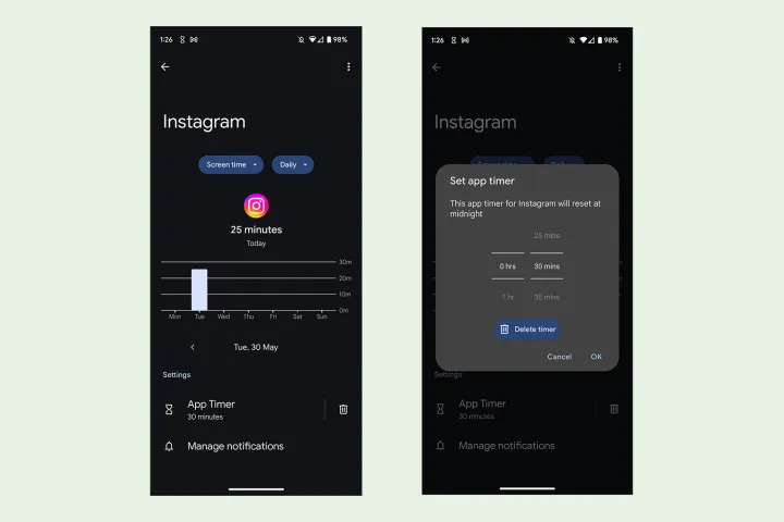
2018 was the golden year when both Google and Apple turned their attention to freeing us from the clutches of smartphone addiction. Google introduced App Timers as part of its Digital Wellbeing initiative starting Android 9 Pie. Apple, too, jumped on the bandwagon with iOS 12 the same year and introduced App Limits under the category of Screen Time to help iPhone and iPad users cut time spent on the phone.
Both mobile operating systems have their identical approaches to help you limit the time spent consuming apps. Android lets you monitor the time spent per app daily and set the maximum daily allowance.
iOS offers similar insights about daily usage, segmenting it based on different apps and lets you set daily limits for each app that may take up more headspace than what you would desire them to.
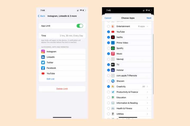
In addition to setting a strict timer for individual apps, iOS also allows limits based on app category. There are numerous categories you can use can collectively limit at once instead of having to set limits for each app individually. You can either select all the apps suggested under a category or check only the ones you want to restrict. And even nicer is the ability to set these limits for specific days of the week — a feature that doesn’t exist on Android.
Admittedly, App Limits on iOS feel more refined and give finer controls on how you can manage your interaction with apps that graze your attention. Android, undoubtedly, feels crude and premature in comparison. But despite all its bells and whistles, iOS still lags behind Android in effectively escorting you away from draining apps.
Android has a very clear advantage

To elaborate on why I say this, let me walk you through the different scenarios when you are about to run out of your daily allocated durations on iOS and Android.
Let’s begin with Apple’s implementation. Five minutes before you reach the end of the daily app limit, iOS will inform you with a time-sensitive notification. When these last five minutes end, a pop-up covers your entire screen, telling you the daily limit has elapsed.
In response, you can either tap OK or Ignore Limit. The latter allows you to extend the limit either by an additional minute or 15 more minutes — or ignore the daily limit entirely. If you’re like me, you would probably choose to take one more minute to detach yourself from those random cooking hacks or the cute video of kittens.
When that minute ends, iOS will nag you again to keep the iPhone down or ignore the limit once again. If you ignore the limit again, you will no longer see the option to add one extra minute. Instead, you will now be forced to extend the timer by 15 more minutes or ignore the daily limit entirely.
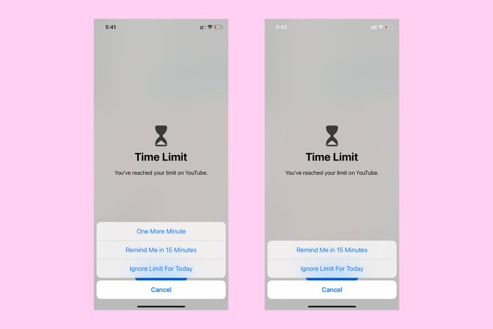
In that one extra minute, the following video will have taken your attention. You could either abandon it in between or choose to add 15 minutes to the daily allowance. Fifteen minutes later, the iPhone will politely remind you to step away from the app once again.
From there on, this is how it goes down for me. On most days, I would keep the phone away by now. But on days when my self-control is weaker than usual, I may choose to ignore the limit once again. This will show the option to extend the timer by another 15 minutes or ignore the daily limit once and for all. The cycle continues until I can muster the strength to (temporarily) overturn my inner demons, asking me to keep watching those mind-numbing videos. Even worse, Apple did nothing to change this with its recent iOS 17 update.
And that’s one reason why I prefer to use Android. In comparison to app limits, timers are much more straightforward on Android. You don’t get the option to club apps as you do on iOS, so you must set a timer for each app individually.
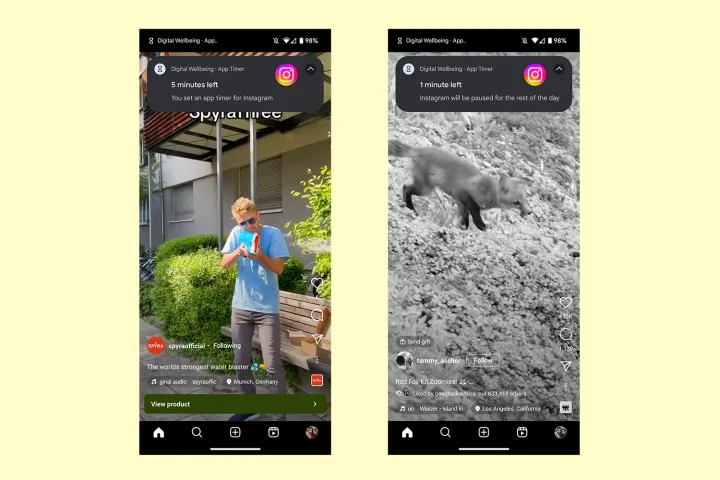
Like iOS, Android will remind you five minutes before the block off. And at the end of those five minutes, it will simply shut the app with a warning message saying you exhausted the daily limit.
That’s it! You don’t get the option to ignore the limit or extend the timer. The only way to use the app again is by going to Digital Wellbeing under Settings and changing your daily timer. This added friction is a much bigger deterrent than the reminder screen on iOS, which gives easy access to the snooze buttons.
If you’re using a Pixel phone, your screen also turns to grayscale during the last minute, but that may not be true for every Android phone. Talking of how other Android interfaces handle app timers, I particularly like Samsung’s implementation.
Samsung find the middle ground

Samsung’s One UI offers a middle ground between giving you recurring options to extend the daily limit an infinite number of times or blocking the app off completely. One UI sends you a reminder when 10 minutes remain for the app to be closed off. You may either ignore the warning or add another 10 minutes. If you ignore the warning, you will see a similar notification with five minutes remaining and then again when just one minute remains.

While this is more enabling than stock Android, you can extend the app’s timer only once. If you add 10 minutes to your allowance, the option to extend the timer disappears from further notifications about limited time. This way, Samsung’s approach appears less harsh than stock Android but also more rigid than iOS.
Google and Apple must do more than the bare minimum
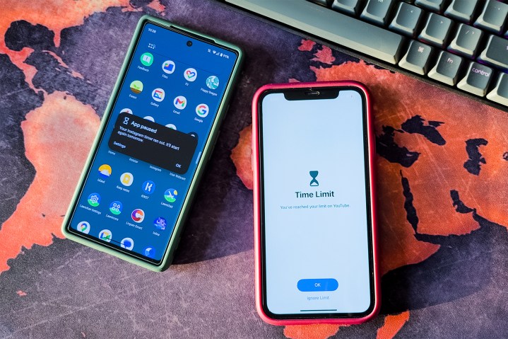
As we see from how both mobile operating systems handle app restrictions, limits on iOS appear much easier to flout and overrule. Meanwhile, Android acts sternly, adding a sense of resistance by making you go through the extra steps of changing the timer permanently (until you reduce the daily limit again).
To me, Android’s approach is much more sensible because certain apps — like social media — are consciously designed to feed on our insecurity. Developers of the apps often brazenly deploy algorithms that show us exactly what will smash right through our self-control like a bullet through a sheet of paper. While that happens, our clever brains will doctor a reason as to why a few more minutes of reading banter on Twitter or watching one more TikTok will be harmless. But we know in hindsight, it’s not!
Blocking off apps is only half of the solution, and I feel Google and Apple should inspire us to purposefully spend time away from our phones — as OnePlus does with its Zen Mode, which locks the phone out and forces you to spend time away. There hasn’t been much from these dominating companies, though, and app timers have only received minor updates. As applications and experiences with technology get more immersive, it is crucial Google and Apple add ways to prevent us from dissociating from our realities.
Yet, with what we have, I feel Android is still more effective than iOS in helping us stay sane, even if that’s in a small way.


