Android 9 Pie — the latest version of Google’s mobile operating system — embraces circles, rounded edges, artificial intelligence, and it genuinely attempts to care for your digital wellbeing. Dozens of small delectable feature crumbs, not quite filling on their own, add up to a satisfying slice of pie. We’ve been using the final version of Android Pie for the past few weeks on a Google Pixel 2 XL, and have also spent time with the update on the OnePlus 6 (in beta), and the Essential Phone. Here’s what we like, and what we don’t.
While your phone might not have Pie yet, more devices will launch with in in the coming months, and expect older devices to receive the update over the next year. You can keep track of what devices have received the update in our handy guide. We also don’t list every new feature in this review — you can check out our Android 9 Pie roundup for more.
Visual and navigation changes
Goodbye, sharp edges. One of the first changes we noticed with Android 9 Pie is just how round the interface looks now. Notifications have rounded edges, the quick-settings tiles are in clean, pie-shaped circles, and the Settings app has been revamped with a more colorful, rounded interface. It makes the OS feel friendlier and fluid, and we’re happy with the change.
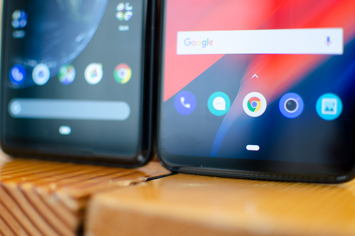
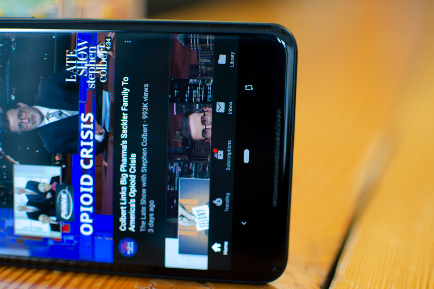
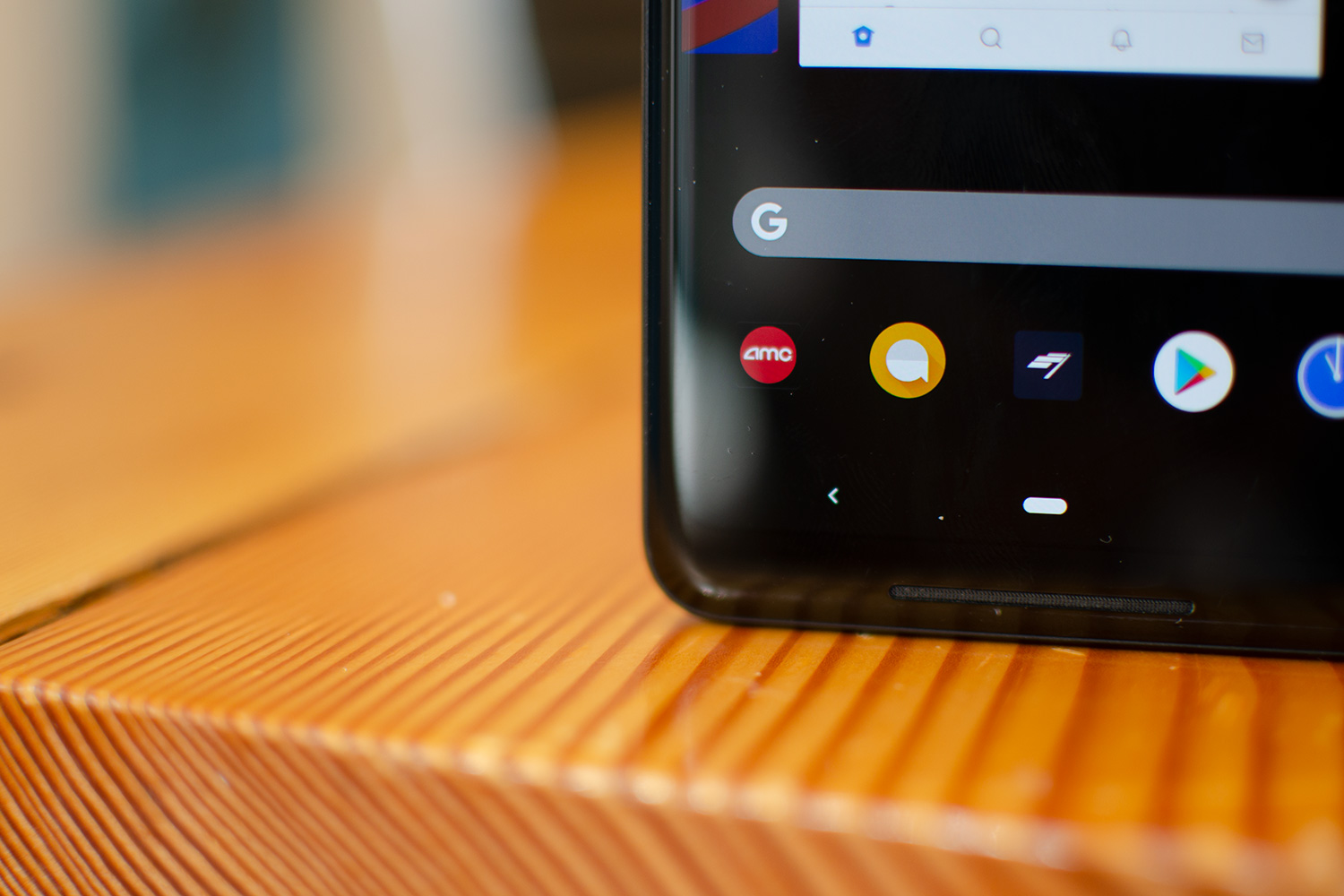
Perhaps the most drastic change, however, lies in the navigation menu. Gone are the Android navigation buttons in favor of a single, pill-shaped icon. Like iOS on the iPhone X, Android is now all about gesture navigation: Using swipes instead of taps on icons. We like the idea, but Google’s current implementation in Pie feels — pardon the pun — half-baked.

Here’s how it works: The pill-shaped button acts almost exactly the same as the old home button. Tap it once and you’ll go home; press and hold it and you’ll open Google Assistant. Once you jump into an app, you’ll see the back button appear on the left of the home button. It works exactly the same as before, but the button looks a little more angular and smaller. The redesigned back button looks out of place with the rounded theme that has taken over the rest of the OS.
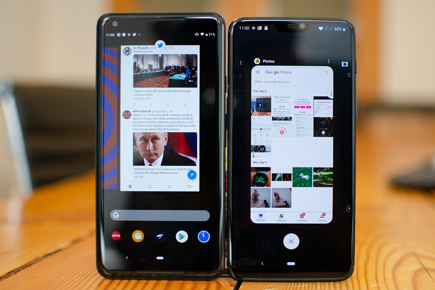
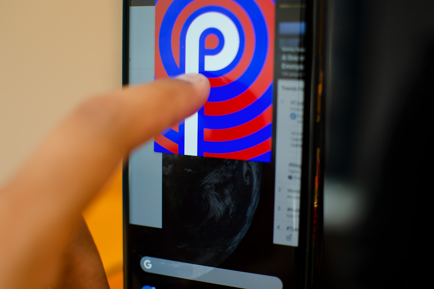
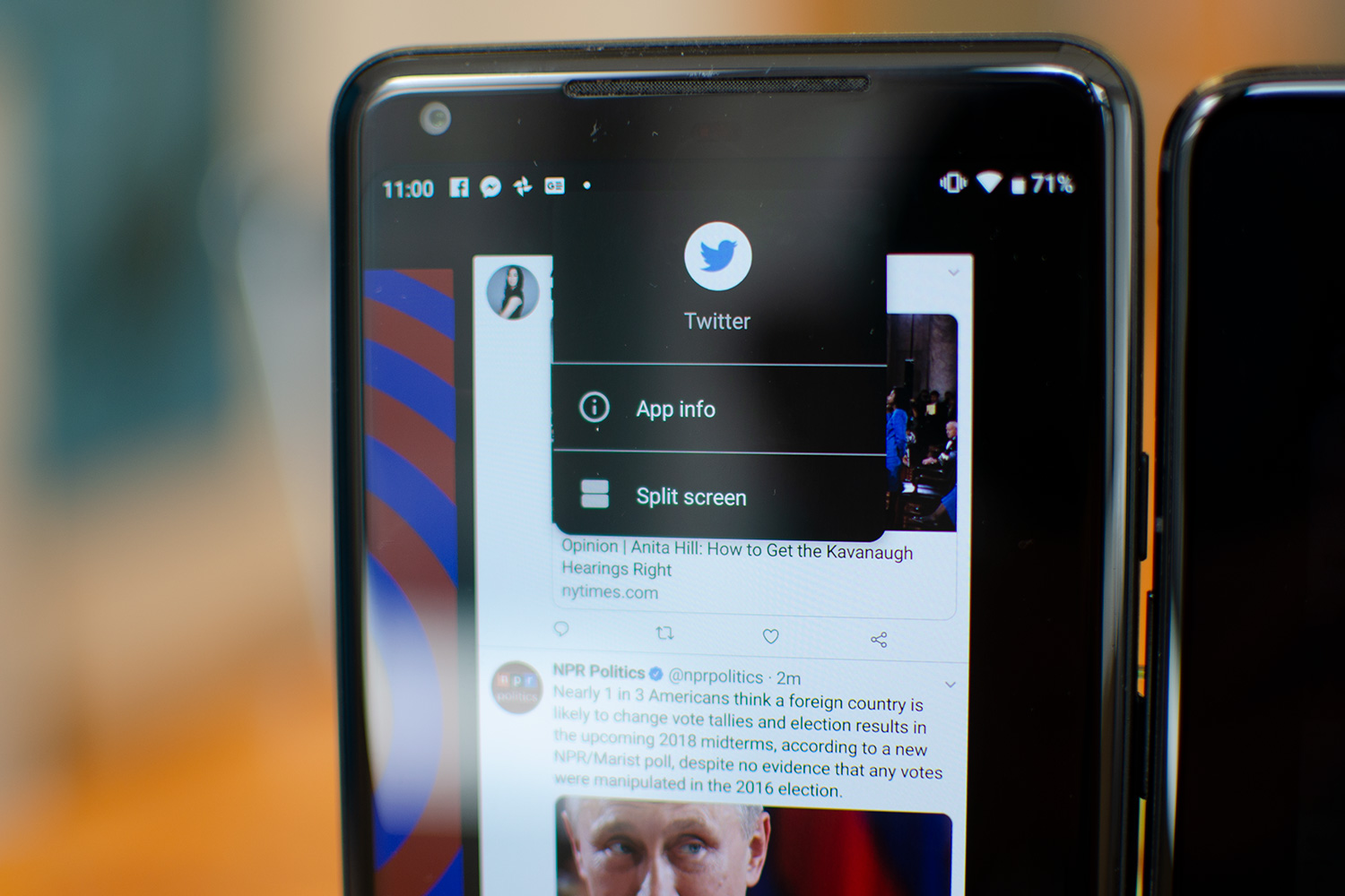
There is no Recents button to see an overview of the recently opened apps, but there’s still a way to access them: Drag the home button to the right to switch back to the previous app. You can also press and hold it to the right to scroll through all your recent apps. To see the full list of Recent apps, or to force close some of them, do a half-swipe up from the bottom of the screen. A full swipe up will open up your app drawer.
Google’s current gesture navigation implementation in Pie feels — pardon the pun — half-baked.
It now feels like extra work just to access the App Drawer, because you need to make sure you swipe completely up. The half-swipe up doesn’t look elegant at all, and it feels disrupting. It also feels as though it takes more time to find a recently-opened app in the Recents menu: It shows fewer apps, which means more scrolling to find the one you’re looking for. The old vertical stack was faster and easier to use.
Like all new changes, it takes some time to get used to the new gesture system, but we’re still not too fond of it after testing it for more than three weeks. Our biggest gripe is how the pill-shaped home button manages to take up the same amount of space as the traditional navigation buttons. At least with the iPhone X, the bar at the bottom takes up very little screen real estate. Thankfully, you can always swap back to the traditional Android navigation buttons, though some manufacturers will have gesture control enabled by default.
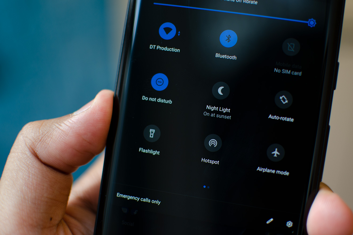
Jump up top to the notification drawer, and you’ll notice the clock now lives on the left side of the system tray, and the quick settings area is now packed with more rounded tiles. It looks cleaner, but we’re sad to see some functionality disappear — you can’t tap on tiles like Wi-Fi to see networks within the same interface. Instead, you’ll need to press and hold it to dive into the relevant section of the Settings app. In the same vein, if you used to tap the Settings icon at the top of the system tray, that now requires two swipes down as it has moved lower in the notification drawer. We like the visual changes here, but it does feel like a step back in functionality.
Editor’s note: Many of these visual changes may not be the same as you see here on our Pixel 2. Android Pie will look different on your smartphone, but it should still carry the same improvements and changes.
A.I.: Adaptive Brightness, Actions, Slices
A new brightness slider showcases some of the machine learning at play in Android 9.0 Pie. Your screen will still adjust to ambient light as it always has, but Adaptive Brightness now learns from the manual tweaks you make throughout the day. It will learn your habits over time, and will adjust it the brightness accordingly. Essentially, it’s meant to make sure you don’t need to keep changing brightness manually all the time. It works surprisingly well, but it definitely needs quite a bit of time to learn your daily preferences. It’s the first time we’ve felt satisfied leaving an auto-brightness feature turned on.

Machine learning powers two more additions in Android Pie: Slices and Actions. The latter predicts actions you’re about to perform, and it will inject two buttons in the app drawer. For instance, if you’re about to text a friend, it might offer a quick shortcut you can tap on that will open up your default messaging app and jump straight to the contact. Another example is re-ordering food through your favorite delivery app at a certain time of day.
Actions needs some time to learn your routines, but when it does, it offers genuinely useful shortcuts.
Like Adaptive Brightness, Actions needs some time to learn your routines, but when it does, it offers genuinely useful shortcuts, like jumping into a conversation thread with a specific person in a messaging app. It’s not a drastic change, but it shaves seconds.
Slices add more details when you search your phone for content and apps. For example, if you type in “Lyft” in the Search bar, you may find a link to find a driver to take you home or to work. Unfortunately, this feature still isn’t available yet, and will arrive sometime this fall.
Both of these new features require support from developers to really work. From what we’ve seen with Adaptive Brightness and Actions, A.I. isn’t just a buzzword in Android Pie — it really works.
Richer notifications, quality of life improvements
Android handles notifications incredibly well, so much so that Apple has taken a page out of Google’s book in iOS 12. But Google isn’t done innovating. In Android 9 Pie, you’ll now find Smart Replies baked into notifications. These are basically prepackaged replies based on the way you typically reply (which it learns over time).
We didn’t find the recommendations to be any more tailored to us than the next person, and we mostly found them to be a good way to send short, canned responses when we were busy. They don’t work with every app just yet, so it’s tough to gauge how useful they’ll ultimately be.

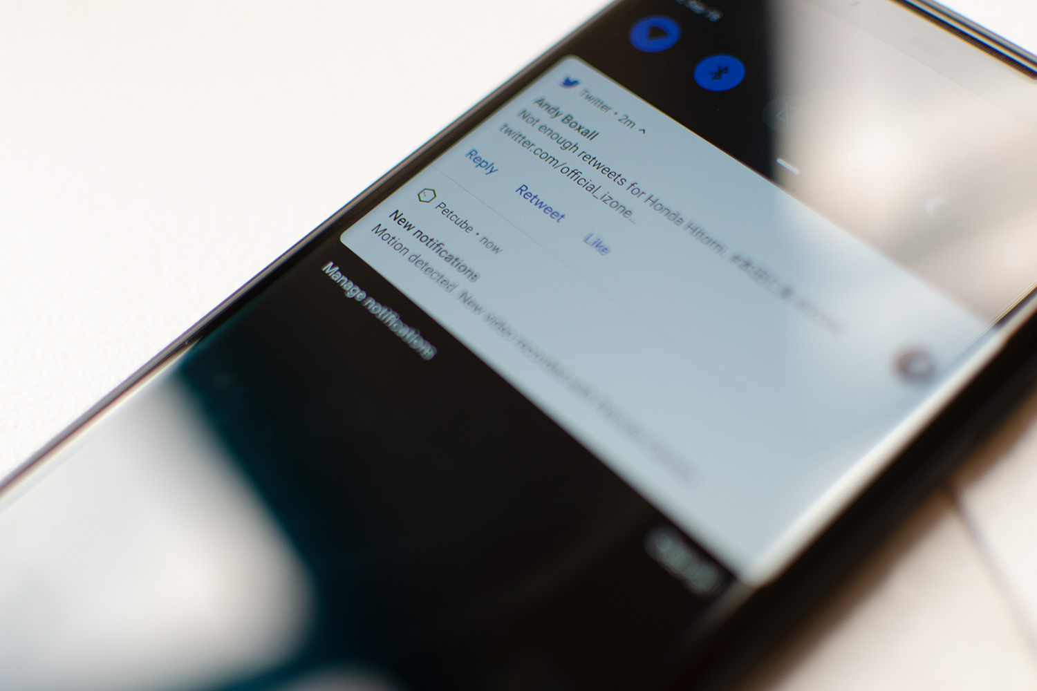
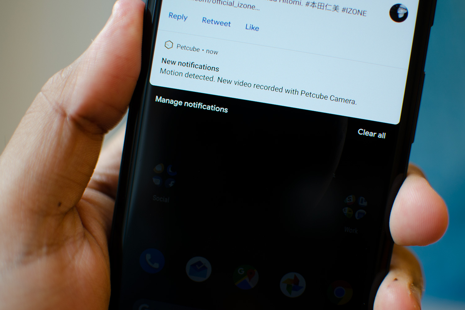
The actions you can perform on notifications look a lot nicer now — “Reply” and “Mark as Read” are no longer divided separately, but instead they float in the notification bubble. The font changes here really help make the interface look cleaner, and so do the brighter colors. You can even see images directly in the notification so you don’t need to open an app to respond, which helps make notifications more useful than ever before. It truly does make multitasking on a phone feel faster.
There are a lot of other changes that just improve the everyday usability of the OS. For example, Do Not Disturb is no longer a mess of confusing options. Instead, tap it once and the OS will completely block all visual and audio interruptions. You can even flip your phone face down to turn this on. It’s simple, and incredibly effective.
These changes may be minor, but together they drastically improve the day-to-day Android experience.
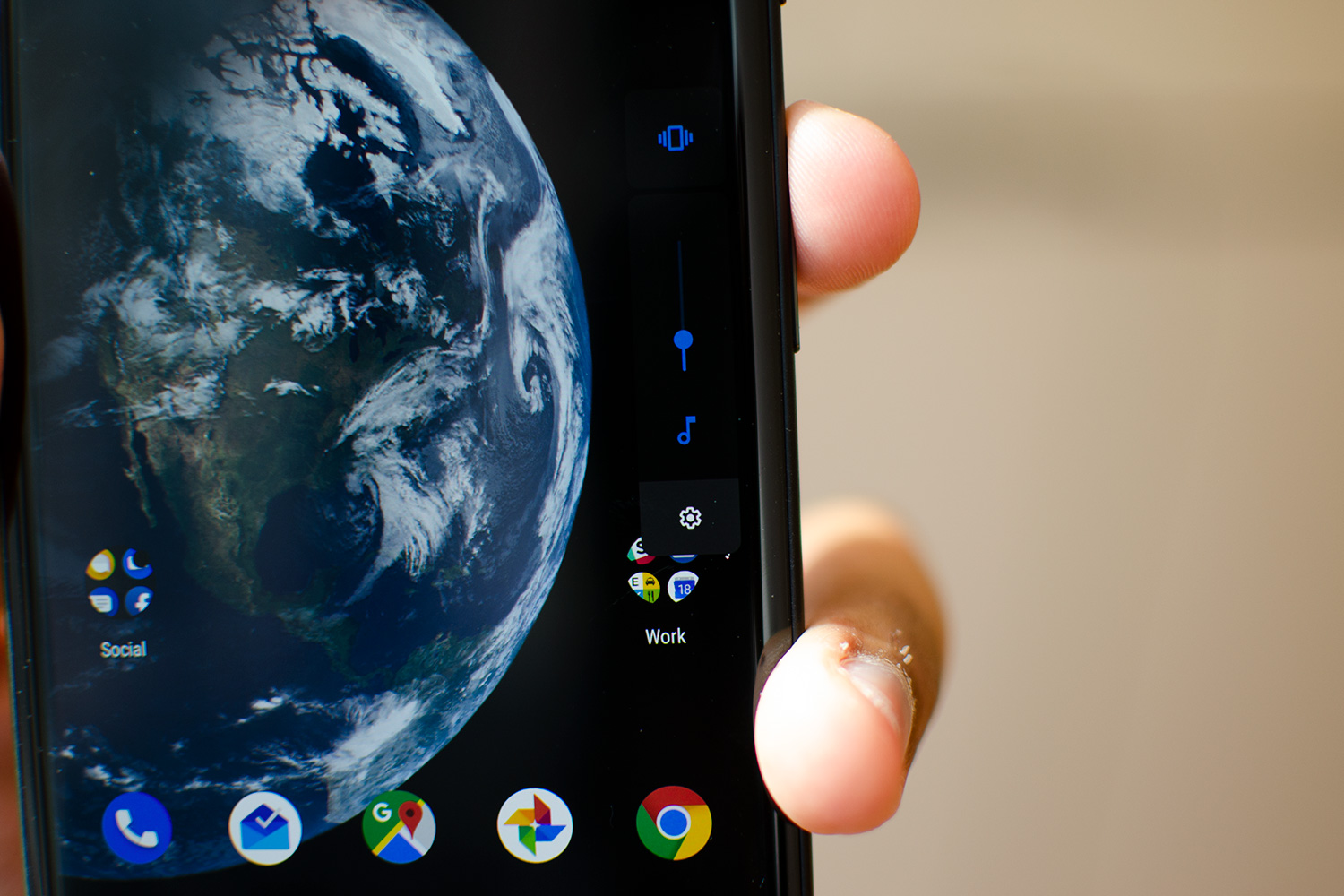
Always have trouble with the volume control buttons? Now if you increase or decrease the volume, it defaults to changing the media volume. If you want to change your phone’s sound profile, you can tap one icon to cycle through three modes: Sound, Vibrate only, or Mute. The settings icon will take you into the full volume control menu. It’s a delightfully beneficial change.
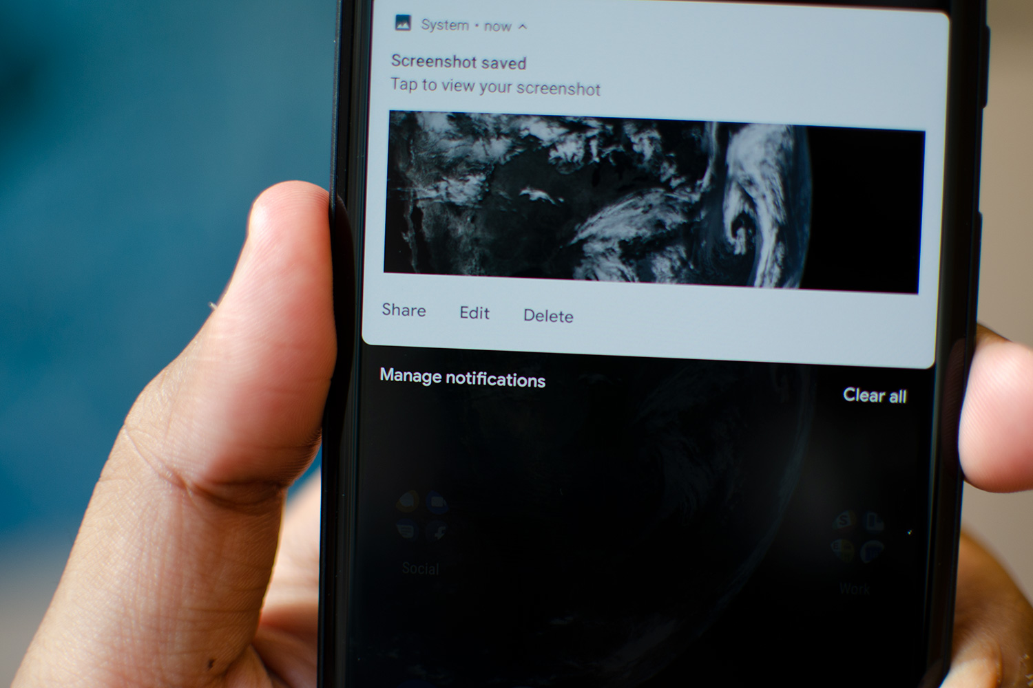
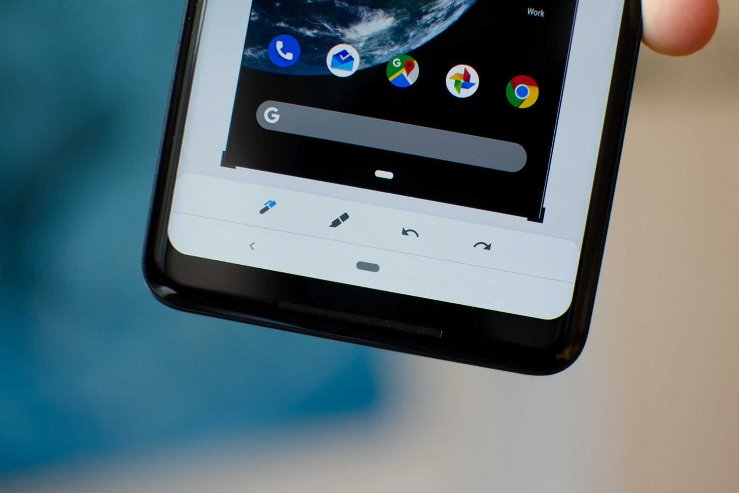
You can now take screenshots by tapping a new icon in the power menu (it appears when you press and hold the power button), and edit screenshots right when you take them. The latter is long overdue, as you’ve been able to markup screenshots on iOS for some time.
But our favorite feature of all is the screen rotate function. We’ve all encountered times when the phone’s screen unnecessarily rotates to landscape mode. Now, when screen lock is turned on, an icon appears when you rotate your phone, giving you the option to rotate. About time.

Notice a trend? These changes may be minor, but together they drastically improve the day-to-day Android experience.
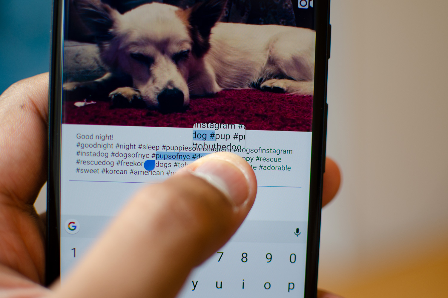
Some other quality-of-life changes that are worth mentioning are the magnified view when you move the cursor on text (like in iOS); a note in the notification drawer showing when your next alarm is scheduled; more details in the Night Light tile that reminds you when night mode kicks in; and the fact that you can now see battery life on the Always-on Display (on Pixel devices).
If you keep swiping away some notifications without interacting with them, Android Pie will also ask if you want to stop receiving those alerts completely, which is a handy way to offer up the ability to block particular notifications from an app. A new Manage Notifications button at the bottom of your notifications gives further control, like toggling notifications off and on, app by app.
Digital Wellbeing, and spending less time on your phone
A recent Motorola, Harvard, and Massachusetts General Hospital survey found that more than 53 percent of respondents (born in 1990s and the early 2000s) described their phone as their “best friend.” It’s clear we spend too much time on our phones, and Google wants to address this with a few “Digital Wellbeing” features in Android Pie.
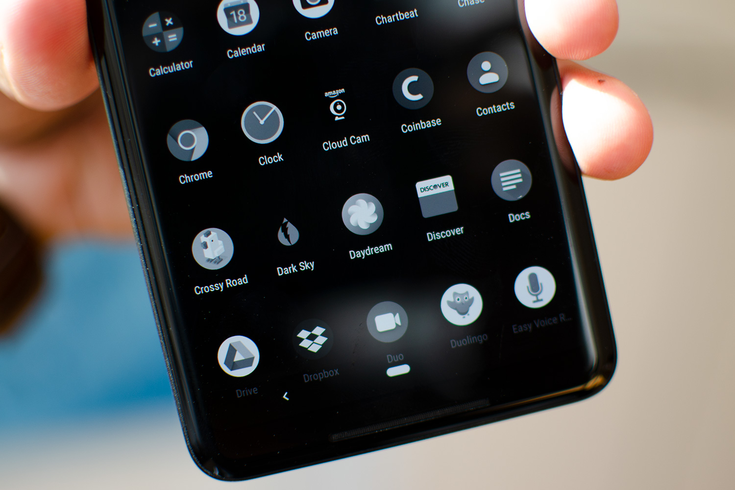
There are four key components to Digital Wellbeing, which is currently in beta for Pixel devices. The updated Do Not Disturb option, which we mentioned earlier, helps completely block out all alerts so you can focus or pay attention to the task at hand. Then there’s App Timers, which let you set a limit for how long you can use an app. After you hit the limit, the app’s icon goes grayscale to remind you to adhere to your limit. It’s nice to see this available in the OS, but it requires a lot of willpower from the user to not override the limit.
The Dashboard in the Settings menu is also an eye-opening way to see all the times you pick up and unlock your phone, or the amount of notifications you’re bombarded with on a daily basis. It’s beneficial if you just want to keep track of what takes up most of your time, but we haven’t found much a desire to return back to it after checking it out the first time.
Wind Down effectively makes us put our phone on the charger before bed.
The final component is called Wind Down, and it’s perhaps the most useful of the lot. At a specified time bed, the whole phone screen goes grayscale. It sounds subtle, but the missing color for app icons like Twitter made us sincerely want to put the phone down. Do Not Disturb mode also engages, so you don’t get in the habit of checking notifications before bed. Wind Down effectively makes us put our phone on the charger before bed.
We’re excited to see these new additions come to other Android devices after the beta period ends. With the exception of Do Not Disturb and Wind Down, it’s tough to see if any of these will reshape our lives for the better, as the onus remains entirely on you.
Under the hood improvements
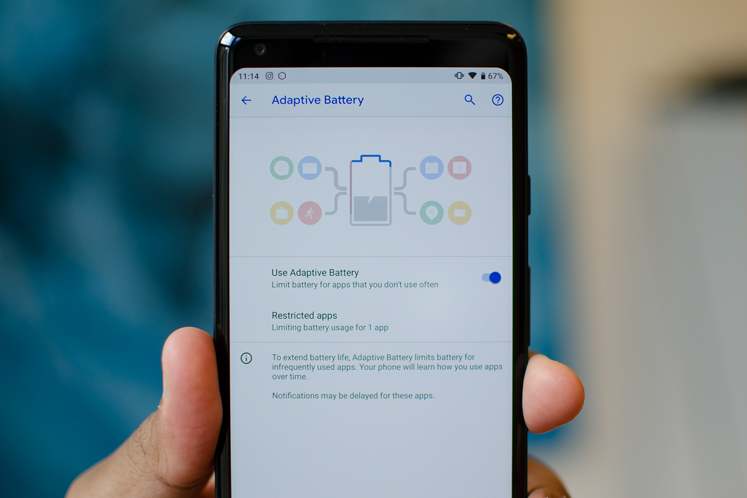
As with every update, there are things happening under the hood that you may not notice at first. One of the most important is Adaptive Battery. Google said it’s working with its DeepMind division to analyze user behavior, so the OS can predict the apps you’re most likely to use next, and ready up resources accordingly. Google said this will result in a 30-percent reduction in CPU wake-ups, which should help improve battery life. We haven’t seen much of a change in battery life on our Google Pixel 2 XL before or after we installed Android 9 Pie, but it could just be due to our high usage, so we’re not prepared to dismiss it entirely.

Another significant addition is that apps running in the background can no longer access the microphone or camera. It’s worrying to think this wasn’t the case before, but we’re thankful it’s here. There’s also now a consistent fingerprint authentication prompt across all apps and services, so it looks the same throughout the OS.
This consistency is another running theme, not just for Android Pie but for all Google apps and services. Google is helping developers integrate its Material design elements into third-party apps thanks to a Material Theme Editor, which helps unify the design. Of course, it only helps if developers use it.
An update you’ll want
It’s incredible that a little more than a month after Google released Android 9 Pie, we’re using it on three different smartphones. While it may not seem like much, that’s a major leap for Google, and a boon to Android, which has been struggling with fragmentation for quite some time. We’re hoping most of the new Android phones launching this fall come with Android Pie installed — like Sony’s Xperia XZ3 — and that older devices are updated at a much quicker pace than ever before.
Android 9 Pie is one of Google’s biggest updates to Android in some time. Android 7.0 and 8.0 largely fixed things under the hood, but this version brings fresh visual changes. There are so many small improvements that your day-to-day use of Android will drastically improve, and the injection of artificial intelligence is already helpful. We do hope Google can tweak its gesture navigation system to be a little less confusing, but otherwise Android Pie is an update you’ll want to bite into.

