Android tablets have long languished behind the most successful product in the segment – the iPad. One of the most prominent reasons why Android tablets don’t stand a chance against iPads is because of the bad app optimization and UI elements. The devices are mostly blown-up versions of Android phones. But not anymore. Google is rethinking the UI and adding new features that will make Android tablets more competitive with their Apple counterpart.
The Android tablet segment is reaching 270 million active users and it’s about time Google introduced new UI elements to its operating system. Android tablets will now allow you to see more at a glance with dual columns in the notification panel – a feature that was present in my Dell Venue 8 tablet back in 2014. But it will be more refined with refreshing elements.

When you open an app, the new Android experience will tag a taskbar at the bottom — much like the Chrome OS — to help make working on the tablet easy with a keyboard. You’ll also be able to run a couple of apps simultaneously and, much like Windows 11, it will save the two windows in the background so you can switch back to the dual-screen setup as and when needed using the recent tabs button.
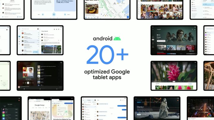
The company is also making things easier app-wise. You’ll soon be able to do more with Google apps on tablets since it will be updating more than 20 Google apps for tablets and devices with larger screen sizes with more to come. The Android maker is focusing on app optimizations for a better large-screen experience on its OS. For instance, YouTube Music, Google Maps, and Google Messages will have a multi-column view on tablets.


