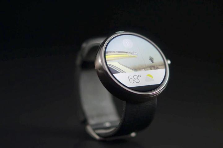
Ever since Google showed us those tantalizing photos of the Android Wear operating system on the Moto 360, we’ve been wondering what the new wearable platform will look like. Android Wear is supposed to be centered around Google Now and communicate effortlessly with your smartphone, but we still only have a vague idea of what it will look like. Now, a Google developer advocate named Timothy Jordan has released a few images of Android Wear notifications, alongside a short description of the OS.
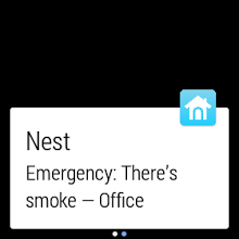
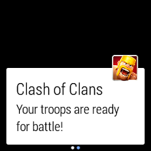
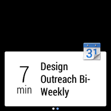
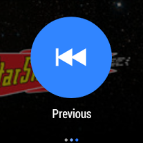
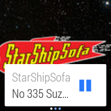
Jordan posted images of his favorite Android Wear notifications on the official Android Developer’s Google+ page. The first notification is an emergency alert from Nest, warning employees about smoke detected in the office. This dire message is quickly followed by a second notification, telling the same employee that the smoke has cleared. Next up is a notification from the game Clash of Clans, followed by a Google Calendar alert about an upcoming event, and a few images of how Pocket Cast playback will look on Android Wear. In case you were wondering, StarShipSofa is the featured podcast.
- 1. A notification from a Nest device, alerting you of an emergency.
- 2. Gaming notifications will also be shown.
- 3. You’ll be alerted to calendar appointments through Android Wear.
Each notification, with the exception of the playback buttons for Pocket Cast, appears as a white box on the display of your Android Wear smartwatch. In the right-hand corner, you see the corresponding app icon and if it’s not a Google-made app, the name of the app also appears in the notification. Then, the snippet of text follows, letting you know that the break room is on fire or whatever else is happening.
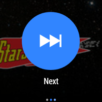
- 1. Control your music using Android Wear on a smartwatch.
- 2. Podcast information shows on the main screen, along with a pause button.
- 3. Large, friendly buttons should make Android Wear easy to use.
Given the limited amount of space available on most wearable device displays, the notifications seem to focus on the brevity of the message and the clarity of the type face. The font appears pretty large in comparison with the notifications you receive on your Android smartphone or tablet, and that’s a good thing. The overall look of Android Wear notifications appears to be consistent with flat UI design elements, fitting in with Android and the current industry trend. The lasting impression is one of simplicity and efficiency. After all, the last thing we want is a cluttered smartwatch display.
Hopefully we will see much more of Android Wear at Google I/O, including the possible debut of the LG G Watch.
