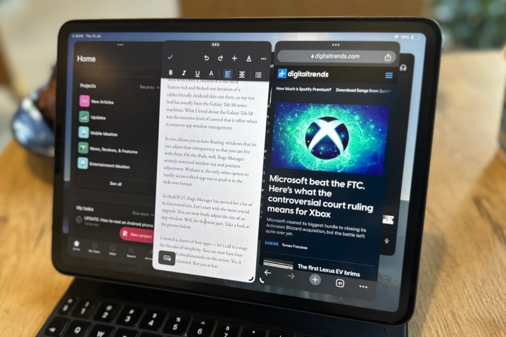
With iPadOS 17, Apple promised a refined Stage Manager experience. So, as soon as the first public beta was released, I rushed to my iPad Pro to check whether Apple’s claims made at WWDC 2023 had any merit to them. Well, Apple delivered with Stage Manager on iPadOS 17 — and to a large extent.
One of my biggest gripes with Stage Manager was that it wasn’t flexible. Apple wanted to ape a core multitasking feature from macOS, but the implementation left a lot to be desired. Digital Trends Editor Joe Maring wrote an extensive (and lukewarm) take on how Stage Manager didn’t live up to its promises.
I, on the other hand, didn’t abandon the cause of Stage Manager. A part of that hope was driven by the fact that Stage Manager would get fixed in the months following iPadOS 16’s public release. That didn’t happen. But the main reason that I kept bumping into Stage Manager each day was because I use a tablet as my primary computing machine.
I alternate between an iPad Pro and whatever Android tablet I can get my hands on. I usually stick with One UI on Samsung tablets because it is the most feature-rich and fleshed-out iteration of a tablet-friendly Android skin out there, so my test bed has usually been the Galaxy Tab S8 series machines. What I loved about the Galaxy Tab S8 was the extensive level of control that it offers when it comes to app window management and a true desktop-like experience.
So, on iPadOS 17, is Stage Manager finally ready to shine?
Stage Manager is finally flexing
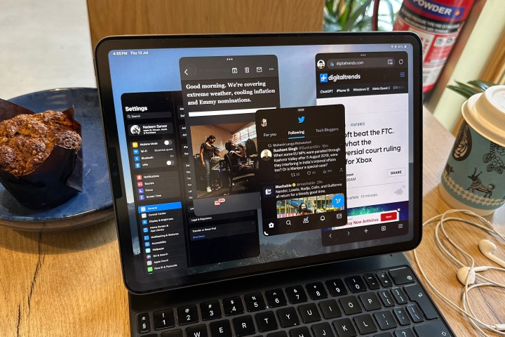
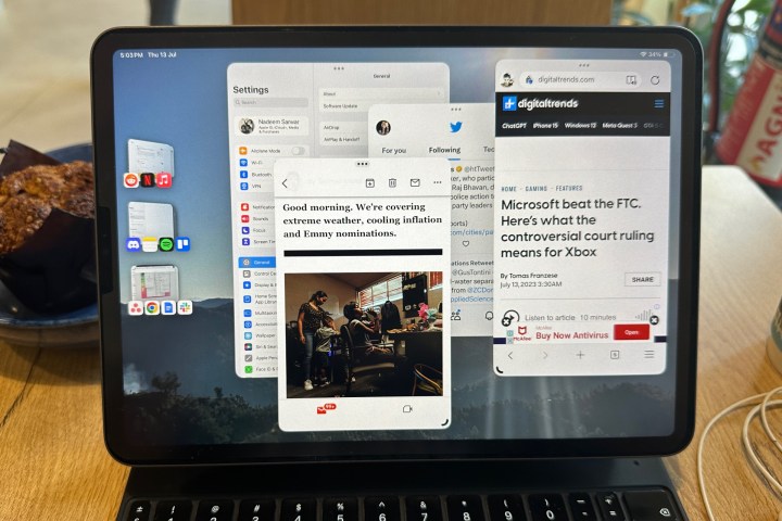
In iPadOS 17, Stage Manager has atoned for a lot of its functional sins. Let’s start with the most crucial upgrade. You can now freely adjust the size of an app window. Well, for the most part. Take a look at the picture above.
I created a cluster of four apps — let’s call it a stage for the sake of simplicity. You can now have four apps visible simultaneously on the screen. Yes, it does look cluttered. But you can at least do that.
Moreover, depending on your app preference and how it scales to different aspect ratios, it just might work. My work usually involves four apps — Google Docs, Chrome, Asana, and Microsoft Teams — that should be in my view at all times. With a little bit of window resizing and getting rid of the dock, I got a working combination for my 11-inch iPad Pro. If you have a 12.9-inch iPad Pro, then it’s even better.
But there are still a few restrictions. You can’t align an app window alongside the edge of the screen; there’s always some gap on either side. Plus, iPadOS 17 automatically tries to adjust the window position to a more center-aligned position.
Yes, it’s not as liberating and flexible as Android 13-based One UI 5 on a Samsung tablet, but after a whole year of borderline frustrating experience with Stage Manager, I will gladly take whatever flexibility Apple is currently offering with Stage Manager in iPadOS 17.
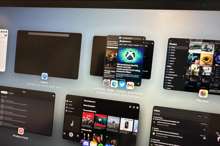
Another neat touch is that Stage Manager remembers the size of each app window in the cluster. As you switch between stages, your iPad not only shows app windows in your pre-selected format but also remembers whether the dock is visible — or not — for that particular window arrangement.
You still don’t have pixel-level control over the size of app windows. Once you tweak the window size of an app, iPadOS 17 automatically does some vertical and horizontal adjustments of its own. But why would Apple want to gatekeep the size of app windows?
My guess is that Apple is still focused on offering a meaningfully scaled view of apps instead of just cramping or expanding the UI, as is the case with most Android tablets.
In hindsight, it’s a blessing in disguise. So far, I haven’t come across many apps that look like a cramped mess, irrespective of the window size or aspect ratio adjustments I’ve made.
There are still some UI bugs
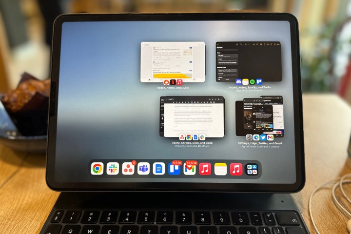
There are still a few unresolved issues with Stage Manager. While handling multiple app clusters, you can’t directly click on an app’s icon and open it, regardless of whether you are trying to do so in Stage Manager mode or multi-tasking view. It’s rather funny — and frustrating to equal measure — that when you tap your finger or hover the cursor over an app’s icon, it is magnified, hinting that it is ready for user input.
But when you tap on it, nothing happens. Instead, you will have to push-click on the larger app cluster or stage icon to open it. But that’s not all. When you click on a cluster or stage to open an intended app, it won’t directly pop up on the main view. Instead, you will see the app that was in the foreground when you last worked on that app group or stage.
The only other way to instantly access an app after opening a cluster or stage is if you’ve already adjusted the size of the windows in such a way that the desired app is always in view. But do keep in mind that if you extend the vertical height of an app window beyond the dock, it disappears. And that’s another problem.
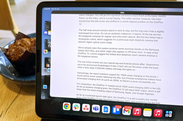
Unlike certain Android skins on tablets, where you can see app clusters you’ve made at the bottom of the screen and access them with one click, iPadOS doesn’t offer any such flexibility. That becomes troublesome when the dock is no longer visible, so you have to open the multi-task view, peer into the Stage Manager array on the left edge of the screen, and then select the right cluster.
But even at this stage, there’s one more hurdle to overcome. By default, Stage Manager adjusts the window size in such a way that only half the stage icon is visible on the left side of the screen. That means, at any given time, you only have two app icons in your view out of three or four. The only way to overcome this is if you resize the window and move it towards the right edge of the screen so that you can see each app’s icon in a stage (like in the image above).
Another downside of vertically increasing the size of app windows and losing view of the app dock is that you can no longer see the number of notifications for each app. In multi-task or Stage Manager, app icons don’t show the notification bubble. So, there’s that compromise to live with, as well.
A rewarding experience, or closest to one
With iPadOS 17, Stage Manager is finally taking the form that it was always destined to serve. Yes, there are still some minor UI caveats, but I’m not sure whether Apple will address them all. So far, though, I am impressed with how smooth the upgraded Stage Manager experience has turned out to be.
Switching between stages is a breeze. So far, I haven’t come across any app crashes or aggressive background activity limits. Even with multiple browsers running across different app clusters, each with a couple of dozen tabs active, every UI interaction has been zippy and buttery smooth. More than ever, it makes sense why Apple wanted to limit this perk to iPads with the mighty M-series silicon only.
With iPadOS 17, Stage Manager is finally taking the form that it was always destined to serve.
It would be utterly cool if Apple could also port over the macOS multitasking keyboard shortcuts to iPadOS, too. It would be a shame not to because the Magic Keyboard has been ready for such powerful tasks for years.
On a concluding note, I can confidently say that if you’ve been waiting for Stage Manager to morph into a desktop-like device, Stage Manager on iPadOS 17 is the closest you can get.


