“The iPhone 14 Pro's outstanding performance, simple and powerful software, versatile camera, and high-quality design make for an effortless ownership experience.”
- Camera improvements mean great photos
- Always-on display looks fantastic
- Powerful A16 Bionic processor
- Vibrant screen and clear speakers
- Long-term software support
- One-day battery life
- Modest charging speed
Everything about the iPhone 14 Pro feels entirely effortless. The design is expertly judged and modern, the software is incredibly simple to use, and the camera takes even better photographs than its predecessor. But effortless can be taken another way, too, in that it’s not exactly the most daring update over its predecessor.
Let’s talk in detail about whether the iPhone 14 Pro is worth the effort on your part to either take the plunge into Apple ownership or upgrade from an existing iPhone. If you’re looking for a less expensive option, check out our iPhone 14 review. And if you prefer your iPhone to be bigger and more expensive, see our iPhone 14 Pro Max review. Also make sure to check out our list of the best iPhone apps so you have the best apps on your new iPhone.
About our iPhone 14 Pro review
Our iPhone 14 Pro review was originally published on September 26, 2022, and written by Andy Boxall. The 11 months later and second opinion sections were written by Christine Romero-Chan, while the rest of the review was penned by Boxall.
iPhone 14 Pro: 11 months later

I’ve been using the iPhone 14 Pro as my daily driver ever since getting the device on launch day last year. Though I’ve tried using Android phones since joining Digital Trends, I keep coming back to the iPhone 14 Pro for a few reasons. But how has the experience been almost a year later, especially since the iPhone 15 is just on the horizon?
The iPhone 14 Pro is still impressive overall, but the “shiny and new” factor is wearing off. One of the big reasons why I was so interested in the iPhone 14 Pro last year was because of the Dynamic Island. However, it’s nearly a year later, and the whimsy and charm of the Dynamic Island is fading. From my experience, most of the apps I use on a daily basis don’t make use of the hardware feature much, and I only use the Dynamic Island mostly when listening to Apple Music or getting turn-by-turn directions in Apple Maps.
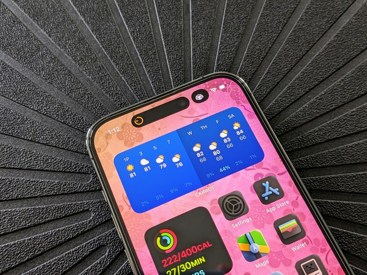
Basically, I only really ever see the Dynamic Island in use with native Apple apps and hardly any third-party ones. Given that it’s been almost a year and there’s still not that many apps that support the Dynamic Island (or Live Activities, for that matter), it’s been a bit of a letdown. Hopefully, this changes once the Dynamic Island is available on all iPhone 15 models, not just the Pros, but as of right now, it’s been very limited, unfortunately.
Performance has remained snappy and solid, however, battery life seems to have taken a hit. Again, this is a launch day device, but according to the Settings app, battery capacity has fallen down to 94%. Of course, this seems to be on the better side of things compared to other people, but it definitely has affected daily use. After taking it off the charger around 8 a.m., the iPhone 14 Pro typically ends up around less than 50% around 4 p.m. Because of this, I’ve been plugging in more often in the late afternoon or early evening to be able to make it through the rest of the day.
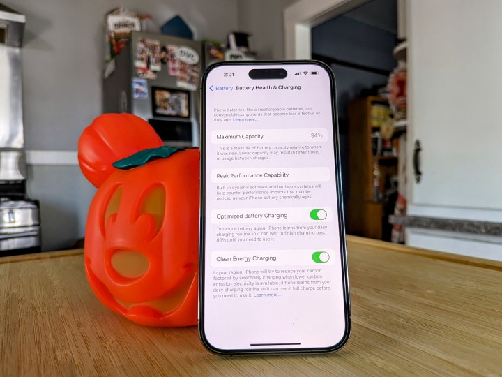
Usage hasn’t changed since launch day — a lot of iMessages, checking email on Spark and Outlook, work chats in Microsoft Teams, social media (Ivory for Mastodon, Threads, Instagram, and Facebook), playing Disney Emoji Blitz, listening to Apple Music, getting turn-by-turn directions, Nexar dashcam recording, and more. The days I’m using Apple Maps and Nexar for longer drives means even worse battery life, and requires charging in the car. I feel that battery life wasn’t too bad a few months ago, but it seems to have taken a big hit with recent updates. Fingers crossed the iPhone 15 Pro fixes this!
iPhone 14 Pro: 2 months later

I’m nearly two months into using the iPhone 14 Pro every day, and it has continued to impress. The battery life, one of the big concerns when we first reviewed the phone, has stabilized and now mostly matches my iPhone 13 Pro before it, returning two working days of moderate use before needing a recharge.
We’ve continued to test the camera, and have since put it up against the iPhone 14, a battle it predictably won. It’s an interesting look at why camera fans will want to spend more to get the Pro, and how it’s all about the little differences rather than large, glaring improvements. We’ve also tested it against the Galaxy S22 Ultra, one of its top rivals. I’ve found the camera to be reliable, fun to use, and a great everyday companion.

The other standout feature on the iPhone 14 Pro, Dynamic Island, has not yet reached its potential though. It continues to be most helpful in Apple’s own suite of apps, or with general phone functions like calls, but third-party app developers have not embraced it yet. High-profile apps like Uber and Starbucks have not added support yet, for example. There are fun things you can try, like this virtual pet app, but it’s not really what made us excited about Dynamic Island.
Finally, the combination of an iPhone 14 Pro and an Apple Watch is still the best smartphone/wearable pairing you can get today. It’s wonderfully seamless, with notifications delivered reliably, and workouts tracked without issue. While buying a phone and a smartwatch is expensive, it’s truly worth it with the iPhone and Apple Watch. I lean towards the Apple Watch Series 8, as I like the always-on screen over the Watch SE 2, and don’t always want the additional size and weight of the excellent Apple Watch Ultra.
The iPhone 14 Pro is still a highly recommended product, and the conclusions in our review still stand after two months.
iPhone 14 Pro: design

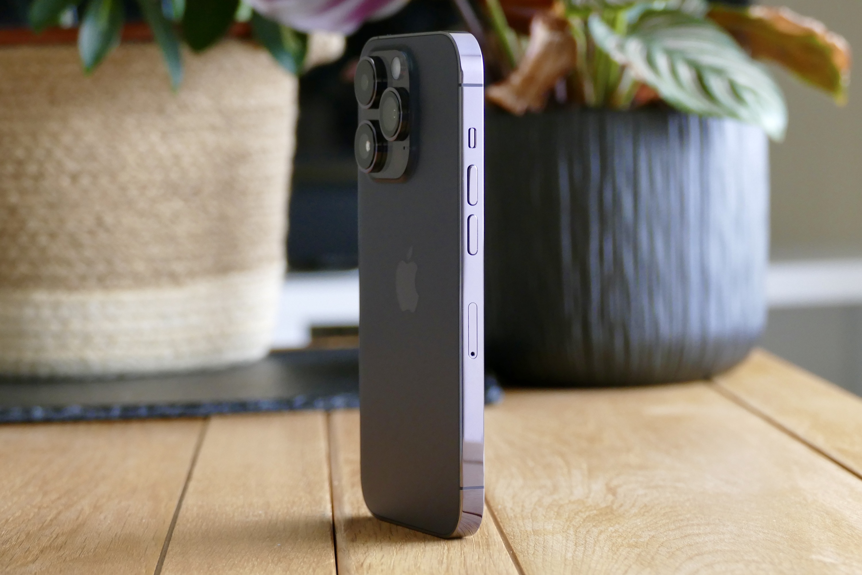
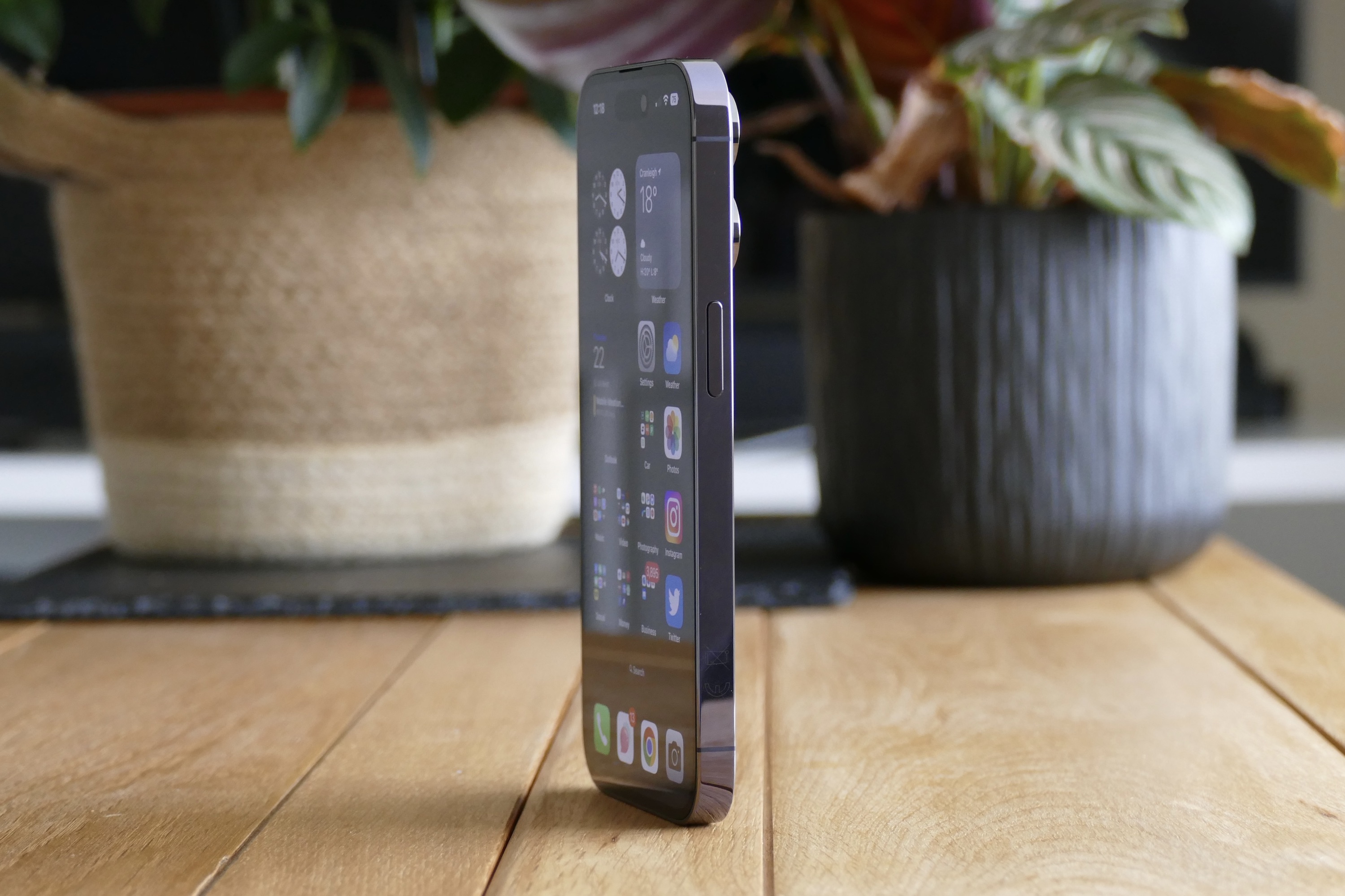
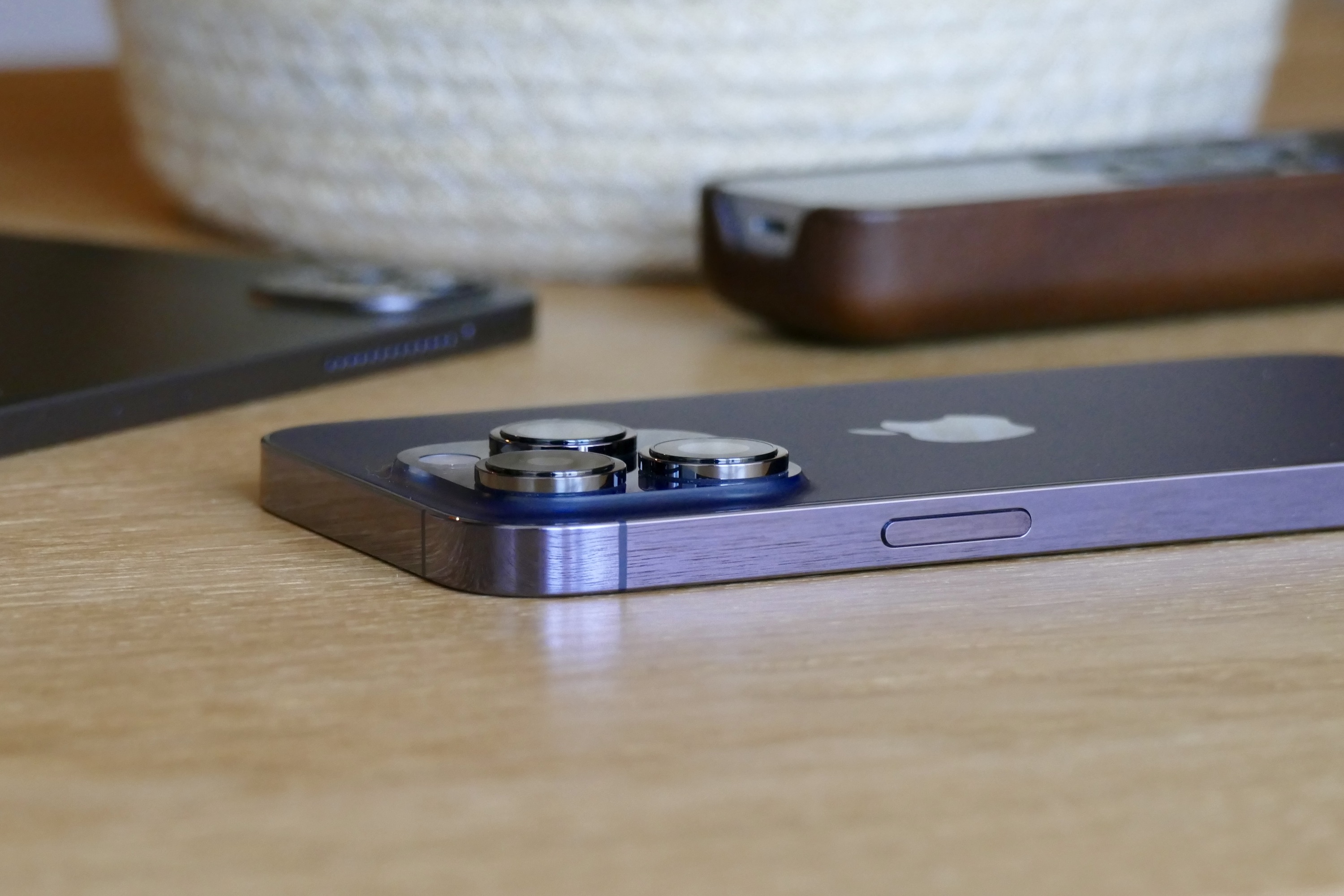
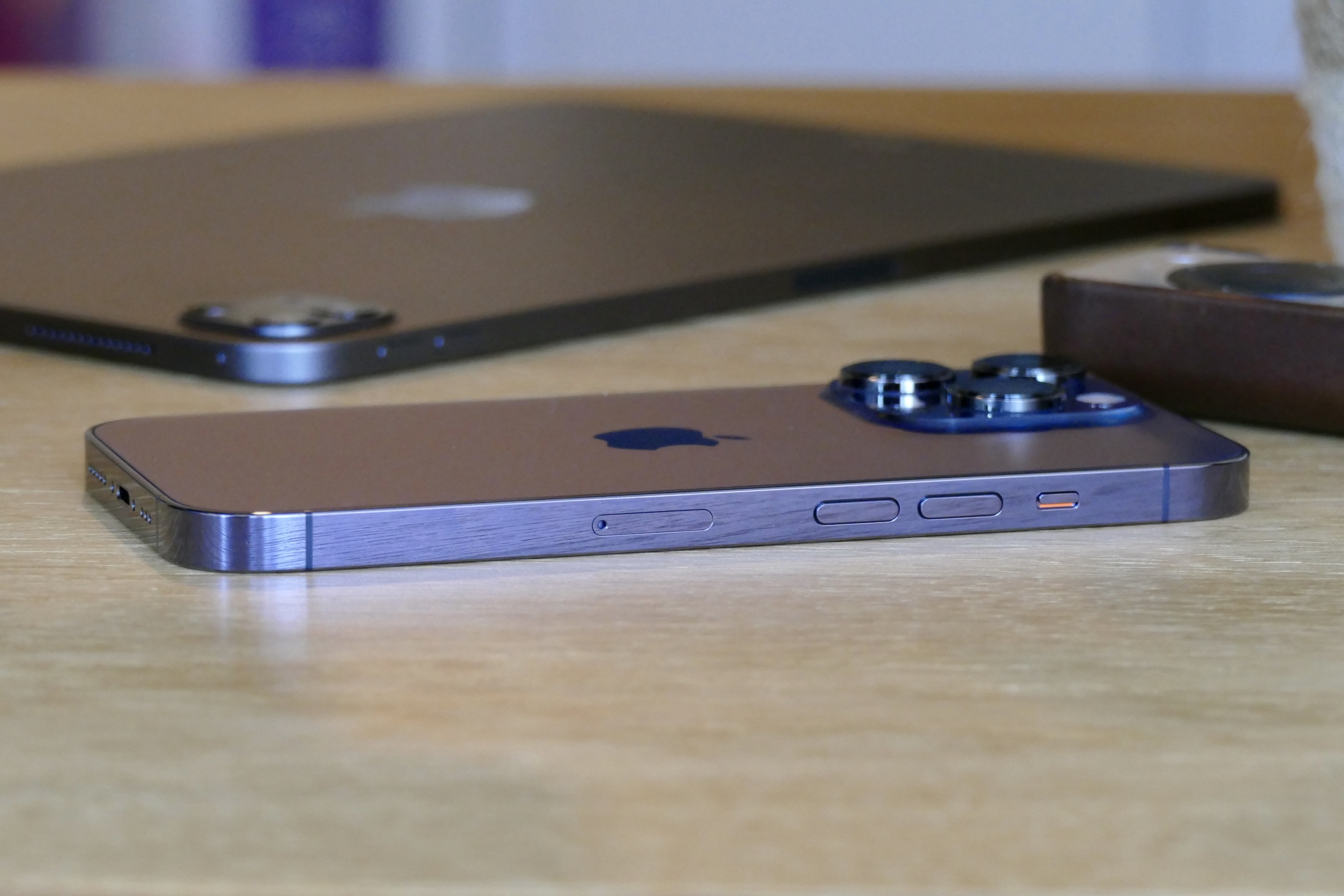
If you’ve seen an iPhone 12 Pro or iPhone 13 Pro, the iPhone 14 Pro will be very familiar. It has the same flat, squared-off chassis that still feels slightly too sharp in your hand, but is beautifully made from stainless steel. Apple’s Ceramic Shield is over the screen and there’s toughened glass on the back. An IP68 water-resistance rating adds confidence, as the phone will avoid damage from accidental water spills. The volume controls and power button are still in place on the side, and if you buy an iPhone 14 in the U.S. you won’t find a SIM tray, as this is the first iPhone to only accept an eSIM.
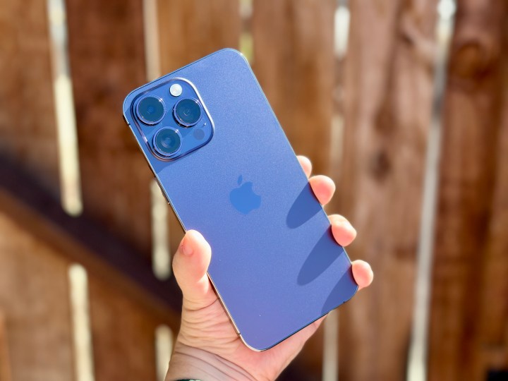
The 6.1-inch Pro is beautifully balanced in your hand, and it is usable with one hand too. It’s no featherweight at 206 grams, but it never feels ungainly at 71mm wide and 7.8mm thick, plus I have not had any fatigue from holding it for long periods of time. It can be a slippery thing, though, and protecting it with a case will help keep it from making an unwanted break for freedom. There are several ordinary colors (black, silver, or gold), but go for the lovely new Deep Purple and choose a transparent case. It looks almost black in some situations, but get it in the right light and the purple absolutely pops. Even the chassis has a purple hue. I think it looks excellent.
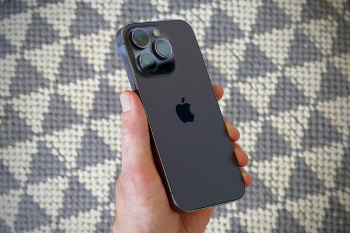
On the back, the camera module is large and makes a bold statement when the iPhone 14 Pro isn’t in a case, but because the three cameras protrude considerably, the phone never lays flat on any surface. It all adds up to a smartphone that’s unmistakably an iPhone. This isn’t a groundbreaking design, there’s nothing especially flashy about it, yet it manages to be classy and cool, fitting in with every situation. It doesn’t demand attention, but it will still get admiring glances, particularly if you choose the purple one.
Would I have liked to see a design that wasn’t almost exactly the same as the last two models? Yes, that would have been good. Does it strictly need to look any different? No, not at all. Apple has got the Pro formula right — classy looks, just the right size and weight, high-quality materials, and stellar build quality — so it can’t be blamed for not making dramatic changes with the iPhone 14 Pro. The one thing I’d have liked to see is more color options, but I expect those will come later to keep the range fresh.
iPhone 14 Pro: always-on screen

The new 6.1-inch Super Retina XDR screen, with its 2556 x 1179 resolution and 460ppi pixel density, has some tricks up its sleeve. Before we get into the big changes, it’s worth mentioning the brightness. It reaches 1600 nits normally, but can boost to 2,000 outdoors in sunlight, and the difference is noticeable. There’s a “bump” when the extra kicks in, and the screen really does become brighter and easier to read when the sun is beating down.
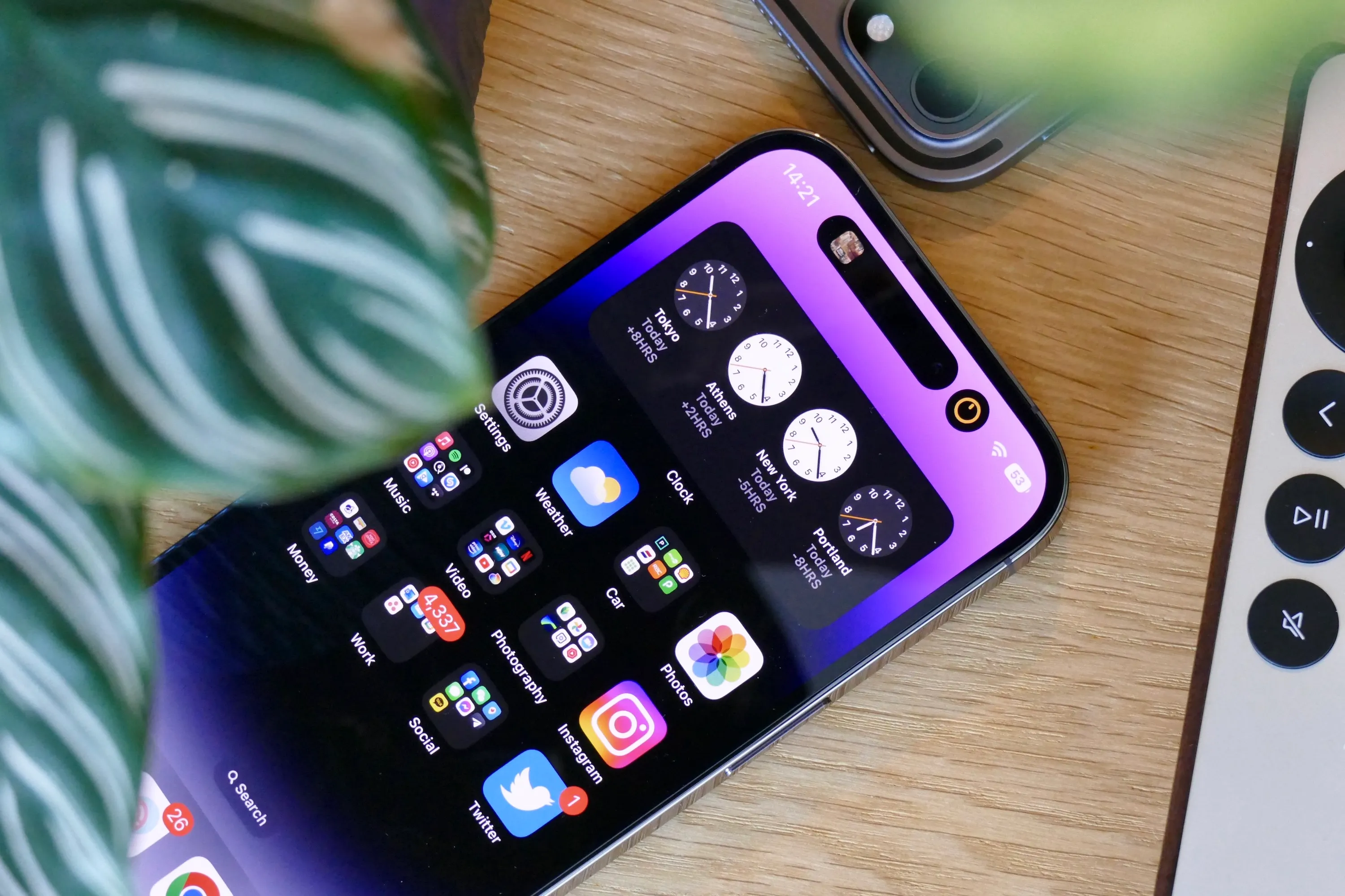
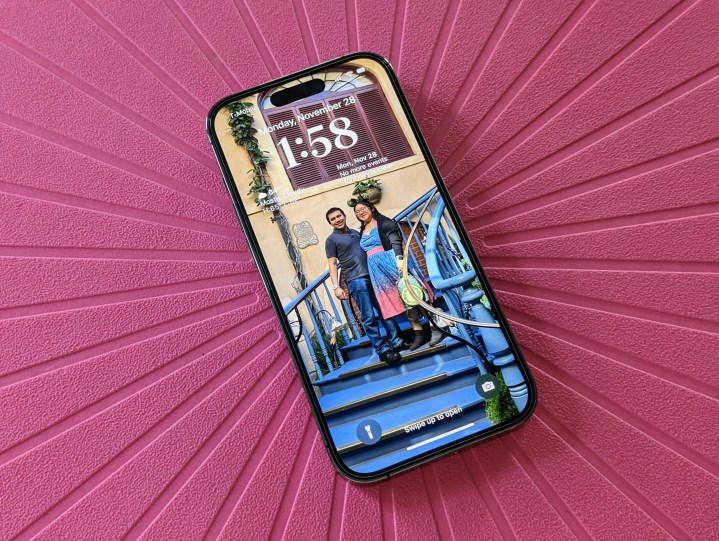
However, it’s the always-on display that’s the largest, most obvious new screen feature. Android phones have had always-on screens for years, showing the time, battery, and notification icons against a black screen. Apple’s always-on screen is essentially just a dimmed version of the lock screen, in full color, and with dynamic widgets and notification alerts. It’s the Apple Watch’s always-on screen, just on your phone. It’s also so much more than we’ve seen on any other phone, with the time and date highlighted in a bright white font over your choice of wallpaper, and notifications clearly showing the icon and basic details about each one.
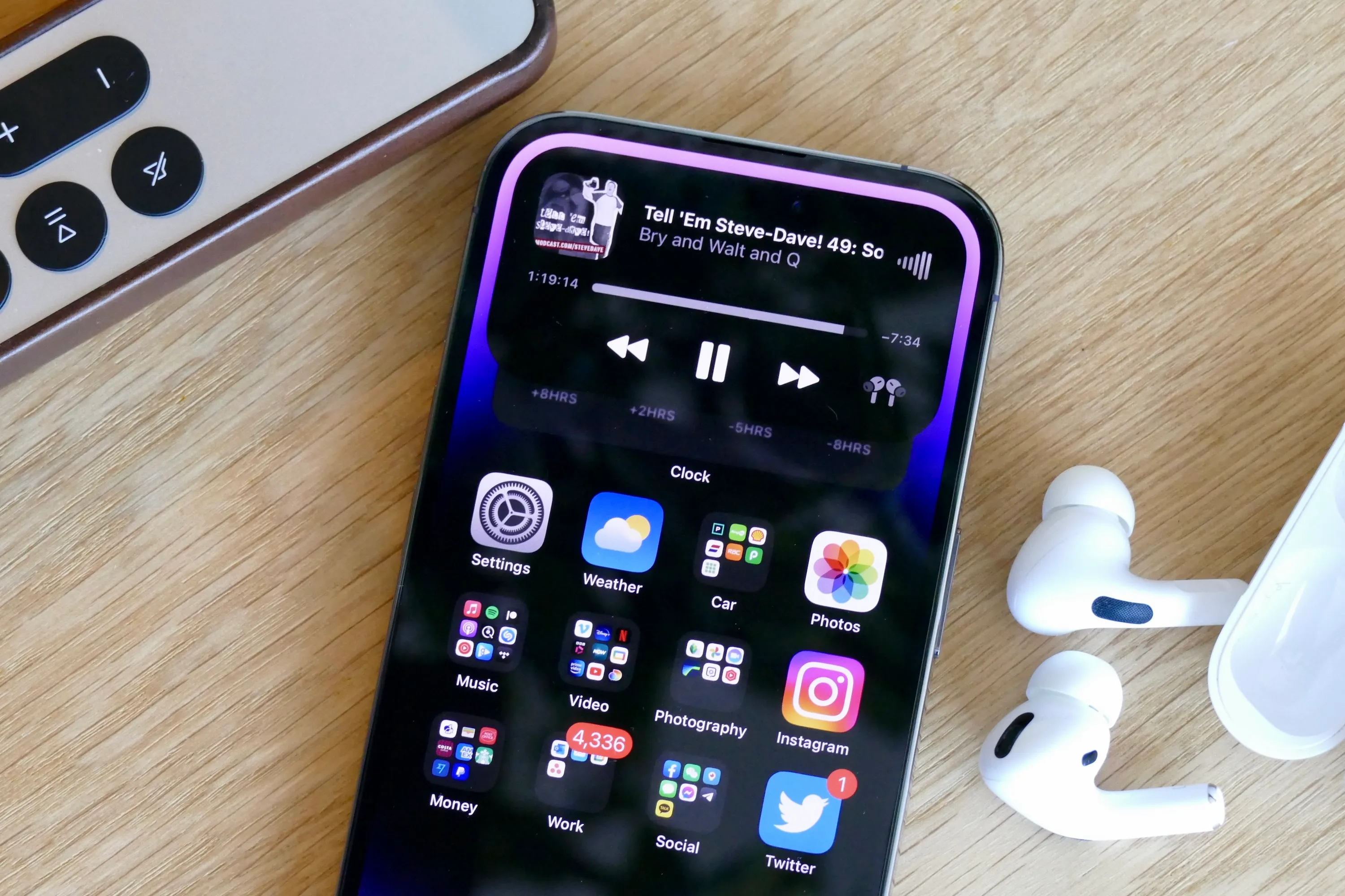
Controls for music and audio apps also stay on-screen and a quick tap wakes them up, ready to pause or change tracks. I’ve found the whole lock screen experience to be sharper and faster to react than before. I use the phone in my car for music, and where before it took multiple taps to make anything work, it’s a single tap and an instant reaction on the iPhone 14 Pro. The always-on screen is beautiful, useful, and a step above implementations we’ve seen elsewhere in terms of design. But it may not be helping battery life, which we’ll come back to later.
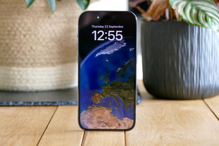
Apple’s 120Hz ProMotion feature makes a return and should be considered a strong reason to choose the Pro model over the standard iPhone 14. The higher refresh rate provides smoother scrolling and less-jarring animations, and doesn’t cause as much eye-strain. It quickly becomes “invisible,” but you will absolutely notice its absence. Watching video on the iPhone 14 Pro, the screen comes alive with stunning colors, deep blacks, and pitch-perfect contrast. Even the stereo speakers are some of the best in the business. There’s clarity, power, and actual presence to the sound, and I can happily watch videos and listen to streaming music through them for long periods of time.
The iPhone 14 Pro has a fabulous screen, and it’s sure to be even more immersive and pleasurable to view on the bigger 6.7-inch iPhone 14 Pro Max … if you can bare the extra weight and price of the device.
iPhone 14 Pro: iOS 16 and Dynamic Island
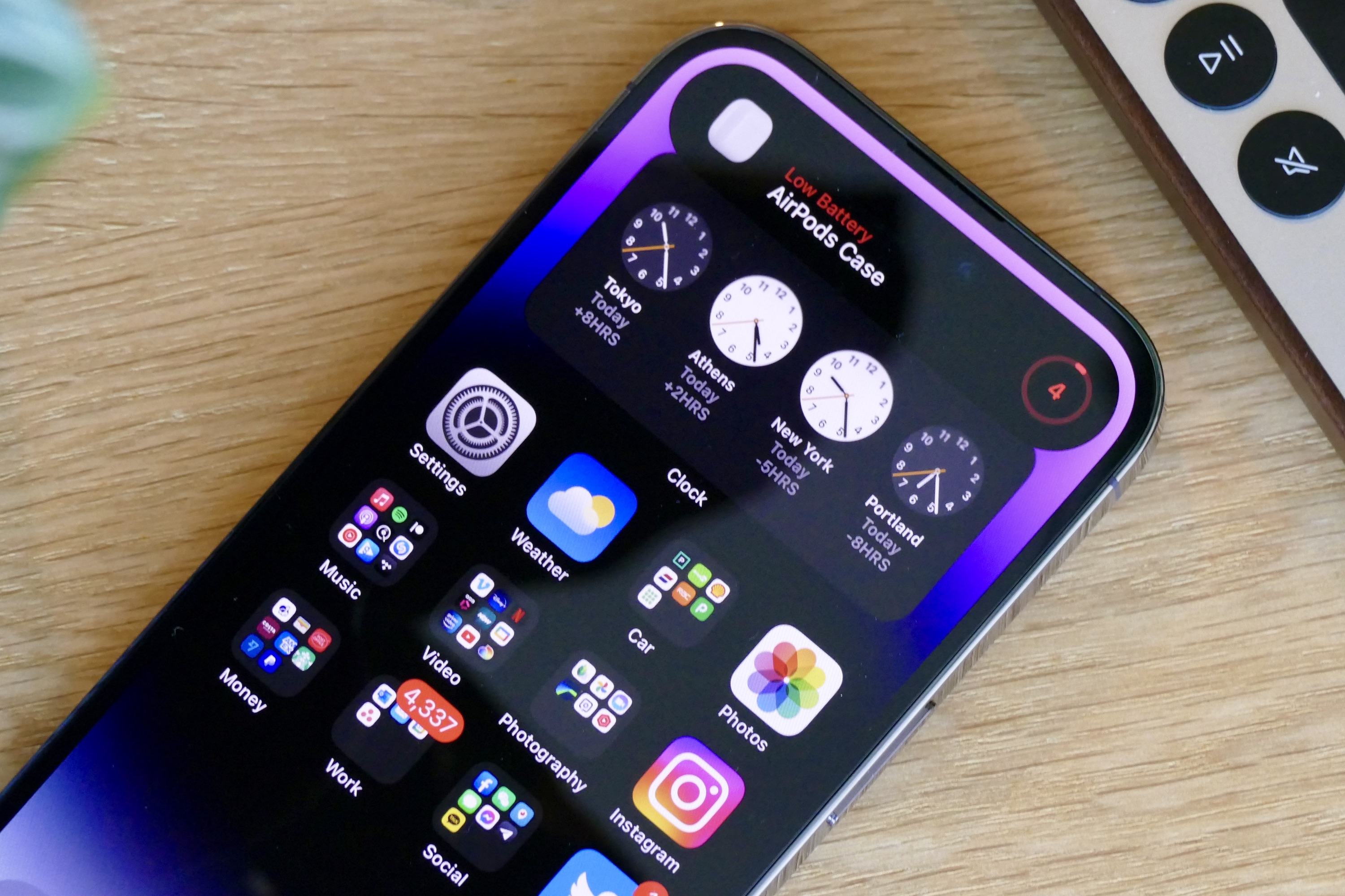
Dynamic Island, Apple’s cringey name for the expanded pill-shaped notch replacement at the top of the screen, is most definitely a work in progress. At the moment, it’s relatively simple, showing information about Bluetooth connections, screen and voice recordings, face unlock alerts, and timers. Apple’s Live Activities feature isn’t ready yet, and developers haven’t been given access either. When these things happen in the near future, Dynamic Island’s usefulness will skyrocket.
For now, what you see is potential. The Dynamic Island never feels intrusive, and the functionality it does provide is helpful. Music controls are the best example, as a short tap takes you directly to the app that’s playing, and a longer press reveals a set of quick controls. Although these features can be found elsewhere in iOS, it’s undeniably fast and intuitive to use the Dynamic Island, and it bodes well for the future when more apps make use of it. It’s also a seamless thing of beauty, as the software morphs and shifts around the hardware component so slickly that you really can’t tell where one begins and the other ends.
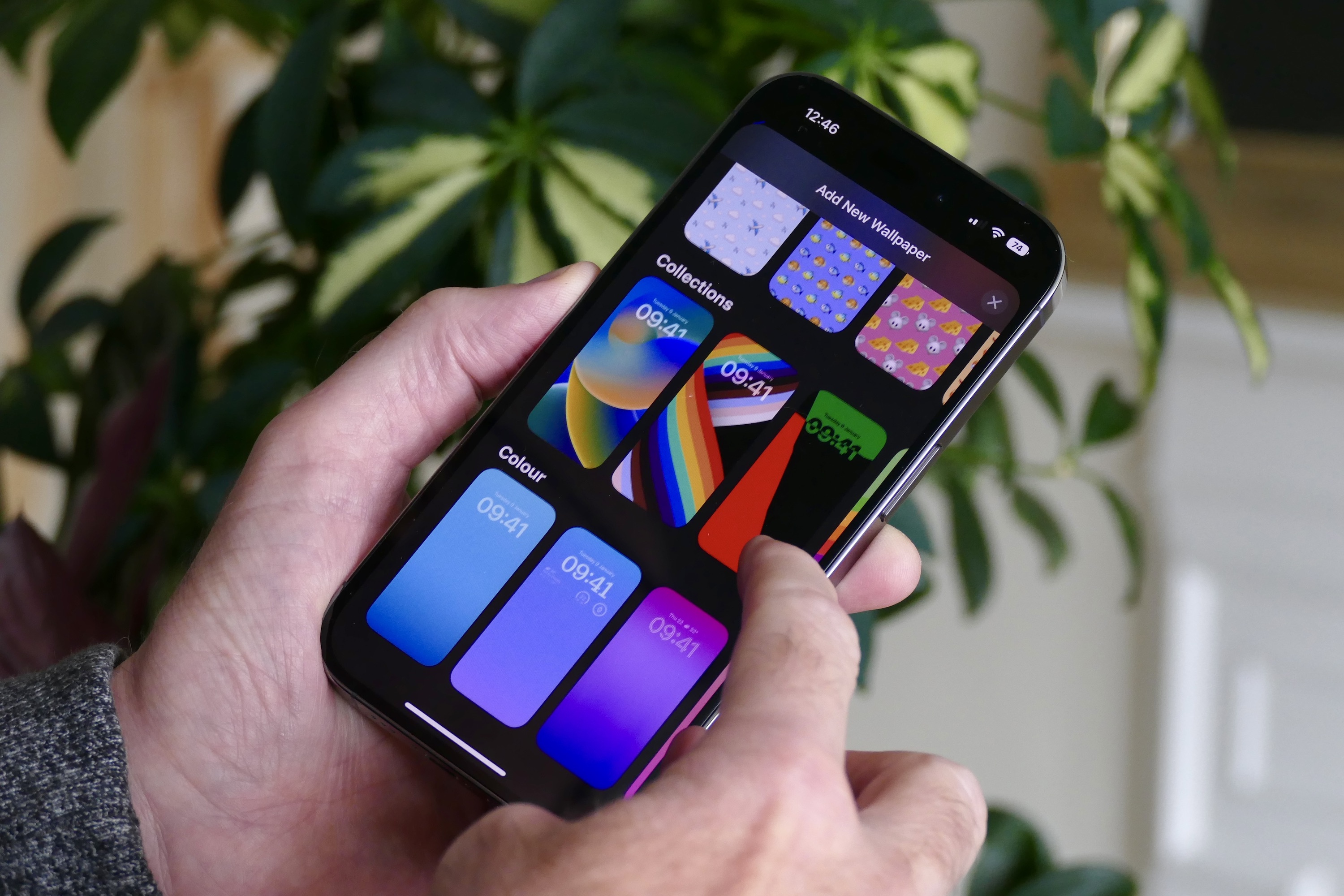
The iPhone 14 Pro comes with iOS 16 installed. In addition to the new battery percentage display and the excellent haptics, much has been made about customizing iOS 16’s lock screen, and I remain unconvinced it’s necessary or beneficial. Even the new Settings page to change the wallpaper and add widgets is needlessly complicated and rather confusing. I’ve personally seen no everyday benefit to adding more clutter to the lock screen, but understand others may feel differently. The new A16 Bionic processor powers all this with aplomb, and while I’ve had no problem with performance at any time, I’m not sure I can see any real difference between it and the A15 Bionic in the iPhone 13 Pro.
The notification system in iOS has also been demonized for some time, but it’s a personal thing. I’ve used iOS for years and have seen the system evolve into what it is today. No, it’s not perfect, but it’s better than ever before, and I don’t consider it the hateful thing some others do. Notifications sit at the bottom of the lock screen in a stack, which can be expanded when Face ID sees you. Some can be interacted with or further viewed, or tapped to open the corresponding app. To me, it does what I want, and is by no means better or worse than most Android notification systems. Siri even (surprisingly competently) reads my messages when I’m using my AirPods.
Negatives? Muscle memory means I often pull down on the left of the screen when the phone’s unlocked to better see notifications I may have missed, but this once-helpful feature has been reduced to a copy of the lock screen and does make notifications slower to view and interact with. I also dislike the Search widget being permanently stuck to the bottom of each home screen, which just duplicates functionality and causes visual clutter.
There’s one key software advantage over many other phones that makes the iPhone such a joy to live with, and that’s software updates. Although Apple doesn’t put a time frame on how long it officially supports its smartphones with major updates to iOS, the most recent iOS 16 software works as far back as the iPhone 8, released at the end of 2017. It’s reasonable to expect the iPhone 14 Pro to continue getting updates for another five years.
iPhone 14 Pro: camera
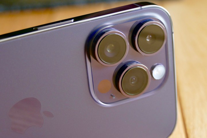
Yes, the iPhone 14 Pro’s camera is an improvement over the iPhone 13 Pro’s camera. It’s not by much, but the enhancements do make a difference. The main camera has 48 megapixels, while the wide-angle and telephoto cameras have 12 megapixels. We have compared the iPhone 14 Pro to the iPhone 13 Pro and to the Samsung Galaxy Z Flip 4 already, providing a deep dive into its abilities in different environments, and how the new Photonic Engine improves lowlight zoom images.
What about the app and the photographic experience? The iPhone 14 Pro can take 2x or 3x optical zoom shots, or expand to a 0.5x wide-angle photo; for video, it can record up to 4K resolution at 60 frames per second (fps). It’s versatile and satisfying, and while some may want to see a greater optical zoom, the 3x setting gets you in pretty close. For this reason, I have found the new 2x zoom more useful than if Apple had added a 5x zoom.
Face recognition is near-instant when using the rear camera, the app immediately recognizes and perfectly isolates text to copy and paste into other apps or messages, plus Siri Knowledge is great at recognizing plants and animals. The image-editing suite is powerful but confusingly laid out and not particularly fast to use, and I find that the premade filters rarely enhance my images. Samsung does a better job with its filters, but its editing suite is even less intuitive, and I often still turn to apps like Snapseed to give photos a boost.
Stills can be shot in Apple’s ProRaw mode, providing more potential for editing by those who know how to get the best from the format. But beware, as ProRaw photos take up a lot of space, with single images coming in at around 60MB or more. It gets even worse if you want to experiment with the ProRes feature for video, as Apple estimates a single minute of ProRes video will take up a giant 1.7GB of storage space. It also estimates that the 100GB remaining on my 256GB iPhone 14 Pro will let me record ProRes for just 19 minutes.
ProRes and ProRaw are niche features that most people won’t feel the need to experiment with, and it feels similar to the returning Cinematic Mode (which now shoots in 4K resolution at 24 fps or 30 fps) and the new Action Mode. This adds a gimbal-like level of stabilization to videos where you and the target are moving around. The iPhone 13 Pro already had great stabilization for video (see the comparison with the gimbal-equipped Asus Zenfone 9 for evidence), and it’s great on the iPhone 14 Pro too, plus the smoother transition between zoom levels is very welcome.
Yes, the iPhone 14 Pro’s camera is an improvement over the iPhone 13 Pro’s camera.
Shooting photos and video in the normal modes at a reasonable resolution, and with the stock stabilization, will likely be enough for most people in most situations. The additional pro-style features may not get used very often, and certainly not by everyone who buys an iPhone 14 Pro, but they are implemented well, and should you have the knowledge and correct additional software to properly try them out, they are undoubtedly powerful.
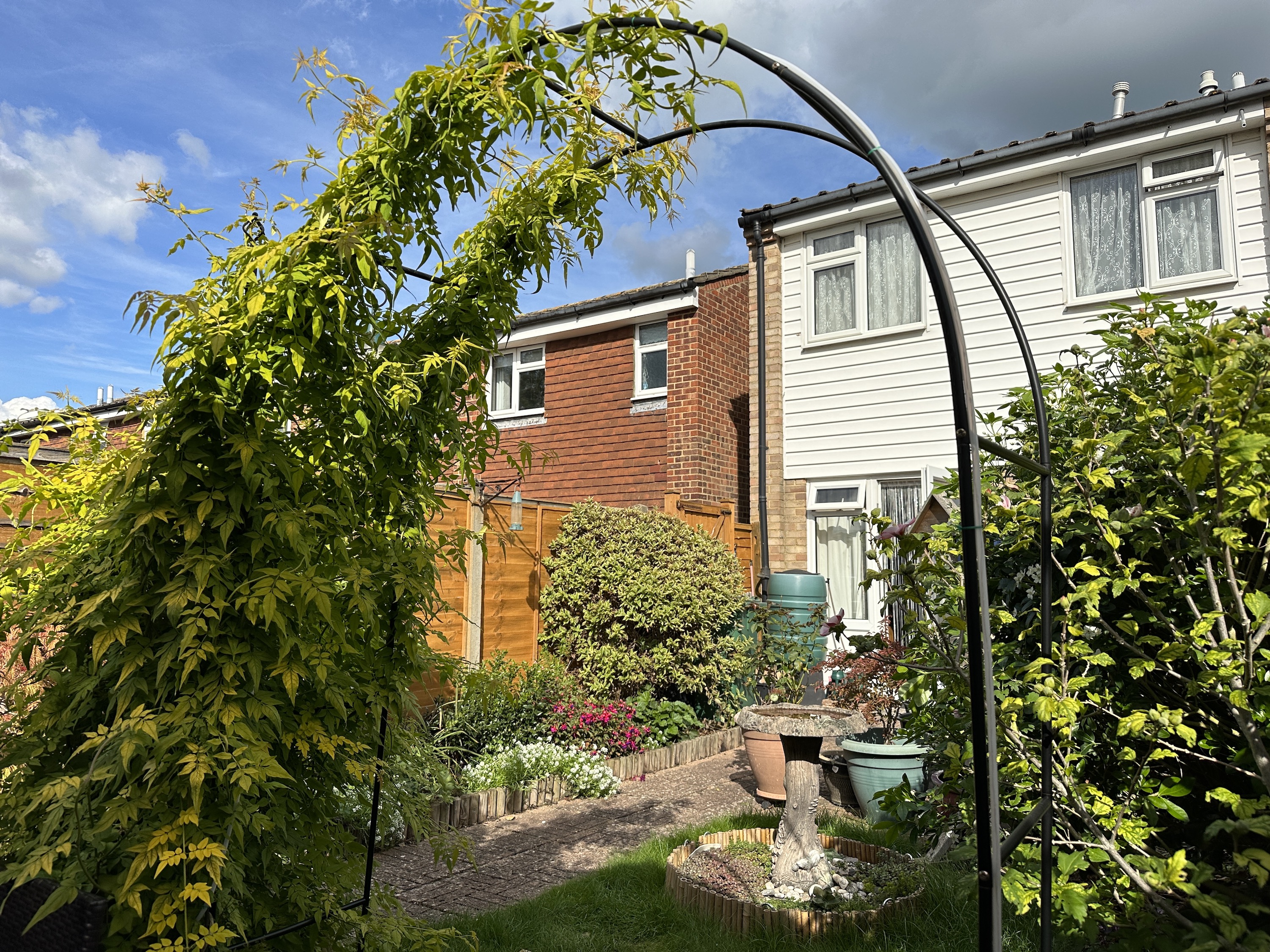
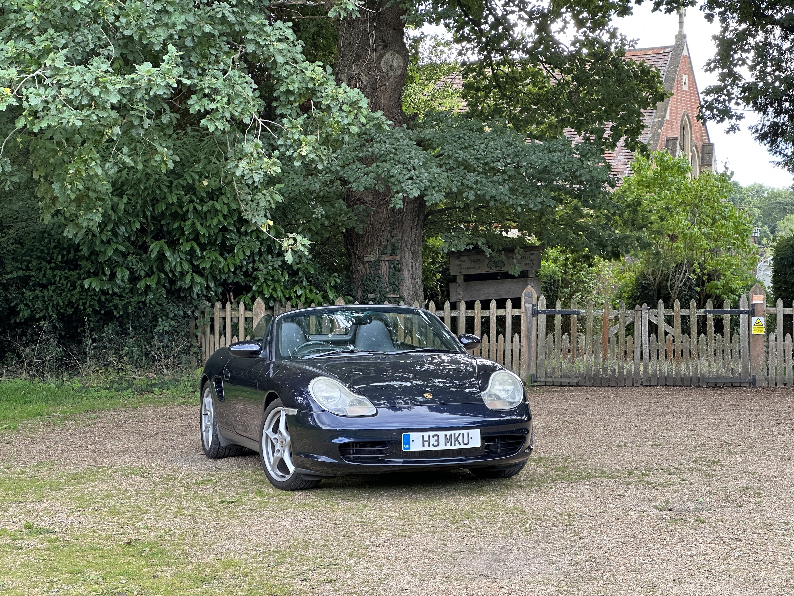
The iPhone 14 Pro’s camera is fantastic. It takes exciting and vibrant photos in the sun, detailed and balanced photos in the dark, and has more than enough versatility for me to experiment. There’s more technical expertise hidden inside than ever before and features that are beyond me right now but could prove useful and enjoyable in the future.
iPhone 14 Pro: battery and charging

The iPhone 14 Pro’s battery performance hasn’t been great, but there are signs of improvement. Initially, the battery was never going to last more than a day, and with moderately hard use (around three to four hours of screen time), it would be down to less than 30% by early evening — and that saw some anxiety start to creep in. Heavy use and a trip to the charger were necessary by this point. This was also mostly connected to Wi-Fi, and sometimes with no gaming — just GPS, camera, apps, a short amount of video, and a few hours of streaming music.
The battery life and charging technology are the least impressive aspects of the iPhone 14 Pro.
Since those dark, early days, the iPhone 14 Pro seems to have settled down into my own use patterns. While the battery isn’t going to suddenly last for two days, it has definitely improved. The arrival of iOS 16.0.2 may also have helped optimize the system. Although it’s not mentioned specifically as a benefit, the very first version of iOS 16 also dramatically cut the battery life on my iPhone 13 Pro — suggesting software may be a factor in the relatively poor battery performance.

Apple doesn’t supply a charger with the iPhone 14 Pro, but it does put a USB Type-C to Lightning cable in the box. If you own Apple’s 20-watt charging block, expect the battery to charge to 50% in about 30 minutes. I use Apple’s 29W charging block, and this takes it to full in just over an hour. It’s acceptable performance, but can’t match the fast charging times provided by the OnePlus 10T, or many phones from Oppo or Xiaomi. It is consistent with Samsung’s phones, though.
The battery life and charging technology are the least impressive aspects of the iPhone 14 Pro. Other brands, particularly some of those not sold in the U.S., have made significant advancements in fast-charging technology, and it’s reasonable to expect the majority of Android phones to last two days on a single charge with normal use. Apple falls behind this, and if you demand a lot from your phone, then be prepared to carry a battery pack or make emergency charging stops during the day to avoid any anxiety.
There is some anecdotal evidence from people testing beta versions of iOS that battery life has been further extended, and it’s something we will continue to monitor on the iPhone 14 Pro.
iPhone 14 Pro: a second opinion
I originally bought an iPhone 14 Pro on launch day because I was enamored by the Dynamic Island and the camera upgrade. However, after several months with the iPhone 14 Pro, I still love it, but for a different reason.
Though the Dynamic Island is fun and delightful, its usability is becoming stale. Apple brought the Live Activities API in iOS 16.1, which allows for a new notification style and Dynamic Island capabilities on the iPhone 14 Pro. There still aren’t too many app developers out there who have made use of the Dynamic Island for their apps, thus making the primary developer that utilizes the Dynamic Island still Apple itself. Sure, there are some fun examples of Dynamic Island with Pixel Pals, but for practical use cases, there just aren’t very many options out there that don’t come from Apple.
Though the iPhone 14 Pro brings a big camera upgrade with 48MP, it honestly doesn’t make too much of a difference if you came from an iPhone 13 Pro, like I did. Since the 48MP main camera uses pixel binning (four sub-pixels making up a single larger pixel), your photos will still appear to be 12MP in the metadata. However, you can shoot in full 48MP resolution in ProRAW format, which is excellent for total control in the post-editing process and gives you enough detail and resolution to print on large canvases. But let’s face it — this is a relatively small and niche use case, and most people won’t be shooting in ProRAW, especially since those are huge file sizes. For day-to-day photos, the 48MP main camera wasn’t enough to upgrade from a 13 Pro, though the 2x telephoto zoom is a good feature to bring back.
But the reason I still enjoy using my iPhone 14 Pro so much is because of the display — and not just the always-on functionality. Because the iPhone 14 Pro display reaches 2000 nits peak brightness outdoors, it’s possible to actually see your screen when outside in bright sunlight. It’s no longer hard to see the display when the sun is bearing down on your device, and it makes it much easier to take photos and video. Thanks to this improved display, I can actually use my iPhone outside without having to block the sun. Huzzah!
iPhone 14 Pro: price and availability
The basic iPhone 14 Pro with 128GB storage space costs $999, or 1,099 British pounds in the U.K. The price increases every time you add more storage space, right up to $1,499 or 1,429 pounds for the top 1TB version. All iPhone 14 Pro models are available to buy now through Apple’s online store and most networks in the U.S.
iPhone 14 Pro: verdict
One of my favorite things about the iPhone 14 Pro is how easy it is to live with, and this begins from the moment you get it out of the box. It doesn’t take long to set the phone up, and if you’re coming from another iPhone, Apple provides everything from extra temporary iCloud storage and fast account transfer to make it really simple. If you’re trading in your old iPhone, a little notification pops up that essentially automates the process required to get it ready to be sent back. It’s effortless and a great introduction to your new, expensive phone.
It goes far beyond those first moments. I use both AirPods Pro and AirPods Max, which connect instantly and have fantastic Bluetooth range, plus I can swap between different devices without any of them getting confused. I also regularly use Sony’s WH-1000XM3 headphones with the iPhone, and the accompanying app makes keeping it up to date simple, and the Bluetooth connection is equally as stable.
I’ve connected the Apple Watch SE 2 and the Apple Watch Ultra to the iPhone 14 Pro, and again, it’s very easy, and the connection absolutely flawless. My Oura Ring also connects without issue, and the app works very well. My podcasts download when I want them, Apple Pay is accepted everywhere, the choice of cases to protect the phone is enormous, and even resale value is typically stronger than any other device. There are also two new safety features: a car crash detection system that I have no intention of testing, and an emergency satellite calling feature that I can’t test because it’s not out until November. I hope to never need it.
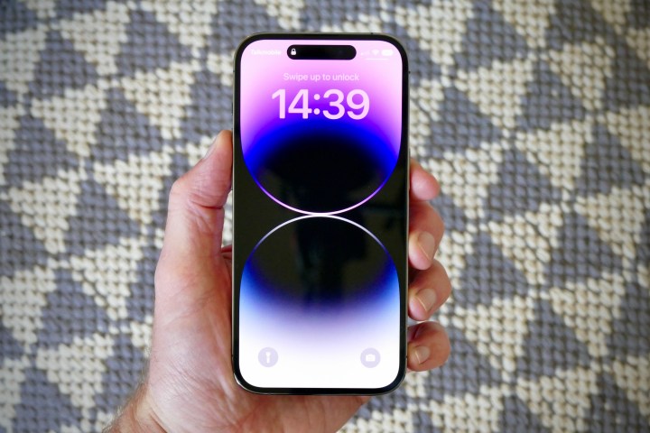
I don’t want the phone I own and use every day to be an effort. It’s one of the reasons needy software like Oppo’s ColorOS and OnePlus’s OxygenOS frustrates. The iPhone 14 Pro works with me, providing all the functionality and quality I expect from a phone that costs $1,000, plus a wealth of features that hide from view yet enhance my ownership, whether that’s the 120Hz ProMotion screen or crash detection.
This is what I want, far more so than any visual change for change’s sake, and the iPhone 14 Pro delivers it. Buy with confidence, and enjoy the very best smartphone ownership experience you can have. However, if you have an iPhone 13 Pro already, then there’s not much new here unless you’re really taken by the always-on screen and Dynamic Island, and it’s really the same story for anyone with an iPhone 12 Pro too. Anyone with an iPhone before the 12 will find it a considerable and worthwhile upgrade.


