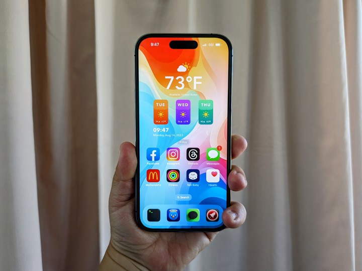
As September quickly approaches, that means the iPhone 15 launch is just on the horizon. But it also means that the iPhone 14 lineup has been out for almost a year now, and it’s been one heck of a ride.
The base model of the iPhone 14 did not change much from its predecessor, and the iPhone 13 mini replaced the iPhone 14 Plus, but the iPhone 14 Pro was where all the excitement was. Or, at least, that’s what I thought after watching last year’s keynote.
Let’s take a look back at the iPhone 14 Pro and why I’m still using it — despite the flaws.
It’s (almost) the perfect size
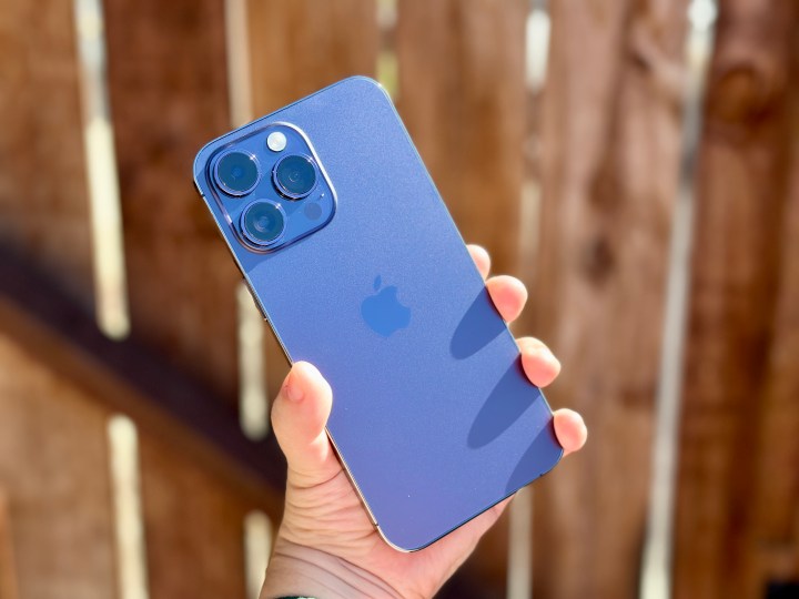
I’ve been playing around with more Android devices ever since joining Digital Trends, and for the most part, I love what you can do with Android. There’s no doubt that Android does a lot of things better than iOS, such as notifications, customization, user control of the hardware, and more. And there are definitely more apps available that you just won’t find on Apple’s App Store, such as emulators, for example.
But one thing that bothers me about a lot of Android devices is the simple fact that so many of them are just too damn big. The Galaxy S23 Ultra is one of the best phones out there if you want a great smartphone camera, but it’s massive with a 6.8-inch display. I love the looks of the Nothing Phone 2, but since the screen size is 6.7 inches, I have found it pretty difficult for me to use it comfortably, especially without a case.
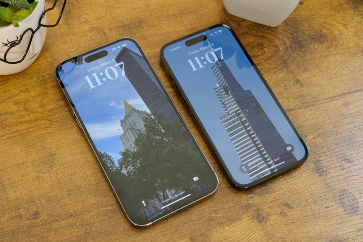
Though the iPhone 14 Pro is still a bit larger than I’d like at 6.1 inches (I personally think 5.8 inches is the perfect size), it’s still one of the smaller phones out there, and for me, that’s great. With the help of a PopSocket, I can manage one-handed use on the iPhone 14 Pro quite well, which I do more frequently than I’d like to admit. It’s still a bit heavier than I’d like, though, so I get hand cramps after extended use, but it’s better than larger phones, which are very hard for me to use comfortably.
Maybe one day, Apple could bring back the mini or go back to the 5.8-inch size, but until then, the 6.1-inch iPhone 14 Pro size works best for me.
The Dynamic Island is a mixed bag
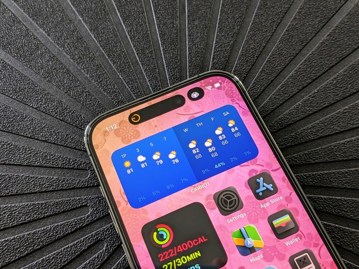
When Apple first announced the iPhone 14 Pro, one of the key selling points over the standard iPhone 14 models was the Dynamic Island. The elongated capsule cutout, which can change in size depending on the app you’re using and how you interact with it, is replacing the notch that has been around since the iPhone X. Rumor has it that the entire iPhone 15 lineup will have the Dynamic Island, fully eliminating the notch once and for all.
I never liked the notch since it was introduced, as I always thought it was ugly and took up more space than it should have. I like the Dynamic Island more than the notch, as it can house useful status indicators and also show fun little things like audio playback, timers, map directions, and a few other things.
However, though I mostly like the Dynamic Island, the most use I get out of it primarily comes from native Apple apps. I barely get any use out of the Dynamic Island from the third-party apps that I depend on daily, and that’s been disappointing.
With the Dynamic Island rumored to be coming to the entire iPhone 15 lineup, I hope that it will get more useful soon. Because right now, the Dynamic Island is still very limited — even a year later.
Apple needs to tone down its camera processing
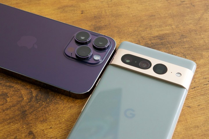
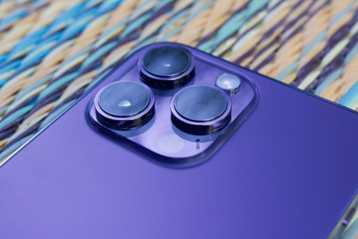
I still use my iPhone 14 Pro as my primary smartphone, but I’ve also tried out enough Android phones by now to realize that Apple isn’t the best anymore when it comes to photography. And that’s because of Apple’s overuse of computational photography processes to try and make your photos come out “better.”
Have you ever noticed when you snap a photo and then view it right away, that you’ll see how it looks as you captured it for a few seconds before it “corrects” itself for the final result? I’ve seen this happen plenty of times, and typically, the actual photo ends up looking worse than what I was seeing before those computational processes were applied.
Unfortunately, this “smart” auto-editing process can’t be turned off as it could with previous iPhones, so you just end up getting stuck with those images. The only way to avoid these oversharpened and processed images is to either shoot in ProRaw format or use a third-party camera app, such as Halide. But as someone who mostly uses the camera to capture a very active toddler, I don’t have time to go into an app like Halide and make sure all the settings are correct before I want to snap a photo.
I’ve used other phones to take photos of my daughter, such as the Google Pixel 7, and I love how the results turn out. They look natural, and though Google also uses a lot of AI for post-processing on its images, it does it much better than Apple.
I’m not saying that my iPhone 14 Pro takes terrible photos, especially of my daughter, but when I look at the results side by side, I often prefer what I get from a Google Pixel. The iPhone has been suffering from this overprocessing of photos since the iPhone 13, and it’s only been more apparent this year with the iPhone 14 series.
I hope Apple learns from the past two years and makes the iPhone 15 lineup not suffer from bad image quality again, or at least gives us the option to turn off all that computational stuff. The camera hardware is always great — it’s the software that ruins it.
Battery life has been abysmal

I’ve had every generation of iPhone since the original. I upgrade annually and preorder every year to get the latest and greatest on launch day. For the iPhone 14 Pro, that means I got it on September 16, 2022, and really began using it the following weekend.
When I first started using the iPhone 14 Pro, I remember the battery didn’t seem to last as long as the one in the iPhone 13 Pro I had, and that’s been the general consensus across the board. Through software updates, the battery life seemed to get better, and then worse, and then it repeats the process over — just like a roller coaster.

This prompted me to check my iPhone 14 Pro’s battery health, as I’ve been getting abysmal battery life lately on iOS 16.6. Turns out that it’s at 94% capacity, and again, we’re talking about a launch-day device that isn’t even a year old yet. When I say “abysmal,” I mean it seems to get to around 40% to 50% by 3 p.m. to 4 p.m., after being unplugged around 8 a.m. and being used pretty heavily throughout the day. It’s basically gotten to the point where I just plug it in around the middle of the day to make sure I don’t have a dead phone by dinnertime.
I’ve also noticed that the iPhone 14 Pro has been getting warmer more often, mainly when I’m playing games on my phone or just charging it via a cable or MagSafe. I’m sure it has something to do with the depreciating battery, and it’s another reminder of how disappointing battery life has become, even after just under a year of use.
It’s been a love-hate relationship with my iPhone 14 Pro
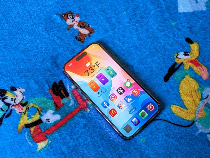
With the iPhone 15 set to be revealed next month, it’s a good time to take a look back and see how the iPhone 14 Pro I’ve been using as my daily driver has performed. It definitely hasn’t been perfect, but the iPhone 14 Pro has been mostly reliable, with a few shortcomings.
I’m hoping to see Apple improve some of these flaws with the iPhone 15 lineup, so I’ll keep my fingers crossed. But I’m also excited about some other things, like the new button replacing the mute toggle, USB-C (finally!), and even a possible titanium frame.
We only have a few more weeks to wait until the fall iPhone event, so here’s hoping!


