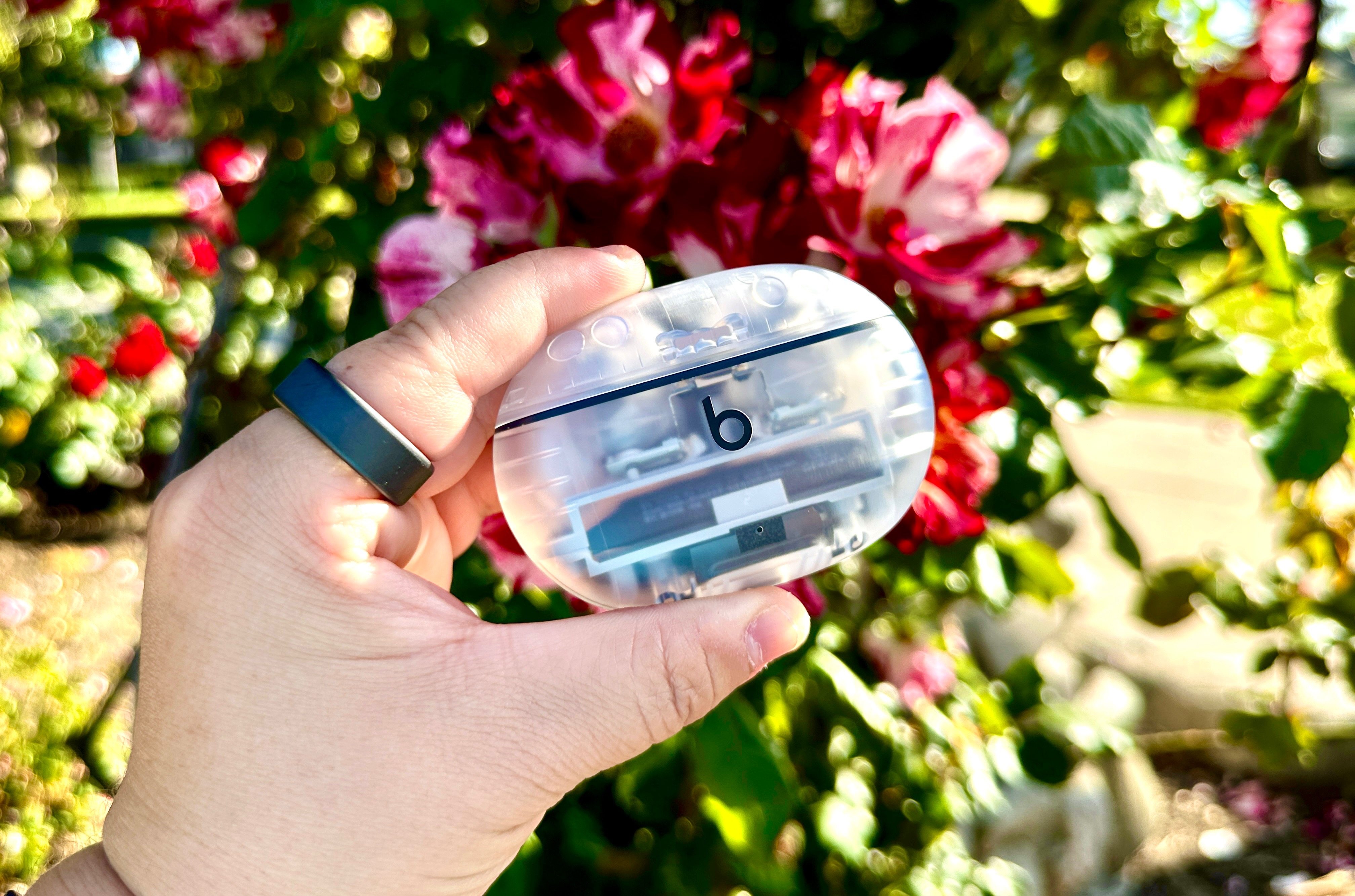
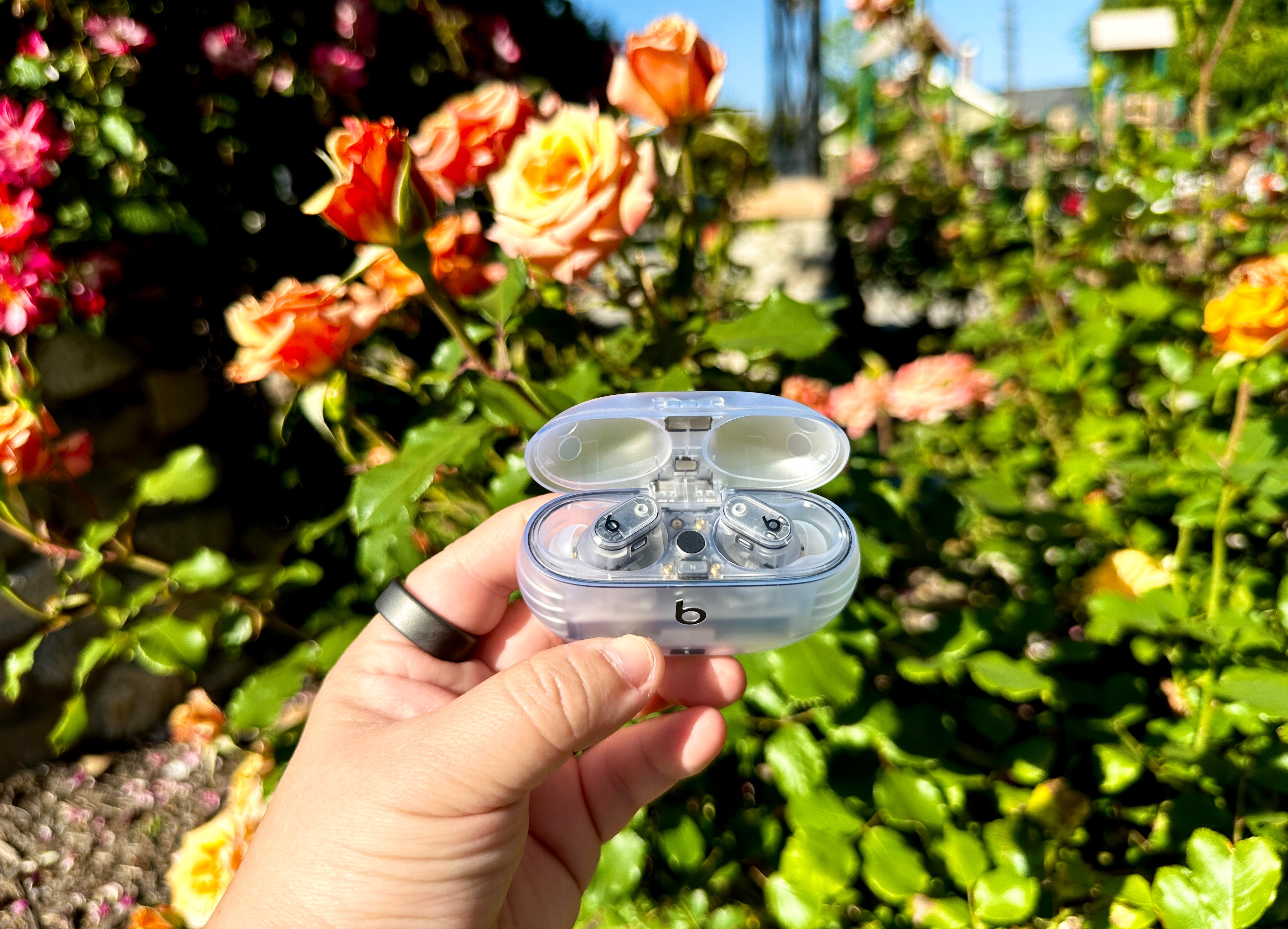
Apple has released a new product that’s gotten a lot of attention because of an awesome new color option. No, it’s not an iPhone, iPad, or even an Apple Watch. Heck, it’s not even the AirPods Pro 2. So, what am I talking about?
Apple acquired Beats by Dre in 2014, and this week, Beats dropped the new Beats Studio Buds+, which are pretty similar to the AirPods Pro 2, but cost less dough. And they come in one of the coolest colors I’ve seen in a long time: transparent.
I think the transparent option is one of the best-looking colors I’ve seen offered for any electronic device in years — and it begs the question: Why can’t Apple do something similar for the iPhone?
Bring back the age of transparent electronics
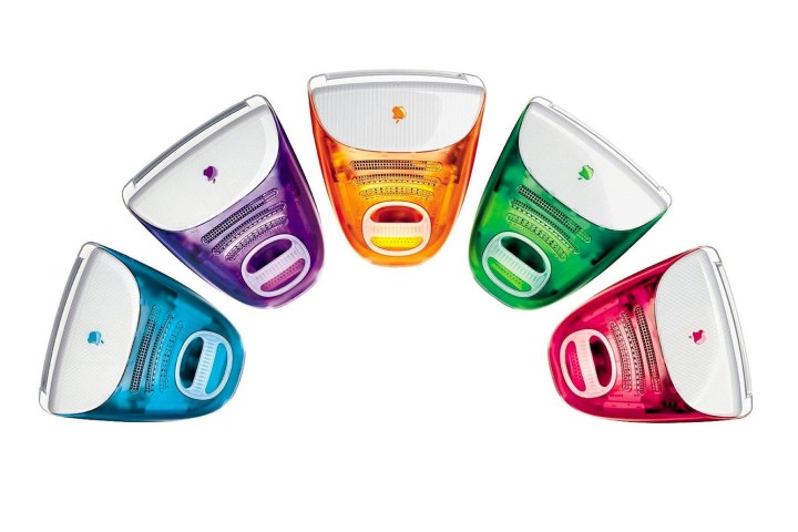
Transport yourself to 1999, back when Apple had the clear and colorful iMac computers. I didn’t have one myself, but I thought they were the coolest things ever — and wished I could afford one at the time. They were bold with the color variety, and being able to see all of the inner components through the clear plastic casing was, to me at the time, incredibly futuristic.
But the colorful and transparent iMacs were just one of many such products. The ’90s was the start of a fun era of vibrant and transparent electronics, from the transparent N64 variations to the handhelds like the Game Boy Color and Game Boy Advance. I think I had a transparent Game Boy Color, but I know for sure I had the transparent purple Game Boy Advance — and it was absolutely one of my favorite gadgets ever.
However, after the early 2000s, the craze of transparent electronics seemed to have evaporated, replaced by solid colors and metallic finishes. Every smartphone or tablet comes in some basic black or white color, with maybe one or two actual fun color variations, depending on what you’re looking at. And it’s typically the same situation for earbuds.
When I first bought a pair of Beats, the company was not yet under Apple. I thought they sounded a little bass-heavy, and the durability didn’t seem to be great (a wired set of earbuds stopped working after about a year). But I will admit that the Beats brand has always been quite creative with its color offerings, which is what I love about the transparent Beats Studio Buds+.
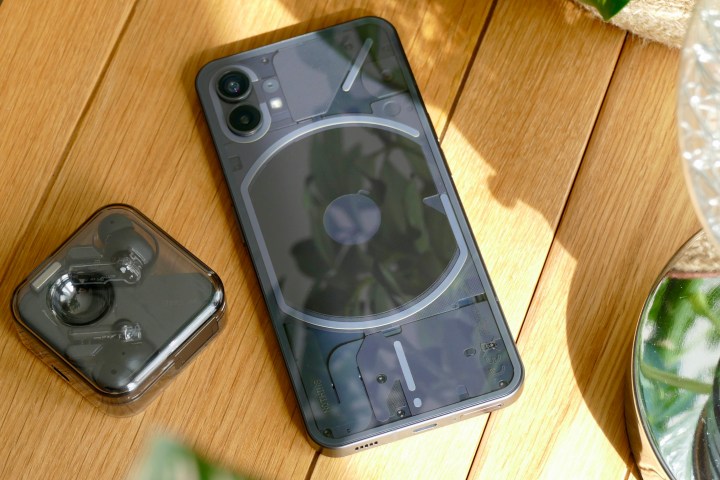
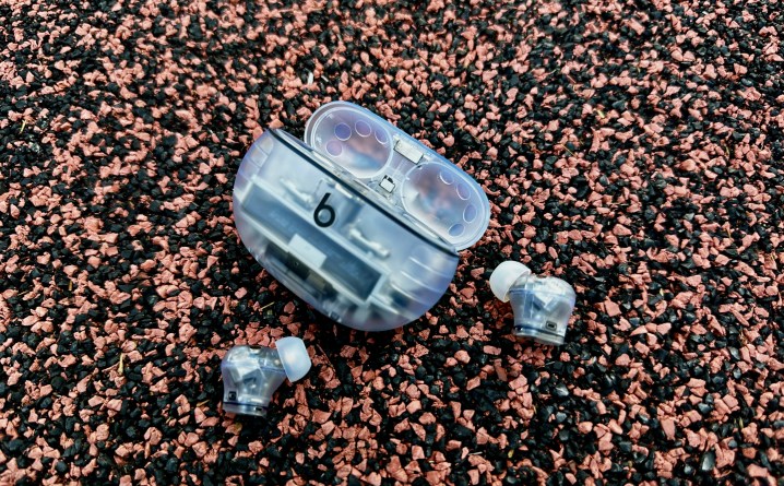
Beats isn’t the first company to step into the modern era of transparent earbuds — Nothing did it first with the Nothing Ear 1, and even on the mobile front with the Nothing Phone 1. But Beats takes it a further with the completely transparent charging case and even the earbuds themselves, so you can see all of the inner components that make things work.
It’s very nerdy and geeky, but I absolutely love that. Plus, seeing the innards of a device is cool enough that Spigen actually makes some sleek cases with a design that lets you take a peek into the device itself, like this recent Google Pixel 7a version.
I wish Apple would bring Beats’ creativity to the iPhone
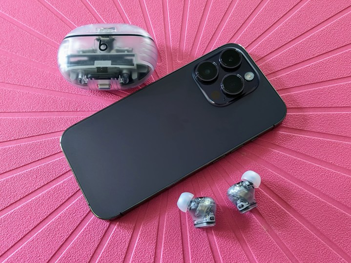
As much as I like Apple, one of the things that it seems to always get wrong is its colors — especially when it comes to the iPhone. I always go for the Pro models because I want the better cameras (though that’s ruined by overprocessing these days), but Apple seems to be under the impression that professional and fun don’t mix. All of the “fun” colors are reserved for the standard iPhone models, though sometimes it also gets those colors horribly wrong as well (just take a look at the “purple” iPhone 14, for example).
I wish Apple would take some pages from its own Beats subdivision and make actual good colors for its other products, specifically the iPhone Pro models. I was hyped for the Deep Purple iPhone 14 Pro that I have since I tend to pick up whatever the new exclusive color is (how else am I supposed to show off that it’s the newest model?), but I was slightly disappointed with it when I saw it in person. The actual metallic purple hue of the phone only properly shows up in the right lighting, which isn’t 100% of the time. Otherwise, it just looks like a dark gray with a purple tint to it.
The rumors for the iPhone 15 Pro is that it will show up in a dark metallic red color, and the standard iPhone 15 may be getting light pink and light blue shades. From renders floating around, the standard iPhone 15 once again looks to be getting the better colors, and I’m personally not as hyped up for a dark metallic wine-red color.
But how cool would it be to one day have an iPhone that’s transparent, letting you see all the inner components? I mean, it’s not impossible, seeing as how Nothing has done it with the Nothing Phone 1 — and the upcoming Nothing Phone 2 will be no different.
Apple’s color choices for the iPhone are growing stale and boring, and there needs to be some innovation on that front to breathe life into it again. Maybe a transparent iPhone will continue to be nothing but a pipe dream, but with Beats trying its hand at it with the Studio Buds+, it’s a dream that doesn’t feel quite as out of reach as it used to.
