“The Apple Watch is the best smartwatch we’ve used, and the first that feels friendly and has character. Watch OS 2.0 adds needed app and Siri abilities.”
- Unique communication methods make it special
- Attractive design in multiple sizes
- Notification taps are subtle
- Setup is a breeze
- Watch OS 2.0 fixes some app problems
- Third-party apps crash
- Software has a learning curve
- One-day battery life
Apple has done something rather special with the Apple Watch. It’s made the a piece of wearable tech that feels friendly and has a little bit of quirky character about it. Android Wear, the Pebble, and the many proprietary operating systems installed on other less well-known watches are workman-like and functional, but the Apple watch is fun. It’s not without its issues, but they’re not too bad. The effort to learn the interface feels worth it to us.
The world of wearable tech has been crying out for a product that engages people — Something that operates as a companion device to our phone, but also goes a step further. For Apple, that step was using it to connect people in unusual, fun ways. Is the Apple Watch the gadget that’s going to take wearable tech into the mainstream? Let’s find out in our updated review of the Watch with watchOS 2.0, released in Sept. 2015.
Updated on 9-22-2015 by Andy Boxall: Read below the Setup section to learn more about Watch OS 2.0 and how it has helped and hurt the Apple Watch experience.
Setup is easy, but you’ll need to crack open that user manual
Getting an Apple Watch and unboxing it is an occasion in itself — far more so than unboxing an iPhone or an iPad. The Watch Sport, for example, comes in an overly elaborate oblong box, with an embossed Watch logo on the front. There’s considerably more empty space inside than actual content, but it all adds to the drama. Buy a Watch Edition, and you get a smaller, but considerably plusher box, which doubles as a charging stand.
The Apple Watch could be one of the first pieces of tech that’s better with a friend.
Syncing the Apple Watch with your iPhone is an absolute breeze. Forget all that messing around with Bluetooth connections and pairing that you experienced with Android Wear or Pebble. Apple gets you to point the iPhone’s camera at the Watch, and that’s about it. You set everything else up in the app. The Apple Watch activates most of the notifications as standard, and it’s up to you to trim them down. However, the Watch doesn’t bombard you with notifications; it keeps things simple. It took less than 10 minutes to set up.
Here’s where the quirks begin. There are two main screens. The first is the app home screen that’s populated with colorful bubbles depicting your apps. It’s manipulated using the Digital Crown on the side of the Watch, or by pinching and swiping the touchscreen. It looks awesome, but it’s also a bit of a confusing mess, and almost impossible to navigate while you’re moving around. Forget trying to do anything when out for a run; it’s just too fiddly.
DT accessory pack:
42mm Classic Buckle Strap ($150)
If you’re looking for a more refined strap for your Apple Watch, try one of Apple’s fancier options, like the Classic Buckle.
42mm Leather Loop Strap ($150)
The Leather Loop strap has a magnetic closure, which is pretty cool, plus the leather offers a more elegant look than silicon.
Rest Composure charging dock ($64)
This wooden charging dock will give your Apple Watch a nice place to nestle down for the night while you charge it.
Apple Watch magnetic charging cable ($40)
Let’s face it — You’re going to lose your Apple Watch charger, so you might as well buy another one for back up.
The trick is to get rid of apps you won’t use. There is a real risk of stuffing the Apple Watch full of fun, but ultimately useless apps, but it ruins the experience. Slim it down, and apps are easier to pinpoint on the screen. You can also select the ones you use most often and put them in Glances, so they’re always easily accessible. To see Glances, simply swipe up from the bottom of the screen. Then you’ll see your main apps, and you’ll be able to swipe through them at will. For example, I’ve got weather, transit, music, and a few other apps in Glances.
The other main screen is the standard Watch face, and it’s the first time I’ve ever needed to watch an instructional video to find out how to change the face. I’m not a stupid person, but I just couldn’t work it out. Turns out, you have to press the screen harder than normal to see the alternatives.
This sets the tone for using the Apple Watch. It’s very different to the iPhone, and requires you to learn how it responds to touch, gestures, and the Digital Crown. It’s natural to feel lost, and there is a real learning curve. You’ll need to have patience, and prepare to take time to understand how it operates. The tutorial videos in the app certainly help, and the user guide Apple published not that long ago is invaluable. Yes, you should actually read the user manual for this device.
WatchOS 2 arrives, and promises plenty for the future
The Apple Watch received its first software update in late September. Does it change the entire Apple Watch experience, or is it more of the same, with a few tweaks for good measure? We’ve spent a short time with the software to find out.
WatchOS 2 certainly doesn’t refine or alter the Watch experience drastically, but it does go beyond only offering a few tweaks — although only just. Downloading and installing the new version gives the opposite impression, at first. It takes two hours to complete, but unlike the iPhone and iPad, there’s noting else to do once the software’s on the Watch. There’s no messing around with yes to this, and no to that.
The keypad to enter the PIN code has a new look, with larger square buttons instead of small rounded ones, but otherwise things look exactly the same as they did on Watch OS 1. There are a couple of new watch faces to play around with, including animated time-lapse pictures of various cities, but the option to add your own photos makes things more fun.
It’s just like adding wallpaper on your phone, except the Watch will look at whatever albums you’ve synced with it. It works best with Favorites, and if the picture is chosen carefully, you can give the Watch a very individual look. This, along with the horizontal watch face mode for use when it’s charging are the most obvious visual alterations.
Depending on your watch face of choice, one of the first things you’ll (probably accidentally) trigger in WatchOS 2 is Time Travel. It’s not actual time travel, though, so don’t get too excited. It’s Apple’s name for zipping through your calendar using the Digital Crown, showing future appointments and even what the weather will be like. It’s a good idea, but the Calendar app works just as well, and doesn’t require a particular watch face to be set.
Apps may get useful using WatchOS 2
Moving on, let’s take a look at what’s supposed to be a major upgrade with WatchOS 2: Speed. Using apps on the Apple Watch with the first software version was a pain, because the vast majority were too slow to be of any use. If and when they did open, you’d most likely just pulled out your phone anyway. How’re things now apps run on the watch itself, rather than via the phone?
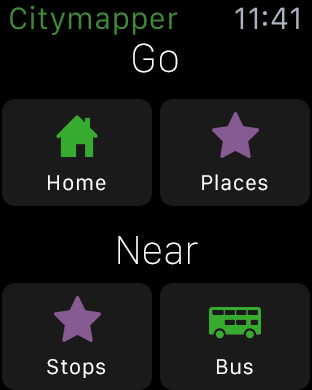
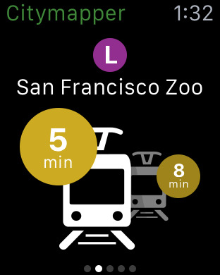
Sadly, it’s pretty similar at the moment, because there are so few apps updated to take advantage of WatchOS 2. Citymapper is ahead of the game, and provides what we hope is an indication of things to come. The app opens in the same amount of time it does on the phone, is well-designed and easy to navigate, therefore it works very well. If this is the future of using third-party apps on the Apple Watch, we’re very happy indeed.
Apple’s standard apps feel much the same, although Maps did come to life quicker than before. Any third-party apps that haven’t been updated are still the same, infuriating, dimwitted, often useless icons they were before. Even with the Watch set so the screen doesn’t sleep for 70 seconds, there still isn’t enough time for the WeChat app to open up. It does have enough time for it to crash, though.
Citymapper also has an unfortunately named Complication to test out as well. Complications are little widgets that can be added to certain watch faces, providing extra functionality. They should be called widgets. Complication is appropriate here because it does over-complicate the screen. If you like busy watch faces with lots of information, you’ll love them. Once developers are up to speed, they’ll inundate us with them. Personally, I’ll stick to apps and an uncomplicated watch face.
If this is the future of using third-party apps on the Apple Watch, we’re very happy indeed.
Siri’s responsiveness has also improved, but regardless of the fact she can now open apps, search, or pull up Glance views, you’re still left talking to your watch. It makes you look ridiculous, even more so than talking to Siri on your phone. But should you do it, then she’s faster, but still a little cloth-eared, and it sometimes take two or three tries to wake her up. It all comes down to wrist movement, because the screen has to be awake and on the watch face for her to start listening.
WatchOS 2 isn’t a reason to snap up an Apple Watch if you tried one out before and didn’t really find much use for it. The basics remain unchanged, and if notifications on your wrist weren’t enough then, don’t expect anything new here to change your mind. Just not yet. Over the next few months, apps for the Apple Watch should improve considerably, and if they can match the Citymapper experience, the Apple Watch is going to get a lot more useful — and really will mean your phone stays hidden away, while you work on your smartwatch.
It’s the little things that make Apple Watch special
Getting back to the watch itself, Notifications are the way it reaches out to you. When notifications start to arrive, the quality of the vibrating haptic alerts is immediately obvious. Yes, I said quality, because these go way beyond the irritating buzzes generated by other wearables. The Apple Watch taps you, gently but noticeably. The first few times you feel it, it actually makes you question what’s generating it. Maybe it’s Jony Ive’s disembodied finger that’s jutting out from under the aluminum body, you think. It’s almost uncanny.
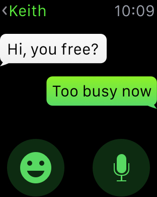
This is where the joy of communicating with the Apple Watch starts to come in. The alerts make you want to receive messages. It’s easy to reply using speech, and if you’re communicating with iMessage, they can be sent as audio messages. The Bluetooth range is good, and I was able to leave my phone on the second floor of my house, wander to the kitchen downstairs, and still reply to messages on the Watch. The dictation requires physical interaction to stop though, unlike Android Wear, which stops recording for you.
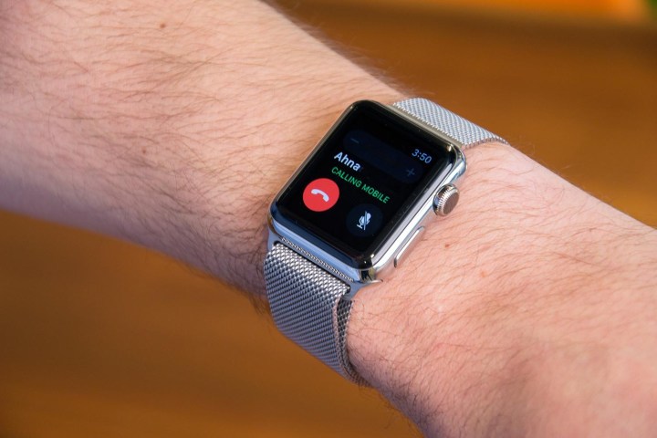
Press the button on the side of the Watch, and you get a list of your favorite contacts. Each can be called or messaged from here, plus if they own an Apple Watch, you get the chance to send personalized animated emoji, taps, hand drawn sketches, or your heartbeat.
It may sound frivolous, but the taps, drawings, and in particular, the heartbeat, are truly unique ways of communicating with close friends or loved ones. It’s enhanced by the Watch’s fantastic haptic feedback system, which adds real life to the heartbeat. For some people, this will be the Apple Watch’s killer feature, and only by getting someone else’s heartbeat on your wrist will you understand its potential.
Apple Pay also works flawlessly. With a double tap of the side button, our default card was brought up, and we were able to buy a cookie at Panera Bread in New York City. Not only were we able to walk out of the office with nothing but an iPhone and Apple Watch, but we also got to bask in the glory of the cashier’s excitement when the transaction went through.
1.5 day battery life
After using the watch for an extended period of time, it gets almost two days of regular battery life. On a regular day, we end with about 40 percent battery life. The watch does drain the juice out of our phone quicker than normal. Owners of the iPhone 6 Plus will be fine, but those using an iPhone 6 (or the new iPhone 6S) will feel the pain of lower battery life. The Apple Watch drained our iPhone 6 as much as 30 percent more each day.
Just get the Sport — Don’t waste your money on the Edition
After an hour out and about wearing the Watch to test navigation and fitness tracking, it did get a little sweaty under the strap and body of the Watch Sport. Not uncomfortably so, but taking it off and letting things breathe for a moment helped. The Apple Watch is very light — even more so for the 38mm model — and otherwise very comfortable to wear. The Watch Sport may be the cheapest in the range, but it does everything its more expensive sister Watch models do, and there’s really no need to pay more.
The gold Apple Watch Edition is absolutely, positively, not worth it at all. Here’s what you get that’s different from the versions that cost a tenth of that price: A real gold body, a rather nice box, and a sizeable hole in your bank account. The Watch functions in exactly the same manner as the other models, and the straps are also identical. Yes, if you buy a Watch Edition with a Sport strap, that’s the same one fitted to the model that costs $350.
Paying $17,000 for an Apple Watch makes no sense. If you’ve got exactly that amount in your bank account, ready to blow it all, please think two, three, or four times before ordering a Watch Edition. It’s a toy for people who spend $17,000 like most of us buy a $5 coffee. After trying on the Watch Edition at Selfridges in London, I visited Watches of Switzerland, a retailer that sells many expensive timepieces, to see what else I could get for my imaginary thousands.
While chatting to a salesperson, a customer overheard my conversation and asked if I had tried out the Watch Edition. He had too, so I asked whether he liked it. He called it “exquisite,” and lavished it with praise about the build, feel, and its ability. I asked if he tried the Watch Sport. He sneered and said it was “rubbish.” He was about to go into a private room to try out a few watches.
If you have an ounce of sense, you’ll buy the Apple Watch Sport and be very, very happy indeed.
Maybe I’m not as refined (read rich) as this gentleman, but to my wrist, the only difference I could feel between the Watch Sport and the Watch Edition was the latter is quite a bit heavier. If that’s good enough for another $16,500, then go for it. If you’ve got an ounce of sense, you’ll buy a Sport and be very, very happy indeed.
Additionally, if you’re a woman with small-to-average wrists, Apple is the only manufacturer that makes a smartwatch that will fit your wrist. We’ve tried nearly every Android Wear smartwatch, every Pebble, and alternative smartwatch, and none of them have fit on a woman’s wrist – except the Apple Watch. The 38mm size is a game changer. It makes the Apple Watch the very first smartwatch that’s appealing to women, and those with petite wrists.
Conclusion
A few months into its release, it’s still difficult to say whether the Apple Watch is going to break into the mainstream. It’s also too early to say whether our initial warmth toward it is because it’s new and fun. Only more time spent with the new Watch OS will tell if the sheen will wear off, and other issues will arise. We’ll update regularly, but for now, if you’re even slightly tempted by an Apple Watch, make the effort to try one out. We think you’re going to like it.
Highs:
- Unique communication methods make it special
- Attractive design in multiple sizes
- Notification taps are subtle
- Setup is a breeze
- Watch OS 2.0 fixes some app problems
Lows:
- Third-party apps crash
- Software has a learning curve
- One-day battery life


