We’re fast approaching Apple’s WWDC on June 5, where we will not only get a glimpse of what’s to come in Apple product software updates but possibly a look at the hyped-up mixed reality headset. But even if you aren’t interested in the AR/VR stuff, Apple will still be showing iOS/iPadOS 17, watchOS 10, and macOS 14 too.
This year has also had a lot of back and forth going on in the rumor mill, with Bloomberg’s Mark Gurman saying that iOS 17 may be a quiet release this year, then later saying it may be big by bringing highly requested user features. He also claimed that while the Apple Watch itself may have more modest hardware upgrades this year, there may be more focus on the software front with watchOS 10 instead.

It’s been relatively quiet on what we may actually see on the software side of things, but that hasn’t stopped the community from coming up with renders of what they think will be coming.
One concept from Twitter user Parker Ortolani is particularly interesting, as it reimagines the home screen on the Apple Watch in a fresh, new way.
What if watchOS deemphasized launching apps and introduced a new more customizable home screen with widgets and live activities, a fresh take on the glances and dock ideas… pic.twitter.com/EsSt5vOPQw
— Parker Ortolani (@ParkerOrtolani) April 9, 2023
Instead of making watchOS so focused on individual apps, Ortolani imagines what watchOS would look like if it had widgets, Live Activities, and far greater home screen customization. It’s a fascinating idea, and it’s one that might just work.
Is it time for a watchOS revamp?

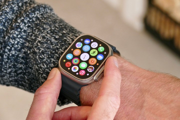
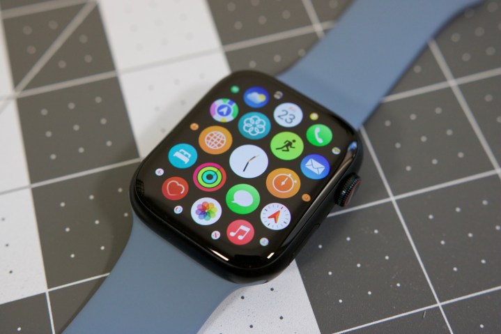
Ever since the original Apple Watch (Series 0, as it was dubbed afterward), it has had the same home screen layout: a bunch of small app icons arranged in a grid. Though you can move the icons around and make some creative grid layouts, the process is tedious and cumbersome. Plus, since none of the icons are labeled with the app names, it can be a bit of a mess to find the app you want, especially if you just don’t bother rearranging the icons where you want them.
I’m personally not a fan of the Apple Watch home screen, so I actually changed the app view from that annoying grid to a “list” style view, which is much better (on your Watch, go to Settings > App View > List View). Everything is in alphabetical order, so while it’s not the perfect system if you have a lot of apps (lots of scrolling), it is easier to quickly find exactly what you need.

Both of these methods are far from perfect. That’s what makes Ortolani’s concept a breath of fresh air. It’s a mashup of apps, widgets, and even Live Activities. This kind of home screen layout takes the focus away from just launching apps and replaces it with real-time information on the home screen. No, this doesn’t look like it will replace your favorite Apple Watch watch face — it’s just what you’ll see when you press the Digital Crown to view the home screen/app drawer.
According to Gurman’s last claim, watchOS 10 could be a “fairly extensive upgrade with notable changes to the user interface.” I don’t think it would be too big of a stretch to see some kind of change made to the home screen or app view. Apple did make huge changes to the iPhone home screen with iOS 14 and even shook up the lock screen with iOS 16, so it’s not impossible.
There’s just one problem with this concept

While I think the concept looks great and would be a welcome change to what we currently have on watchOS, there is one problem with it: that’s a lot of scrolling.
I suppose this would also depend on how many apps, widgets, and Live Activities you put on the home screen or have installed on your Apple Watch. But if you have a lot, then this would just mean you’d have to scroll more to see specific bits of information. This may not be as much of a problem if you have an Apple Watch Ultra since it has a large display at 49mm, but for smaller displays (I still use a 40mm Series 5!), it may be more annoying to scroll through.
Of course, there’s no guarantee that Apple will even use the format from this concept if it even changes up the home screen on the Apple Watch at all. But if Apple does, I hope that it still takes older Apple Watch models with smaller displays into consideration. You know, so I don’t need to turn my Digital Crown a million times just to see the weather or check when my food is going to arrive.


