“Its tasteful design and thrifty price (for an Android Wear smartwatch) may turn heads, but Asus’ first Android Wear watch disappoints with an uncomfortable wristband and inconvenient sensor placement.”
- Good price
- Handsome design
- Solid charging cradle
- Good battery life
- Uncomfortable clasp
- Redundant software
- Dim screen
- Inaccurate heart rate monitor
If it had debuted soon after the unveiling of Android Wear after last year’s Google I/O, the ZenWatch might have commanded more attention. It would have stood out in a field of by rubbery, plastic, and very clearly first-generation products (I’m looking at you, LG G Watch). Since then, the competition hasn’t just heated up, it has exploded.
From the G Watch R to the Moto 360, we’re seeing ever more comfortable and stylish smartwatches. From a specifications standpoint, the Huawei Watch – which squeezes sapphire glass and the highest-resolution smartwatch screen yet into an impressively small package – seems to warrant consideration. Plus, the recently announced collaboration between Google, Intel, and Tag Heuer promises to take Android Wear to luxuriant new heights.
That’s not to say the ZenWatch is completely unremarkable by comparison, but the niche within the Android Wear niche it occupies – square smartwatches – is one that feels like old hat. After wearing a Moto 360 for nearly six months, I can safely say that circular screens are more than a novelty. Something about them just feels futuristic, whether it’s how cleverly the classic timepiece form factor has been adapted or how great analog watch faces look on them. Whatever the reason, the ZenWatch in contrast just seems… plainer.
Attractive, lightweight and solidly built
But mundanity isn’t necessarily a bad thing for a device that’s intended to be worn in many different social settings. The ZenWatch’s enclosure, a two-toned sandwiching of materials – a metal band of “rose gold” (Asus’s term) ensconced by stainless steel on either side – inoffensively pairs with dress both casual and bespoke. Most notable about the smartwatch’s body, though, is its sturdiness – it feels vastly more durable than the similarly metallic Samsung’s Gear Live, my closest point of reference. Despite that solidity, though, the ZenWatch is pleasingly light on the wrist, something I certainly can’t say about the tank-of-a-watch Moto 360.
Both of the front and back are relatively unadorned. The screen rests in the center of an oversized bezel which curves around each of its four corners. Curves, in fact, seem to have been a guiding design principle behind the ZenWatch’s design: every border is an ever-so-rounded one. The effect is very pleasant.
The ZenWatch’s underside continues the minimalist trend. Embedded within it are five pogo charging connectors, four retaining screws, a tiny cutout for the microphone, and a flush power button. Unlike other Android Wear watches, there’s no blinking heart rate monitor to be found – it’s integrated into the front bezel. The end result – a clean, flowing aesthetic – befits the watch’s namesake.
Clasp annoys, but the charger pleases
The leather band that ships with the ZenWatch is, like the body, constructed well. Colored a neutral tan, its stiffness and exposed stitching may not quite evoke the luxury brands Asus is clearly attempting to emulate, but it comes closer than others. The band secures around the wrist using an adjustable metal deployment clasp, which nicely complements the watch enclosure’s styling. Unfortunately, the clasp’s function is worse than its form: it peaks the bottom of the band, making it uncomfortably tight. I didn’t find it bothersome enough to swap out – a process made easy by the ZenWatch’s 22mm quick release bars – but it was a definite annoyance, especially when typing.
Unfortunately, the clasp’s function is worse than its form.
The bundled charging accessory is worth mentioning. However, its not for the design, but for how profoundly superior it is to the notoriously flimsy Gear Live cradle. The ZenWatch charger sadly isn’t wireless – it clips onto the watch – but is firm, coated with soft-touch plastic, and easily removable. Because I’m prone to semi-frequently dropping expensive devices, the watch fits very snuggly when secured, giving me some peace of mind. Take note, Samsung.
AMOLED screen performs well, and battery outlasts the competition
Even if you’ve never used an Android Wear device before, it’ll probably come as no surprise that interactions primarily take place on the touchscreen. The ZenWatch is about average on that front – its 1.63-inch, 320×320 resolution display is par for the course, and just about matches the Gear Live and Sony SmartWatch 3. Powering the screen is hardware adherent to the unspoken formula established by Android Wear’s debut devices, the G Watch and Gear Live: a 1.2Ghz Snapdragon 400 processor with three of four cores disabled, 512MB of RAM, and 4GB of storage.
The screen exemplifies the very best and worst AMOLED traits: colorful but dim. Indoors, Android Wear’s many colorful backdrops really pop, but seeing them in direct sunlight is pretty much impossible on the default brightness (P-OLED it is certainly not). Bumping the setting up helps, but comes at the cost of accelerated battery drain.
Otherwise, the display performs well. Unlike the Gear Live, it’s appropriately sensitive to touch looks great in Android Wear’s black-and-white, and is minimally reflective. It’s just a shame Asus couldn’t cram an ambient brightness sensor in the ZenWatch, but the heart rate monitor’s odd placement presumably made that impossible.
I mentioned battery, and I’m happy to report it’s quite good. Even after an active work day and a half hour of installing and uninstalling apps, the indicator read close to 50% when I plugged it in to charge the first night. That’s better than my Moto 360, which even after a series of battery-focused updates still sometimes falls short of a full day.
I’d be remiss if I didn’t mention the vibration, which is the strongest I’ve encountered on a smartwatch – easily more noticeable than the Gear Live and Moto 360’s motors. If you’re worried about missing notifications, you needn’t be – for better or worse, you won’t be able to ignore the ZenWatch’s buzzing.
Android Wear gets a few modifications
Android Wear hasn’t changed dramatically since it launch, so there isn’t much new to report on the vanilla software front. But for the uninitiated, Android Wear performs a few functions out of the box. It’ll present you with actionable notifications from a paired smartphone, and let you dismiss those notifications when you’re finished with them. It’ll sync cards from Google Now, including weather, commute time, flight information, and nearby entertainment. It’ll let you do a number of things with your voice, including a Google search, deal with messages, and set reminders. The list continues with customizable watch faces, fitness tracking, heart rate monitoring, and GPS on compatible devices.
Google limits the degree to which vendors can customize Android Wear, but Asus has worked around that restriction by creating a small catalog of apps for the ZenWatch. The ZenWatch Manager, the device’s companion Android app, recommends no fewer than three Asus-made, ZenWatch-exclusive apps: ZenWatch Wellness, ZenWatch Camera, and ZenWatch Music.
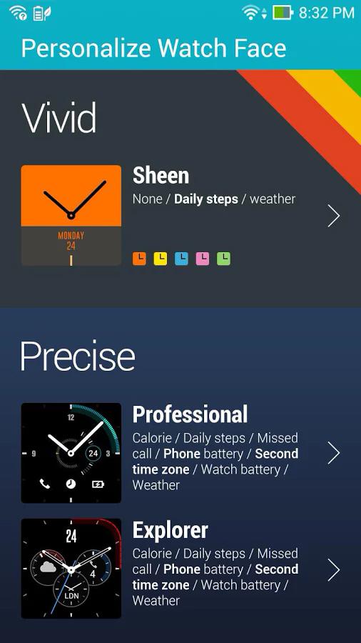
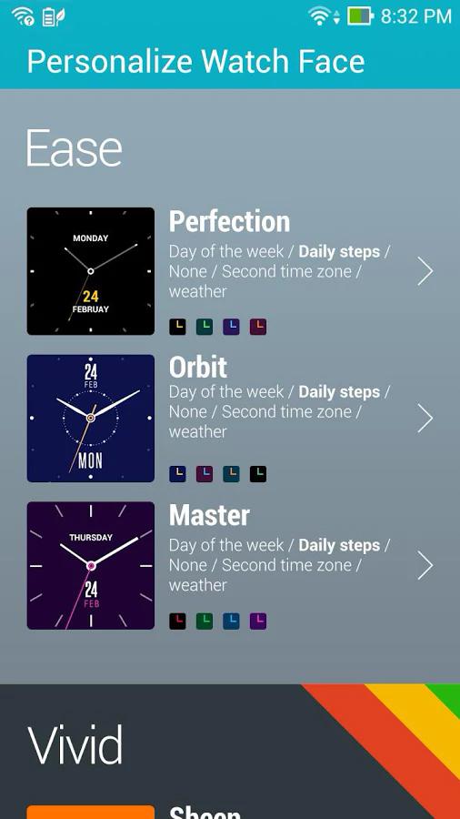
Think of ZenWatch Manager as a software hub for the ZenWatch. It can perform simple tasks like customizing the colors of pre-installed watch faces, reporting battery life, find a lost watch, and alert you when the connected phone is out of range. It has tools like a compass and a fun flashlight, where a selectable solid color lights up the ZenWatch’s screen. It’ll also recommend a mixed bag of other apps that are compatible with the ZenWatch.
Heart rate measurements were all over the place.
ZenWatch Wellness is a much more holistic alternative to the default Google Fit app. It’ll record and graph your steps, calories, and exercise intensity over time, but also attempt to infer your “relaxation” level from simple vitals like heart rate. At least, that’s what it’s supposed to do; owing mostly, I think, to the unfortunate placement of the heart rate monitor, I was never able to get a “Zen” reading. And heart rate measurements were all over the place – 144 beats per minute after a very sedentary morning, which I find suspect. Despite those glitches, the app has thoughtful inclusions like a “Remind me to move” function and granular controls for location tracking. I wish it synced with Google Fit – it’d be nice to have my fitness data viewable on a single dashboard rather than spread out across multiple services – but that’s my only real complaint. ZenWatch Wellness is quite cohesive.
Less cohesive are ZenWatch Camera and ZenWatch Music. Why Asus felt the need to duplicate default apps is unclear; all Android Wear watches ship with a remote viewfinder and music controls. Even more perplexing is the fact that neither offer functionality found outside the Google equivalents. The cynic in me thinks the offerings were an ill-conceived attempt to rope ZenWatch users into the Asus ecosystem, but perhaps future updates will make the apps more compelling. Right now, though, both are redundant.
It’s not perfect, but it is affordable
If there’s one word I’d use to describe the ZenWatch, it’d be “imperfect.” The design is beautiful, but imperfect, because the band isn’t as comfortable as it should be. The software is good, but imperfect, due to the short fall of Asus’s bundled software and unreliable heart rate monitoring.
Even at its $199 asking price, which is affordable for Android Wear, I can’t quite recommend Asus’s first attempt at a smartwatch. Its better qualities just aren’t enough to redeem it. I went in with an open mind, but my experience throughout the testing period has been one of yearning to swap the ZenWatch for my Moto 360. That, I think, says plenty.
Highs
- Good price
- Handsome design
- Solid charging cradle
- Good battery life
Low
- Uncomfortable clasp
- Redundant software
- Dim screen
- Inaccurate heart rate monitor


