Android’s home screen is full of colorful app icons, useful widgets and even trance-inducing animated backgrounds, but it still works the same way interfaces have since the 1990s: You need to customize it yourself. We adapt to the home screen, rather than it adapting to us. This is where Aviate comes in. Founded by three ex-Googlers and a good number of other smart people, it’s an “intelligent home screen that simplifies your phone,” and it does it without your help.
Aviate opened a private alpha test in July, and thanks to some attention from Reddit, it has already amassed 70,000 users. It’s private beta test begins today. Every current member will get five invites to send to friends, and because we love ya so much, we got our hands on 500 invites to give away to you guys. Check it out here on the Google Play Store and enter the code “DTRENDS” when you’re in the app to get in. It works on Android 2.3 devices (and above).
I got the chance to interview two members of the team and try out the new beta version for the weekend.
Putting your home screen on autopilot

“We’ve found that people’s home screens are cluttered and it’s always on the user to organize and clean it up,” Aviate’s Mark Daiss told us. “What we’re trying to do here is simplify it all.” Daiss formerly founded Pupil, an image-based Q&A app.
Instead of having a list of apps and a bunch of blank home screens, Aviate divvies up your home screen into contextually aware, customizable “spaces” and intelligently organizes all your apps into Collections. There are no settings to tweak (unless you want). You install it from the Google Play Store, tell Google that you’d like to “always” use it as your default “launcher,” and watch as your home screen morphs into something new. All of your apps work fine, and your old home screen isn’t erased; but you may not need it anymore.
Organizing your apps for you
With zero input from you, Aviate intelligently organizes every program on your phone. When you first install it, Aviate picks half a dozen categories to display based on the apps you have installed and creates rows of apps for you. These are essentially extra-wide folders. You can drag and drop whatever apps you want into them, and Aviate will suggest new apps based on what other Aviate users have downloaded and use regularly. On our phone, it bundled Twitter, Hangouts, Instagram, and other apps into a Social category, and made rows for Music, News, Games, Finance, and “Going Somewhere,” which is filled with navigation and travel apps. There are 22 categories to choose from, and they cover everything I can think of. You can hold down on a category to move it up or down the list, or remove it entirely. A full “A-Z Apps” list lets you see everything in one spot.
“On Androids there are pages and pages of home screens with apps and widgets everywhere,” said Daiss. “What we wanted to do is auto categorize your apps into collections and condense your home screen into a few concise screens. Then we wanted to add context.”
There are many ways Aviate adds context, and most of them are still in their infancy. Aviate pays attention to where you are when you use apps, and what time it is. After a couple days, it auto populated “Night Time” and “Morning Routine” categories for me, based on the apps I use when I get up, like Gmail, and what I open at night, which are usually apps like Netflix.
A home screen for every place and time
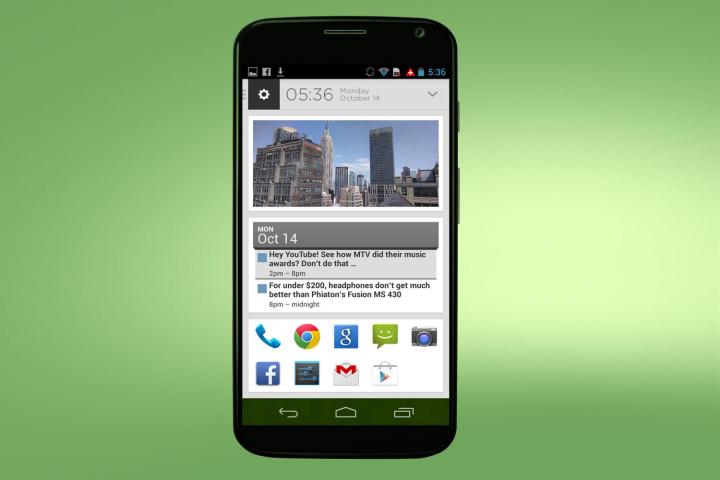
Collections are neat, but the main page, which is called “Spaces,” is where Aviate sets itself apart. It looks simple. There are 10 spots at the bottom for your most-used apps, a big picture in the middle, which you can change by holding on it, and a clock up top. But in the upper left is where the magic is. Right now, the upper left of my phone shows a House (because I’m at home) and a sunrise because it’s the morning. If I pull down on the picture on the main page, it will bring up a calendar, the weather, a button to set my alarm, a Do Not Disturb button, and my Morning Routine apps. I can add or delete more widgets as I please. Aviate is compatible with any widget installed on the phone.
Aviate also changes its home screen depending on where and when you are (context). When you leave for work, your Aviate home screen Space turns green for “Going Somewhere” and if you pull down on it, you can easily access your navigation apps, check traffic in Google maps, and navigate to Home or Work with the push of a single button. When you get to work, Aviate automatically switches my Space from green to blue, noting that you’re at the Office. My Work Space has work apps, a button to add a new event to my Google Calendar, and a button to send an email.
It’s not all just Work and Home, though. If you go to a flea market, for example, your Space will change to a shopping icon. Pull down the menu and shopping apps, a blank Tweet with the establishment’s Twitter handle, and some tips from Foursquare users pop up. On any location page, there are buttons to open the camera, check in, and post. These buttons are map-able to any app you want. If you are a student and show up at school, your Space would turn red and pull down information that you might want when in a “college or academic building.” Restaurants have their own pages, too. You can customize and populate every type of Space you go to, if you are the picky type.
In the future, Aviate will add more context and present you with apps and actions you want in the moment.
“There are a lot of other contextual clues that we’re moving forward with,” said Daiss. “For example, when someone plugs in headphones that means they want to listen to music. We could also take advantage of patterns with texting or email.”
Aviate loves all apps
The best part about Aviate is that, unlike other home-screen replacements like Facebook Home, it isn’t trying to push its own services. It only wants to serve you with whatever apps help you most, said Aviate co-founder Paul Montoy-Wilson, formerly a Project Manager for the Google Play Store. “Facebook Home is a great example of a application where they rethought the user experience but they clearly focused on the Facebook application, but at Aviate we think people want to be connected on all of their apps and content.”

“The vision of what we’re doing is similar to Google now in a lot of ways,” said Montoy-Wilson. “What Google Now is trying to do is within Google’s walled garden. We think it’s both an intelligence problem and an entire user experience rethink problem.”
Aviate, he said, is a complete rethink of the home screen, while Google Now is just another addition. In the future, Aviate may add voice features of its own.
A good option for any Android
After using Aviate on a small tablet (it’s currently only supposed to be used on phones) for a few days, I began using it on my Moto X as well. I don’t want to go back. It’s still in Beta, will occasionally crash, and has plenty of features that aren’t present yet, but it’s already more pleasant than almost any other Android interface I’ve used. Switching to Aviate is a little like the switch from MySpace to Facebook back in the day. MySpace let you customize your page to death, but it never worked well and looked like hell. Facebook limited visual customization, but was far more organized. Aviate is a lot better looking than Facebook has ever been, and it works seamlessly with your phone, whether it’s an HTC, Samsung, Motorola, Nexus, LG, or Alcatel One Touch.
Now all I can hope is that it will add profiles, so I can take my Aviate home screen from phone to phone. Now I just I feel bad for Apple users. Though Apple’s interface is already slick and smooth, Aviate would help users save time and make life more enjoyable. Too bad Apple doesn’t allow home screen modifications, and likely won’t anytime soon.


