“Excellent battery life, wonderful call quality, and of course that keypad make the new Blackberry an easy choice -- for some people, anyway.”
- Quality and durable build
- Keyboard and trackpad are vintage BlackBerry
- Better screen than predecessor
- BlackBerry Assistant continues improving
- Excellent battery life and call quality
- Trackpad not as useful as in past years
- Some Android apps are missing
- Specs a little dated
- Camera good, but not great
It’s not uncommon for a beleaguered company to go back to its roots to reorient itself, and no product exemplifies that paradigm better than the Blackberry Classic. This is vintage stuff, harkening back to an era where QWERTY keyboards were the norm and the tech world zealously got high on Crackberry handsets, thumbs flapping away.
BlackBerry hasn’t been shy in suggesting that the Classic can bring those users back, but is the inclusion of an old-school trackpad — one few things that separates the Classic from a Q10 — that much of a draw? We took a short trip through a time warp to find out.
Hands on video
Classic BlackBerry
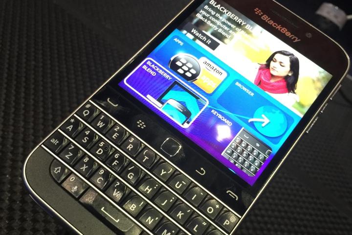
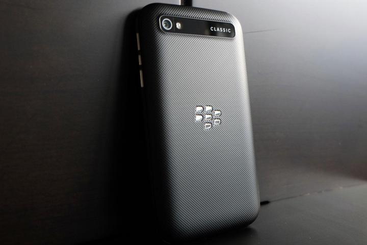
A quick glance at the Classic elicits memories of devices past. This is a BlackBerry hardware cocktail, with the key ingredients coming from the Bold 9900, Q10, and various other Bolds and Curves from the past. In spite of the throwback design, the build quality is superb. A stainless steel ring lines the edges of the phone, fusing together a rubberized and textured back with a 3.5-inch, 720 × 720 IPS display, a toolbar, and a QWERTY keyboard.
A quick glance at the Classic elicits memories of past devices.
On the right side, you have the volume rockers and BlackBerry Assistant button. The 3.5mm headphone jack is at the top, and the nanoSIM and microSD slots are on the left. The speaker grills and microUSB port are at the bottom, while the camera and LED flash are on the back.
One of the more obvious design cues here is the weight. This phone is slightly heavier than the iPhone 6 Plus and practically the same as the Samsung Galaxy Note 4 — both considerably larger than the Classic. This heft adds to the nostalgic tone of the device (remember how heavy your handset used to be?), but seems a bit out of place in a time where going lighter is preferable.
And yet, this phone feels more premium than mid-range, despite what turns out to be restrained specs. Not that you would, but an accidental drop of this phone would probably turn out better than a comparable mid-range handset. Diehard BlackBerry users might lament the lack of a removable battery, but could be more than a little forgiving of the additional weight.
What’s old is new again?
If BlackBerry has even a whiff of confidence in the Classic’s launch, it’s because of the (mostly) positive reception to the Passport. Though true sales figures won’t be known until Q4 results are announced, that phone was praised for sticking to the company’s roots in a different way, through a focus on business. The Classic is a different beast.
Take away the toolbar, paint it white, and you’re not far off from a Blackberry Q10. The Classic was originally going to be the successor Q20, but its given name actually makes more sense. Everything about the device is subtle, even though the nostalgic context behind its existence is patently obvious.
Under the hood, the Classic is powered by a 1.5GHz Snapdragon S4 dual-core processor and 2GB of RAM. It has 16GB internal storage, expandable up to another 128GB via the microSD slot. The IPS display is not just 0.4-inches larger than the Q10’s — in spite of the inclusion of a toolbar over the keypad — but also clearer, sharper, and brighter than the latter, too. BlackBerry has wisely been tighter-lipped about the components inside than the fit and finish on the outside because there isn’t anything to brag about there.
Still, good specs don’t always make a good phone. What’s different in this particular case is that the Classic is being positioned to solve navigation, productivity, and security concerns by adding little that’s new. What exactly does the toolbar bring here, for example?
In practice, the trackpad’s cursor function is really relevant only to the browser and Maps. Otherwise, a blue highlight acts as the anchor for navigating. It’s actually easy to pick up and get used to, though I found myself using more of a hybrid approach wherein I could open something using the trackpad, but then use the touchscreen thereafter. It was when dealing with text that it showed its true mettle. Selecting, copying, and pasting text is rarely as easy with a touchscreen phone as it was here. I’ve long been frustrated at how the process works on iOS and Android, and didn’t feel that way when using the Classic.
Having a physical back button was more convenient than I expected it would be, though the intuitiveness of the BB10 operating system doesn’t really need it often. Making and taking calls using the corresponding toolbar buttons was easy enough. The menu button was useful, though it was the one I neglected most because I’ve already grown accustomed to getting those functions done by just tapping on the screen.
Android apps
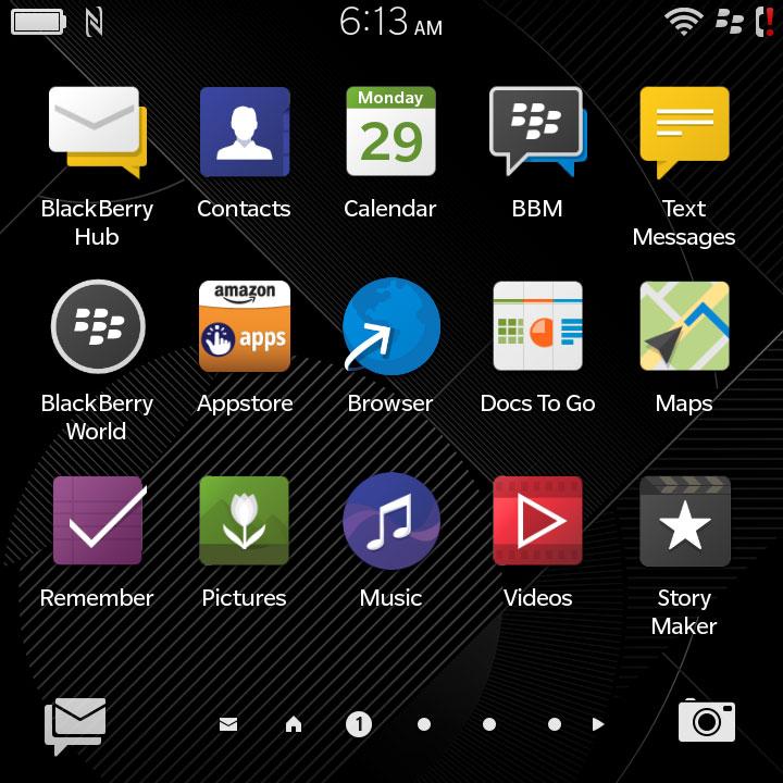
The Q10 will eventually get the BlackBerry 10.3.1 update to add the Amazon Appstore, but for now, the Classic is the only one other than the Passport to have it. The Appstore’s existence legitimizes Android apps on the BlackBerry, and while Amazon’s tighter curating leaves out a good 75 percent of what’s available on Google Play, most of the popular apps are there. What seems strange is that there are apps that work perfectly fine on the Passport that are nowhere to be found on the Classic. Netflix is the most glaring omission, but there are others. Instagram, Uber, Snapchat, and Google’s suite of apps are still missing, and the only way to fill those gaps is to use something like 1MobileMarket or Snap to sideload them.
The Classic’s squared orientation poses a challenge for how Android apps and games may appear. Swiping down from the top pulls up an option to change the appearance to better fit the screen. There are three different settings, and they do a pretty good job of managing those challenges. Playing Angry Birds or using Sonos Controller wasn’t difficult at all.
The thing with the unique dual-app situation here is that integration only goes so far. The Twitter and Facebook Android apps may be better overall, but you won’t see notifications turn up in the Hub. These aren’t isolated cases. They’re pervasive, because Android apps aren’t baked into BB10 beyond simply downloading and using them. This is a shame, given that the Hub is still the best messaging and calendar tool in the business. A software update might help things along, but there’s no word on when or how that would happen.
Part of the problem is that Android apps relying on Google Play Services won’t work at all. If the number of apps like that increases, it could be a looming issue longer-term.
The camera
The 8-megapixel rear camera isn’t going to win any prizes, but it’s still a considerable step up from what the Bold 9900 had three years ago. In daylight or well-lit environments, it produces solid results. Colors aren’t too saturated and exposure levels don’t veer too far to lighter composition, as was the case with past BlackBerrys. Using HDR mode does help keep contrast in check.
When the lights dim and night falls, however, the camera struggles to capture the same level of detail; noise creeps in, and shadows dominate. There’s no image stabilization to help the cause, so even shooting a moving object becomes challenging. This tends to happen with video, too. Stationary shooting in 1080p at 30fps or 720p at 60fps is fine, but if you’re moving around a lot, your footage may end up a little shaky.
Chugging along with an assist
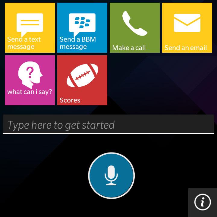
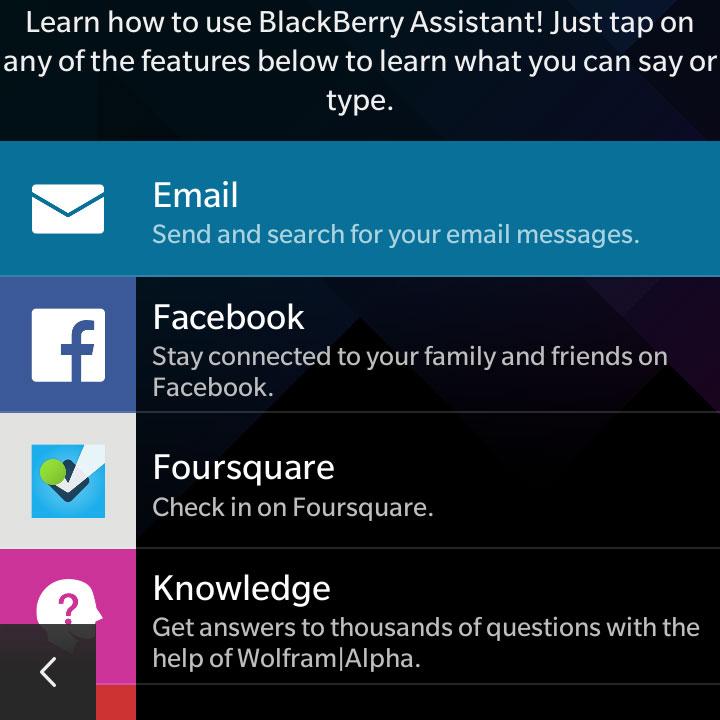
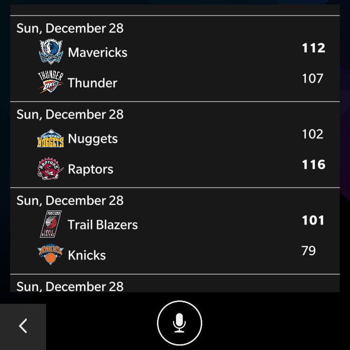
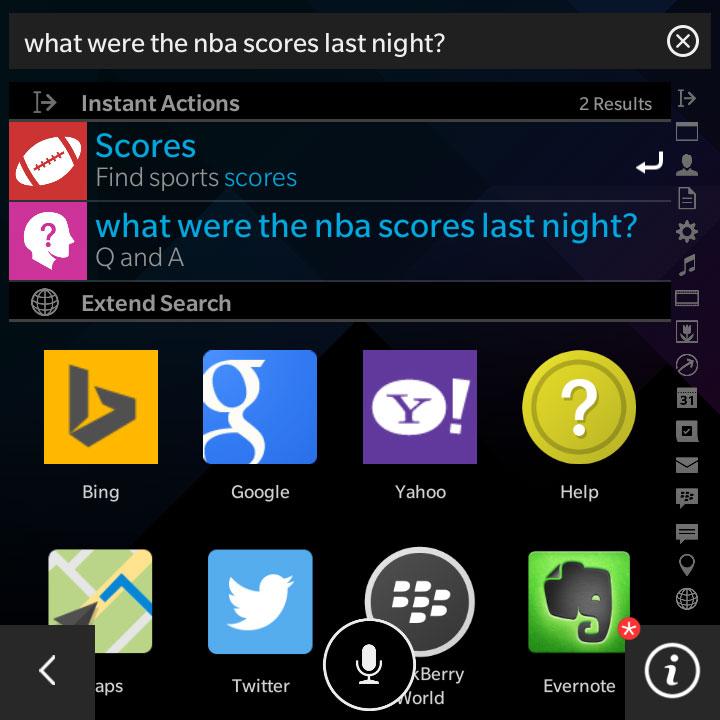
BlackBerry Assistant is the best voice assistant you haven’t used yet. I like that it works immediately by either holding the dedicated button between the volume rockers and speaking a command or just typing in a query. But it’s what you can say and how BlackBerry Assistant consistently cuts through and presents results that make it so reliable. It not only taps into Google, Yahoo, or Bing, but also Yelp, Foursquare, Evernote, Facebook, Twitter, and Wolfram Alpha.
Take away the toolbar, paint it white, and you’re not far off from a Q10.
BlackBerry also smartly separated what can be asked by app or feature, rather than laying them all out in one long list. This is useful in case you lean more towards certain apps than others.
Two other key features that make the Classic a reliable pleasure are battery life and call quality. Few mid-range devices have speakers as good as these, and calls through the earpiece were excellent. Battery life was such that I went well over 24 hours on one charge with moderate usage. On more limited usage, I was able to go through a weekend until looking for a charger on Monday morning.
Conclusion
The Classic earns its name in just about every respect. It’s a throwback that presents a familiar look and feel to the most loyal BlackBerry users, while adding elements of modernity in the process. Keeping fans in the fold was already a linchpin of its existence, but suggesting that defectors would come back because of it is premature at best, wishful thinking at worst.
This doesn’t make the Classic a phone to scoff at, it’s just a sign of the market it enters. Touchscreens have less of a learning curve than they had years ago. Larger screens are the rule, rather than the exception. Keyboards and trackpads aren’t in demand.
But that doesn’t mean there are no users out there waiting for these features. And so the Classic makes their choice much easier. The Passport is the muscle car, whereas the Classic is the dependable wagon that basically comes off as a modern Bold.
Highs
- Quality and durable build
- Keyboard and trackpad are vintage BlackBerry
- Better screen than predecessor
- BlackBerry Assistant continues improving
- Excellent battery life and call quality
Lows
- Trackpad not as useful as in past years
- Some Android apps are missing
- Specs a little dated
- Camera good, but not great


