It feels like the smartphone market has plateaued in terms of design. With the exception of folding phones and flip phones, pretty much all handsets today are glass and metal slabs. And to top it off, most smartphones come in the most drab and boring colors possible.
That’s why the Nothing Phone 2 is one of the most interesting smartphones out there in terms of design and aesthetics. It features a transparent glass back that lets you see its internal components, and there are even LED lights that serve multiple purposes. The Nothing Phone is completely unique and stands out from a sea of otherwise boring phone designs, and it feels really special because of that.
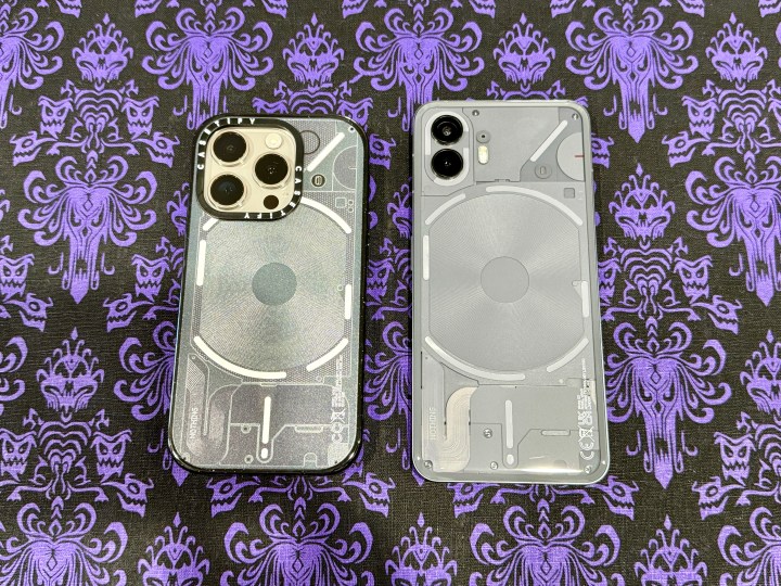
Casetify, a mobile accessory brand that’s well known for having tons of designs and customized phone cases, has partnered with Nothing for a collaboration that no one saw coming. With the Casetify x Nothing collab, you can now turn your iPhone, Samsung Galaxy, or Google Pixel device into a Nothing Phone … kind of.
A case for the techies

There are actually four different case designs in the Casetify x Nothing collection: Case (1), Case (2), Case (3), and Case (4). The first two are based on the actual Nothing Phone 2 design, in both black and white, while the other two cases are more about the Nothing logo aesthetic, also in black and white.
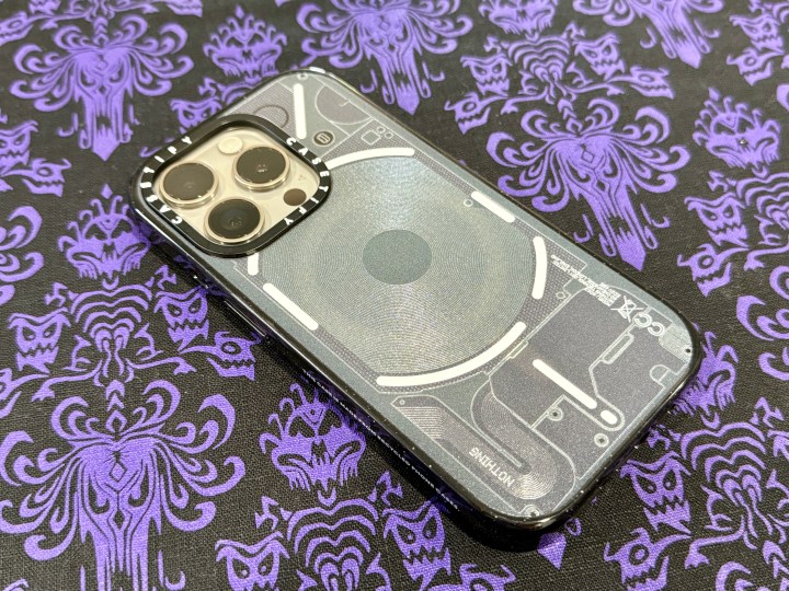
I’m a big fan of the Nothing Phone 2 design, so I wanted to check out the Case (1) for my iPhone 15 Pro. It comes in four different case styles for the iPhone (from the iPhone X to the iPhone 15 Pro Max): the best-selling Impact Case (with or without MagSafe), the Mirror Case with MagSafe, the new Impact Ring Stand Case with MagSafe, and the Bounce Case with MagSafe. For Samsung, it’s available for the S22 and S23 series, while Google options are for the Pixel 6/6 Pro and Pixel 7/7 Pro. Samsung and Google options are only available in the Impact Case style.
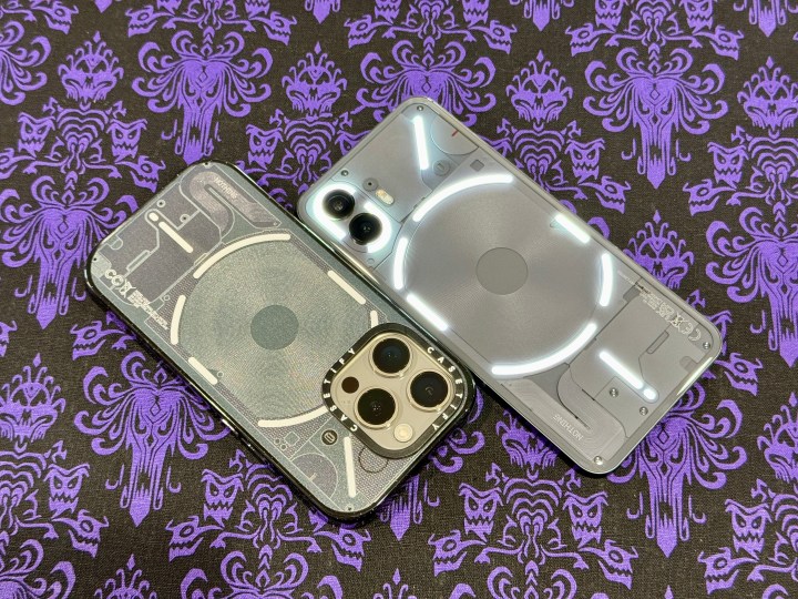
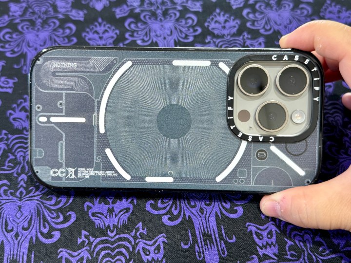
The Nothing Phone 2 design is printed on the back of the case, which is mostly composed of a material that’s made with recycled phone cases. For the most part, the printed design is fairly accurate to what the actual back of the Nothing Phone 2 looks like.

Casetify did add some texture to the case by slightly elevating the ridges along the wireless charging coil part of the design, as well as the curvature in the bottom left corner, where the Nothing logo is (like on the actual phone). There are also curved white stripes to simulate how the Nothing Phone 2 looks like when the Glyph interface is lit up. Lastly, Casetify really did a great job nailing the details, as you even have the regulatory compliance symbols in the bottom right corner (with some alterations since this isn’t an actual phone).
Overall, the design of the Case (1) from Casetify is pretty spot-on, with a few adjustments made to make the design work with an iPhone 15 Pro. For example, I wish that the ring around the camera bump would have just been plain white like the other light strips (since the Nothing Phone 2 has lights around the camera module) rather than have the Casetify logo emblazoned in white on black. And, of course, the gigantic camera module cuts into the upper half of the white light strip, making it a bit imperfect.
Still, if you’ve ever wished you could turn your iPhone, Samsung Galaxy, or Google Pixel phone into a Nothing Phone, this case helps achieve that aesthetic.
It’s not just about looks

The Nothing collaboration is just one of many different designs that Casetify has in its portfolio. I’ve been using Casetify cases for several years now, and the Impact case is one of my personal favorites. Though Casetify cases aren’t cheap (they start at around $52 and up), they are incredibly tough and durable while retaining a pretty slim profile.
The Impact Case, which is my preferred style, has military-grade drop protection up to 8.2 feet. As someone who tends to drop the phone a lot, I’m always confident that the Casetify case will absorb any shock from impact, and the actual iPhone is safe and sound while the case itself gets banged up a bit.

The profile of the Impact case is not too bulky, and it’s pretty easy to get it in and out of legging pockets. The edges are somewhat glossy, but it adds additional grip, which is always welcome.
I also love that Casetify has incredibly tactile buttons. However, I wish it used an actual cover for the Action button on the iPhone 15 Pro. Instead, it currently features a cutout, though the button is still quite accessible since it’s not too recessed, unlike other cases I’ve tried recently.
The phone case no one expected

This is definitely one of the more silly but fun collaborations that I’ve seen Casetify do. I definitely did not expect it, and I don’t think anyone else did either. When the news of this collaboration hit my inbox, I knew I had to check it out.
Nothing has always had a cool phone design, while the iPhone has mostly grown stale, so I was excited to dress up my iPhone 15 Pro as a Nothing Phone 2. And Casetify absolutely didn’t disappoint.


