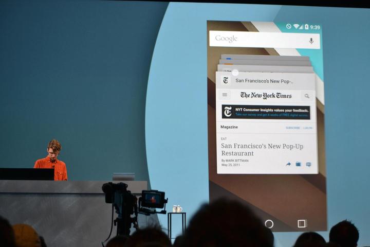
Android L will allow you to search apps and Chrome tabs together

chrome android get closer newspaper 0071
Image used with permission by copyright holder

Chrome will now be more closely integrated with Android than ever before. At Google I/O, Google revealed that Chrome browser tabs will also appear on the multitasking menu on Android devices, search results in the browser will take you directly into apps, and a consistent “material design” aesthetic will add transitions and touch feedback animations.

Avni Shah, Google’s director of product management for Chrome, just unveiled the changes. She revealed that the number of people using Chrome on mobile devices has risen from 27 million in 2013 to over 300 million today.

Recommended Videos

The biggest change to Chrome is the fact that your recent tabs from Chrome searches will now appear alongside your recent apps in the recently used page or multitasking menu. This will make it easier than before to skip in and out of what you’ve been doing. It also now looks like a 3D rolodex with apps and Chrome tabs as individual cards.

It also works the other way with app indexing. Google revealed the ability to dive straight into an app from the search results a while back, but it was limited to a handful of apps. Now that capability is being opened up to all developers to implement in their apps. If you have an app installed then you’ll be able to dive into the content you are looking for directly in the app by selecting it from the search results in Chrome.

Another new API will allow developers to include their recently used apps in the search results from the Google search bar. That means users can go from the search bar on the home screen straight into a point in an app that they’ve used before. It’s a valuable tool for developers to help users “rediscover” their content.

These new changes will come when Google releases Android L in the coming months.

Simon Hill
Former Digital Trends Contributor
Simon Hill is an experienced technology journalist and editor who loves all things tech. He is currently the Associate Mobile…
Does your Duolingo app icon look sick? You’re not alone
The Duolingo app icon, showing a sick-looking version of the Duolingo owl.

It's an absolute tragedy: The normally chipper Duolingo owl has fallen ill.

Just kidding. The app icon might have changed, but it doesn't mean any significant changes are coming to the app. It did stir up quite a bit of conversation on both X (formerly Twitter) and Reddit, though, as users around the world noticed that the Duo owl looked like he needed a heavy dose of DayQuil.

Read more
How to use Circle to Search on your Android phone
Samsung Galaxy S24 showing Circle to Search.

When Samsung unveiled its Galaxy S24 series, including the Galaxy S24 Ultra, it also introduced several new features in its Galaxy AI suite. One of these new features was Circle to Search, which allows you to easily search for anything on the screen with a simple gesture. This feature works by drawing a circle on the screen, and the AI will then search for items within that circle.

Think of Circle to Search as a combination of Google Lens and a screenshot search. You can activate Circle to Search no matter what you're doing. Whether you're on your home screen, in a web browser, or using an app, you can always use Circle to Search. This feature enhances the overall user experience by providing quick and easy access to information on the screen.

Read more
One of my favorite iPhone apps is finally coming to Android
The Arc Search app, showing a search result for how to peel an apple.

Good news, Android users! One of the best iOS apps released this year is finally coming soon to Android.

The app in question is Arc Search. Created by the same company behind the Arc Browser web browser for Mac and Windows, Arc Search is a mobile browser that strongly emphasizes straightforward, simple browsing — with a nice pinch of AI on top.

Read more