“Clicks is a fun novelty case that brings a blast of nostalgia to your iPhone.”
- Keyboard keys feel nice
- Backlit, customizable keys
- Very helpful shortcuts
- Frees up a lot of your display
- Too light for its own good
- Makes your iPhone look ridiculous
- No MagSafe
Before the iPhone, there were BlackBerrys, Palm Treos, Nokias, and even the Sidekick. One thing that all of these had in common was a physical QWERTY keyboard, which were easier to type on than T9 keypads on what would have been called “dumb phones” back in the day.
But when the iPhone hit the scene in 2007, everything changed. Other phone brands followed suit with glass slab touchscreens, and the physical keyboard on a smartphone went extinct.
Enter Clicks. The company made a splash at CES earlier this year, revealing the first keyboard case for the iPhone. Way before I started using an iPhone, I had a BlackBerry Pearl and a T-Mobile Sidekick III. I loved being able to type messages and emails quickly on the go with these devices. I had mastered those physical keyboards back then, and though I got used to the iPhone’s virtual keyboard over time, I still missed having a keyboard with physical buttons.
A few weeks ago, I got my hands on a Clicks case for my iPhone 15 Pro and added a physical keyboard back into my life. It has its use cases, but, unfortunately, it’s not something I’ll keep on my phone 24/7. Let me explain why.
Getting to know the Clicks Keyboard

The case itself for Clicks is interesting. It’s very lightweight due to the soft plastic and silicone materials used. The reason for these materials is that the case needs to be lightweight for usability (you still need to factor in the weight of your phone), yet flexible enough so it’s easy to get your iPhone in and out.
Another factor contributing to the overall lightweight design is the lack of a battery, as the keyboard runs off of your iPhone’s battery. When you insert your iPhone into the case, Clicks plugs into the USB-C or Lightning connector and draws power that way. The USB-C port at the bottom of the case has passthrough fast charging, so you don’t need to take the case off to charge your iPhone.
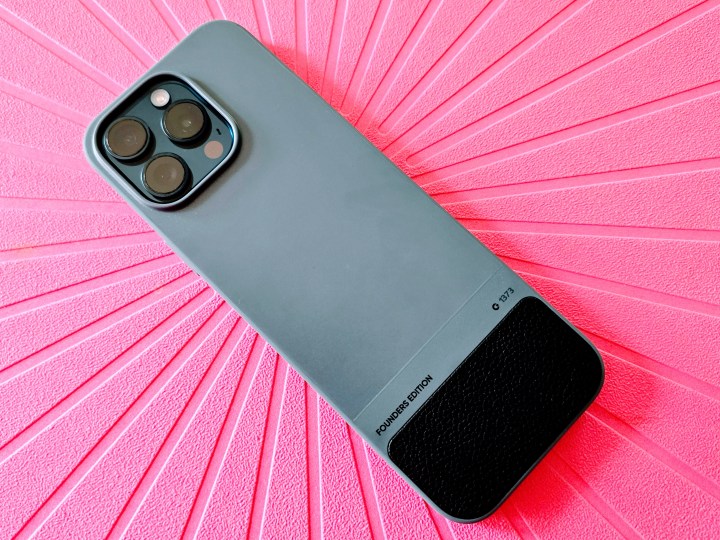
The Clicks case features tactile button covers for the volume, Action, and power buttons, as well as a precise cutout for the camera. On the bottom rear of the case, a small leather area provides additional grip as you type on the keyboard.
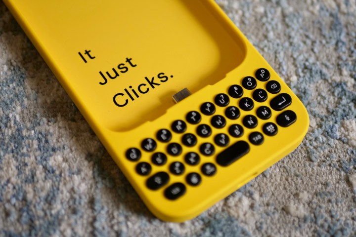
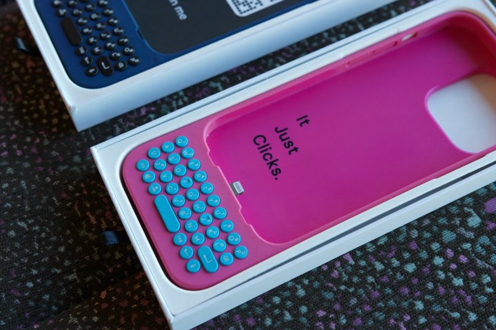
Clicks launched in two colors at first: London Sky and Bumblebee. It recently added two more colors to the lineup: Miami Beach (a hot pink with neon blue buttons) and Royal Ink. I got the London Sky version for this review, and my colleague Andy Boxall got a Bumblebee unit.

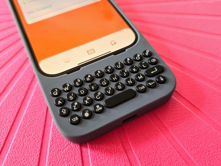
The keyboard sits at the bottom of the case, thus extending the overall length of your iPhone model when it’s inside. The buttons are round and have nice and satisfying tactile feedback when pressed. The QWERTY layout mimics what you already have with the iOS virtual keyboard, with the addition of a few extra keys like CMD, Enter, and Tab.
When you open up the Clicks packaging, you’ll find a guide that tells you the keyboard shortcuts that you can do with Clicks. For example, press CMD+H to go back to the home screen, bring up Spotlight search with CMD+space, and you can even scroll through Safari just by pressing the spacebar. There are more global shortcuts and even app-specific ones. It takes some time to learn all of these keyboard shortcuts, as well as to type on the keyboard itself.
Using the Clicks app

There’s also a Clicks companion app available in the App Store. The app serves a couple purposes: to update the firmware for the keyboard and give you a few customizable settings.
Yes, your Clicks keyboard can be customized to better work the way you want it to. In the app, you’ll find the setting to adjust the backlight intensity (yes, it’s backlit!), how long before the backlight dims, caps/alt/soft return options, and the Battery Saving mode.
The Battery Saving mode is interesting. Since the keyboard case does not have its own battery, it draws power from the iPhone instead. With Apple’s implementation of USB-C, when something is plugged into the port, it will always draw power. But with the battery-saving mode for Clicks, it will physically cut off power to the case after a certain amount of idle time. Enabling this will eliminate that phantom battery drain when you just aren’t using the keyboard.
What I like about Clicks

When I first saw Clicks revealed, I was excited. This looked like a cool idea, and I loved having physical keyboards on my phone back in the day. Bringing a touch of BlackBerry to my iPhone? It was so crazy, but I thought it might just work!
Though I don’t keep Clicks on my phone all the time (more on that in the next section), I do appreciate the feel of the keys when I type on them. The keys have a very nice click when pressed, and it’s quite satisfying. I also love the fact that the keyboard has a backlight, making it possible to use the accessory in the dark if need be.
I also like having keyboard shortcuts available, which is a cool addition. Once you get accustomed to them, it does make it easier to use your phone quickly, especially when scrolling in Safari or searching a page (using CMD+F).
The biggest advantage to using Clicks, though, is the fact that you can free up your entire iPhone screen. Think about it — the virtual keyboard takes up a good chunk of the space on the screen, leaving you with less content on the display. When you use Clicks, there’s no virtual keyboard on the display (unless you choose to use it), letting you view more of a conversation thread or email or edit a video or photo without blocking the content when doing so. This is what makes Clicks great for content creators, and it’s marketed as such.
What Clicks needs to improve

Clicks was one of my most anticipated iPhone accessories of the year. However, when I finally got it, I was a bit disappointed — for a few reasons.
First off, Clicks makes your iPhone comically large. I’ve said it before, and I’ll say it again — I miss the 5.8-inch size of the iPhone. Though the 6.1-inch size of my iPhone 15 Pro is tolerable, Clicks just makes it so much worse by increasing the overall height since the keyboard sticks out at the bottom.
Then there’s the issue of weight. The Clicks case is just too lightweight, so when you have your iPhone inside, it’s incredibly top-heavy. For me, this makes it extremely unergonomic, as all the weight is at the top of the iPhone, and barely any weight is down at the keyboard part. It is not balanced in the hand when used, and it’s very uncomfortable.
Though I like the design and feel of the keys, I also think that they’re too small and a bit cramped. I tried using Clicks to write my daily journal entry on Day One, but there was a big learning curve due to the size of the keys, and I often ended up pressing the wrong keys as I tried to type faster. And it’s not like I have sausage fingers either, but it sure feels that way when I use Clicks.

I also found myself typing way slower because of this, and it was frustrating enough that I just went back to using the virtual keyboard instead. For example, I typically write an entry in Day One in 5 to 10 minutes. When I used Clicks, it took me over 20 minutes to finish writing an average entry.
Clicks also lacks MagSafe, which is a huge letdown for me. One of my must-have accessories is my MagSafe PopSocket grip, which I think would help with a few of the issues I have with the Clicks, but I can’t use it due to Clicks’ lack of MagSafe. I suppose I may need to just try a non-MagSafe PopSocket or grip instead. But the lack of MagSafe also means I can’t use my MagSafe car mounts, chargers, or battery packs. If you’re like me and are heavily invested in MagSafe accessories, this is a huge drawback.
Clicks Keyboard price and availability

Right now, you can only purchase the Clicks Keyboard for iPhone from two places: directly from the Clicks website or through Best Buy. It comes in four colors: London Sky, Bumblebee, Miami Beach, and Royal Ink.
Clicks is currently available for the following iPhone models: iPhone 15, iPhone 15 Plus, iPhone 15 Pro, iPhone 15 Pro Max, iPhone 14 Pro, and iPhone 14 Pro Max. It starts at $139 for the smaller phones and is $159 for the larger sizes.
Should you buy the Clicks Keyboard?

That all said, should you buy Clicks? It’s complicated. Yes, having the full display available to view content is very nice, and it makes a big difference if that’s what you need. For me, I find it most useful for replying to long conversation threads and emails.
But as much as I miss the old days of having a physical keyboard on my smartphone, Clicks just doesn’t work that well for me.
Since the case is so lightweight, it ends up being far too top-heavy when you’re using it with your phone. And since I have smaller hands, it’s not ergonomic due to the strain of trying to keep it in my hands while typing on a small, cramped keyboard. I would love to be able to help mitigate some of my issues with something like one of my MagSafe PopSockets, but that brings up the other issue: the lack of MagSafe.
The keyboard feels nice, the backlight is cool, and the ability to customize it with the app is neat. But for something this expensive, it shouldn’t be so uncomfortable to use for extended amounts of time. And it definitely makes your iPhone look hilariously large, especially the iPhone 15 Pro Max. I already have an issue with how my phones barely fit pockets in women’s clothing — this just makes it absurd.
Personally, I wish Clicks used a slide-out or even a swivel-out keyboard design. That would solve the size issue while still having a physical keyboard. The keyboard part needs to have a bit more weight to balance it out. MagSafe is always welcome.
In the end, Clicks is a very cool and fun idea, but the execution just isn’t where it needs to be.


