For over a decade, Apple’s iPhone has largely remained the same in terms of interface and lack of customization. Though jailbreaking was a thing in the early days, the average person wouldn’t know how to do that, or even want to risk their device. If you were wanting customization on your smartphone, people would simply tell you to go to Android.
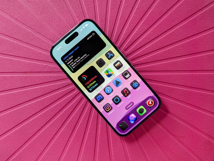
Apple surprised everyone when it launched iOS 14, which was the first version of iOS that allowed for some customization on the Home screen. With iOS 14, Apple let users add widgets to the Home screen, and it allowed custom app icons through the use of the Siri Shortcuts app. There were new customization features in iOS 15, but iOS 16 gave us the next step, which is Lock Screen personalization with new typefaces and text colors, as well as widgets.
Having any customization options on iOS is a miracle and a step in the right direction. But at the moment, the current implementation leaves a lot to be desired.
Changing up my app icons should not be so tedious

When iOS 14 came out, I was ecstatic. Being able to have widgets on the Home screen? Finally! Having the ability to change up my app icons without jailbreaking? Cool! But after finally changing up my Home Screen from a boring stock layout and icons, I realized how much work is involved and I got too lazy to really do it again. Thankfully, I picked a themed icon pack that I really liked, so I haven’t felt the need to really change it up since.
But we deserve better. Much better.
If you aren’t aware, changing an app icon in the Shortcuts app isn’t hard, but it is very time-consuming when you want to change up to 24 apps on a single page on the Home Screen. And that doesn’t include the Dock, which is up to another four apps, bringing the total up to 28 potential app icons. It takes almost 20 steps to change up a single icon, so imagine the time that is needed to change up to 28 of them — that is a ton of tapping through menus.
I remember when I customized my Home Screen, and it took at least an hour, because sometimes I would mess up accidentally during the process, making me want to throw my phone out the window. And I’m not even counting the time it takes to find a good icon pack that you want to use. Thankfully, I stumbled upon an icon pack that I liked a lot and wanted to use on Reddit (thanks /r/iOSsetups), and then took the time to figure out how to get it on my Home Screen. So it’s definitely easier if you already know what you want.

Apple could simplify the entire process, but it hasn’t done anything with Home Screen customization since iOS 14 in 2020. I would love to see an easier way to apply custom icons, perhaps through a systemwide setting, and Apple could sell app icon packs through a digital storefront, like iTunes or the App Store. Better yet, give us entire themes that we can just apply to the device. I mean, such a feature would literally print Apple money, because I would be buying themes and icon packs constantly if it were that easy. And judging by how there was the “aesthetic AF” TikTok trend back when iOS 14 first dropped, I know I’m not the only one.
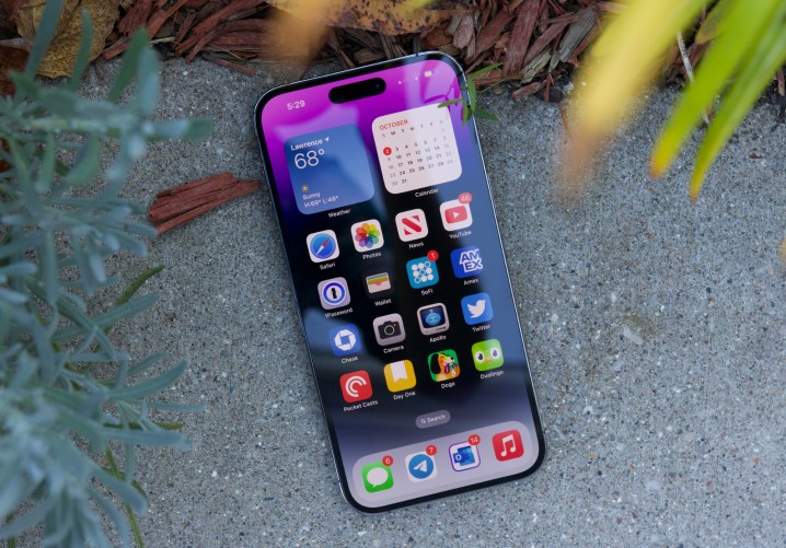
While we’re on the subject of the app icons, why are we also still limited to such a strict grid layout? Yes, on Android, we still have grid layouts, but we can also freely place app icons where we want them. On iOS, a space must always be filled, no matter what. There are apps and other shortcuts that can place an “invisible” app icon, but this is a workaround for a silly limitation. Why do we have to resort to such hacks in the first place? Just let us place the apps where we want.
We should be able to have interactive widgets

With iOS 16, Apple introduced Live Activities. These are basically widget-style notifications on the lock screen that update in real time, or will have interactive controls. This feature has only started to roll out recently, since the iOS 16.1 update, but it opens up a new door to possibilities.
I, for one, wish we could have interactive widgets on the Home screen. Right now, Home screen widgets will simply open up the app when you tap on them. For example, I have a large Fantastical widget on a page in my Work focus, which shows the month and my agenda for the next three days. If I tap on a date on the widget, instead of changing the agenda to show the upcoming events for those dates, it just opens up the app. What if I simply want to see my agenda on the calendar widget without opening up the app? And the Music app widget is also pretty useless, because it only shows your Listening Activity. How about putting some interactive controls on the Home screen instead, as that would be more useful?
It was great that we finally got Home screen widgets in iOS 14, but honestly, it’s very limited in terms of what you can do. Right now, it’s still just glanceable bits of information, and maybe that’s all that Apple intends them to be. But Live Activities shows that we can have some interactive and real-time elements in notifications, and even on the Dynamic Island on the iPhone 14 Pro, so why not make Home screen widgets better?
I hope at some point Apple changes how widgets work on the Home screen, because right now it’s still just a glorified app icon.
Lock screen customization could be better

I was excited when Apple gave us lock screen customization in iOS 16, but it’s far from perfect. In fact, it’s downright messy in its current state, and I really hope that Apple improves this in iOS 17.
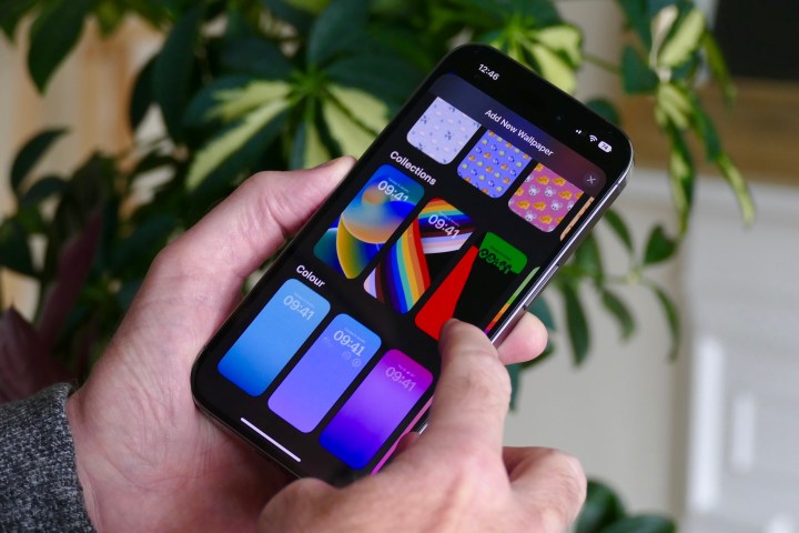
For one, the interface and user experience for it is just … not great. The process for changing up your lock screen appearance is convoluted, and the worst part? You can’t just change the lock screen directly from the lock screen without picking a new Home screen as well. In fact, the entire method of changing just your Home screen wallpaper (even from the Photos app) is no longer simple and easy either — iOS 16’s lock screen customization just butchered the entire process. I hope Apple rectifies this, because it’s just so bad right now.

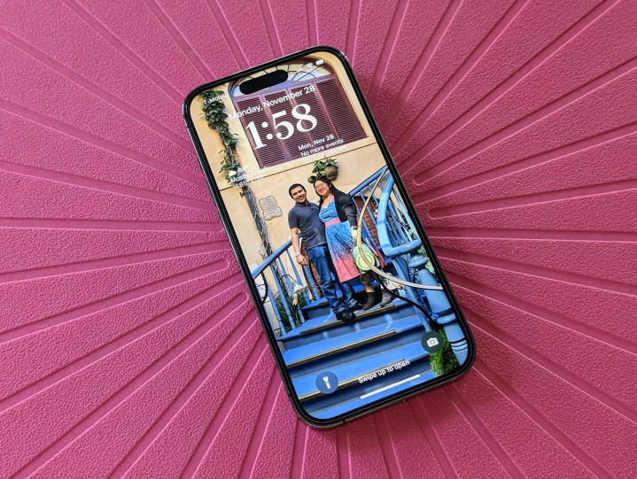
Another thing about lock screen customization that I found odd is the limited space for widgets. We only get one small row underneath the clock for widgets, which are either 1 x 1 squares or 1 x 2 rectangles. Again, it’s just another silly limitation imposed by Apple. Why not let us add as many widgets as we want? Or at least give us the top half of the screen to work with, leaving the bottom half for notifications (unless you move them back to the top). And again, the widgets are just informative glances that update periodically — I hope they can do more one day.
Finally, the big thing about the lock screen in iOS 16 was the ability to change the typeface and text color. But again, Apple could go further with this, because we are limited to three styles with eight different typefaces in each. Apple started allowing custom fonts back in iOS 13, so I’m surprised we don’t have the option to just use whatever font we want on the lock screen.
While Apple does let us basically pick whatever color we want for the text, it could go a step further. Let us have gradient colors for the text, or even have two alternating colors — you can get so creative with that, especially for holidays like Christmas (I dream of having red and green on my lock screen text).
Apple could do so much more with iOS customization

I was happy to see Apple give us more customization options in iOS 14 and iOS 16. However, I’m disappointed to see both Home screen and lock screen customization still very limited, as Apple hasn’t really done much to improve the Home screen in two years.
Sure, it’s a miracle that we even have any of this at all, considering it’s Apple. But compared to what you can do on Android, the customization on iOS is pretty lacking, to say the least. It’s a start, but Apple has a lot of catching up to do. I just hope I don’t need to wait another 14 years before iOS customization is better.


