Instagram doesn’t know when to quit being like TikTok. Last month, the Meta-owned social media company transformed the photo-sharing platform into a TikTok hellscape, reformatting the posts from a 4:5 to 9:16 frame regardless of whether they’re images or videos. Everyone and the Kardashians slammed Instagram for redesigning the app this way, and two weeks ago, Instagram turned it back to its original form.
You’d think that Instagram would have learned its lesson, right? Wrong. According to a report from The Verge last week, CEO Adam Mosseri said during his weekly AMA that Instagram will start re-testing ultra-tall 9:16 photos within the next few weeks.
Under normal circumstances, I’d applaud companies and innovators for reviving something that initially failed because they improved on it. However, in this case, I’m frustrated with Instagram trying on a TikTok-style feed, walking back on it following the backlash, and then deciding to try it again. It’s one thing for Instagram to put its spin on the Stories feature from Snapchat, but it’s another thing to redesign its entire user interface to make the platform resemble TikTok — currently the most popular social media app in the world.
The TikTok-ification of Instagram takes away the type of content people love most about the platform: photos from friends and family, as well as content based on their interests. And it’s something I’m just about fed up with.
Fewer friends, more recommendations
One of the biggest complaints about Instagram’s TikTok transformation was that users saw fewer photos and videos from their actual friends. Instead, Instagram fed them recommended content from random accounts they never followed.
People mainly join Instagram to see photos of their friends and relatives doing different things or celebrating milestones — like graduating from college, landing a new job, getting married, or celebrating the birth of their children (barring any privacy issues). In some cases, content creators and business owners sign up to promote their products beyond Twitter, Facebook, YouTube, Twitch, and even their own website.
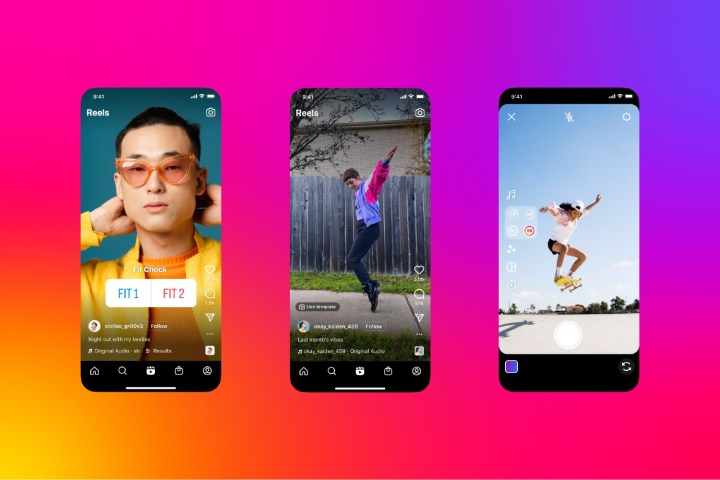
However, Instagram redesigned itself to resemble TikTok because the growth of video content on the site accelerated relative to that of static photos. This meant rendering all video posts less than 15 minutes long into a Reel format, making Reels and regular video posts indistinguishable from each other. In doing so, it was attempting to mimic the success of TikTok to appeal to teens and young adults who use the video-sharing platform more often than they use Instagram.
That caused numerous issues within the app in terms of user engagement. An increase in video content triggered the algorithm to pump out advertisements for products recommended to users that are related to the content they scrolled through. For example, if I scroll through memes and photos related to fashion and mental health, I’ll see video ads for FashionNova and BetterHelp. They sound like great recommendations at first glance, but the more ads I see about those products, the fewer photos of my friends I see.
The new algorithm also caused content creators, business owners, and influencers to net less engagement than they usually get. Especially for business owners, less engagement on their pages means a decrease in the sale of their products simply because they have to curate their posts in a way that appeases the video-centric algorithm. That’s bad for business.
Kim Kardashian and Kylie Jenner, huge celebrities with 326 million and 360 million followers, respectively, said as much: “Make Instagram Instagram Again.”
Long photos with obscuring texts
The worst part about seeing photos in a 9:16 frame instead of the usual 4:5 is the obscuring of the captions that accompany them.
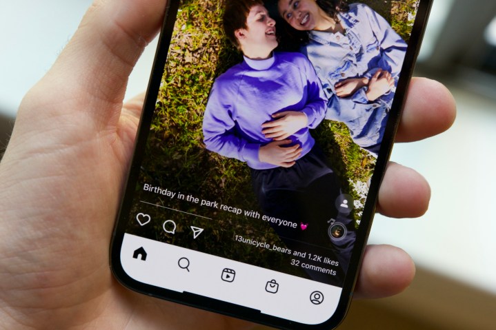
Usually, when a photo gets posted on Instagram, the text box appears at the bottom of the photo for people to read the captions and understand the context — all without obscuring the picture you’re looking at. When the TikTok redesign was implemented, the caption text overlaid the image on the bottom of the screen exactly as it would on TikTok. And because Instagram users have a tendency to write long captions, tapping “See more” brought up a giant wall of text with a subtle dark gradient that covers the photo and other things in the background. The caption wall became even more of an eyesore if the photo happened to be a text-laden meme.
Not only was this annoying, but it was also an accessibility issue. Not being able to see images clearly is already hard enough for some people, but the long caption overlaying the image makes it even harder for people to understand its context. And if someone didn’t use Alt text for their posts, that made Instagram’s redesign an even worse experience for everyone.
Even I, an autistic writer with no visual impairments whatsoever, was incensed at the wall of text obscuring the pictures I was scrolling through. My Instagram feed consists of memes about autism advocacy and feminism, as well as news about pop culture and politics. The lion’s share of those posts are educational, so it’s natural that they condensed text that’s easy for people to digest if they don’t have time to read books or long news articles on the aforementioned topics. The wall of text overlaying another (pre-existing) wall of text — no matter the caption’s length — made the posts impossible to read because all the words are mixed up together.
Instagram needs to stay its unique self
Instagram’s struggle to maintain its sense of self while redesigning the platform to resemble TikTok harks back to Peggy Rathmann’s 1991 children’s book, Ruby the Copycat. In the story, the titular girl imitates her classmate, Angela, from wearing a red bow to a dress with paper daisies held by safety pins. Angela was flattered by Ruby’s attempts to wear the same outfits as her, but she got annoyed with it after a certain point. Then she got furious at Ruby for reciting her version of the poem she wrote about a cat she never met. In the end, the teacher tells Ruby that she can be anything she wants, but most importantly, she has to be herself.
Much like Angela, I was impressed with Instagram implementing the Stories feature from Snapchat four years ago. But then I got annoyed and angry when it started imitating TikTok by turning all posts into a 9:16 frame, non-video preferences be damned. Unlike Ruby, Instagram didn’t learn its lesson and is now planning to make every picture we post a 9:16 frame again — making things all the more infuriating.
No matter who we follow — friends, family, public figures — Instagram needs to remain a site for photos because that’s what made it stand out from other social media sites in the first place. Posting photos on Facebook and Twitter are optional, but doing so on Instagram is not. It needs to leave the 9:16 video format to TikTok and stick with 4:5 pictures. Only when it learns to be itself again can it regain respect from everyone.

