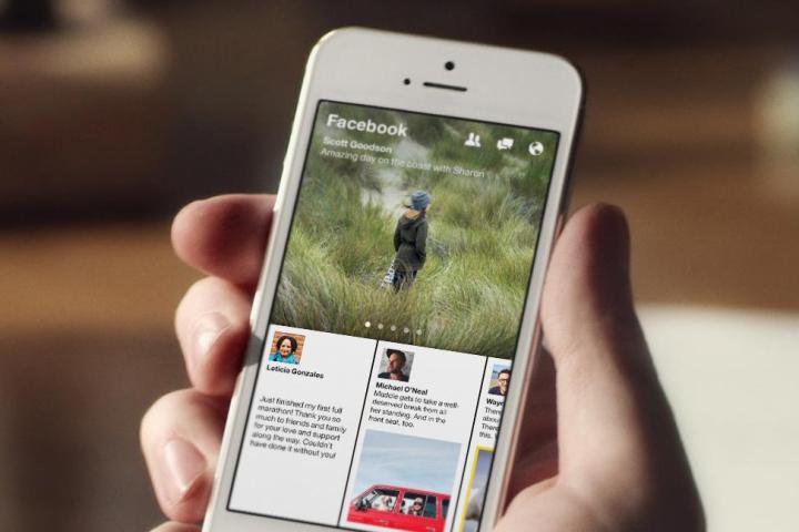
Facebook announced the Paper app late last week, and it’s now ready to download. There are a few restrictions, though. It’s only available for the iPhone, and you’ll only find it in the U.S. branch of the iTunes App Store. Developed by Facebook’s Creative Labs team, Paper is a mashup of the standard Facebook app and a social news reader like Flipboard.
It pulls fresh news stories from your News Feed and presents them, Flipboard style, in the standalone Paper app. If you’re thinking it sounds a lot like the standard Facebook app – which ultimately, allows you to read your News Feed on a mobile device – then you’re half right. Paper’s draw is the additional curated news stories added by Facebook’s own editorial team, plus its fluid look and cool control system. The app makes good use of what Facebook refers to as “Natural movements,” which to you and me means tilting, swiping, and sliding.
Open the app and you’re greeted with a short, slick introductory video, and some instructions on how to set it up. It’s certainly very attractive, and the gestures really are intuitive, regardless of how much we may mock Facebook’s choice of words used to describe them. You can also perform the same primary tasks in Paper as you can in the regular Facebook app. For example, friend requests are there, as are all your notifications, and the chance to add new posts and comment or Like existing ones. If you never wanted to look at the standard app again, you probably wouldn’t need to provided you’re not a heavy user.
Facebook Paper has more than enough style, swish design elements, and cool graphical touches to make you say ohh and ahh while you mess around with it. This is a good thing, as it’s more than can be said of Facebook’s previous mobile efforts. The app is yours to download right now, so give it a try.
We’ll have a full review of Paper soon.


