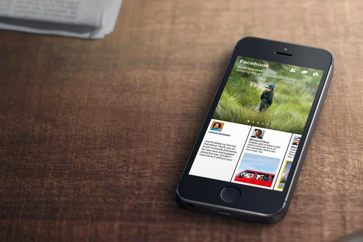
Facebook turns 10 tomorrow, and it’s pre-empting the inevitable “Facebook is dying” news by reinventing itself a day early. Paper is the latest smartphone app from the world’s largest social network, which has a miss-and-miss-again history when it comes to apps. It’s a mobile version of the social network’s News Feed, but serves as more than just an extension to the social network – it’s a complete re-imagining of the Facebook feed.
Paper appears to be doing its best to distance itself from the company behind it. The Facebook logo is not even in the app, though it is mentioned. Even when looking at items shared by your friends, it never feels like you’re scrolling through your news feed in the same familiar way that you have in the past decade.
Gone are the cluttered columns of the Facebook homepage, with text and photos fighting for attention as you scroll. Paper puts them at center stage, making the most of the full screen space they receive. Photos shared by friends and pages alternate at the top of the screen, which is a featured section of sorts, while a full list of what’s being shared on your news feed can be viewed across the bottom. If a story catches your eye, a tap brings it into full-screen focus.
Once you’re in a story, you get to see Paper at its finest. Photos turn into panoramic shots that you can turn your iPhone to view in their entirety. The article preview sits and waits to be explored, requiring you to slide the page up as if opening a folded card. The seamless motion transition is beautiful and natural, playing right into the simple theme of the app. A video introduction shows people writing letters and mailing cards from various locales, a blunt analogy for the way users share stories within the app. Status updates serve as postcards from around the Web, taking users to that destination briefly, like reading a friend’s experience abroad, then pulling users back into their own world.
That’s another key to Paper: This is your feed. Usually Facebook news feeds are subject to the content placed in them by friends, family members, and followed pages. This is, in equal parts, a blessing and curse because not all interests are shared, but all stories are. Paper solves this by supplementing the Facebook feed with curated categories you choose. The app prompts you to add feeds in categories like Headlines, Tech, Planet, Ideas, and other buzz words of interest. These diversify the stories you see within the app and allows you to escape the noise of the standard Facebook news feed without having to leave the app.
Some of the curation could use some fine tuning, or just more specific section titles. Many of the stories in the feeds land there because of the publication sharing it rather than the content of the story. Part of this is because there are only 40 publishers featured right now, a small handful compared to what’s out there. The lack of an offline reading mode will also prevent Paper from replacing popular news-reader apps.
Even though Paper seems to put an arm’s length between itself and Facebook, all of the well-worn Facebook features are present. Friend requests, messages, and notifications are all viewable through their standard icons, which are always on screen when browsing feeds. You can view user profiles by tapping on people instead of stories, create your own posts in-app, Like or comment on a photo, etc. Facebook is still here, it just isn’t all that noticeable. We’re fine with that, and it appears Facebook is as well: There’s a setting within Paper that allows you to receive your Facebook push notifications in Paper instead of the standard Facebook app.
It’s strange to say that an app from Facebook could be a Facebook killer, but that’s what Paper feels like. Between its clear and simple design, interactive interface, and ability to provide you with the best parts of the Web and your feed, Paper outdoes everything that Facebook has tried before it. There’s minimal evidence of Facebook itself, a site that has done little to reimagine itself over its 10 years of existence. Paper is Facebook moving past the news feed to be more than just a social network – it’s as much about you as it is about your friends. There are some improvements that can be made, but it’s an excellent start for a new stage of Facebook. And most importantly, Paper is a venture into mobile that finally works.
Paper is available for download for free for iOS from the iTunes App Store.


