After months of public and developer betas, iOS 16 is finally available as a free update for anyone with a modern iPhone. Apple released its final build of iOS 16 on September 12, bringing with it all of the features we’ve heard about for months. There’s the new lock screen interface, upgraded Focus modes, and edit/unsend features in iMessage — just to name a few of the highlights.
But there’s a lot more to iOS 16 than the big standouts Apple promotes in its marketing. I’ve been using iOS 16 on my iPhone 13 Pro for just about two months now, and during that time, I’ve found a few smaller changes that have really made a difference in daily use.
Here are the five iOS 16 features I’ve come to love the most, plus one other change that I simply can’t stand.
Keyboard haptics
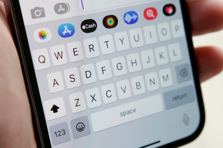
In the 15 years since the first iPhone was announced, no version of iOS has supported haptic feedback with the default keyboard. When you write it out like that, it seems nigh impossible to believe. But it’s true! While Android has supported keyboard haptics for years, it’s something Apple didn’t add until this most recent iOS 16 update.
Despite the long amount of time it took us to get to this point, I couldn’t be happier to finally have haptic feedback on my iPhone’s keyboard.
For 95% percent of my day, my iPhone stays on silent mode to avoid annoying notification sounds. I don’t want my phone to make a noise with every email, Twitter alert, or text message — so it stays in silent mode. But in previous iOS versions, doing so has meant getting no tangible feedback when typing on the keyboard. For times when I knew I’d be doing a lot of typing, I’d turn my iPhone off silent mode just to hear audible taps when sending emails, completing Duolingo lessons, etc. But then I’d inevitably forget to turn silent mode back off and would then be pestered by those dreaded notification sounds.
With haptic keyboard feedback in iOS 16, this is no longer a problem. Even with silent mode enabled, my keyboard now makes subtle vibrations with every key press. And it feels excellent. iPhones have featured the best smartphone haptics for years, and with iOS 16, you can finally experience them whenever you’re typing. My iPhone now remains on silent mode 24/7, I still get tangible feedback whenever I’m typing, and it’s made interacting with my iPhone’s keyboard significantly more enjoyable. I desperately wish we didn’t have to wait until 2022 for this to become a feature, but I’m just glad it’s now here.
More powerful Weather app
At first glance, the Weather app in iOS 16 looks just like it does in iOS 15. You have the temperature at the top, followed by the day’s high and low, an hourly forecast, a 10-day forecast, and a whole lot more.
While the design of the app is mostly unchanged, iOS 16 shows its prowess the minute you start poking around. In prior iOS versions, tapping on anything in the Weather app didn’t do anything. But in iOS 16, you can now tap on any element in the Weather app to see a more detailed view of its data. You can tap on the Hourly Forecast module to see a detailed graph of the day’s temperatures and weather conditions. You can also see similar graphs for the UV index, wind, rainfall, and more — and for up to 10 days in the future.
The Weather app has always been visually pleasing while feeling functionality limited, and iOS 16 completely changes that for the better.
Search bar on the home screen
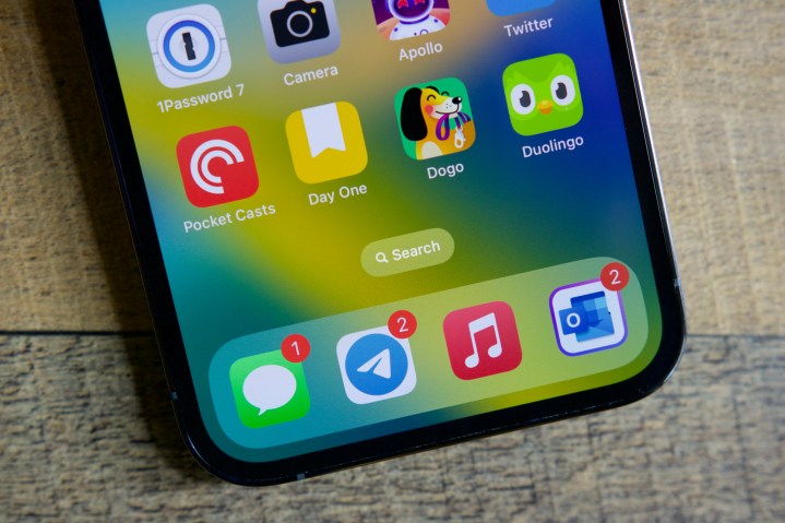
Spotlight Search is one of those features I use on my iPhone every single day. By quickly helping me find an app, addresses in Maps, Safari shortcuts, and more, it’s proven an extremely useful tool throughout daily use. The best part? Spotlight is incredibly easy to access. Swipe down from anywhere on your home screen, start typing, and you’re good to go.
That swipe-down gesture remains in iOS 16, but Apple has also added another way to find Spotlight. Instead of seeing a counter for your various pages at the bottom of your home screen, iOS 16 now shows a new Search button. Tapping that immediately opens Spotlight and your keyboard so you can start typing in whatever it is you’re looking for.
The tried-and-true swipe gesture still works just as well as it ever did, but I also appreciate having that Search button right by my thumb. Combined with a slick new animation that plays whenever opening Spotlight, it makes the built-in search tool feel more prominent than in previous iOS versions.
Photo background remover
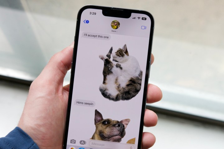
Apple showcased a lot of iOS 16 features when the update was announced at WWDC 2022 in June. But out of all the features that caught my eye the most, the new background remover tool for photos really stood out to me.
The idea behind the background remover is simple enough. You press and hold on a picture in the Photos app, the subject is instantly cut out from the background, and you can then place that cutout of your subject in any other app. We put this feature through its paces right when the first iOS 16 beta was available, and it was nothing short of jaw-dropping.
Although I don’t use iOS 16’s background remover every single day, it’s one of those features that puts a smile on my face each time I do interact with it. It’s dead simple to use, the quality of cutouts is fantastic, and it’s created some pretty hilarious message interactions. Even if the extent of my use of the feature has been to goof off with friends on iMessage, I still absolutely love having it around.
Battery percentage in the status bar
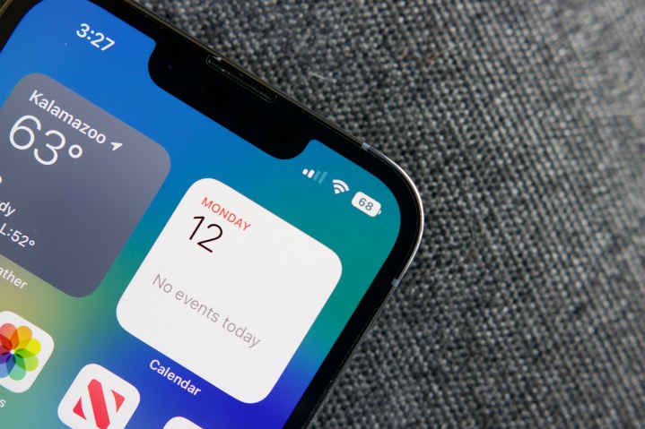
Last but certainly not least, I love, love, love having my iPhone’s battery percentage displayed in the status bar. Having your battery percentage in the status bar used to be a staple of iOS, but when Apple introduced the notch with the iPhone X, it removed the functionality — forcing users to open the Control Center to see their current battery percentage.
Now, iOS 16 changes this. After enabling a toggle in the Battery section of the Settings app, you can now see your remaining battery at all times at the top of the screen. There’s not much more to say about this one other than the fact that it’s fantastic having this option back.
The one thing I can’t stand: notifications

For all of the little things I love about iOS 16, there’s one thing about the operating system I cannot stand — and that’s notifications.
Notifications have always been a sore point for iOS, and unfortunately, iOS 16 doesn’t do anything to make them better. If anything, iOS 16 makes notifications even more annoying than they were in iOS 15.
How? By default, notifications in iOS 16 are enabled as a “Count” view. This means you only see the number of notifications you have on your lock screen. If you want to actually see the contents of said notifications, you need to swipe up from the bottom of the screen and scroll up to view what’s there. In short, it adds another step of interaction just to see what notifications are waiting for you.
While iOS 16 does allow you to change this to a “Stack” view and see some of your notifications right on the lock screen, you still need to swipe up to view the full list of everything available. And even then, you end up with notifications starting at the bottom of the screen instead of the top, totally nullifying any muscle memory you may have from


