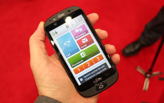

It took a while, but many older folks, and many of those resistant to technology, have finally embraced mobile phones, but the next big challenge is getting your tech-challenged friends and loved ones into the smartphone age. Fujitsu thinks it has a solution, and though we absolutely hate the name, we think the Japanese company may be on to something. The phone is the Stylistic S01 and we had the chance to try it out at Mobile World Congress.
For a phone named the ‘Stylistic,’ it’s shockingly understated, with a black plastic shell, an average sized screen and a solitary but very obvious Home button beneath it. It’s like putting a set of Mazda car keys down on a table; not very impressive, but evidence of a safe and sensible purchasing decision. This is rather appropriate; the Stylistic S01 is aimed at the older generation who want the functionality of a smartphone, but not the fiddling about with a complicated operating system.
Let’s face it, phones for people over a certain age are almost all universally awful, with their gigantic buttons and feeble displays. They’re either too complicated or treat older adults like babies. The Stylistic S01 is very different. Fujitsu has put a lot of thought into reworking Google’s Android operating system to make it easier to use, but has avoided patronizing alterations and the assumption that everyone over the age of 50 is completely clueless. In doing so it has come up with that rare beast: A good Android skin.
Hands-on video
A touchscreen with the sensitivity of a physical keyboard
The touchscreen is the key to the S01’s success. Fujitsu has replaced traditional home screens and app grids with a vertically scrolling collection of buttons, focusing on the main phone features – calls, messages, and emails – before leading into Internet access, the app store, and other less-often used features. This layout is nice, but it only becomes clear how much thought has gone into the S01 when you try to press the touchscreen. Capacitive screens are often so sensitive, a mere brush of the screen can unexpectedly open an app. The S01 has a new type of touch panel where buttons require a degree of effort to push, minimizing the chance of accidentally opening something and providing the same positivity normally associated with a physical keyboard.

Exploring the S01’s custom Android OS – which is built on Android 4.0 Ice Cream Sandwich – reveals plenty more. There’s a curated Web portal with sections on the weather, news, travel and so on, a zoom key which appears when you start scrolling, and even the option to bring up extensive help pages along with a proper user manual. Fujitsu has added handwriting support to the input screen which also works surprisingly well; though finding how it was turned on was irritatingly contrived, and at odds with the rest of the OS.
Call clarity as important as user friendliness
It’s not all about the software either, as Fujitsu has incorporated some of the audio tech seen on its Japanese phones. A demonstration of the noise-canceling microphones – where the phone was mounted in a sound-proof box and blasted with white noise – revealed the extent of its sensitivity, but no more so than any other system. Fujitsu’s call clarity system was more impressive, both technically and in practice. By measuring the pauses in-between words and the frequency of the voice, it can judge how clear a caller sounds, and if it decides the person is gabbling away or making no sense, it manipulates the audio to increase the clarity. It worked very well in Fujitsu’s demo, where a caller spoke very quickly, interspersing their speech with lots of ums and ahs. It was almost incoherent without the feature, but once noise canceling was turned on, it became far more comprehendible.
Better than a regular Android phone, in some ways


When testing new smartphones, putting ourselves in situations relevant to a particular feature is essential, but in the Stylistic S01’s case, all we did was think how much it would suit a parent or older relative. To us, that’s proof Fujitsu has been successful with the S01.
Fujitsu will launch the phone this June exclusively with Orange France, limiting its risk while it tests the market. This puts us in a unique position, as we’re sad a network-branded phone aimed at another generation won’t be getting a wider release, at least for now. Perhaps this will spur Fujitsu on to give the Stylistic a try elsewhere in the world soon.


