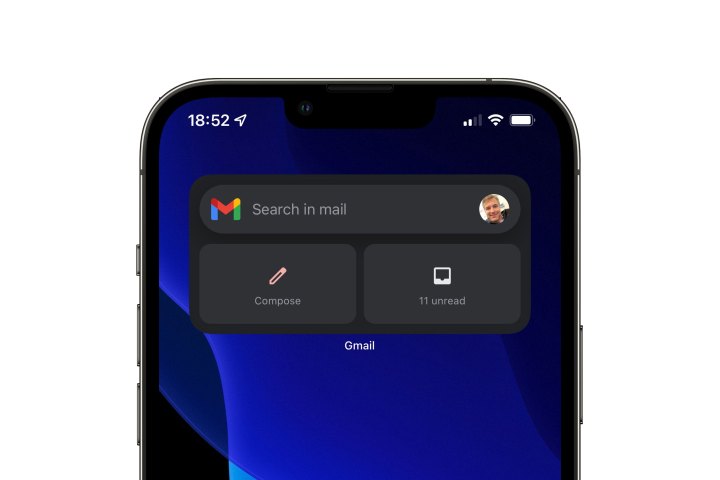
As far as widgets go, Google’s iOS apps have always left something to be desired, but it looks that’s about to change as the search giant has announce plans to bring the widget for its iOS app on par with the Android experience.
Although widgets only came to the iPhone with last year’s release of iOS 14, most app developers came up with some pretty creative ways to make use of the new widgets. Not Google, though, which gave Gmail a widget that was basically just a collection of shortcut buttons that didn’t display any particularly useful information beyond the number of unread messages sitting in your inbox.

This week, however, Google announced that paucity of information will soon be in the past, with the Gmail app getting a new widget that will let you show the top items from your inbox on your Home Screen.
In other words, the Gmail widget will finally catch up to what the widgets for every other mail app have been doing all along. It’s not only a widget that shows more useful information — you’ll be able to see the top three emails, complete with sender, subject, and when they were received — but it also looks more attractive than the old one.

Last month, Google’s design lead for Apple platforms tweeted about the company’s plans to bring Google’s iOS apps more in line with the Apple user experience. While the overall look and feel of Gmail hasn’t changed significantly yet, it looks like this update may be the first step along that road.
Google says the new widget should start appearing in the Gmail iOS app in the next few weeks. Like many of the changes Google makes to its apps, this will probably come from the back-end servers rather than appearing in an App Store update.


