Gmail’s upcoming responsive features will resize emails to fit to any screen

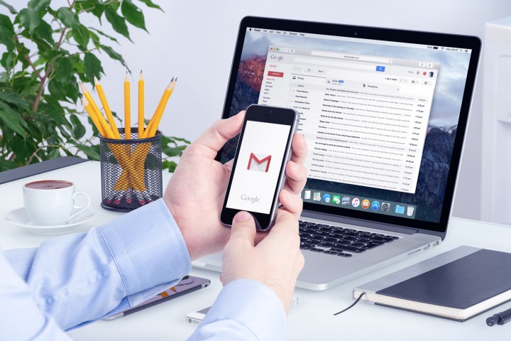
A person accessing Gmail via their phone and laptop.
Aleksey Boldin/123rf
Have a tough time making out the tiny text, scrolling around the massive image, or tapping on the obscured link in messages within your phone’s mail app? You’re not the only one. Smartphones, unsurprisingly, aren’t especially conducive to reading messages meant to be consumed on larger screens. But that doesn’t mean they can’t be shoehorned into forms more readable on mobile, though, and Google’s leading the charge. Enter the new Gmail, an update due out by the end of September that Google promises will noticeably improve the formatting of messages.

Here’s the rundown: In the coming weeks, both Gmail and Inbox, Gmail’s task-oriented spinoff client, will see a “responsive” makeover. Email content will adapt to device screens of “all sizes” — that is to say, the hyperlinks, buttons, and text in emails will automatically resize to the width of the screen on which they’re being read. And in tandem, developers will gain tools that’ll ensure “messages [are] formatted the way [they were] intended.” Email senders will be able to account for the width, orientation, and resolution of screens — a message might format tightly when, say, viewed vertically on a smartphone, but take advantage of the real estate afforded by a big-screened laptop — and even dictate characteristics like colors by device type.

Recommended Videos

“These changes will make your email experience as comfortable and intuitive as possible,” Piere Vollucci, Gmail’s product manager, wrote in a blog post. “And as responsive design becomes more common, you’ll continue to see emails that fit better on all your screens and devices.”

Please enable Javascript to view this content

The update’s due out for mobile devices in the coming weeks, Google said. After that, it’s bound for Gmail on the Web.

Responsive design is not a recent trend, but it’s one that’s picked up steam in recent years. The use of responsive email design increased to 50 percent in June of this year, according to a Salesforce survey. That uptick’s not surprising — a 2014 study on the relative efficacy of email click-through rate found that responsive design results, on average, in a 30 percent higher for the click rate than emails with nonresponsive designs.

Support for responsive designs is the second formatting-focused update Gmail’s received over the past few months. In February, the client on Android and iOS gained rich text formatting options — e.g., bold, italics, underline, and colored text — alongside the ability to instantly RSVP for Google Calendar and Microsoft Exchange events.

Kyle Wiggers
Former Digital Trends Contributor
Kyle Wiggers is a writer, Web designer, and podcaster with an acute interest in all things tech. When not reviewing gadgets…
Google Messages can now be your notes app. Please don’t do that
The Google Messages app on the Galaxy S25 Ultra.

Google Messages recently got an update that allows Android users to use it as a notes app as well as a regular messaging app. This update flew under the radar until Android Authority reported on it last Friday, saying that people can now send long messages, high-quality media, and other content to themselves via RCS messaging, freeing them of the restrictions imposed by its predecessor, SMS messaging. While that is a useful upgrade on paper, it's not a good idea in practice.

A lot of people use messaging apps as a substitute for the original notes app pre-installed in their phones. The problem is text messages sent through RCS are not encrypted, let alone messages sent to yourself, posing a host of security issues. Not long after Apple adopted cross-platform RCS messaging with Android late last year, a group of Chinese hackers called Salt Typhoon launched a cyberattack on U.S. communications networks, leading the FBI and CISA warning Americans to use encrypted messaging platforms, especially if messages are being sent from Apple to Android and vice versa.

Read more
Huawei’s wild tri-fold phone finally breaks out of China, and I’m excited
Huawei Mate XT Ultimate

Huawei unveiled the Mate XT Ultimate in China, just a day after the iPhone 16 Pro launch. While Apple introduced incremental upgrades, Huawei has pushed boundaries with an already novel form factor. And now, it’s expanding beyond China—Huawei has announced the world’s first tri-fold phone in Malaysia.

The Huawei Mate XT Ultimate features a 10.2-inch display (2232 × 3184 pixels), which folds into two additional form factors: a 7.9-inch (2048 × 2232 pixels) book-style foldable and a 6.4-inch (1008 × 2232 pixels) slab phone. More importantly, its three-screen mode adopts a 16:11 aspect ratio, offering a better media consumption experience than traditional foldables, which often have a boxy layout that isn’t ideal for videos.

Read more
Nothing Phone (3a) and (3a) Pro specifications hinted at in a fresh rumor
The Nothing Phone 2a Plus's camera and Glyph Interface lights.

Nothing, the mobile and lifestyle tech brand founded by OnePlus co-founder Carl Pei, is set to launch its next set of mid-rangers early in March. Official details of the devices, including Nothing Phone (3a) and (3a) Pro, have been scanty, but a new leak hints at the tentative specifications, including upgrades coming to the processor, new camera setup, and other improvements to the design.

Earlier, Pei had teased the Nothing Phone (3a) series is moving to a Qualcomm Snapdragon chip instead of MediaTek seen on the Phone (2a) and (2a) Plus. This week's leak, courtesy of a tip received by Indian outlet SmartPrix, corroborates it and states that both phones with be powered by the Snapdragon 7s Gen 3 -- a mid-range chipset launched in August 2024.

Read more