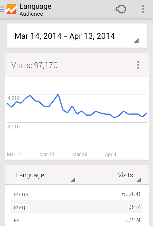
While it’s not as exciting as, say, Google Play Music adding podcast support, Google Analytics is still a widely used platform, and its old design was stuck in the Android Holo days in 2011. If you need a refresher, below is what the old version looked like.
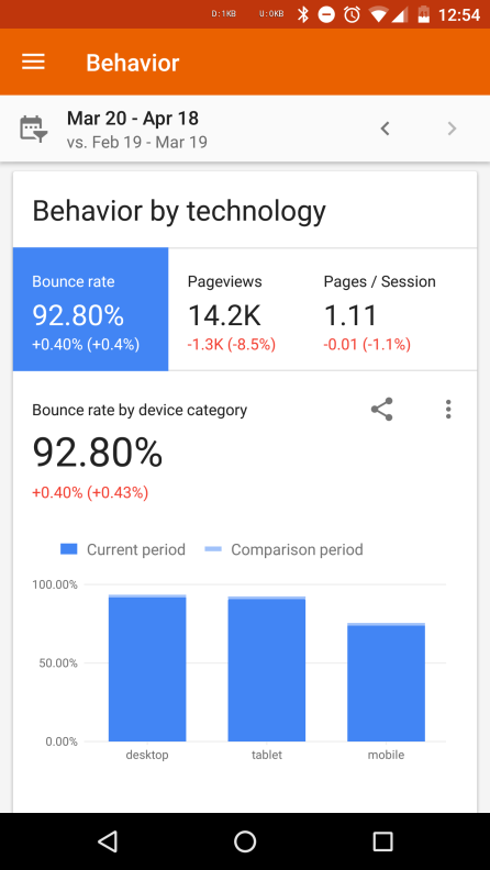
In comparison, take a look at the new version with Material Design.
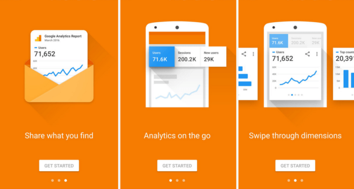
There’s a lot more orange, white, and blue, and the information is easier to see and process at a quick glance. Google Analytics lets you track metric data for any site you added into the service, and since the design jump is pretty big from the previous version, Google has added new onboarding instructions when you first install the Analytics app. It highlights how you can now swipe through dimensions, and share your reports via text, email, chat, and more.
You can tap each dimension for more information, change date ranges, as well as compare them. In the changelog, Google says you can also “tab through metrics” and add segments to see more specific information about the sites you track.

The logo also changed — it’s less square, and has lighter orange and yellow hues.
Google has been updating all of its apps gradually to Material Design, a new set of design rules it unveiled when it launched Android Lollipop in 2014. The update for Analytics is rolling out and should be available on your device soon.


