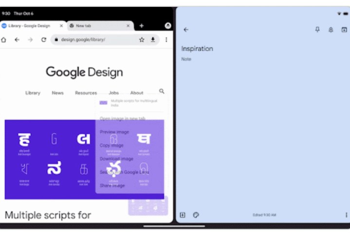
Google today announced the release of its redesign for the Chrome app on Android tablets. After long being neglected on the big screen, especially in comparison to Apple’s or Samsung’s browsers, Google says it’ll be rebuilding the browser to help you get work done faster with a tablet or other large-screened device.
These updates can be broken down into design and functionality improvements, and we’ll be kicking things off with the redesign. The first change adds a new side-by-side design when using Chrome paired with another app. This comes with an auto-scroll back feature so you can swipe between tabs, hiding the close buttons when your tabs are too small to prevent mis-taps — plus the inclusion of a restore feature.

Google is also giving the option of using a visual grid of tabs rather than the horizontal tab strip. You’ll now have the option to view all your tabs as a visual grid. The company says it helps find tabs much faster especially compared to poking and prodding at the little tab strip at the top.
Google is also adding in typical desktop features like drag and drop, tab grouping, and desktop mode. Drag and drop and tab grouping both work exactly as they do on laptops. As for Desktop mode, while it already exists on Chrome for Android, the new change is that you’re able to force the browser to run in desktop mode at all times. It should make those who own something like Samsung’s Tab S8 Ultra very happy.
In summary, the new Chrome app wants to be more like a full desktop app, and Google points out that it’s ready for the Pixel Tablet when it drops. With the company’s Android 13 being focused on making the Android experience better for larger displays, it only made sense that it does so for individual discrete apps as well.
Other apps are coming

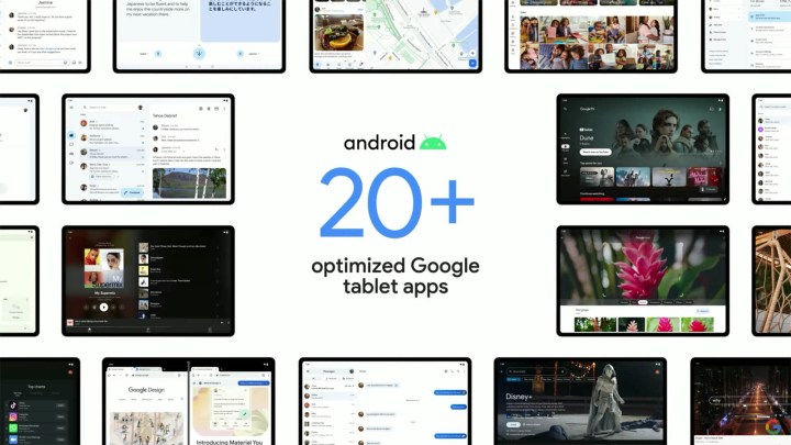
Google isn’t stopping with the Chrome app, though. Other Android tablet apps are either in the process of being updated or have been already. The folks over at 9to5Google have been keeping tabs on how well Google’s adhering to its promises, and the company’s been pretty good at keeping its word. Productivity apps from Google Docs, to Sheets, to Slides all support drag and drop, while entertainment apps like Google TV and YouTube Music now take advantage of larger screens to show more content. Google had long since been critiqued for having neglected the Android tablet app experience as a whole, so it’s great to see the company finally laying a closer eye on things.
Still, Google needs more than a fresh rollout of updates to restore faith in its tablet ambitions. The company is notorious for making U-turns at the drop of a hat. Chromebooks were the future last year; now it is Android tablets. Next year, we’ll have to wait and see if Google can keep this initial burst of enthusiasm going.
