The Web giant said last month it was gearing up to launch the feature, and on Wednesday it announced it’s now showing for all users.
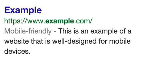
So now when you pull up a list of search results, sites optimized for your smartphone will show with a small “mobile-friendly” label just under the Web address, as shown in the image below.
It’s always annoying when you’re browsing on your smartphone and you land on a messy-looking site where you have to scroll sideways to see all the text, or pinch and zoom to get a better look at the image or navigate the page.
For Google, a mobile-friendly site is one that avoids software not commonly supported by smartphones and tablets (eg. Flash). In addition, any text should be easy to read – in other words, you shouldn’t need to zoom to make it legible or scroll across the screen to reach the end of a sentence.
Google says that another important characteristic of a mobile-friendly site is one where links are positioned far enough apart so you’ve a fair chance of tapping the one you actually want.
“Surfing the web on your mobile phone should be enjoyable and effortless, which is why we’re now helping you find out in advance which websites offer a good experience on mobile devices,” Google’s Javier Perez wrote in a post announcing the wider rollout of the new feature, adding, “Let’s ditch the pinching, scrolling and aimless tapping, and welcome the new wave of mobile-friendly sites.”
Indeed, let’s hope that the inclusion of the new label pushes developers of sites not yet optimized for mobile to implement a few changes so smartphone owners can enjoy a smoother user experience. Of course, it’ll benefit site owners too, as mobile users will be far more likely to return instead of searching out a mobile-friendly alternative.


