Google’s next phone has officially been unwrapped, but for several months we already knew what the Pixel 4 was going to look like courtesy of extensive leaks, as well as a tweet from Google itself that showed off the design. Now, we also have an idea of the other concepts and styles Google’s design team was thinking about as it was visualizing the Pixel 4, thanks to exclusive photos shared with Digital Trends.
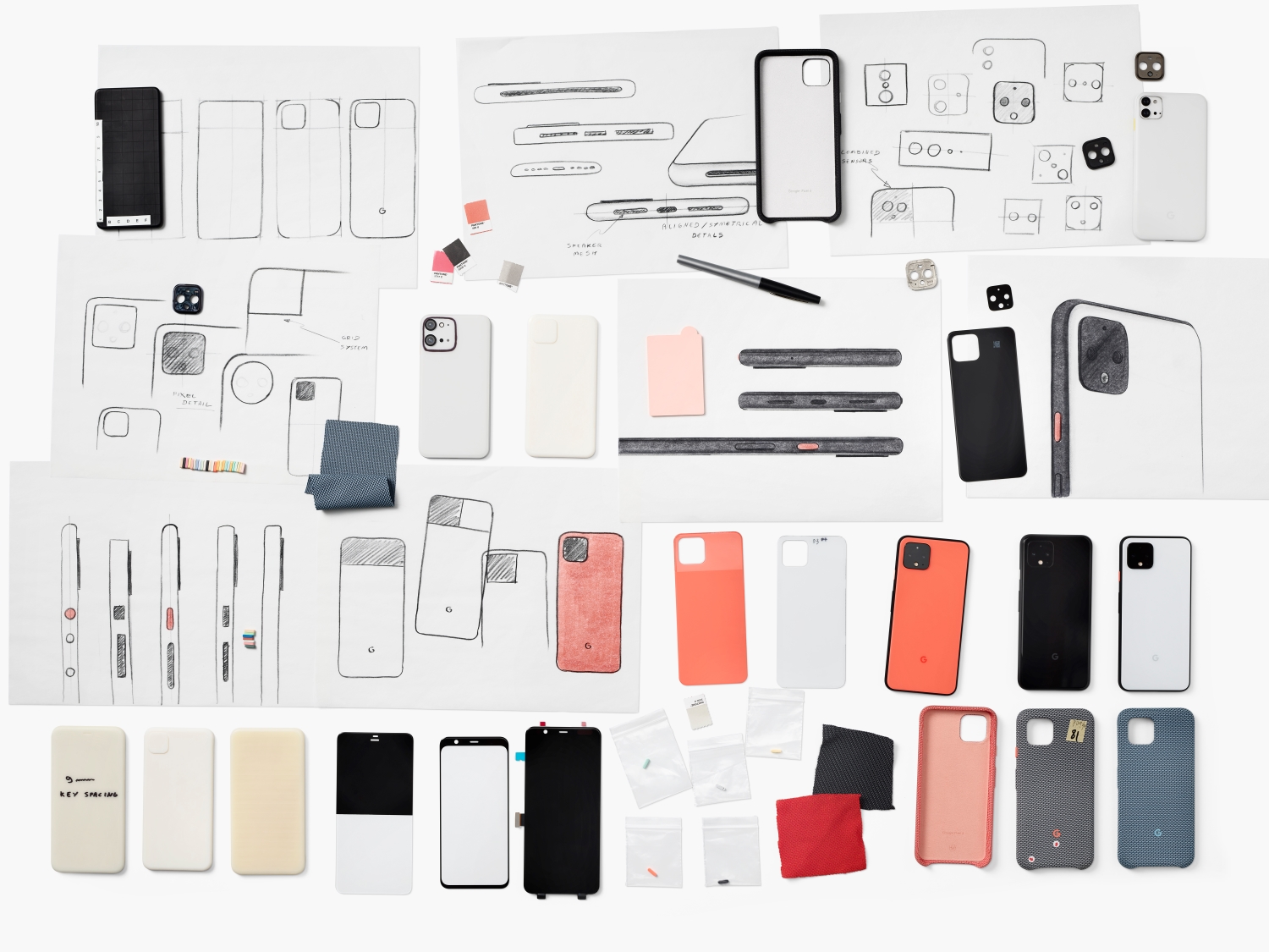
These photos were provided as a part of a larger interview with the Google’s Consumer Hardware design team — you can read the whole story here — but take a look at the above picture and you can see various other concept sketches for the rear design.
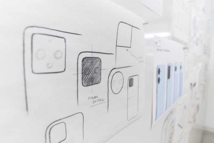
On the left, you can see Google was toying around with different shapes for the camera module — it could have been a circle or a more angular square that extended all the way to the edge of the phone — but Max Yoshimoto, director of Industrial Design at Google, told Digital Trends he felt as though something clicked after the team first began sketching out the square module. Afterward, all the other designs faded away and it was full steam ahead with what he calls the “Pixel square.”
Here’s a cropped version of the photo so you can see some of those other designs a little better:

The first one looks a lot like the Pixel 3, except with a second lens added to the below it, making it resemble Apple’s new iPhone 11. All these concept phones sport a baby blue color, along with a mint green-colored power button, so it looks as though this color scheme may have been scrapped ahead of the final design.
The next one has an oblong, vertical camera module, and looks distinctly like the Samsung Galaxy Note 10 Plus, but with a bigger camera module that’s more rectangular. The latter two are difficult to see, but it looks as though there’s only one lens. It is, however, easy to notice the line separating two finishes, a design element that has been on every Pixel phone since the original. It’s interesting because the line is no longer there on the Pixel 4 as a part of the redesign.
Its presence in these concepts shows the design team didn’t plan on cutting it from the beginning, but it was an evolution as the hardware team began to consider putting additional lenses on the phone.

This next image shows off the first concept in a more finalized prototype, except it’s not baby blue anymore, but a dark blue with an orange accent. A white version is visible next to it at the bottom center of the frame. It’s unclear how far in the design process Google went with this design before scrapping it and opting for the version with the Pixel square.
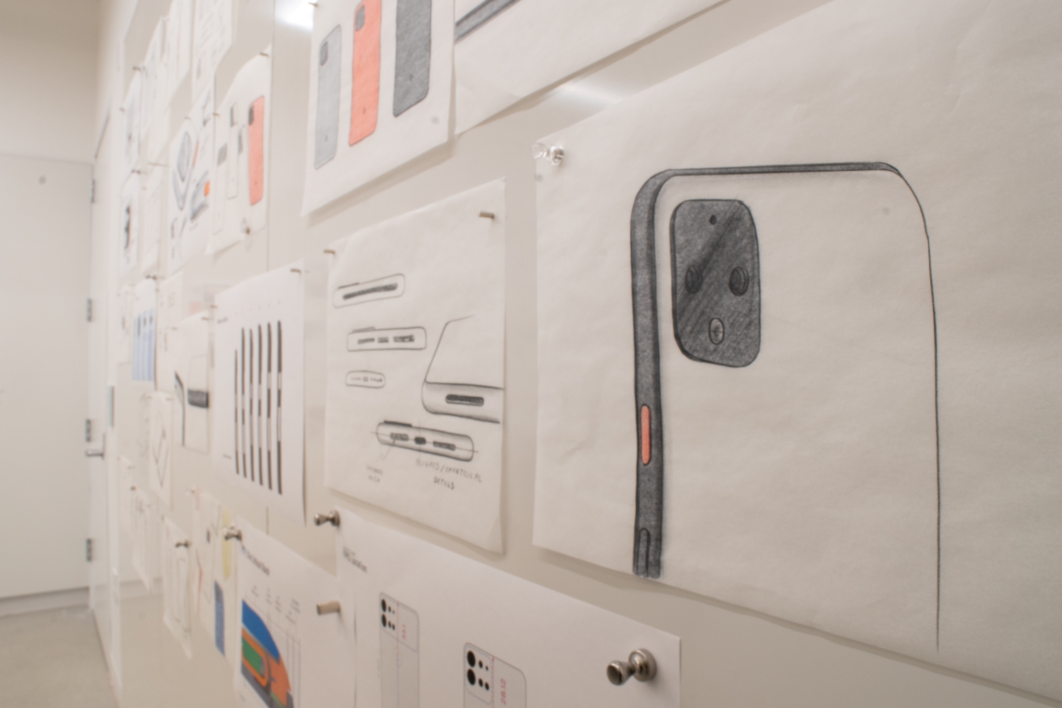
Another big element of the Pixel 4’s design is the black band around the edges of the phone. It hides components like the antenna bands, the speaker grill, the USB-C port, and the SIM slot, but in the picture above, you can see models of the
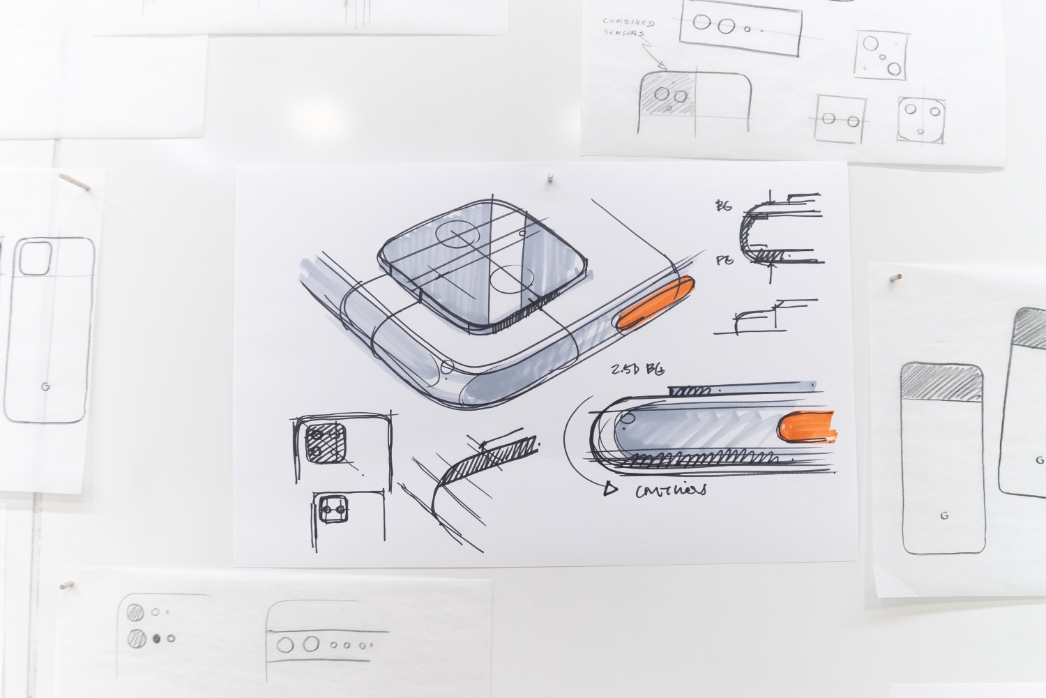
These last few photos show different styles for the camera placements on the back of the phone and even a potential design that would have mimicked the look of the Nexus 6P. There are sketches of Google’s designers toying around with redesigned power and volume buttons, though in the end the team said for consistency’s sake, they kept the buttons and placements the same.
It’s nice to see a company opening up about the design process for its flagship phone, showing us a peek at what styles could have come to fruition, but ultimately didn’t.


