Is the Pixel Watch Google’s answer to the Apple Watch? In that they are both smartwatches tied into their respective ecosystems, yes, but if you solely consider the design, the Pixel Watch doesn’t come close to Apple’s wearable. By holding back and being all Google about the looks, it has missed the opportunity to make the first iconic round smartwatch, and truly make the Apple Watch of the Android world.
Why square has worked for Apple
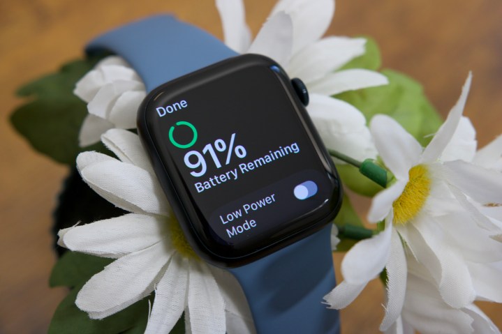
Not every watch has to be round, and when it was introduced, the Apple Watch received plenty of hate for not following that trend. In reality, there are plenty of highly recognizable square watches, from the Casio G-Shock 5000 and 5600 series watches to the Tag Heuer Monaco. Since its introduction in 2015, the Apple Watch has become the most seen, most easily identified, and most widely worn square watch in the world. Counterpoint Research puts the Apple Watch at the top of its wearable shipment estimates, with a 30% market share in 2021. Apple doesn’t release sales figures, but some reports claim it now sells 40 million Apple Watches per year.

Being square has not killed the Apple Watch, it made it a success. Most will put functionality at the top of the list of desirable points before buying a smartwatch, but design likely comes next. Anything we put on our bodies has to have some kind of aesthetic appeal, and although it took some a while to get out of the mindset watches have to be round, it’s clear that it’s no longer an issue for most. The Apple Watch Series 8 looks and feels superb, and Apple arguably has simply refined what is an almost perfect shape since the launch of the Series 5.
Apple’s wonderful design works because it doesn’t look like all the other smartwatches out there. The company was really the first to popularize the shape (let’s not talk about the hideous Pebble or LG G Watch) and now absolutely owns it. When another square smartwatch launches, like the Amazfit GTS series or the Oppo Watch, it’s called out for being an Apple Watch copy. In the world of smartwatches, the square shape has become so synonymous with the Apple Watch, no one really wants to wear an imitation.
The Apple Watch’s shape is distinct and well-judged, and now so intrinsically linked with the brand, that most have accepted that square is a great shape for a watch. The Apple Watch is an icon, and the fact its basic shape has only been refined over the past years instead of dramatically reinvented makes it a timeless one.
Oh so round
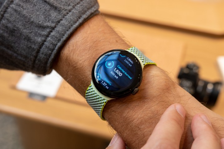
If Apple took a risk making the Apple Watch square, it was a calculated one that has paid off. Google has taken no such risk with the Pixel Watch. It’s as round as round can be, it has a crown on the side, and it has a system for attaching different straps. It’s absolutely the definition of what most would think of when asked, “what does a watch look like?”

Herein lies the problem. It has absolutely no identifying features that make it obviously a Pixel Watch at all. From a distance (if you’re so inclined to check out other people’s wristwear), you may ask yourself if it’s an original Skagen Falster, an Amazfit Zepp E Circle, a Sequent SuperCharger 2, or perhaps even a first-generation Moto 360. Or, really, any circular watch at all. I’m not saying it’s badly designed — the opposite, as the curves look great and it also looks set to be very comfortable — but I am saying it’s very safe indeed.
Unfortunately, that safety has robbed it of individuality. Most look at the Apple Watch and know exactly what it is, which is primarily because of its squareness and the fact Apple has stuck with it since the beginning. It even had the chance to reinvent the design with the Apple Watch Ultra, but didn’t, as it knows the value in sticking with what has turned out to be a fantastic overall style and design for a smartwatch.
Google is going to find it very hard indeed to get the public to recognize the Pixel Watch as a Pixel Watch, not just because it’s round, but because the safe design doesn’t really have any immediately identifiable visual features.
A missed opportunity
What could Google have done differently? It certainly couldn’t have made a square smartwatch. Trying to compete with Apple on a design level in this way would have been a serious mistake, as while iPhone and Android phone owners must use the smartwatch from their respective ecosystems, Google would always be the imitator if for nothing else than the Pixel Watch came along seven years after the first Apple Watch.

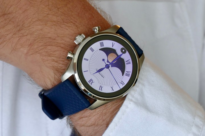
Going round was really the only solution, as there are only so many shapes a watch can be. But there are a lot of Swiss manufacturers that manage to make very different looking round watches from each other on a regular basis, and a lot have gone on to build giant empires out of one or two highly recognizable silhouettes. A Deloitte report says 60% of Swiss watch industry executives feel the Swiss watch industry missed the smartwatch boat.
Surely one of those would have jumped at the chance to work with Google to create what could arguably become the first iconic round smartwatch? Something recognizable, desirable, and uniquely Google, just infused with the design knowledge of a veteran of the Swiss watch industry. The Rolex Submariner, the Audemars Piguet Royal Oak, or the Omega Speedmaster of the smartwatch world.
The Pixel Watch looks like a piece of tech, which on one level is fine as Google is a technology company, but technology is forgettable in a way that truly great watch design isn’t. Creating forgettable mobile tech has been a Google issue in the past, but with the beautiful Pixel 6 Pro and Pixel 7 Pro design, along with its wonderfully natural Nest designs, it appeared to be moving past it. The Pixel Watch certainly isn’t ugly, but it really could have been so much more. Google had the opportunity to make the Apple Watch of the Android world but, at least from a design perspective, it missed.

