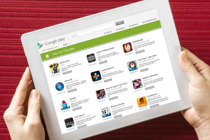
New branding options in the Google Play Store let developers show off their apps

google play may be back in china soon
Halfpoint/Shutterstock
Google’s annual I/O conference has already been an eventful one. Today, the company announced improvements to Play Store customization for developers, including custom storefront pages and A/B testing for apps.

Developers now have a far greater degree of control over the appearance of catalogs, the pages that show all the apps they’ve published to the Play Store. They can now embellish them with banner graphics, icons that represent their brand, and/or featured apps. Google says its working on bringing catalog pages to the forefront in a future Play Store update.

Recommended Videos

Updated by Kyle Wiggers 02-05-2015: Added information about catalog customization.

But what’s A/B testing, you ask? A very reasonable question. Also known as split testing in some circles, it’s often employed as a Web development tool to determine which of two pages performs better: You show one version to a set of visitors, another version to a similar visitors, and see which results in superior traffic. A/B testing is a bit different in the context of mobile apps, but the principle is the same: Developers create multiple unique, independent app listings and see which one manages to accrue more downloads or purchases.

Google will offer a fair degree of A/B customizability when it goes live in the Play Store. App makers will be able to create listings with alternate descriptions, icons, images, videos, and even pricing.  The feature’s use, at least at launch, will seemingly be limited to the simplest forms of optimization — i.e., funneling random groups of users to distinct pages. Given the potential analytics goldmine, though, Google will undoubtedly expand A/B testing capabilities in the future.

A/B testing isn’t an end-all solution for Android’s app profitability woes — according to DAU-UP, a gaming marketing company, average revenue per user is far lower on Android than iOS — but it could help incentivize equal or Android-first release strategies. Kongregate saw conversion rates by up to 50 percent, and sources claim Apple currently has no answer to Google’s system in the works.

Kyle Wiggers
Former Digital Trends Contributor
Kyle Wiggers is a writer, Web designer, and podcaster with an acute interest in all things tech. When not reviewing gadgets…
Google is launching a powerful new AI app for your Android phone
Google Gemini app on Android.

Remember Bard, Google’s answer to ChatGPT? Well, it is now officially called Gemini. Also, all those fancy AI features that previously went by the name Duet AI have been folded under the Gemini branding. In case you haven’t been following up all the AI development flood, the name is derived from the multi-modal large language model of the same name.

To go with the renaming efforts, Google has launched a standalone Gemini app on Android. Moreover, the Gemini experience is also being made available to iPhone users within the Google app on iOS. But wait, there’s more.

Read more
Google is paying a $700 million fine, and you’re getting some of it
Google Play Store on the Samsung Galaxy A53 5G.

If you think your Tuesday is off to a rough start, at least you aren't Google. In the wee hours of the morning on Tuesday, December 19, Google confirmed that it's paying $700 million as part of a settlement regarding antitrust concerns around the Google Play Store.

In July 2021, over 30 states (plus Washington, D.C.) filed a lawsuit against Google over its business practices related to the Google Play Store on Android. Specifically, the lawsuit targeted fees Google charges developers to use the Play Store — and the alleged lack of competition the Play Store allows. Google settled the lawsuit this past September, and now Google has announced the details of that settlement.
Google's paying you $630 million ... kind of

Read more
Google just redesigned one of its biggest apps, and it’s bad
Google Chat app on the Play Store.

Google Chat — Google's business-oriented messaging platform that is similar to Slack and Microsoft Teams — just got a big update for its Android and iOS apps. The update dramatically changes how you navigate the app and, uh, well, it sure is something.

Google Chat's mobile app used to be broken up into two pages: Chat (direct messages between you and other users) and Spaces (larger chat rooms for multiple people). As with most apps, you switched between these with a navigation bar at the bottom of your screen.

Read more