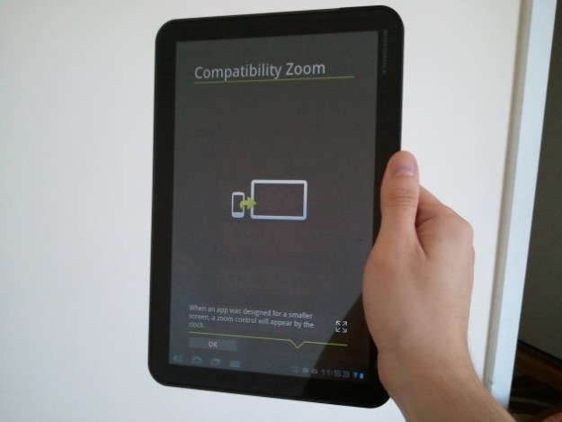
Yesterday, we received Google’s Android 3.2 update on our Motorola Xoom tablet. Like Android 3.1, this is not an overhaul update of Android 3.0 (Honeycomb), but merely fixes a few things and adds some minor features, with an emphasis on the word ‘minor.’ The new OS version has a few noteworthy features for developers, like support for 7-inch tablets and an extended screen support API that will help them make apps look better across the many screen sizes Android devices now come in, from tiny screens to giant 10.1-inch screens, like our Xoom. Users, well, you’re not going to notice much. The only notable feature of the new release is compatibility zoom mode.
Android 3.2 new features:
Supports a wider range of tablets: Google has made a number of small changes to Android Honeycomb to make it look and run better on smaller devices like 7-inch tablets, etc.
- Extended screen support API: Google has added more granular API support for different UI elements, allowing developers to better control their user interfaces across different device sizes.
- Compatibility zoom: A new toggle is available that lets users choose to pixel-scale a fixed-sized app instead of the usual UI stretching. This is for apps not yet optimized for Honeycomb.
- Media sync from SD card: We believe an app needs to first support this feature for it to be useful, but on devices that have a removable SD card, apps can now load and use movies, music, and other media files directly from the card.
Compatibility zoom, seen above for the game Jewellust, simply adds a small zoom button in the Android System Bar that lets you toggle between stretching an app to fill the screen or zooming an app to fill the screen. This feature is, of course, meant for the many (majority) of apps that don’t yet support larger tablet-sized screens. Unfortunately, there is no way to use the app at its intended resolution with a black border around it, like you can do on the iPad. While we understand Google’s reluctance to do this, these apps are going to look bad either way.
“Stretch to fill screen” mode
Here’s a look at the game Armored Strike in “stretch to fill” mode. This is how Android Honeycomb has handled undersized apps in the past. It doesn’t resize the graphics, but instead kind of zooms out and stretches backgrounds. A lot of apps and games appear warped with undersized items in strange places that the developer may not have intended.

Make note of the size of the menu as well. It’s small. If the game were designed with a tablet in mind, it would have a settings menu at the top of the screen, or integrated into the experience.
“Zoom to fill screen” mode
This is the same game, Armored Strike, played in pixel “zoom to fill screen” mode. Instead of stretching out the landscape, the tablet has displayed the app as it was originally intended to be played–just bigger. Like a phone, the menu takes up the whole bottom.

As much as we like a pure experience, the stretch mode was preferable in this case, simply because it let us view more of the battlefield. It should be noted that switching between modes isn’t seamless. When you swap, the app shuts down completely and you must restart it to see what the other mode looks like. As such, we imagine that a lot of people won’t even use this feature unless an app looks broken in the standard stretch to fit mode.
Google’s own apps aren’t tablet-ready
Perhaps Google should start doing more to solve the problem and kick developers into action instead of trying to make smartphone apps look better on a tablet screen. Our first suggestion to Google: drink your own kool-aid. Google isn’t even making all of its apps tablet compatible.

Take a look at the new Google+ app on the Xoom. It has no tablet optimization. How can Google expect developers to support its tablet OS if it isn’t doing so on its major app releases. Curiously, even though Google’s app could use some reformatting, the zooming option is not available. This is likely because Google+ is not a fixed-size app. It is, in its current state, an ugly resized app.
A small update
That’s about it. Aside from the app zooming, not a lot has changed for Android tablet owners, except those who have a 7-inch device, as those may finally make the jump from Android 2.X to 3.2 sometime in the near future. We haven’t yet noticed any slowdown or speedup from the update and the design of the OS remains identical to Android 3.0 and 3.1. For a more detailed look at the many small changes Google has made to Android 3.2, check out the developer overview.
 Supports a wider range of tablets: Google has made a number of small changes to Android Honeycomb to make it look and run better on smaller devices like 7-inch tablets, etc.

