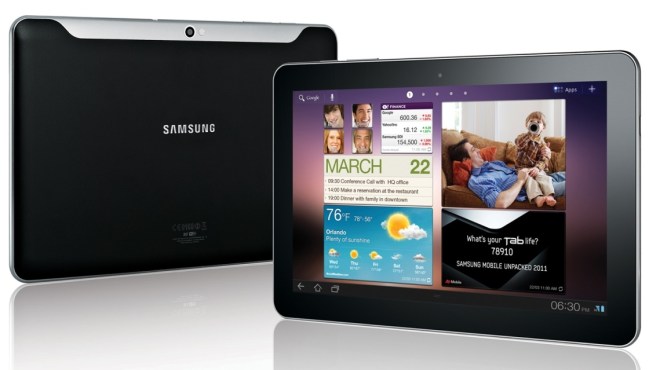
Samsung is taking the iPad seriously. So seriously, in fact, that in two weeks it completely redesigned two of its upcoming tablets to compete with Apple’s new, thinner, iPad 2. The newly announced Galaxy Tab 8.9 and refreshed Galaxy Tab 10.1 are now slightly thinner than Apple’s tablet and will be sold at competitive prices when they hit North American shelves this summer. Now, the only question is what kind of experience they offer.
From cheap to chic

I had the chance to spend some time with the Galaxy Tab family last week and came away mixed and confused. Because of its lightning fast redesigns, the working tablets on display were actually older, fatter models that resembled Samsung’s initial Galaxy Tab 10.1 concept from back in February. They were lightweight and felt cheap, a lot like the sea of iPad knockoffs I tested out back at CES in January. It was a good move to change up the design. You aren’t going to beat Apple unless your product looks like its built well. Luckily, Samsung’s newer designs were heavier (not too heavy), had a metal casing, and featured a nice rubberized grip material on the back, which looked good and should prevent a few accidental droppings. I was thoroughly disappointed with the old plastic design, but impressed by the feel of the new. Now we just have to see if Samsung can fit a working tablet into that sexy new case.
The 8.9 and 10.1 both have the same specs, running on a dual-core processor (we don’t know which), a 1280×800 pixel screen, a 3MP rear camera, a 2MP front-facing camera, HSPA+ high speed support for AT&T, and Android Honeycomb. Samsung claims both devices will have a 10 hour battery life and will have dual-speakers, something Apple’s tablet does not have.
A sluggish, modified Honeycomb

Now that Samsung has improved the hardware, I’d ask them to make some adjustments to its implementation of Google Android. Samsung is the first company I’ve seen that has changed the default design of Honeycomb. A rudimentary version of TouchWiz has been added on top of Honeycomb, changing the navigation buttons and adding a few new widgets to the operating system.
The new widgets are boxed and give Honeycomb a very newspaper grid-like feel. In the demo I saw, widgets for photos, the weather, Samsung’s Social Hub, the date, and Internet bookmarks were readily available. Though much different in style than Samsung’s Android phone widgets, these were still better than Google’s rather sparse set of stock widgets.
Samsung has also done away with the techno-future weird look of the Back, Home, and Menu buttons, replacing them with more clear-cut icons. This is a welcomed change. I’m not sure how much Tron Google was watching when it designed Honeycomb, but those buttons were hideous.

Finally, the biggest change Samsung has made is an OS-X-like line of icons along the bottom of the tablet. Flicking your finger up on the bottom task bar brings this menu up for a few seconds. Unchangeable, this menu contains links to music, phone, calculator, PenMemo, World Clock, Calendar, and Task Manager apps. Oddly, many of these apps aren’t full screen, but also don’t appear to be moveable. They simply pop up over the screen. Samsung’s “Hubs” will also be available on all its tablets.
Samsung’s changes don’t harm the experience from a design standpoint, but the 8.9 and 10.1 tablets ran sluggishly. Simple actions, like switching between homescreens, was not up to par with the snappiness of Apple’s iPad or even Motorola’s Xoom or LG’s Optimus Pad. One of the first things a potential customer looks at when trying out a product is how the experience feels. Samsung failed this test during the show. All of the 8.9 and 10.1 tablets seemed uniformly slow, even with few apps running or on a fresh reboot. Hopefully these performance issues are ironed out before release. If not, I can’t see many choosing this over the competition, higher price or not.
Two tablets, one market
Samsung has potential here, if it can boost the performance of Honeycomb on its tablet. However, I’m not so sure there’s a market for both of these tablets. They both run the exact same hardware and aren’t much different in size. Honestly, it’s hard to tell them apart. Nevertheless, it may be a smart move for Samsung. The manufacturer now has Android devices of almost every size, from 3 inches to 10.1 inches. In the coming year, no matter which trends play out, Samsung will have a device in the fight. The only thing Samsung has to worry about is if 9.7 inches proves to be the only size anyone cares about.


