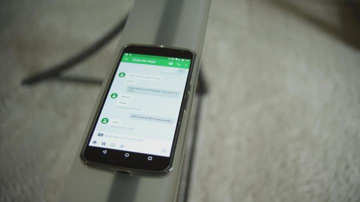
First up: a fresh coat of paint in the spirit of Google’s material design. Communications chief Amit Fulay said in a blog post that the new interface is more “fluid” and “intuitive,” and that’s definitely the case anecdotally. Pulling up threaded conversations seems quicker, switching between the Hangouts phone dialer and messages produces far less stutter, and the new floating Compose button does a much better job of surfacing potential messaging partners than the old Hangouts’ never-ending list of numbers. A streamlined contacts selector makes starting group messages easier, and adding attachments is now a lot simpler — beneath the text of your message is an omnipresent array of icons for tacking on emoji, GIF, your location, and photos.
The Hangouts’ smartwatch companion app hasn’t been forgotten, either. If you’re sporting an Android Wear watch, you can switch accounts, read your conversation history, and reply to messages with a canned response (“OK,” “Give me a minute,” “On my way”), emoji, or voice from your wrist.
But there’s more to the new Hangouts than aesthetic improvements. You can now receive Google Voice (but for now not send), MMS messages, and set Hangouts status messages, and calls placed through the Hangouts dialer will display outbound caller ID. Fulay says message delivery should be “faster” and “more reliable,” too, and the new Hangouts should be easier on your phone’s battery.
Hangouts 4.0 hits the Play Store today. The rollout is staged, though, so don’t fret if you haven’t received an update prompt just yet.

