HTC still makes smartphones, but still isn’t great at marketing them

It’s easy to forget HTC still makes smartphones, as it sold most of its phone division to Google, hasn’t competed in the flagship race for a while, and concentrates on selling the HTC Vive VR headset. The phones are still there, though, and HTC has announced a pair of new ones: The HTC U19e, and the Desire 19+. What hasn’t changed at HTC is its haphazard approach to marketing, which for a brief time extended into advertising Apple’s products too.

HTC U19+
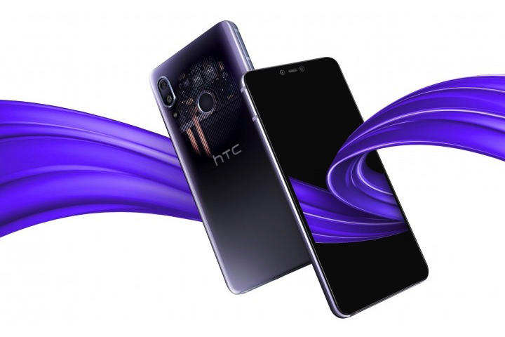
Image used with permission by copyright holder

We’ll come back to that. What about the phones? The HTC U19e is the more interesting of the two, as it has a specification to challenge the current darling of mid-range phones, the Google Pixel 3a. It’s a big phone with a 6-inch screen on the front, and instead of a notch, HTC has bravely decided to add bezels at the top and bottom of the display. The fingerprint sensor is on the back of the phone, along with a dual-lens camera.

Recommended Videos

There’s a healthy chunk of power inside from the Qualcomm Snapdragon 710 processor and 6GB of RAM, plus 128GB of internal storage and a MicroSD card slot. However, despite the bezels, HTC has not added a 3.5mm headphone socket to the U19e. The 1080 x 2160 pixel resolution screen has been given the HDR10 treatment, meaning it should be great for movies. The dual-lens camera is made up of a 12-megapixel sensor and a 20-megapixel sensor. Finally, the battery has a 3930mAh capacity.

It has so far only launched in Taiwan, where it cost the local equivalent of $475.

Desire 19+
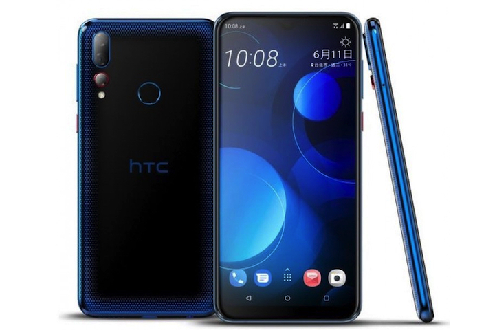
Image used with permission by copyright holder

HTC’s second new phone is a new entry in the Desire series, called the Desire 19+. It stands out from previous Desire phones due to a triple-lens camera, which has a 13-megapixel main camera, a wide-angle 8-megapixel lens, and a 5-megapixel depth camera. The processor inside is a MediaTek Helio P35, along with 4GB or 6GB of RAM, while the screen is even larger than the U19e at 6.2-inches.

The design is different from the U19e and has a camera array that reminds us of the Huawei P20 Pro, which sits on the back with a fingerprint sensor. On the front, HTC has used a notch to reduce the size of the bezels, although the chin still looks large in the photos. It’s also only been announced for Taiwan at the moment, and prices start at $280.

Marketing mix-up

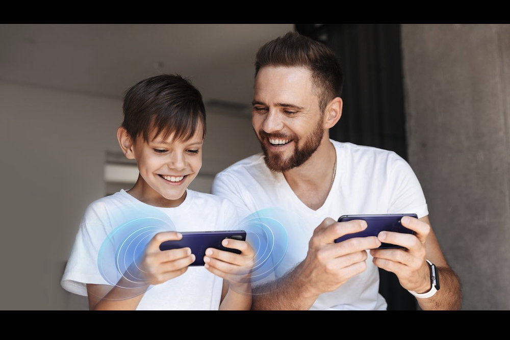
Take a look at HTC’s main website for the U19e now, and there is a lovely photo of a man and (presumably) his son, enjoying HTC’s new phone. However, the image has been carefully doctored since it first made an appearance, as the father was wearing what was very obviously an Apple Watch.

The world’s best smartwatch can do many things, but connecting to an Android phone is not one of them. A mix up at the modeling agency and a mistake by the photographer has resulted in a hasty Photoshop correction to de-Apple the image. HTC has not had the best track record with marketing and promoting its usually decent devices, but this is one will have caused the most embarrassment for the firm.

Whether HTC decides to launch the new U19e or Desire 19+ outside Taiwan has not been revealed.
Andy Boxall
Andy is a Senior Writer at Digital Trends, where he concentrates on mobile technology, a subject he has written about for…
I desperately want a foldable iPhone, but iOS still isn’t ready for it
The Samsung Galaxy Z Flip 4 sitting on a table.

If there’s one thing that causes many iPhone enthusiasts to look enviously at the world of Android smartphones, it’s the much wider array of designs and form factors available. While Apple refines its designs every few years, it has rarely done anything that most folks would consider radical.

Perhaps the most significant departure from traditional smartphone designs has been the return to the foldable phones of yesteryear. Samsung’s latest Galaxy Z Fold 4 and Z Flip 4 have piqued my interest more than ever, but even before those came along, there have been other handsets that have made me wish that Apple would think differently about its hardware designs. And while I don't doubt Apple's hardware for a foldable iPhone could be great, I think the real struggle lies with making iOS useful for a foldable.
Apple’s foldable plans

Read more
Android 12L and Wear OS 3 show Google still isn’t serious about tablets and smartwatches
Onn Android Tablet on Table

Late last year, Google introduced Android 12L, its operating system optimized specifically for tablets and foldables. After years of neglect, Google showed it was finally taking the form factor seriously. The same went for Wear OS 3, with Google breathing new life into smartwatches. There's just one problem for both.

As of the time of writing, not one tablet, foldable, or smartwatch has been updated to either of these operating systems. Google has planned to overhaul how its smartwatch and tablet platforms work for the better, but the company's rollout has undermined its ambitious plans.
Google's lofty ambitions

Read more
Samsung’s Galaxy Tab S8 shows why Android 12L isn’t enough
Samsung Galaxy Tab S8 Ultra with keyboard.

Android tablets have usually fallen behind iPads and Windows tablets when it comes to offering good tablet experiences. With Android 12L, Google is taking that particular bull by the horns. The update will roll out to Pixel phones starting next month, but Samsung's recent announcement of the Galaxy Tab S8 casts a shadow over what should be a revival for Google's tablet ambitions because it shows that the problem with Android tablets isn't really with the interface.
What's Android 12L?
To quickly recap, Google last year announced Android 12L, an initiative the company is using to make Android a better experience on tablets and foldables. The company will continue this work through Android 13 and has hopes for app developers to step in line and create apps that would work better with Android going forward. The big issue here is that Android 12L is redundant for the most part -- and the Tab S8 is a reminder of that.

Android 12L, as far as focusing on bigger screen devices goes, amounts to pretty much a user interface revamp. There's a new multi-pane interface for the lock screen and the notification center, and there's support for a dock for productivity scenarios. But none of this actually fixes problems that exist for users. If you've done any shopping for Android tablets recently, you'll notice that companies like Samsung that actually sell Android tablets have pretty much always had their device software competently tablet-optimized.
Android tablets already have optimized interfaces
https://www.youtube.com/watch?v=pPGzX_y8ccM

Read more