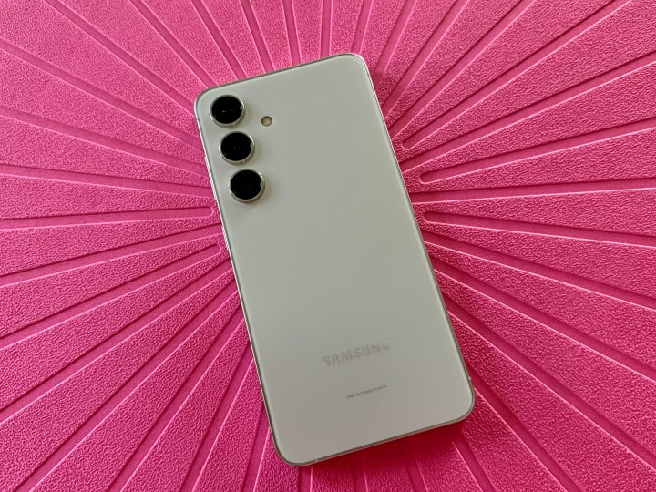
Samsung unveiled its next flagship smartphone line, the Galaxy S24, during the January Galaxy Unpacked event. This new lineup includes the base model S24, the larger S24 Plus, and the top-tier S24 Ultra. It’s one of the first big smartphone releases to kick things off for the new year.
I got my hands on the base Galaxy S24 and have been spending some time with it. Here are my (very positive) first impressions of the device so far.
The size is very similar to the S23
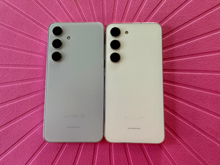
One of the things I loved about the Galaxy S23 from last year was the size. I’m a person who prefers smaller phones, and the S23 was great because it was a relatively compact size compared to most of the competition, and it was quite comfortable to hold and use for extended periods.
When the Galaxy S24 was announced, I was a bit annoyed at the fact that Samsung had slightly increased the display size from 6.1 inches to 6.2 inches (and the S24 Plus got the same .1-inch increase to 6.7 inches from 6.6 inches). I prefer more compact devices because I have petite hands, and large phones are difficult for me to use single-handedly. So, when I saw that the S24 was creeping up in size, my heart sank. After all, it’s a slippery slope — what’s to stop Samsung from slightly increasing it each year? Eventually, there may be no more compact phones.
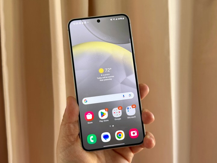
Thankfully, the bump to 6.2 inches is not as bad as I thought. It’s actually pretty negligible, and unless you have the two devices side-by-side, I doubt you’ll even be able to tell the difference. The Galaxy S24 appears to be a smidge taller and a fraction of a hair thinner than its predecessor, but it’s not noticeable unless you look closely. There’s also a slight reduction in bezels, but not too much.
The Galaxy S24 is still quite small and compact, making it a good size for me. It’s about the same as my iPhone 15 Pro but lighter due to the aluminum frame. It’s been comfortable to use, which I’m thankful for.
The new design is good, but also very familiar
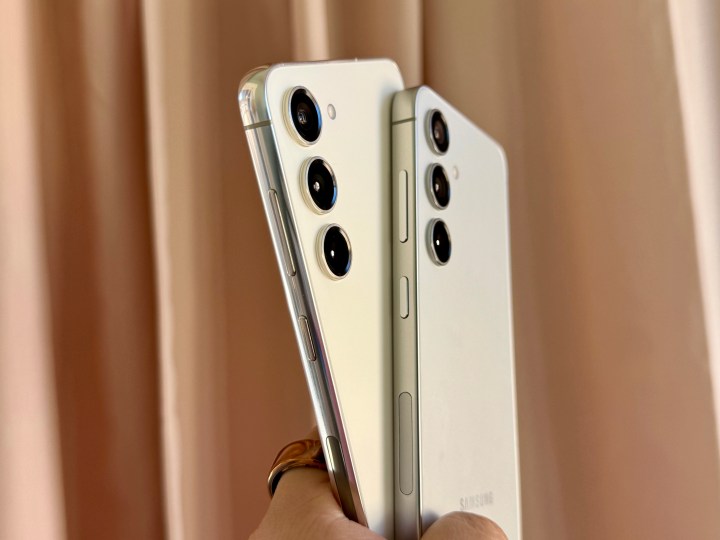
Samsung decided to refresh the look of the S24 and S24 Plus this year by moving to a flat-edged frame instead of the rounded curves from the S23. The flat edges are reminiscent of what Apple has done since the iPhone 12 and up to the current iPhone 15 lineup.
I like the flat edges. It makes the S24 a bit easier to hold and looks much more elegant and clean, in my opinion. But it also feels like a double-edged sword because it’s not actually anything new — it’s been done before. Samsung is simply being a copycat. The Galaxy S24 basically feels like an iPhone 15, and there’s no getting around it.
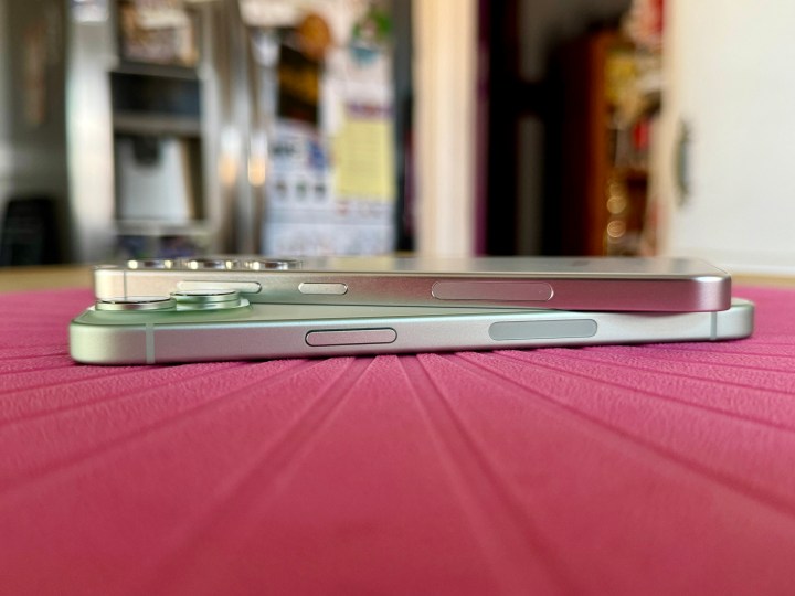
And it seems like Samsung isn’t the only one. From the Google Pixel 9 and Pixel 9 Pro leaks last week, it looks like Google is doing the same thing. Flat edges are coming to the Pixel lineup, assuming those renders are true.
As much as I like the flat edges, it feels like smartphone design has plateaued, at least with the major brands. It works well on the S24, but it’s also a potentially troubling sign of what all smartphones could look like over the coming year.
Circle to Search is incredible
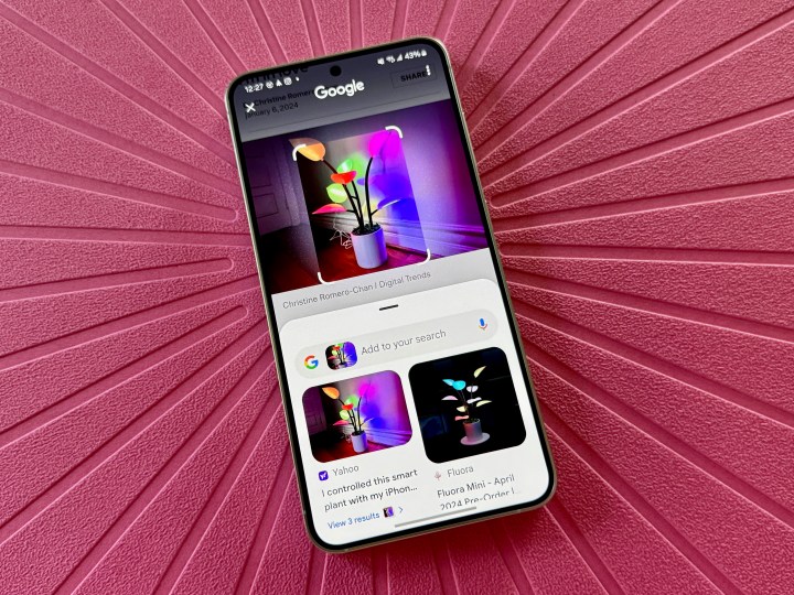
I’m not a huge fan of how AI seems to be taking over everything everywhere, including smartphones. But I must admit that Circle to Search was a feature that intrigued me when I heard about it, and I couldn’t wait to check it out for myself.
I’m always scrolling through my social media apps, and I often come across things that catch my attention, but I have no idea what the name is or what it’s called. I type something into a Google search but sometimes I’m not even close with the results. Circle to Search is a game changer.
I love that this feature works anywhere in any app, not just when you’re browsing the web on Google Chrome. Find something that interests you, and then tap and hold on the center navigation button (or nav bar if you chose gesture navigation), and then tap, circle, or scribble on whatever you want to look up.
The results I’ve gotten so far are pretty good, as I’ll find links to where I can purchase an item that I randomly found, or other articles for products. It’s an impressive AI feature that I wish was on all of my other phones. Thankfully, Circle to Search is available on all of the S24 lineup (the S24 Ultra, in particular, is great because of the S-Pen), and it’s also heading to the Google Pixel 8 series by the end of the month.
This is a convenient feature that all phones should have, not just the Galaxy S24 and Pixel 8. Hopefully, it just becomes a standard feature in the near future.
There’s still a lot more to like
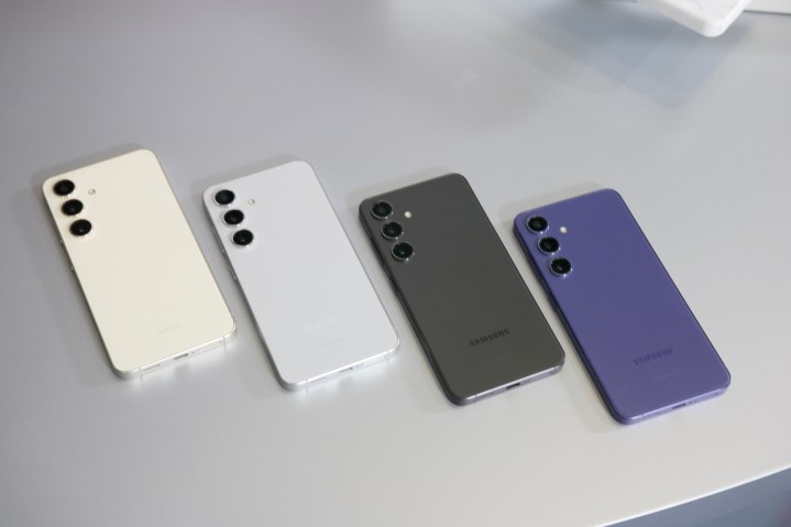
I’ve only been using the Samsung Galaxy S24 for a few days, but I’m enjoying my time with it. Aside from the new design changes and AI-powered tools like Circle to Search, it looks like a decent upgrade from last year’s Galaxy S23.
The Galaxy S24’s display is brighter than ever, which is useful for those bright and sunny Southern California days. Qualcomm’s Snapdragon 8 Gen 3 for Galaxy chip is snappy and fast, and even though the S24 only has 8GB RAM compared to the 12GB of the S24 Plus and S24 Ultra, it’s still quite a powerhouse for the average user — especially those who prefer small phones. The battery life is also impressive, though I wish Samsung would bump up the charging speed for the base model S24 like the rest of the lineup.
I’ll be putting the S24 through the paces more in the coming days for a full review, so stay tuned!


