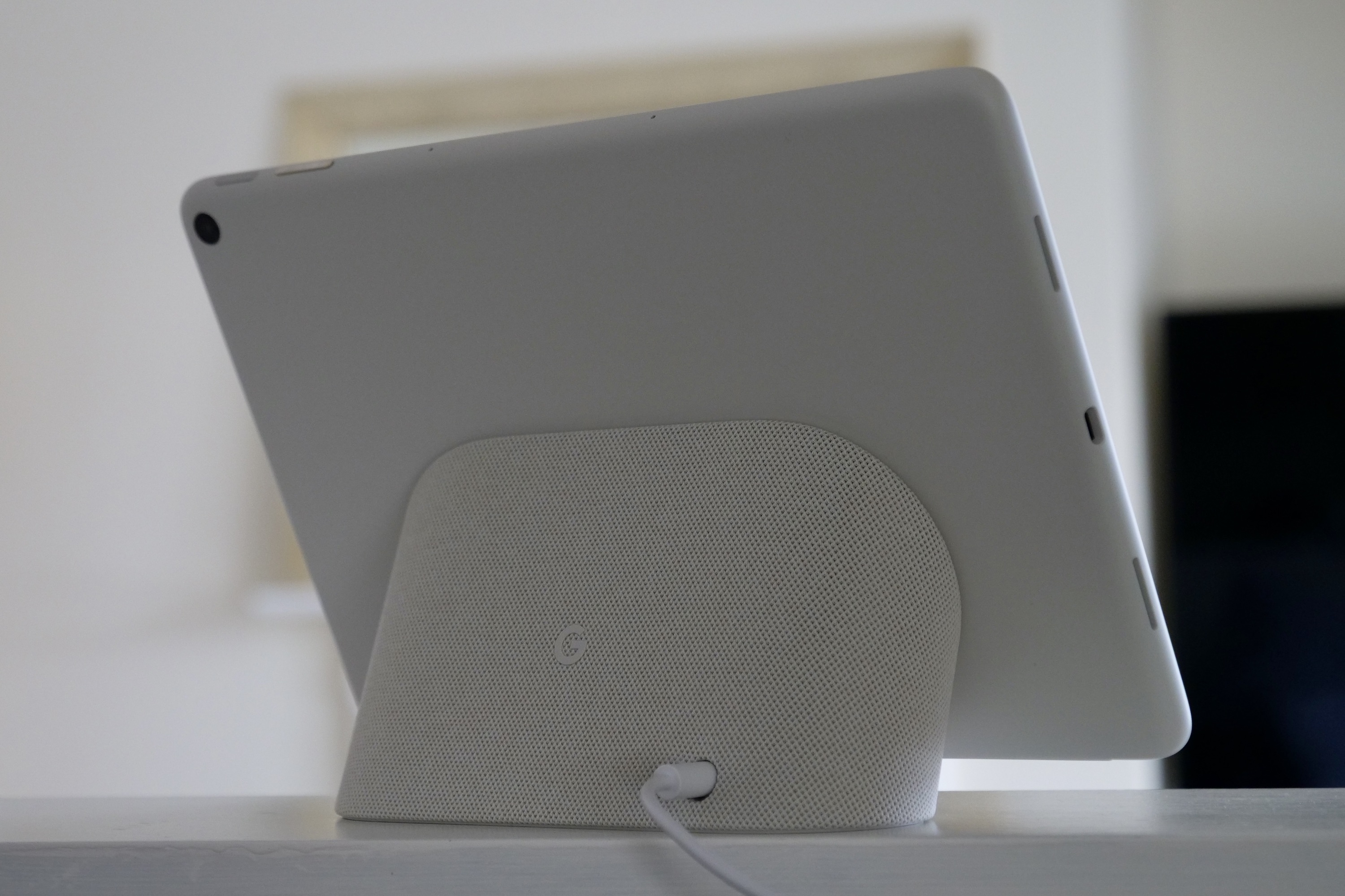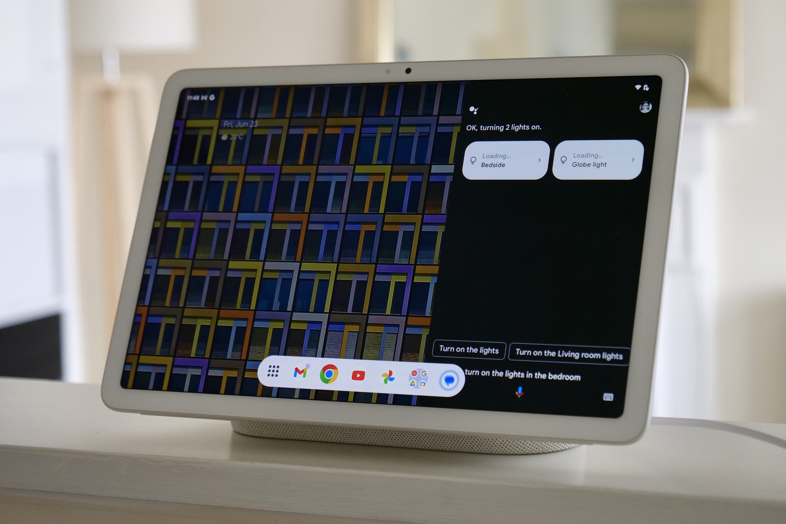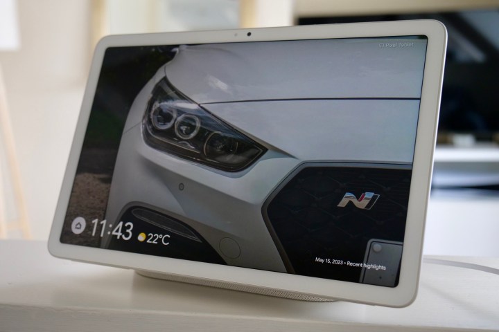
Since arriving in my home, the Google Pixel Tablet has revealed itself to be my ultimate smart home display. It’s done so by performing all the usual tasks I expect from one, plus nailing functions my previous smart display wasn’t very good at.
The trouble is, I could totally do without all the disappointing Android tablet stuff. And as such, it’s proof these two-in-one products are really hard to get right.
One half of the Pixel Tablet is great
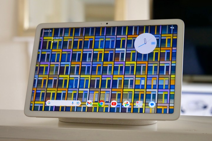
Which half is best? It’s when the Pixel Tablet is docked and operating as a smart display. The screen looks great. It’s a 10.95-inch LCD with a 2560 x 1600 pixel resolution, and it’s a giant step up from my previous smart display, the Lenovo Smart Display 8. I have the screen set so it shows the Recent Highlights reel from my Google Photos account, and the clarity, colors, and definition make them all look so eye-catching and enhance my enjoyment of having the screen in my kitchen a lot.
It took a little while to get the Home Hub aspect working, as the tablet required a few software updates, and the process repeated a few times before it stuck. But now that it’s all set up and working, it controls my Philips Hue lighting system without argument. Google Assistant has also been decent, setting the timers I ask for, giving me weather updates when I request them, and — for the most part — not mishearing things I say.
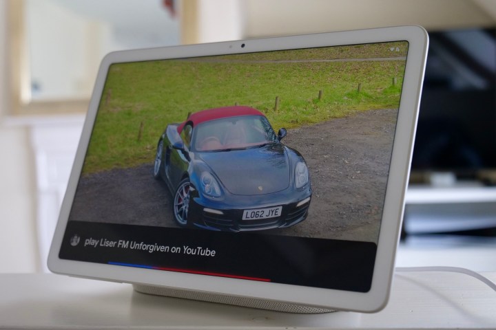
The Google Assistant has even managed to play music and other videos on YouTube when the artists have awkward names. It understood Shmee150’s channel name and that I wanted to hear music from the K-pop group Le Serrafim, despite saying onscreen that it was looking for an artist called Liser FM. The dock’s built-in speakers have more presence than the Lenovo display’s system, and while there’s not much more bass, the sound is projected out further into the room due to the speaker’s placement on the side of the chassis.
It genuinely feels like an upgrade to what I had, and the better screen has prompted me to watch more videos on it rather than reach for a different device like I did when the Lenovo Smart Display was on duty. The magnets holding the screen onto the dock seem to be strong enough to keep it in place even when I adjust the volume manually, but still come free easily when I take the tablet off. A lot of this is different from the experience we had on our review model, once again suggesting Google’s quality control isn’t working at its best.
The other half of the Pixel Tablet isn’t so good
Taking the Pixel Tablet off the dock is where the problems start. Over the short time I’ve had with the Pixel Tablet, the reasons to do so are few and far between. I have a fairly specific way of using tablets, which isn’t simply a repeat of what I do on my phone. For example, I don’t browse social media like Instagram or Twitter, which is for the best because the apps for both aren’t very good on an Android tablet. Instead, I do things like watch videos, read books, browse Reddit, shop on Amazon, and use apps like Autotrader.
I’m fine watching videos on the screen when it’s attached to the dock while I’m doing other things, but the screen’s lack of brightness does become more noticeable when I’m watching more intently. Not using my voice to adjust the volume and pressing the buttons instead only reveals how cheap and clicky they feel. Then if I dare to hold the tablet in an entirely normal way, my palms cover the speakers, and the audio experience becomes noticeably worse.
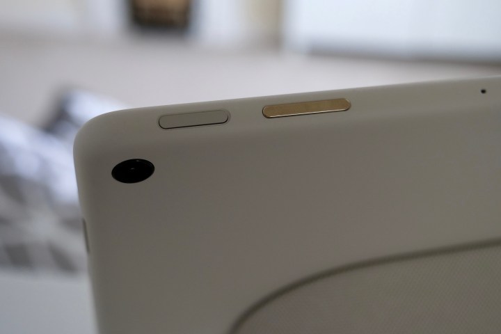
If I accept all this and watch for at least 30 minutes, the tablet starts to get quite warm on the back, mostly on the right-hand side. I’m not going to say it’s uncomfortable, but it’s there, and I want to put it down. This means finding something to prop it up because the official case costs a ridiculous $79. By the time I’ve done this, the screen will have locked itself, and there’s no face unlock feature.
If I just use Autotrader, Reddit, or read a book for a bit, I’m instantly reminded the screen has a 60Hz refresh rate, and my 120Hz refresh rate phone sitting nearby doesn’t have the same limitation and, therefore, has less blur and less eyestrain. It all adds up to not really giving me much motivation to remove the tablet from the dock, with so many disappointments quickly racking up, whether it’s crucial missing features or cost-cutting measures that cheapen the feel and lessen my enjoyment.
When two shouldn’t become one

The Pixel Tablet is not a bad product — it’s just that one half is great, and the other is mediocre. I’m all for adding value and agree that often, a tablet sits around not doing much when I’m not using it, but if it’s going to have additional functionality built into it, it can’t end up compromising the primary function. Which half of the Pixel Tablet is the primary function will differ for everyone, but for me, it’s the smart display half, and thankfully it does that well. The idea of making a docked tablet is spot-on, but the tablet half is a serious compromise over other similar products, and the price is too high for what you get.
The Pixel Tablet reminds me of the Huawei Watch Buds, which is a crazy smartwatch that opens up to reveal a pair of in-ear headphones. It is a cool party trick, but it’s not very good at being either device — living with and using two separate products is far preferable. I think it’s the same deal with the Pixel Tablet. It frustrates me when a single device is made to effectively replace two products but is then not very good at one or both of them, especially when the overall cost reflects its supposed multi-functional ability.
The Google Pixel Tablet is better than the Watch Buds because when it’s working as a smart display, I think it’s excellent. Sure, Google Assistant can be difficult, but it’s a genuine step up from my Lenovo Smart Display, and the design means it also nicely matches my smaller Nest Hub too. That’s great, but the Nest Hub Max exists and would probably bring almost the same benefits I’ve seen through the docked Pixel Tablet for less money — and without the disappointment of the tablet bit.

