There’s little doubt that cameras are among the most important selling points of today’s best phones. Apple, Samsung, Google, and others trade on the value of their camera technology — from the hardware lenses and sensors to the computational photography AI features. And almost without fail, they reserve their very best cameras for their premium flagship smartphones.
It’s somewhat ironic that as important as these cameras are for setting each phone apart, most companies slap them rather unceremoniously onto the back of their devices without much style or panache.

From a design perspective, there’s been a trend toward either minimizing the camera array — as if the designers would love to find a way to pretend it isn’t there — or just slapping on a bulky camera bump that often feels jarringly out of place.
Granted, there’s an argument to be made for minimalism. Samsung’s new Galaxy S23 gives us a taste of that concept with its three protruding lenses that now stand on their own without a camera bump.
However, as with the Galaxy S23 Ultra, they still sit there feeling uninspired. Nothing about these designs suggests that Samsung is proud of its camera system, despite the impressive hardware specs of the cameras themselves.

Apple is a perfect example of going in the other direction. There’s no doubt the camera module on the iPhone 14 Pro makes its presence known in a big way.
Fans of the iPhone have learned to accept the camera bump, but looking at it objectively, it’s hard to see it as anything other than a blemish on what could otherwise be an exquisite look.
Many faces of smartphone camera designs

Of course, not every company shows this sort of inferiority complex when it comes to its smartphone cameras. Some choose to embrace the camera module as an integral part of the design rather than something bolted on as an afterthought.
For example, Google does this with its modern Pixel phones, which have adopted a camera bar rather than a camera bump. It’s a unique design that sets the Pixel apart from just about any other smartphone on the market. There’s also a practical element to the design: unlike most smartphones, an uncased Pixel 7 Pro won’t rock around awkwardly when you lie it on its back.
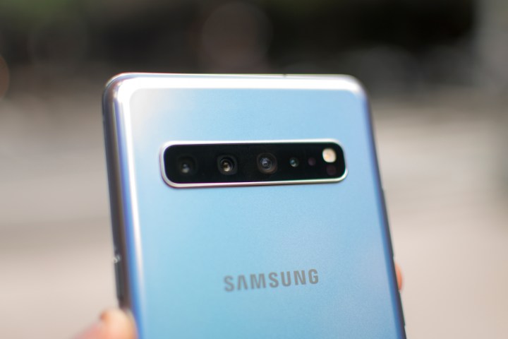
Samsung toyed with a similar concept for the Galaxy S10 lineup in 2019, but the design clearly didn’t stick as it had moved to a more traditional corner bump by the following year.
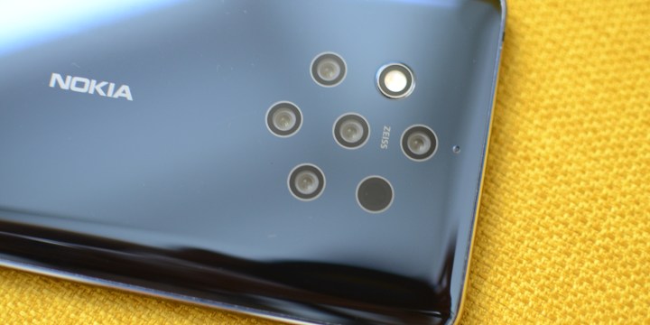
We’ve also seen other interesting designs from niche smartphone models, such as Red’s Hydrogen One and the Nokia 9 PureView. Sadly, the camera designs were probably the most remarkable thing about those phones.
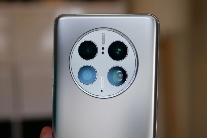
The recent Huawei Mate 50 also goes with a rounded and centered camera module, and I have to give props to Huawei for trying something different — but elegant it’s not.
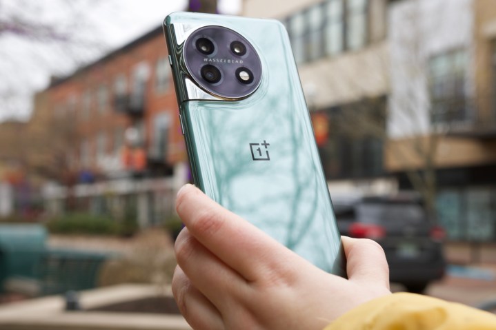
From uninspired camera designs to inventive ideas that don’t quite stick, there’s often a lot to be desired from the aesthetics of a smartphone’s rear camera housing. Thankfully, the OnePlus 11 changes that.
Why the OnePlus 11 gets its camera so right

This year, OnePlus got my attention with the OnePlus 11 — and not just because the OnePlus 11 camera gives the iPhone 14 Pro a run for its money. The cameras in OnePlus’s flagship models have always piqued my interest, thanks to the company’s collaboration with Hasselblad. However, while the OnePlus design has gotten more classy and refined over the past few years, the camera array has retained the cliche squared-off look of most of its competitors.
That’s not to say that the camera bump on the OnePlus 10 Pro didn’t make a statement. It was as big and bold as Apple’s iPhone 14 Pro bump, yet more attractive and flowing seamlessly into the OnePlus design. However, the statement it made still wasn’t that different from most of its rivals.
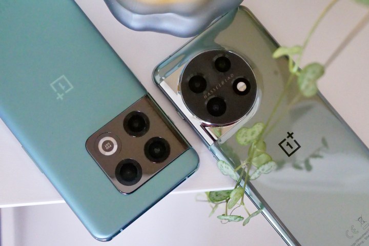
This year, OnePlus has decided to get more creative with the look of the OnePlus 11, moving to a rounded camera module that feels like it finally deserves to have the name Hasselblad stamped onto it.
It’s an opinionated design, to be sure, but as someone who cut his photographic teeth many years ago on a Hasselblad 500C/M, I quite like it. There’s a certain nostalgia to it that feels more “right” to me than OnePlus’ earlier attempts at this collaborative branding.
Most importantly, it changes things up and clearly sets the OnePlus 11 apart. It’s unmistakably something different, and it could easily become the signature look for the company’s flagship phones if OnePlus embraces this as its new normal.
In the end, that may be the biggest problem with the look of the cameras on modern smartphones. While companies are doing everything they can to set themselves apart in camera performance, few are doing anything to create distinctive and inspired designs — and that’s sad.
Until technology improves significantly, the laws of physics mean there will always be some protruding cameras, but that doesn’t mean designers can’t find a way to make them look both elegant and unique.


