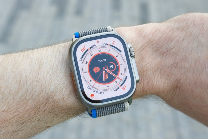
When Apple pulled back the curtains on the Apple Watch Ultra last September, it didn’t click with me at all. I’m a longtime Apple Watch wearer and love a lot about what Apple’s done with the product line, but the idea of strapping on a 49mm smartwatch to my tiny, bony wrists sounded like a horrible idea.
That apprehension has continued since then. Even with my colleagues talking about how to properly wear the Apple Watch Ultra and arguing that the smartwatch really isn’t too big, I still wasn’t convinced that the Watch Ultra was for me.
However, after months of ignoring the smartwatch, I decided it was time to put my preconceived notions aside and give the Apple Watch Ultra a fair shake. I expected to try it on and hate it, but at least be able to say I made an attempt.
I’ve now been wearing the Apple Watch Ultra for a few days, and I’m happy to admit that I was completely wrong about it.
Yes, the Apple Watch Ultra looks incredible
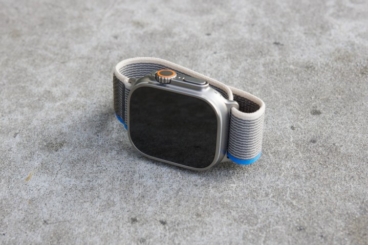
First off, the Apple Watch Ultra looks outstanding. I was never particularly impressed with how it looked in pictures online, but actually seeing with my own eyes and using it convinced me otherwise.
The minute you pick up and hold the Apple Watch Ultra, it’s immediately clear that you’re dealing with something special. The titanium case looks lovely in person, and the added heft it adds to the wearable is noticeably different compared to other Apple Watch versions.
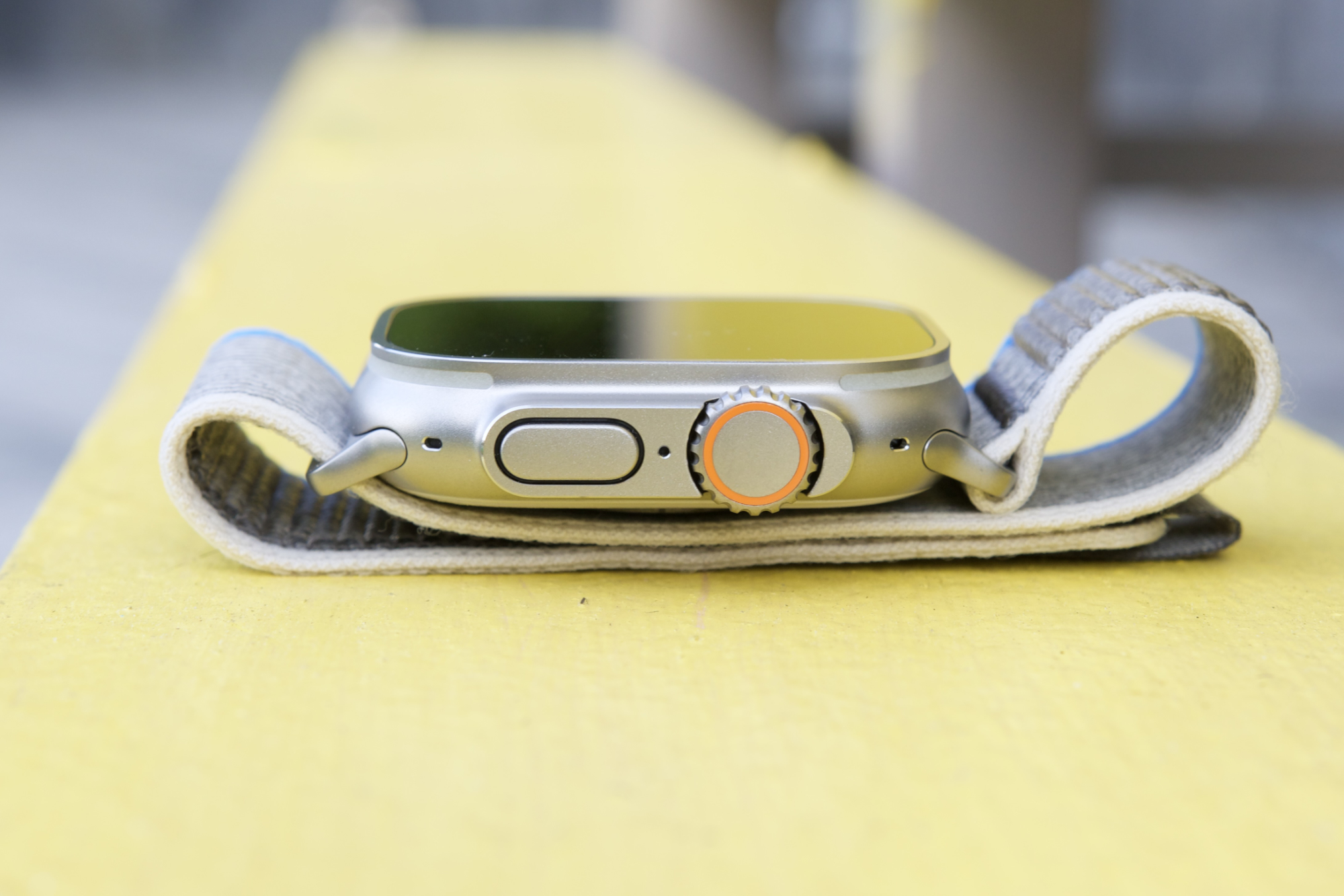
The guard around the Digital Crown and side button also isn’t an issue, as I had feared. It doesn’t protrude from the Watch Ultra as much as I thought it would, and I think it adds a touch of character that other Apple Watches simply don’t have.
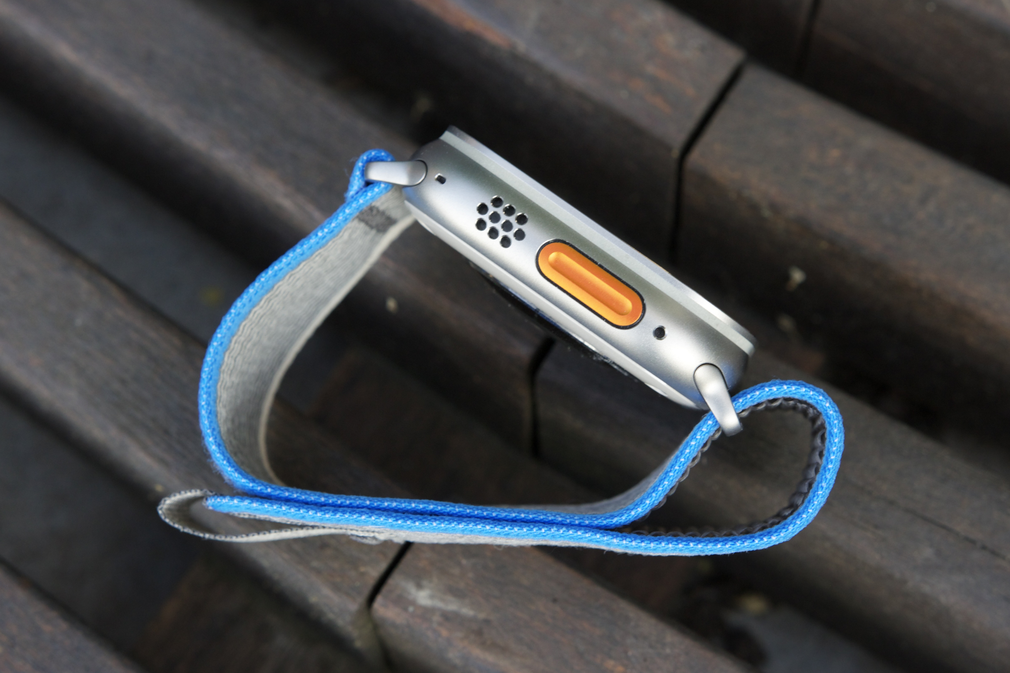
My Apple Watch Series 8 has never felt cheap or poorly made, but the attention to detail on the Apple Watch Ultra is in a league of its own. The Digital Crown moves with unmatched smoothness. The side button feels so much better than it does on any other Apple Watch model, and that same great tactility also applies to the Action Button.
As cliché as it is to say, there’s an unmistakable premium feel to the Apple Watch Ultra. Apple’s design chops for its smartwatches have always been among the best in the business, but having now used the Apple Watch Ultra, there’s no mistake that this is the best wearable hardware Apple has ever produced.
The one thing that surprised me the most
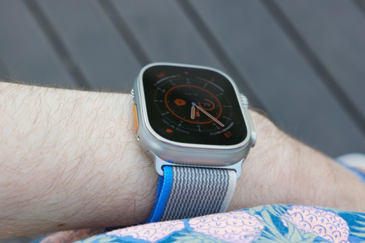
I could keep raving about the Apple Watch Ultra’s design, but that’s not what has impressed me the most. As much as I love its appearance and tactile buttons, the biggest surprise happened when I put it on my wrist for the first time.
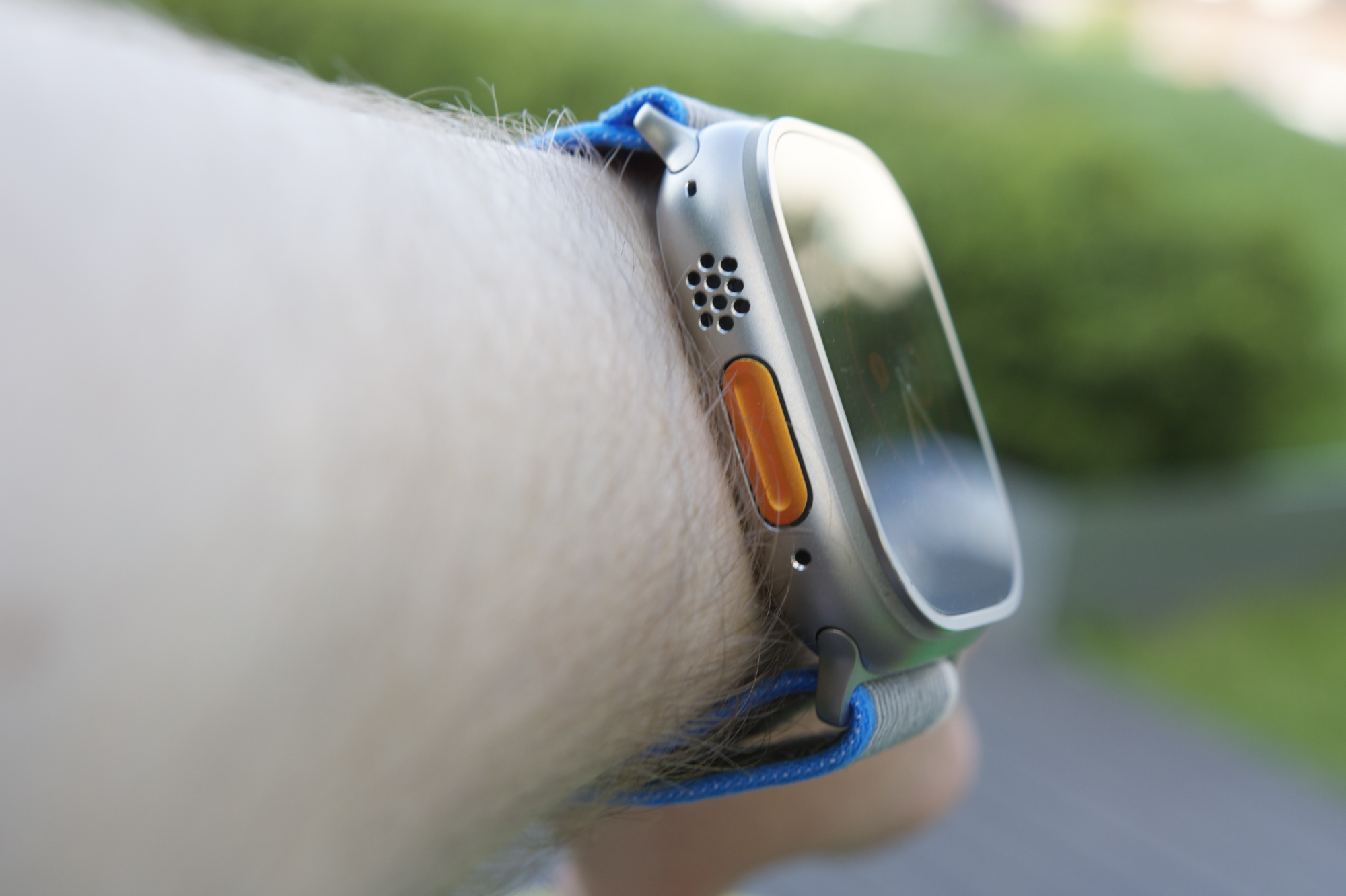
A watch with a 49mm case that weighs over 61 grams sounds daunting — especially for someone like myself with small wrists. But almost instantly, I was shocked by how lightweight and comfortable it felt.
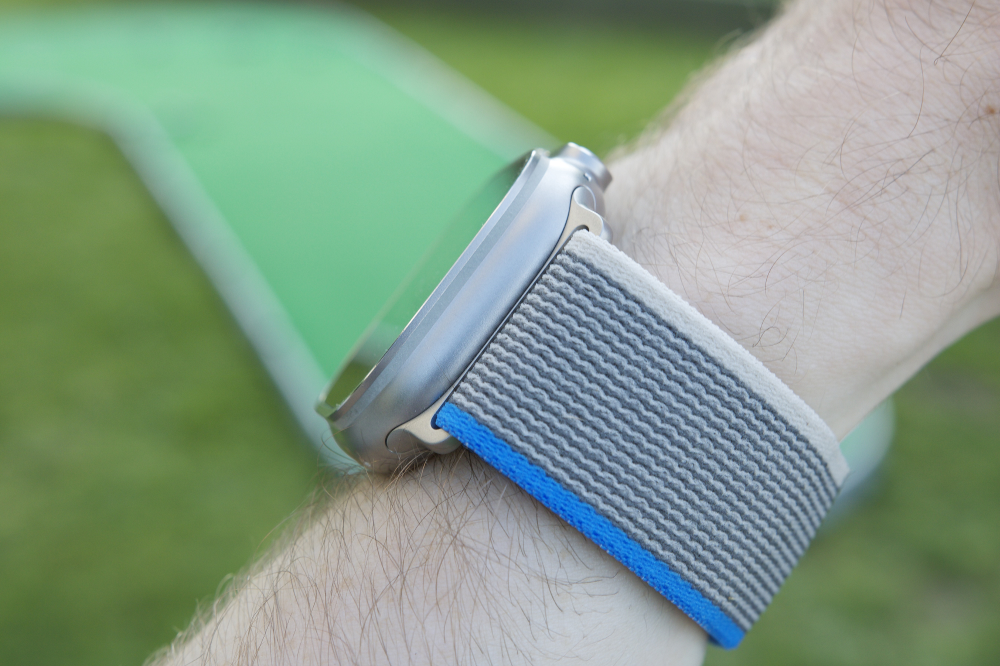
I’m not 100% sure why the Apple Watch Ultra feels as good as it does. Maybe it’s the soft Trail Loop strap that came with mine. Perhaps it’s the rounded corners and cool glass underside that rest gently on my arm. Whatever the reason is, all I know is that it’s far less intimidating than I expected.
To be fair, I still think the Apple Watch Ultra looks ridiculous when viewing photos of people wearing it. But to actually wear the watch yourself is a completely different experience — and one that’s radically changed my opinion about the Apple Watch Ultra.
There’s still one big looming question

All of this high praise comes with a big caveat: I’m only talking about the Apple Watch Ultra’s hardware, not the software. And that’s important to point out, as the watchOS software is fundamentally what caused me to replace my Apple Watch with a Garmin earlier this year.
I still have issues with how the Apple Watch tracks activity and the lack of depth it provides there — a problem that isn’t being addressed in watchOS 10. And based on what I know about the Apple Watch Ultra, it doesn’t actually address any of those complaints.
Still, with hardware this good, I’m eager to keep wearing the Apple Watch Ultra. I don’t suspect it’ll get me off of my Garmin kick, but it has made me excited to wear an Apple Watch again. And that’s a great start.
