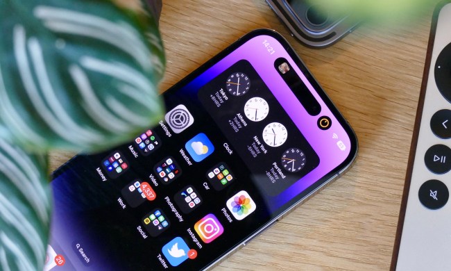
Apple finally released iOS 18 to the public on September 16 after months of betas. It’s one of the biggest iOS updates in history, ushering in a new age of Apple Intelligence, more customization, RCS support, a new Photos app, and a lot more.
I didn’t use the iOS 18 betas, so the public release is the first time I’ve tried out all of the new features, minus Apple Intelligence (it’s coming in iOS 18.1 next month).
Though I’m excited to finally have the next major iOS update, I also can’t believe how bad some of the features I’ve been waiting months for actually are. Let me explain.
Messy home screen customization

One of the things I love about Android software is that it is highly customizable, especially the home screen. You can place apps and widgets anywhere you want without fuss.
After many years, Apple has finally added that kind of customization to the iOS home screen. With iOS 18, we can place our app icons and widgets anywhere on the home screen grid, and we can even change our Control Center layouts.
Except there’s a problem: it’s like iOS is fighting me every single time I try to make a change. It feels so very un-Apple-like in terms of how the whole experience has been the opposite of seamless.
Since iOS 14 let us change our app icons without jailbreak by using Shortcuts, I’ve had the same home screen for the past few years. That’s because I went through a lot of trouble with Shortcuts’ tedious process to have a mostly uniform look on my home screen. But I was eager to redo my entire home screen with iOS 18 and the new Dark theme for the icons, and I found the process to be rather clunky, to say the least.
It feels so very un-Apple-like in terms of how the whole experience has been the opposite of seamless.
Even though Apple made it possible to place your apps and widgets anywhere, even with spaces between them, it feels like an afterthought. When I drag an app out from search or the App Library and try to place it in the middle of an empty page, it will immediately go up to the top-left corner like the old days. And since it’s still grid-focused, you still have to adhere to that, so it’s not like you can just have an app or widget directly in the center of the home screen. It’s also impossible to have a 2 x 2 widget in the center, with one column of apps on the left or right. So it’s not exactly “anywhere” you want.
The new Control Center isn’t what I hoped for

Similarly, though I like being able to customize the Control Center layout, it’s even worse. I had all the controls I wanted, but whenever I resized one or moved a control, everything else seemed to move somewhere else. The controls didn’t shift by one space, but just went wherever they pleased — it didn’t make any sense.
This happened multiple times, so whenever I tried to move something back to where I wanted it, everything else moved again. It was a never-ending, rage-inducing fight with iOS to get my Control Center how I wanted it to be.
Another thing I noticed is that if I have an app on the home screen for two Focus modes, it seems that iOS 18 doesn’t like that either. I have 1Password on my main home screen and also on my Work Focus mode. However, each time the Focus is enabled with my schedule, 1Password is nowhere to be found on my Work home screen. This has to be some kind of glitch, as I had no issues with this before on iOS 17.
So far, iOS 18 feels half-baked

I’m a little shocked at how bad the home screen and Control Center customization have been. Wasn’t this in beta for a few months? It just feels a bit, well, half-baked compared to what I’ve tried so far with the final release. I’m surprised that this implementation of the home screen and Control Center made it out of beta because it still feels like a beta.
That’s not to mention that iOS 18 is still missing a core part of the overall experience with Apple Intelligence. Apple Intelligence features will begin rolling out in iOS 18.1, which is currently in beta and scheduled to come out sometime in October. But considering how this is a big part of iOS 18 as a whole, my iPhone 15 Pro with iOS 18 right now feels incomplete.
I really hope that iOS 18.1 next month improves these things in addition to finally giving us Apple Intelligence. Otherwise, I guess I’ll refrain from making any further changes to my home screen and Control Center unless I feel like throwing my iPhone out the window.


