I admit it: I got sucked into the anticipation and excitement around the concept of running any app I wanted on the cover screen of a compact folding smartphone. I wasn’t the only one either. The ability to run any application on a tiny, folded-up smartphone sounds — on paper — really exciting.
But then I tried the feature out and realized that I was wrong about folding flip phones in this regard. Actually, I didn’t want to run any app on the screen at all. I only need a few.
Flip phones, cover screens, and apps

The Motorola Razr Plus (or Razr 40 Ultra as it’s known in the U.K.) can run practically any app installed on the phone’s cover screen. By default, there is a selection of apps available when you swipe to the right of the main screen, but the edit button lets you add as many as you like. It shows a half-hearted warning that apps may not quite look right, as they’re not designed for the oddly shaped small display, but other than that, it’s a total free-for-all.
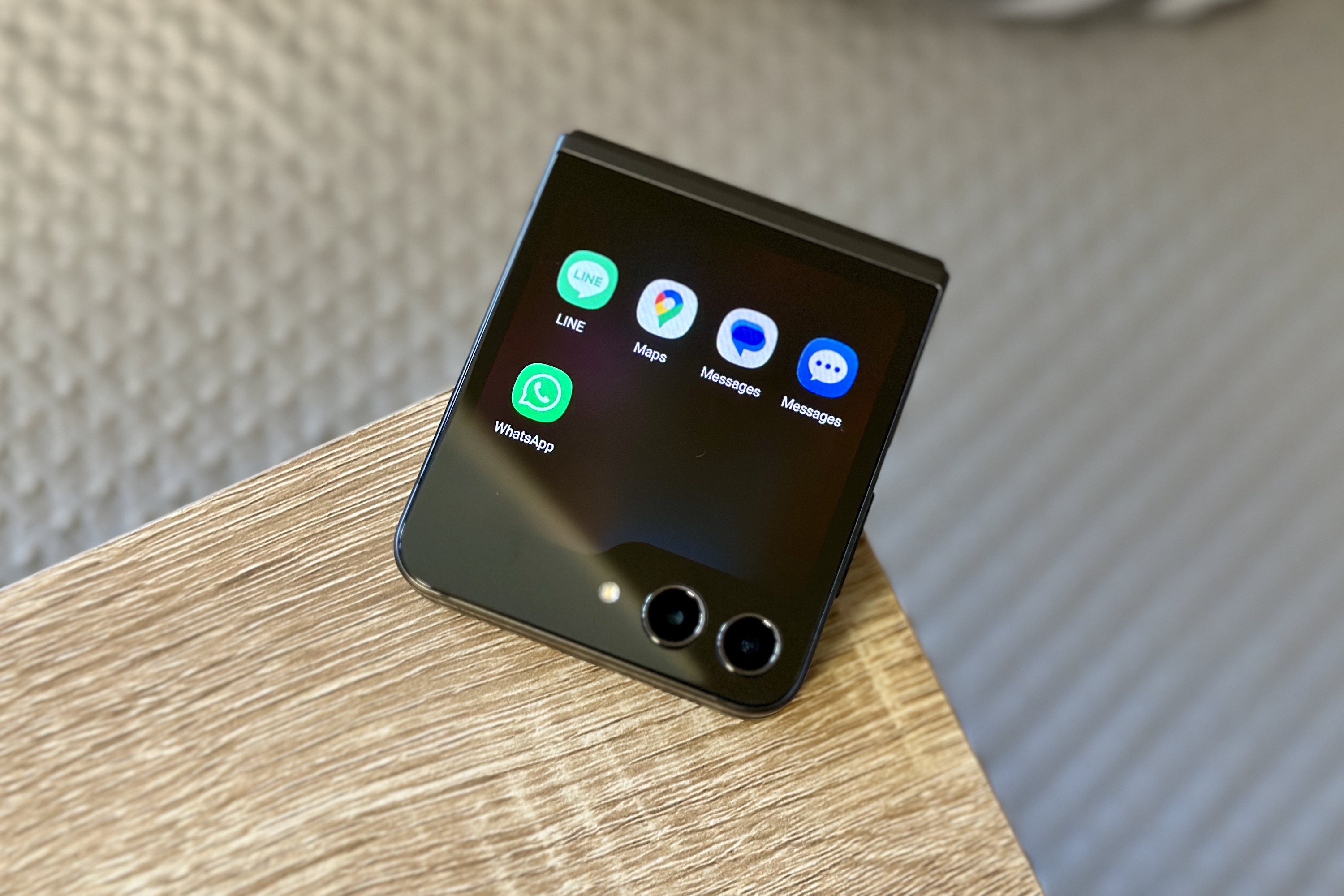
Samsung went in a different direction with the Samsung Galaxy Z Flip 5, and out of the box, it only lets you run a selection of curated apps it thinks you most want on the cover screen. There was a bit of furor over this ahead of launch, and I’m ashamed to say I was somewhere in the mix, stating that Samsung really needed to widen app support on the cover screen if it wanted to be a success. Post-launch, it was discovered that if you jump through a few hoops and install a separate app on the phone, it’s relatively easy to get any app you like operating on the outer display.

That’s any Android app you like on a small screen. Nirvana, surely? Well, no.
As a quick reminder, the Galaxy Z Flip 5 has a 3.4-inch Super AMOLED cover screen with a 720 x 748 resolution, while the Razr Plus has a 3.6-inch AMOLED with a 1056 x 1066 resolution. You can probably tell, even without trying either phone, that these are square screens and not oblong ones — and that they are also much larger than the ones fitted to the Galaxy Z Flip 4 and the Razr Plus’s cheaper sibling, the Razr 40.
The hard truth about using any app you want
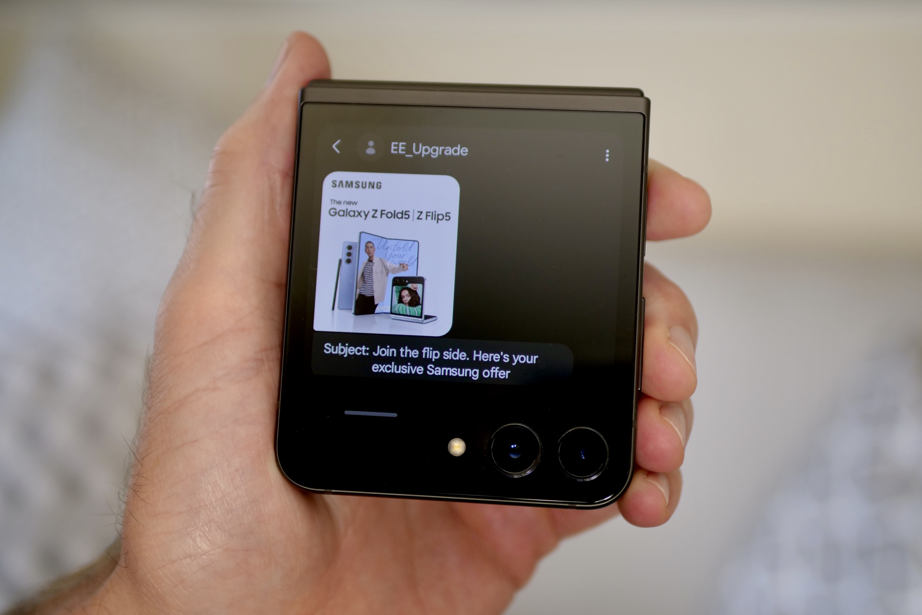
Just because the cover screens on these two superb phones are bigger and higher resolution, and can run any app you like, doesn’t mean you should bother. I’ve used both phones for many weeks now and love the way the cover screens show notifications, let me reply to messages, take a quick look at Google Maps, and briefly check an email. I also appreciate how useful they are to show QR codes, tickets, or other time-sensitive information. Basically, they are excellent at saving you time by performing any simple task that would otherwise require opening the phone.
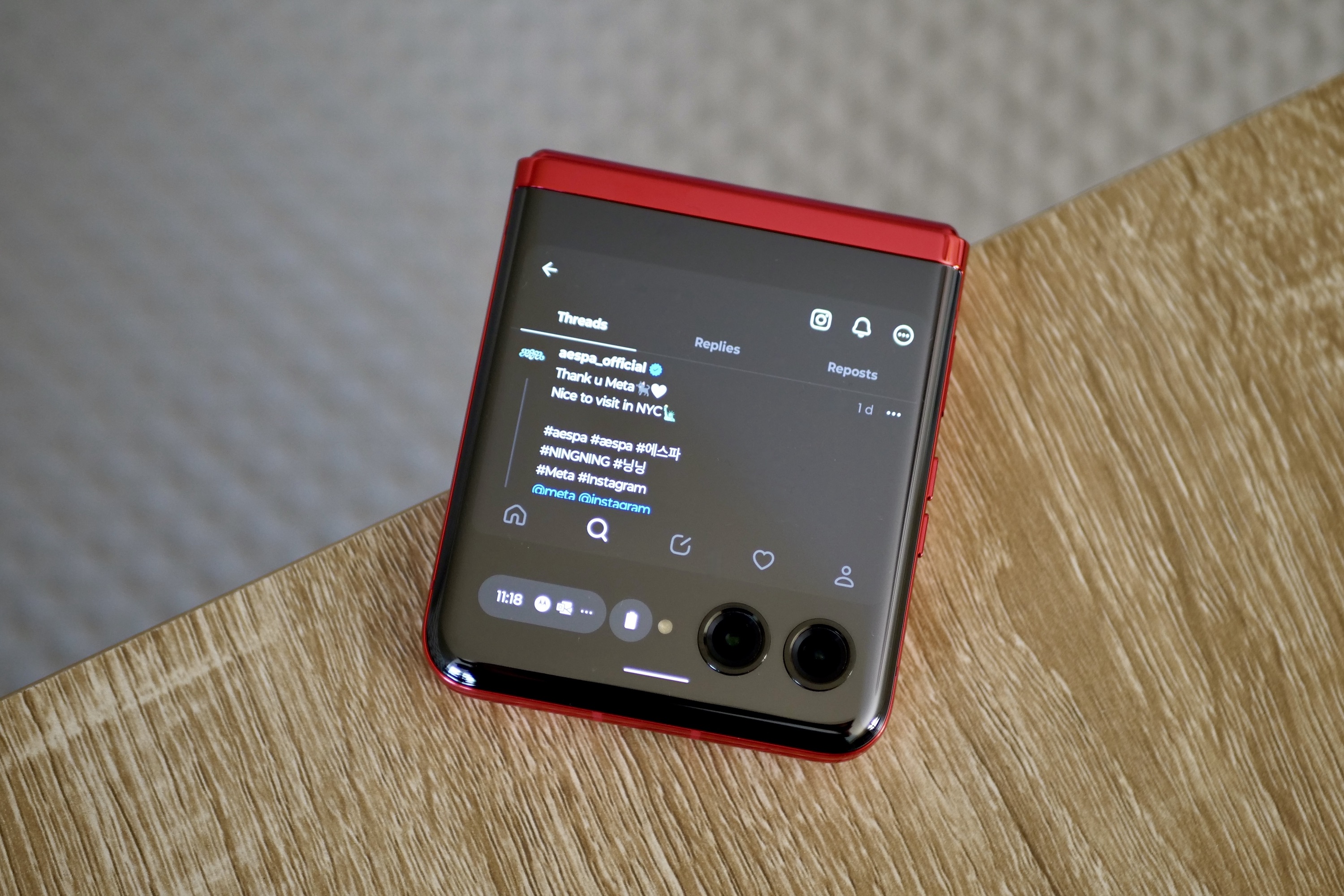
However, the instant I want to write a long message, accurately reply to an email, browse Chrome or Threads, play a game, or watch a video, I open the phone. Why? It’s natural.
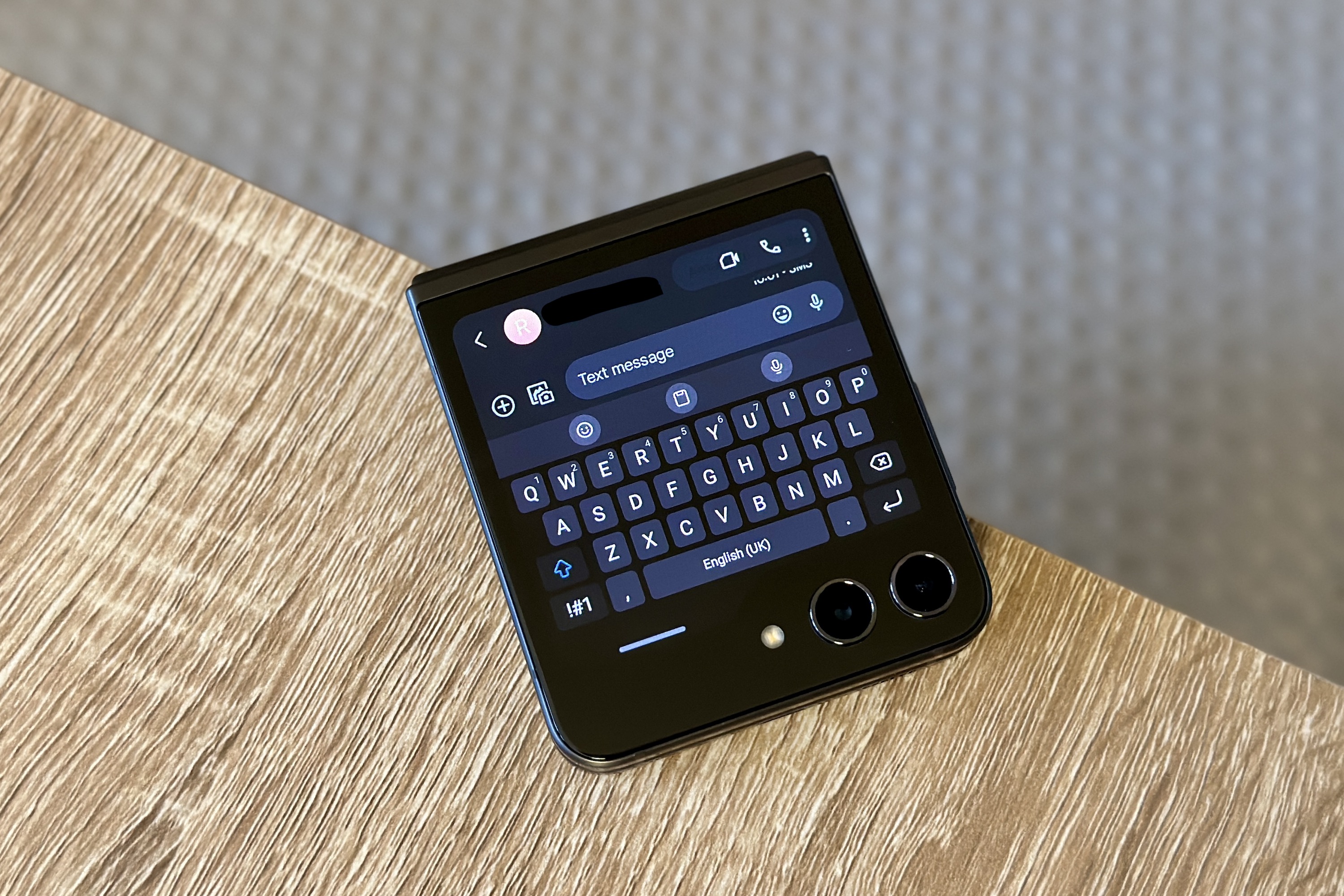
When you use the keyboard on the closed Razr Plus, for example, it takes up the entire screen, so you lose context from the original message, slowing you down. When you open Threads, you see one short post at the most and a bit of any attached image, making browsing a laborious affair (which is repeated in Chrome). When you watch a YouTube video, it displays at a fairly low resolution on the screen and is obviously tiny. And while I can add Pocket City to the cover screen, I don’t know why I’d suffer through actually playing it there instead of just opening the phone.
I quickly began to use only a core selection of apps on the cover screens of these phones, such as Messages, WhatsApp, Line, and Outlook. And even then, it was really only to get a little more information outside of the normal notification. As soon as I wanted to do anything in greater detail, I opened the phone to do it. I felt a bit silly getting excited about any app on the cover screen because, in reality, it’s usually much easier and faster to just open the phone up to do anything of substance.
That said, Samsung’s optimized apps are brilliant and far slicker than on the Razr Plus. For example, WhatsApp makes better use of the space on the Z Flip 5 than it does on the Razr Plus. That’s despite the Razr Plus having a bigger screen, simply because WhatsApp has been specifically designed to work on the Z Flip 5. The keyboard doesn’t just fill the screen, although it’s more fiddly to use because it’s smaller, and you can better navigate YouTube on the cover screen too. But I still have no real wish to use either of them.
Foldables need to be smarter about this
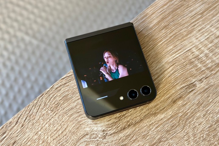
This may sound like I don’t want apps on the cover screen of my folding flip phones, but this isn’t strictly true. What I’ve found is that the ideal situation is a mix of both Samsung and Motorola’s approaches to them.
Samsung only offers certain apps on the cover screen by default because each has been specially adapted to work there, ensuring quality and functionality don’t suffer. However, it has wasted time and effort optimizing apps like Netflix. I can’t think of a single instance where I would want to watch videos on the cover screen when I could just open up the phone for an infinitely better viewing experience.
Motorola just leaves it down to you from the start and doesn’t require installing another app to make full use of the cover screen’s functionality. This is a great way around the issue of a curated app list likely not providing access to features like digital keys or tickets that are visible in less popular apps, which simply aren’t likely to be worth optimizing for the cover screen. But as the Z Flip 5 proves, apps really benefit from being coded to work on a cover screen.

Freedom to use different apps is essential, but optimizing apps that are actually useful is equally important. Before using these two phones, I was adamant I wanted the chance to have any app on the cover screen, but now having lived with them, my opinion is different.
I wasn’t completely wrong about the need for such open-app functionality, but my earlier thoughts have been refined. Yes, the ability to run any app on the cover screen is a must-have for phones like the Z Flip 5 and Razr Plus, but anything outside of a logical, core group of optimized apps is absolute overkill.

